App Store Screenshots That Convert: Design Rules and Teardowns
Your screenshot set is the largest surface on the product page and the one place you get to argue for the install rather than describe it. This is how we design sets that survive the two-second scan: what the first panel must do, how to sequence the rest, which caption styles work, and the size, format and content rules on both stores — including the Play restrictions that quietly make an iOS set non-compliant on Android.
On this page
- Why do screenshots decide conversion more than your icon?
- What does the first screenshot have to accomplish in one second?
- How should you sequence a screenshot set as a narrative?
- Which caption styles actually lift installs?
- How do iOS and Play screenshot rules and sizes differ?
- What changes when few viewers reach the end of the set?
- How do you localise screenshots without redesigning them?
- Which screenshot patterns consistently underperform?
- How do you decide what to test first?
- Frequently Asked Questions
Why do screenshots decide conversion more than your icon?
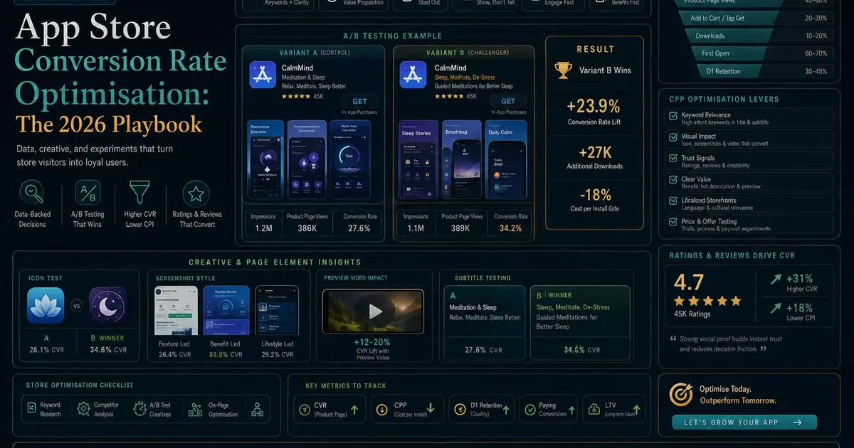
The icon decides whether someone looks at your listing; the screenshot set decides whether they install — and it is the only asset on the page that can carry an argument rather than an impression. That is a difference in kind, not in degree, and it is why screenshot work pays back faster than almost anything else on a product page.
Think about how much information each asset can hold. An icon is a single mark seen at roughly a fingernail size in a search result. At that scale it can communicate a category, a brand and a mood — three impressions, no more. A screenshot set is up to ten full-height panels, each one large enough to hold a headline, a device screen, a data point and a visual metaphor. The set can state a problem, demonstrate a solution, show proof and close. The icon cannot do any of those things; it can only get you looked at.
The placement asymmetry compounds it. On both stores, the screenshot carousel sits directly under the title block and occupies the majority of the visible product page before anyone scrolls. The long description sits below it, and in our experience the share of visitors who expand and read that description is small enough that treating it as a conversion asset is a category error. It is a keyword and context asset on Google Play and a supporting document on the App Store. The screenshots are the pitch.
Google Play widens the surface further: its own documentation notes that screenshots "may be displayed throughout Google Play, for instance in search or on the homepage, in addition to your store listing." That means your first two panels get used in contexts you did not design them for, cropped and scaled by a layout you do not control. Apple's search results behave similarly in that the set is previewed inline, so a screenshot that only works at full width on a product page is a screenshot that fails half the time it is shown.
There is also a measurement argument. Icons are hard to iterate on because they carry brand equity and because the effect size of a small icon change is usually below the noise floor for anything but a very high-traffic app. A screenshot set has multiple independent variables — first panel, order, caption style, art direction, background treatment — each of which can be changed without touching the brand. It is the part of the listing where a small team can actually run a programme rather than a one-off redesign, which is the practical reason it deserves the first slot in your conversion rate optimisation backlog.
Across the 300+ apps we have managed since 2013, the single most common product-page problem we inherit is not a bad icon or a thin description. It is a screenshot set that was produced once, by a designer who was handed no conversion brief, as the final item on a launch checklist — and then never revisited while the app changed underneath it.
What does the first screenshot have to accomplish in one second?
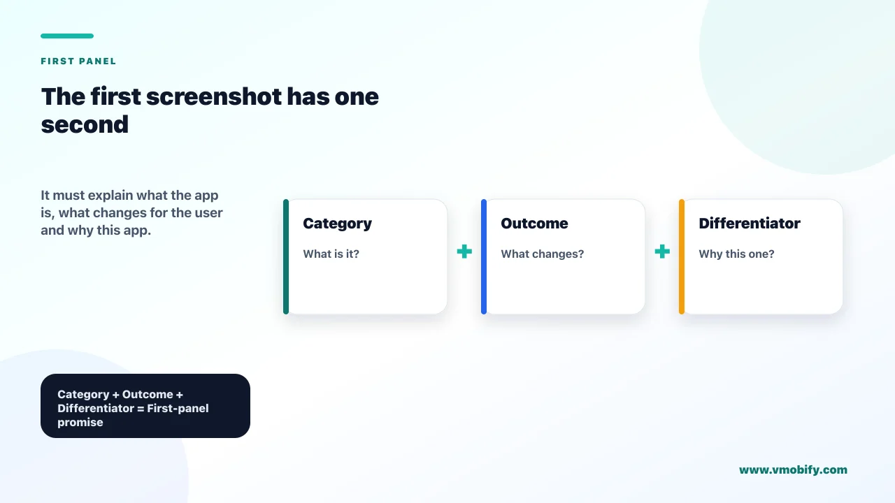
The first screenshot has to answer three questions in roughly a second: what category of thing is this, what outcome do I get, and why this one rather than the others in the search results. If it answers only the first, you have built a label rather than an argument.
Each of the three jobs has a concrete failure mode:
- Category. Someone scanning results has to place you instantly — budgeting app, running tracker, invoice tool. Abstract art and mood photography fail here. A recognisable piece of the real interface, even partially cropped, does the categorising work faster than any headline.
- Outcome. Not the feature, the result. "Track your spending" is a feature. "Know where your money went, every week" is an outcome. The panel needs the outcome in the caption and evidence of it in the art.
- Differentiator. In a category with ten near-identical competitors, the first panel is where you say the one true thing your competitors cannot copy quickly — the bank coverage, the offline mode, the local language support. Not the price — neither store permits a price or promotional terms on a panel.
All three have to survive being shrunk. The test we run on every set before it ships is deliberately crude: view the first panel at about a quarter of its full size on a phone, at arm's length, for one second, and then look away and say what the app does. If a person who has never seen the app cannot answer, the panel is not finished. This is not a design-taste judgement, it is a legibility floor, and it is the reason caption text on a good first panel is usually two to three times larger than a designer's instinct suggests.
"Bigger" has a ceiling on Google Play, though, and it is a documented one rather than a matter of taste. Play's preview asset requirements instruct developers to add taglines only where they are necessary to convey the key characteristics of the app, and state that taglines "should not take up more than 20% of the image". That is the constraint your Android first panel has to satisfy: type large enough to survive a quarter-size glance, inside a text block that occupies no more than a fifth of the canvas. In practice this is reachable — a three-to-five-word line set very large in a band across the top third generally lands well under a fifth of a 1080 x 1920 panel — but it does rule out the stacked headline-plus-subhead-plus-bullet treatments that creep into iOS sets, and it is worth measuring rather than eyeballing before you ship. The same rule is why the Play version of a set is often a slightly restrained cut of the iOS version rather than a straight re-export.
Google Play adds a hard formatting incentive to get the top of the set right as well. To be eligible for the large-format recommendation sections on the store, Play's preview asset requirements state that apps need at least four screenshots at a minimum of 1080px in either 16:9 landscape (minimum 1920 x 1080px) or 9:16 portrait (minimum 1080 x 1920px), and games need at least three. If your set does not meet that bar, you are opting out of merchandising surfaces without realising it.
One structural decision belongs to the first panel too: whether to use a device frame — and this is one of the places where the two stores genuinely want different things. Framed screenshots read as "this is an app" and give the eye a familiar container, but the bezel and the background around it consume panel area that would otherwise carry the interface, which is a real cost at the sizes a search result renders at. Full-bleed screens use the whole panel and feel more immediate, but at small sizes they can read as a website or an advertisement rather than an app. On iOS this is a pure design trade-off, and we default to framed for utility and finance apps, where credibility matters more than immediacy, and full-bleed for media, games and anything visual where the content itself is the argument.
On Google Play it is not purely a design trade-off. Play's preview asset guidance lists "device imagery" among the image elements to avoid, on the grounds that it dates quickly and can alienate users on other hardware, and for Wear OS listings the instruction is absolute: do not position the screenshots within device frames, or add text, graphics or backgrounds that are not part of the app's own interface. So the honest default is a framed set on iOS where it suits the category, and an unframed, full-bleed set on Play — which is another reason to keep frames on their own layer in the source file rather than baking them into the artwork.
Whatever you choose, make the first panel able to stand alone. Assume it is the only one that will ever be seen, because for a meaningful share of your traffic it will be.
How should you sequence a screenshot set as a narrative?
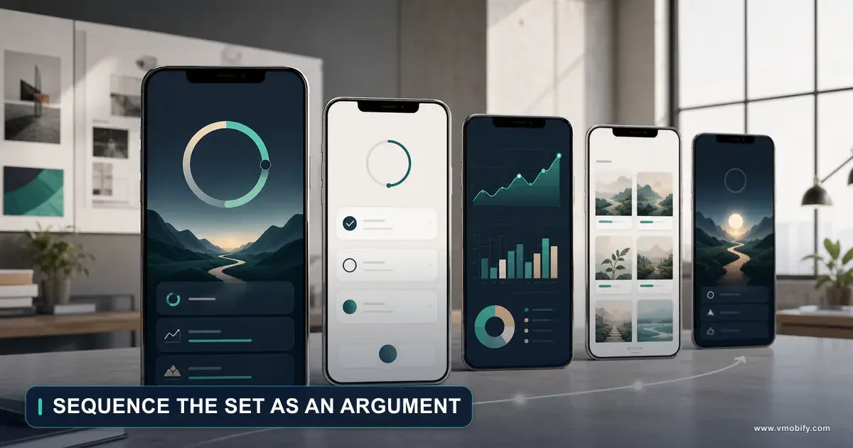
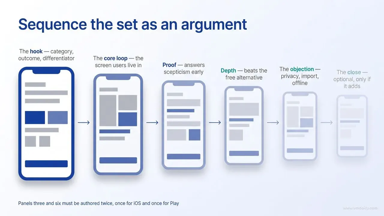
Sequence the set as an argument with a beginning and an end — problem, core value, proof, depth, close — because a set ordered as a feature tour gives the viewer no reason to reach panel four. Order is a design decision with a measurable effect, and it is the cheapest thing on this page to change.
The template we start from, and adapt per vertical:
- Panel 1 — the hook. Category, outcome, differentiator. The one that has to survive alone.
- Panel 2 — the core loop. The single screen a user will spend most of their time in, annotated so the value is obvious without context. If someone stops here, panels one and two together should be enough to install on.
- Panel 3 — proof. A named integration, a security or regulatory credential, a certification, a coverage claim — something the viewer can verify. This is where scepticism gets answered, and it belongs early rather than late because scepticism arrives early. Read the platform note below before you decide what form the proof takes: a store rating, an install count or a customer testimonial is available to you on iOS and barred on Google Play.
- Panel 4 — depth. The second-order feature that separates you from the free alternative. Often the one that converts the comparison shopper rather than the casual browser.
- Panel 5 — the objection. Whatever your reviews and support tickets say people worry about: privacy, data import, offline use, cancellation, lock-in. Answering it in the set removes a reason to leave. What you cannot do here is answer a pricing objection with a price — App Store Review Guideline 2.3.7 keeps prices and terms out of screenshots, and Play bars price and promotional information outright. Address the value concern in words that state no figure, no discount and no terms ("cancel any time, from the app" rather than "£4.99, cancel any time"), and leave the number to the in-app purchase metadata where the stores render it themselves.
- Panel 6 — the close. A forward-looking outcome statement or the onboarding promise ("set up in two minutes"). Optional, and only worth including if it says something the first five did not. Keep it a statement rather than an instruction: Play asks developers to avoid any form of call to action in screenshots, naming "Download now", "Install now", "Play now" and "Try now" as examples, so a closing panel that reads like an ad button is a policy problem on Android as well as a weak close.
Two of those six panels therefore have to be authored twice — a proof panel and a close that are legal on iOS are not automatically legal on Play. That is a template decision, not a per-market one: build the Play variants of panels three and six at the same time as the iOS ones rather than discovering the conflict during a listing update.
Note what this ordering does not do. It does not save the best for last, it does not build suspense, and it does not follow the app's own navigation order. Product teams gravitate towards showing the app in the order the tabs appear, which is a map of the engineering, not a case for the install.
How many panels should you actually produce? Apple accepts up to ten per device size and Google Play up to eight per device type, but capacity is not a target. In our portfolio, five or six well-made panels have generally done better than ten mediocre ones — we have no public benchmark to point at here, only the pattern across the sets we have rebuilt — and the mechanism we would offer for it is straightforward: producing ten forces a team to include screens that do not carry an argument, and every panel that does not carry an argument teaches the viewer that scrolling is not worth it. We treat panels seven onward as optional depth for the small share of high-intent researchers who read everything, never as load-bearing.
Two sequencing patterns are worth naming because they behave differently. A panoramic set, where one continuous image spans several panels, looks striking on a product page and can lift dwell time — but it breaks whenever the store shows a subset of your screenshots in a search or recommendation layout, because half an image is not an argument. A modular set, where each panel is self-contained, is more robust and is what we recommend by default unless the app is a game with strong art. If you want the panoramic look, cheat it: keep a continuous background band across panels while making each panel's message independently complete.
Finally, sequence with the video in mind. An app preview autoplays in the first slot on the App Store, so on iOS your "first screenshot" may in practice be your first frame of video. Apple accepts up to three app previews of 15 to 30 seconds; if you ship one, design the poster frame with the same rules as panel one.
Which caption styles actually lift installs?
Short benefit captions — three to five words, one idea per panel, positioned at the top where the eye lands before it reaches the artwork — outperform every other style we have tested. The caption is doing more of the persuasion work than the screen behind it, which is the opposite of how most sets are budgeted.
The caption styles you can choose between, roughly in order of how often they win:
- Benefit statement. "Get paid in two days." States the outcome in the user's language. The reliable default.
- Quantified proof. "Reconciles 500 invoices a minute." Strong when the number is a product capability that is genuinely differentiating and verifiable; weak when it is a vanity metric the user does not care about. Note the distinction the next bullet turns on: a throughput figure describes the app, a user count describes its popularity, and only the first is safe on both stores.
- Social proof. "Trusted by 40,000 retailers." Works on panel three of an iOS set, and only if the number is large enough to be impressive without explanation. Do not put this style on Google Play. Play's preview asset requirements state that screenshots must not include any content reflecting or suggesting Google Play performance, ranking, accolades or awards, user testimonials, or price and promotional information, and give "Best", "#1", "Top", "New", "Discount", "Sale" and "Million Downloads" as examples of words to avoid. An install-count caption, a quoted review, a painted-on star rating and an award laurel all sit squarely inside that prohibition. The Play substitute is product-inherent proof: name the banks you connect to, the certification you hold, the regulator you are authorised by, the number of countries the service covers. It answers the same scepticism without making a claim about your standing on the store.
- Feature label. "Smart categories." Cheapest to write, weakest performer — it names a thing rather than a reason.
- Instruction. "Scan any receipt." Effective for apps whose value is a single physical action, poor for anything with a broad use case. Keep the instruction pointed at what the app does, not at the store button: Play asks you to avoid any form of call to action and its examples are store-directed — "Download now to scan receipts" is clearly out, while "Scan any receipt" describes what the app does. The wording is broad enough that the safest Play caption states the capability rather than commands it.
Some mechanical rules that we apply without re-litigating them. One caption per panel, never two competing lines of equal weight. Sentence case rather than title case or all caps, because it reads faster at small sizes. Two lines maximum, and if a translation needs three lines the sentence is too long in every language. Text anchored to the top third of the panel, not the bottom — in a carousel the bottom of a panel is where the eye is already moving away, and on Google Play the panel may be cropped in ways you do not control.
One of those rules is ours and one of them is Google's, and it is worth knowing which is which. The two-line maximum is a house style. The size ceiling is not: Play requires that a tagline take up no more than 20% of the image, which is the outer bound on the "go bigger" instinct that makes a first panel legible. The two constraints are compatible — a single very large line across the top of a 1080 x 1920 panel is nowhere near a fifth of the canvas — but a two-line caption set at display size, with a subhead under it and a badge beside it, can quietly cross the line. The practical check is to draw the bounding box of every non-interface text element on the panel, add the areas, and confirm the total sits under a fifth of the image before the set goes to the Play Console. Apple publishes no equivalent cap, so an iOS panel can carry more text — which is precisely why the two sets drift apart if nobody is watching.
There is a second, newer reason to take caption wording seriously. In June 2025, Appfigures reported that Apple had begun extracting text from screenshot captions and treating it as part of an app's keyword metadata, with the observation that keywords appearing in screenshots reinforce rather than compete with the name, subtitle and keyword field. Be precise about the status of that claim: it is a third-party analysis of observed ranking behaviour, not something Apple documents, and we would not restructure a keyword strategy around it. But it does mean that where two caption phrasings convert equally well, the one containing your target keyword is free upside. Conversion first, keyword second, never the reverse — a caption written for the algorithm reads like one, and the humans notice.
The discipline that improves captions fastest is not copywriting technique. It is source material. Pull the exact phrases people use in your reviews, your support tickets and your onboarding survey, and use their words rather than your product team's. In our portfolio, the caption rewrites that produced the clearest gains were almost all substitutions of an internal feature name for the phrase customers already used to describe the same thing.
Keep a consistent typographic system across the set: one typeface, two sizes, one accent colour. A set where each panel has its own layout reads as a collage, and a collage is harder to scan than a rhythm. The eye should learn where to look on panel one and find the same thing in the same place on panels two through six. That learned rhythm is what lets a viewer absorb four panels in the time it would otherwise take to parse two.
How do iOS and Play screenshot rules and sizes differ?
Apple specifies a short list of accepted pixel dimensions per device display size and accepts one to 10 screenshots per size, while Google Play specifies a flexible range — 320px to 3840px with the long side no more than twice the short side — and accepts up to eight per device type. Getting these wrong is the most avoidable delay in a listing update, so here are the current rules from both platforms.
On the App Store, per Apple's screenshot specifications:
- Count and format: one to 10 screenshots in .jpeg, .jpg or .png. Images cannot include alpha channels or transparencies — a flattened export is not optional, it is a rejection cause at upload.
- iPhone: screenshots are required at the 6.9-inch size or the 6.5-inch size — Apple's requirement row sits on 6.5-inch and reads "Required if app runs on iPhone and screenshots for 6.9" display aren't provided", so satisfying either one satisfies the rule. Each display size accepts more than one pixel dimension: 6.9-inch takes 1260 x 2736, 1290 x 2796 or 1320 x 2868 portrait (and the landscape transposes of each), and 6.5-inch takes 1284 x 2778 or 1242 x 2688. Author at 1320 x 2868, because it is the largest accepted 6.9-inch size and everything else scales down from it cleanly.
- iPad: required if the app runs on iPad. The 13-inch size accepts 2064 x 2752 or 2048 x 2732 portrait — so 2048 x 2732 is not merely a 12.9-inch legacy dimension, it is a valid 13-inch upload, which matters if you have an existing 12.9-inch set you would rather not re-render. The 12.9-inch size accepts 2048 x 2732 only.
- Scaling: Apple fills gaps for you. If 6.5-inch screenshots are absent, scaled 6.9-inch screenshots are used; 6.3-inch and 6.1-inch fall back to scaled 6.5-inch; 12.9-inch and 11-inch iPad fall back to scaled 13-inch. In practice one iPhone set at 6.9-inch and one iPad set at 13-inch covers the modern estate.
- App previews: up to three, each 15 to 30 seconds.
On Google Play, per the preview assets documentation:
- Count: up to eight screenshots per supported device type, and you must provide a minimum of two screenshots across different device types to publish the store listing at all.
- Format and size: JPEG or 24-bit PNG with no alpha. Minimum dimension 320px, maximum 3840px, and the maximum dimension cannot be more than twice the minimum dimension — so a 1080 x 2400 export is out of ratio, while 1080 x 1920 is fine.
- Large screens: for tablets and Chromebooks, add a minimum of four screenshots between 1,080 and 7,680px in 16:9 landscape or 9:16 portrait.
- Merchandising: the 1080px / four-screenshot bar described earlier is what qualifies an app for large-format recommendation placements.
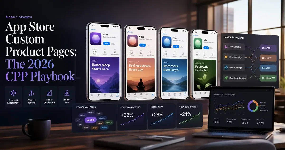
The strategic difference matters more than the pixel tables. Apple's screenshot slots are per localisation and per device size, which makes a fully localised iOS set expensive to produce but precisely targetable. Play's model separates device type from language and layers custom store listings on top, with up to 50 of them per app and only one custom listing per country at a time. Which is to say: on iOS you vary screenshots by audience through custom product pages — Apple allows up to 70 additional versions of the product page — and on Play you vary them through custom store listings targeted by country, user state, search term or ad campaign.
Two practical consequences. First, never build an export pipeline that assumes both stores take the same file: the aspect-ratio ceiling on Play will reject the tall iPhone dimensions that Apple mandates. Second, build the iPad and tablet sets deliberately rather than by upscaling the phone set. A phone panel scaled to a 13-inch canvas looks exactly like what it is, and large-screen users are disproportionately paying users in most categories in our portfolio.
What changes when few viewers reach the end of the set?
It changes the budget: the front of the set deserves more design time than the tail, and every panel towards the back has to be treated as a bonus rather than a dependency. Once you accept the scroll-depth reality, several conventional design choices stop making sense.
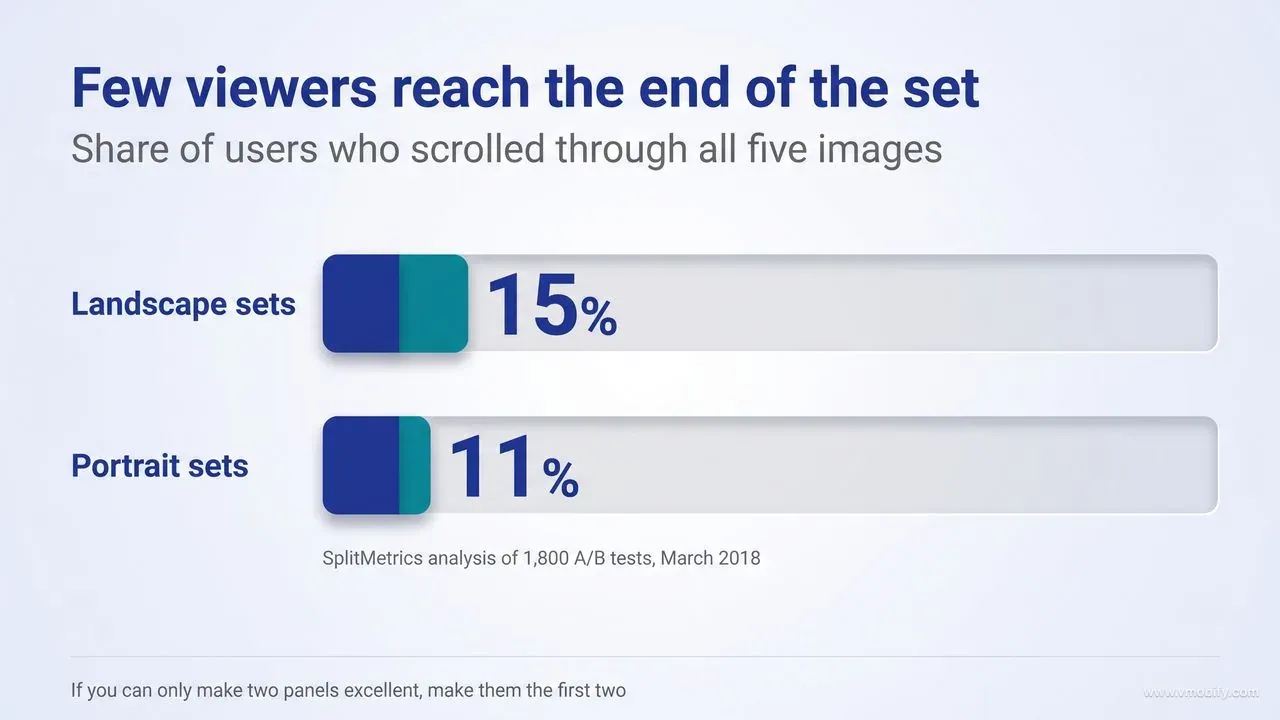
The most-cited evidence here is a SplitMetrics analysis of 1,800 A/B tests with at least 100 views per five-image set, which found that only 15% of users scrolled through all five images in a landscape set and 11% in a portrait set. Be precise about what that measures: it is a completion rate for the fifth image, not a drop-off curve. It tells you the tail of the set is thinly read; it does not tell you what share of viewers stop at panel two, and we have not found a public source that does. Anyone quoting a specific panel-two abandonment figure is extrapolating, ourselves included if we did it.
Two further caveats belong alongside the number, because we would rather you trust it correctly than repeat it uncritically: it was published in March 2018, and the App Store product page has been redesigned since; and the sample was drawn from tests where most sets were already optimised, which if anything makes it a generous estimate rather than a pessimistic one. Neither Apple nor Google publishes scroll-depth data of its own, so this remains the best public number rather than a settled fact.
What follows from it, regardless of the exact percentage and regardless of where in the set attention actually falls away:
- No message may depend on a later panel. If panel five carries the pricing reassurance that makes the app make sense, most viewers never receive it. Move it forward or repeat it.
- Redundancy is a feature, not sloppiness. The strongest differentiator should appear in the first panel and again, phrased differently, in the third or fourth. Editorial instinct says do not repeat yourself; conversion behaviour says most people only ever see one of the two.
- Panoramic sets are a luxury. They only pay off for the minority who scroll, and they cost the majority who do not.
- Evaluate the set truncated. Review it as panels one and two only, then as one through three, before ever reviewing it as a complete strip. Design reviews conducted on a full-width desktop mock of six panels systematically overvalue the tail.
It also changes what a screenshot test is really measuring. When you swap panel four and see no movement, that is usually not evidence that panel four does not matter — it is evidence that hardly anyone saw it. Test the front of the set first, and interpret null results at the back of the set as a reach problem rather than a creative one.
There is a nuance worth keeping. Scroll depth is not uniform across traffic sources. Someone who arrives from a targeted ad already knows roughly what the app is and is scanning for a reason to say no; someone browsing a category top chart is scanning for a reason to say yes. High-intent traffic tends to go deeper into the set and read more carefully, which is exactly why per-source variants exist on both stores. If a meaningful share of your installs comes from paid traffic, a dedicated page for that audience is usually worth more than another round of edits to the default set.
The practical rule we give teams: if you can only afford to make two panels excellent, make them the first two, and let panels three onward be competent and consistent rather than ambitious.
How do you localise screenshots without redesigning them?
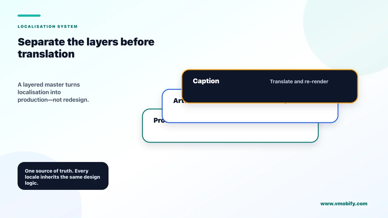
Build the set once as layered templates with text, artwork and device screens on separate layers, so a new market costs a translation pass and a re-render rather than a new design project. Localisation becomes expensive only when the original files were flattened, and that is a production decision made long before the first translation.
The layered source file should separate at minimum: background and brand elements, the device frame, the app screen capture, the caption text, and any callout or annotation graphics. With that structure, a new locale means swapping two layers — captions and screen captures — and re-exporting. Without it, a designer is rebuilding each panel by hand, which is why so many apps ship English screenshots to every market and quietly accept the conversion cost.
What actually has to change per market, in priority order:
- Caption text. The highest-value change and the cheapest. Translate for meaning rather than words — a three-word English benefit line often needs restructuring, not translating, to stay three words.
- In-app screen language. A translated caption above an English interface undermines the caption. If the app is localised, capture the screens in the target language; if it is not, do not claim otherwise in the captions.
- Numbers, currency and formats. Currency, dates in local format, phone numbers and addresses that look plausible to a local reader. Nothing signals "not for you" faster than a dollar sign in a market that does not use one. The currency here means the figures inside the app's own interface — a basket total, a transaction list, a budget — not the app's subscription price, which neither store lets you paint onto a panel.
- Proof points. On iOS, "Trusted by 40,000 retailers" is stronger as a local number where you have one, and weaker as a global number in a market where you are unknown. On Google Play that whole caption style is unavailable, so what varies by market is the product-inherent proof instead: the local payment methods you support, the domestic banks you connect to, the regulator or certification that means something in that country. That often localises better anyway, because a credential a reader recognises beats a headcount they cannot place.
- Imagery of people and context. Worth changing where the app depends on cultural context; usually not worth the production cost otherwise.
Two typographic constraints decide whether templates survive translation. First, text expansion: German and Russian commonly run substantially longer than English for the same message, so any caption box sized exactly to the English string will break. Design the box for roughly a third more characters than English needs. Second, script metrics: Devanagari, Thai and Arabic need more vertical line height than Latin at the same point size, and a caption block set at a tight leading in English will collide with itself in Hindi. Set line height generously from the start, in the template, rather than fixing it locale by locale.
Both stores expect this work. Play instructs developers directly to localise graphic and branding text as appropriate for different markets and languages, and its custom store listings can be targeted by country. Apple holds screenshot slots per localisation. The mechanics are covered in more depth in our store localisation guide; the point here is that the design system determines whether using those slots is a day of work or a month of it.
One sequencing tip that saves rework: localise the top two panels for every market you care about before localising all six panels for any of them. Given how few viewers reach the end of the set, two localised panels across eight markets is worth considerably more than six localised panels in one.
Which screenshot patterns consistently underperform?
The patterns that lose most reliably are the ones that show the product without arguing for it — raw unannotated screens, splash pages, and feature tours that could belong to any app in the category. Several of them are also explicit policy problems, which makes them cheap to eliminate before a designer spends a day on them.
The ones that break Apple's rules outright, from the App Store Review Guidelines:
- Splash screens, title art and login pages. Guideline 2.3.3 states screenshots "should show the app in use, and not merely the title art, login page, or splash screen". Text and image overlays are explicitly permitted, so annotation is fine — an empty brand panel is not.
- Prices and terms in screenshots. Guideline 2.3.7 says metadata including screenshots "should not include prices, terms, or descriptions that are not specific to the metadata type". Pricing belongs in the in-app purchase metadata, not painted onto a panel.
- Content above a 4+ rating. Guideline 2.3.8 requires screenshots to be appropriate for all audiences regardless of the app's own rating.
- Other platforms in the imagery. Guideline 2.3.10 prohibits names, icons or imagery of other mobile platforms or alternative app marketplaces in your metadata. Android hardware in a mockup is a rejection, not a style choice.
Google Play maintains its own screenshot content requirements, and they are stricter about persuasion than Apple's are — which is the single most common reason a set that shipped cleanly on iOS gets rebuilt for Android. From Play's preview asset requirements:
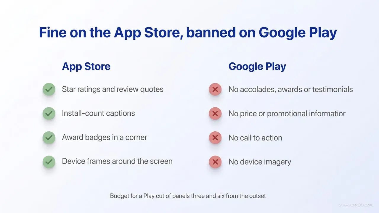
- No performance, ranking, accolade, award or testimonial content, and no price or promotional information. Play names "Best", "#1", "Top", "New", "Discount", "Sale" and "Million Downloads" as example words to avoid. This rules out the install-count caption, the quoted five-star review, the painted-on store rating and the award laurel in the corner — all of which are ordinary practice on the App Store.
- No call to action. "Download now", "Install now", "Play now" and "Try now" are the examples given. A closing panel built around an imperative aimed at the store button is a policy problem, not just a tired one.
- Taglines capped at 20% of the image, and to be used only where they are necessary to convey the app's key characteristics. This is the one Play rule that directly constrains screenshot art direction rather than screenshot copy.
- Screenshots must show the actual in-app experience, focused on core features and content. Conceptual artwork with no interface in it fails here in much the same way it fails Apple's 2.3.3.
- No device imagery. Play lists it among the elements to avoid because it dates quickly and can alienate users on other hardware — and for Wear OS listings, positioning screenshots inside device frames is prohibited outright, along with adding text, graphics or backgrounds that are not part of the app's interface.
- No third-party trademarked characters or logos without permission, and no Google Play badge or any other store's badge or icon. Press logo walls are a straightforward breach unless you hold written permission for every mark on the panel.
- No people interacting with the device — fingers tapping the screen, hands holding the phone — unless the core app or gameplay experience genuinely happens off-device.
- A clean notification bar. Edit out carrier names and notifications; battery, WiFi and cell service indicators should read as full.
- Alt text on every screenshot, 140 characters or fewer, describing the important part of the image. It is an accessibility requirement rather than a creative one, and it is the field most teams leave empty.
The practical consequence is that "one set, two stores" is a false economy for any app whose argument leans on social proof. Budget for a Play cut of panels three and six from the outset, keep the frame and the badge on separate layers so they can be switched off, and run the finished Android set against the list above before upload rather than after a rejection.
The ones that are legal but lose anyway:
- Raw, uncaptioned screen captures. The most common failure in the sets we inherit. A screen with no caption asks the viewer to infer the benefit from an interface they have never used, in under a second.
- Tiny device frames on a large background. A phone rendered at 40% of the panel leaves an unreadable screen and a lot of empty gradient. If the frame is small, the screen inside it is decoration.
- Caption text at the bottom of the panel. It arrives after the eye has moved on, and it is the first thing lost to cropping in store-controlled layouts.
- Eight panels of the same layout with different screens. This is a navigation tour. It reads as long rather than as thorough, and it flattens the priority signal that panel order should carry.
- Award badges and press logos. On Google Play these are not a design question at all — accolades and awards are prohibited content, and third-party logos need permission you probably do not have — so the answer there is simply no, in a corner or anywhere else. On the App Store a small badge in a corner can add credibility, but a panel dedicated to a logo wall still spends a scarce slot on something the viewer did not ask for.
- Low-contrast caption text over screenshot artwork. Beautiful in a design tool at 100% zoom, invisible on a phone in daylight. Caption text needs a solid backing area or a background dark enough to guarantee contrast.
- Sets that were never updated after the app was redesigned. A mismatch between the screenshots and the actual first-run experience is a retention problem, not just a listing problem, because it sets an expectation the app then breaks.
One more, subtler failure: sets designed to look impressive to the founder rather than legible to a stranger. The internal review meeting is a poor proxy for a search result. If the people approving the set have already used the app, they cannot see it the way a first-time viewer does, and the fix is procedural rather than creative — put the set in front of someone who has never seen the product before it ships.
How do you decide what to test first?
Test in order of traffic exposure multiplied by uncertainty — which almost always means the first panel first, then the order of the set, then caption style, then art direction. Testing in that order also happens to be testing in descending order of expected effect size, which is what makes limited traffic go furthest.
The queue we use:
- First panel concept. Not a colour change — a genuinely different argument. Outcome versus feature, framed versus full-bleed, proof-led versus benefit-led.
- Set order. Free to produce, since the assets already exist, and frequently worth more than a new design. Promote your proof panel; demote the feature tour.
- Caption style across the set. Benefit statements versus feature labels, applied consistently, tested as a system rather than panel by panel.
- Art direction. Background treatment, frame style, colour system. The most expensive to produce and usually the smallest effect, which is why it belongs last despite being where design conversations naturally start.
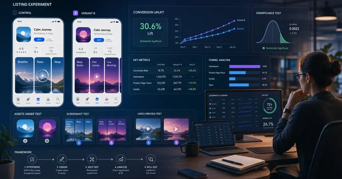
Both stores give you native tooling for this. Apple's product page testing allows up to three treatments of alternate app icons, screenshots and app previews in a single test, runs for 90 days or until you stop it, lets you choose what share of traffic enters the test, and reports against at least 90% confidence. Google Play's store listing experiments cover variants of the icon, feature graphic and screenshots, support localised experiments in up to five languages, let you set the percentage of visitors who see a variant, and stop automatically after six months. Both are documented per-platform and both have quirks worth understanding before you read a result as truth — that methodology is a subject of its own, and we have written about it separately rather than compressing it into a design guide.
The constraint most teams hit is not tooling, it is traffic. If your listing sees a few hundred impressions a day, a formal test on a caption tweak will never resolve, and pretending otherwise wastes months. Below that threshold the honest approach is to apply the design rules in this post as best practice, ship the strongest set you can, then re-evaluate after a fixed period using directional evidence — conversion rate versus the prior period, adjusted for the traffic mix. Not rigorous, but considerably better than running an underpowered test and acting on noise.
Whatever you test, change one thing at a time and keep a record of every variant with its result, including the losers. The value of a screenshot programme compounds through the accumulated knowledge of what your specific audience responds to, and that knowledge lives in the log rather than in the winning creative. In our portfolio, the apps with the strongest product pages are not the ones with the best designers — they are the ones that have been running this loop for two years and can tell you why panel three says what it says.
If you want that loop run for you rather than built from scratch, that is the core of our ASO service: producing the set, testing the front of it, and keeping it current as the app changes.
Frequently Asked Questions
How many screenshots can you upload to the App Store and Google Play?+
Apple accepts one to 10 screenshots per device display size in .jpeg, .jpg or .png with no alpha channel. Google Play accepts up to eight per supported device type, and you must supply a minimum of two screenshots across different device types before you can publish the listing.
What size should App Store screenshots be in 2026?+
Apple requires iPhone screenshots at the 6.9-inch size or the 6.5-inch size, and each accepts several dimensions. The 6.9-inch display takes 1260 x 2736, 1290 x 2796 or 1320 x 2868 portrait; author at 1320 x 2868 because it is the largest. The 6.5-inch display takes 1284 x 2778 or 1242 x 2688. For iPad, the 13-inch size accepts 2064 x 2752 or 2048 x 2732. Apple scales the smaller sizes down from the larger sets automatically.
What are the Google Play screenshot size requirements?+
JPEG or 24-bit PNG with no alpha, a minimum dimension of 320px, a maximum of 3840px, and the longer side cannot be more than twice the shorter side. For tablets and Chromebooks, add at least four screenshots between 1,080 and 7,680px in 16:9 or 9:16.
How many screenshots do people actually look at?+
Fewer than most teams assume. A SplitMetrics analysis of 1,800 A/B tests found only 15% of users scrolled through all five images in a landscape set and 11% in a portrait set. That study dates from 2018 and neither store publishes its own figures, so treat it as directional — but design as though the first two panels are the whole set.
Should screenshots use device frames or full-bleed screens?+
On iOS it is a design trade-off: frames add credibility and a familiar container but give up panel area to bezel and background, while full-bleed uses the whole panel and feels more immediate yet can read as an advert at small sizes. We default to framed for utility and finance apps and full-bleed for media, visual and gaming apps, then test the choice on the first panel. On Google Play it is not a free choice — Play lists device imagery among the elements to avoid because it dates quickly, and Wear OS listings must not place screenshots inside device frames at all. Keep the frame on its own layer so the Android cut can drop it.
Do screenshot captions affect App Store search rankings?+
Possibly. Appfigures reported in June 2025 that Apple had begun treating text extracted from screenshot captions as part of an app keyword footprint, reinforcing rather than competing with the name, subtitle and keyword field. Apple does not document this, so write captions for conversion first and treat a keyword match as free upside where two options convert equally.
Can screenshots get an app rejected?+
Yes, on both stores. The App Store Review Guidelines require screenshots to show the app in use rather than title art, login or splash screens (2.3.3), prohibit prices and terms in screenshots (2.3.7), require 4+ appropriate content regardless of app rating (2.3.8), and prohibit imagery of other mobile platforms or app marketplaces (2.3.10). Google Play adds rules Apple does not have: no rankings, accolades, awards, testimonials or price and promotional content, no call to action such as "Download now", taglines capped at 20% of the image, no device imagery, no unlicensed third-party or store logos, no fingers on the screen, a clean notification bar, and alt text on every image. Alpha channels cause upload failures on both stores.
Sources
- Apple — Screenshot specifications (App Store Connect) — Primary source for counts, formats, exact pixel dimensions and the auto-scaling fallbacks between device sizes
- Apple — App Store Review Guidelines — Sections 2.3.3, 2.3.7, 2.3.8 and 2.3.10 govern what screenshots may and may not show
- Apple — Product Page Optimization — Up to three treatments, 90-day runtime, traffic allocation and the 90% confidence threshold
- Apple — Custom Product Pages — Up to 70 additional product page versions with their own screenshots, previews and promotional text
- Play Console Help — Add preview assets to showcase your app — Screenshot counts, formats, dimension range, aspect-ratio ceiling, large-format merchandising bar, and the content rules barring accolades, testimonials, price and promotional content, calls to action and device imagery, plus the 20% tagline cap and alt-text requirement
- Play Console Help — Run A/B tests on your Store Listing — Testable elements, localised experiments in up to five languages, traffic split and automatic stop after six months
- Play Console Help — Create custom store listings — Up to 50 custom store listings, one per country, targeted by country, user state, search term or ad campaign
- SplitMetrics — App Store screenshot scroll depth study — Analysis of 1,800 A/B tests: 15% scrolled all five landscape images, 11% portrait — published March 2018; measures completion of a five-image set, not per-panel drop-off
About the author
Amol Pomane — Founder, Vmobify
Amol leads Vmobify, a mobile app growth agency that has driven 30M+ downloads and ranked 54K+ keywords across 300+ apps since 2013. He writes about ASO, paid user acquisition, retention, and the operational reality of scaling mobile apps in India and global markets.