App Store Conversion Rate Optimisation: The 2026 Playbook
Your store listing is the last gate between a search result and an install. This guide covers every lever that moves App Store CVR — benchmarks by category, screenshot design, icon A/B testing, App Preview video lift, ratings influence, feature graphic on Google Play, Apple PPO vs. Store Listing Experiments, and seasonal updating.

What Is a Good App Store CVR Benchmark for Your Category?
App Store CVR — the percentage of store-page visitors who install — varies so dramatically by category that quoting a single "good" number is actively misleading. The US App Store averaged 25% CVR across all apps in H1 2025 per AppTweak's CVR methodology research, but that headline hides a 65-percentage-point range: Business apps convert at up to 66.7%, iOS Utilities target 33–38%, Finance sits at 18–22%, and Board Games scrape along at ~1.2%. Measuring yourself against the wrong benchmark will send your team chasing either false comfort or an impossible target.
Google Play benchmarks run 3–5 percentage points higher than iOS for most equivalent categories. That gap reflects the different intent profiles of each store's search audience and the broader reach of Play's browse surfaces. Adapty's 2026 CVR-by-category research segments iOS and Play separately for exactly this reason.
The second critical cut is paid versus organic traffic. Paid traffic converts at 2–5% because it reaches cold audiences who have not yet signalled intent. Organic search-driven traffic converts at 25–40% because users typed in a relevant query. Blending these two populations into a single CVR number produces a metric that describes neither audience accurately and makes A/B test results nearly uninterpretable. Establishing split tracking before any CRO work is non-negotiable.
Across our 300+ app portfolio, the typical new client converts at 60–75% of their category benchmark on first audit. The gap is almost never a product quality issue — it is a listing quality issue. Knowing your subcategory benchmark in the first week of any ASO engagement is what tells you exactly how large that gap is and how much revenue is sitting on the table.
The US App Store averaged 25% CVR across all apps in H1 2025. But at subcategory level, the range runs from 1.2% (Board Games) to 66.7% (Business). Always benchmark within your subcategory, not against the all-app average.
Why Do the First Two Screenshots Drive 80% of the Install Decision?
The first two or three screenshots are the most commercially important real estate in your store listing because they are the only elements visible in search results before any user interaction — and eye-tracking and A/B test data consistently show that roughly 80% of the install decision is made based on what users see in those frames before they scroll.
In Apple Search Results, up to three portrait screenshots (or one landscape) display inline in the result card. On Google Play, the feature graphic and first two screenshots appear in card format across most device sizes. Users on mobile rarely scroll a search result row — if the first frames do not generate enough signal, the thumbstop never happens and the app is passed over entirely. A technically superior product with weak first-frame messaging routinely loses installs to a weaker app with a polished two-panel narrative.
The resource allocation implication is stark. Teams that invest equal effort across all ten screenshot slots are misallocating. In our work across hundreds of apps, optimising screenshot slots 1–3 alone produces 70–90% of the CVR lift available from the entire screenshot set. Slots 4–10 still matter for users deep in their evaluation — but they rarely drive the initial conversion decision for undecided users.
The practical test: download the screenshots from your top five category competitors and view them at the actual size they appear in a search result row on a device — not at the 1080px design canvas where they were created. If your first frame becomes illegible noise at thumbnail scale, you have identified the single most urgent optimisation in your listing.
Test your screenshots at the size they actually appear in search results — around 120–140px wide on most devices. If your caption text is illegible at that size, rewrite it to 5 words or fewer.
How Do You Design App Store Screenshots That Actually Convert?
High-converting screenshots follow a repeatable two-panel narrative: problem acknowledgement or tension in frame one, solution or outcome in frame two — with every design variable (caption, background, device frame, orientation) in service of that narrative rather than showcasing features for their own sake.
Based on aggregated A/B test data from our portfolio and SplitMetrics' published research, the design variables that move CVR most reliably:
Higher CVR
- Dark mode background (utility, finance, productivity)
- Caption at top of frame (Western markets)
- Frameless UI (no device bezel) for utility apps
- Benefit-focused caption: "Replies in 3 seconds"
- Bold warm tone if category is white-and-blue
Lower CVR
- Light background in a category of light backgrounds
- Caption at bottom — hidden before eye processes image
- Heavy device bezel competing with caption message
- Feature-focused caption: "Advanced AI engine"
- Same colour palette as your top 5 competitors
Caption length is a hard constraint, not a soft guideline. Screenshot captions render at thumbnail size in search results; anything longer than 5–7 words becomes unreadable on most devices below 6 inches. "Replies in 3 seconds" beats "Powered by our advanced proprietary AI engine that replies in seconds" not just in clarity — it converts measurably higher in A/B tests because it is the only version that is actually legible in search results.
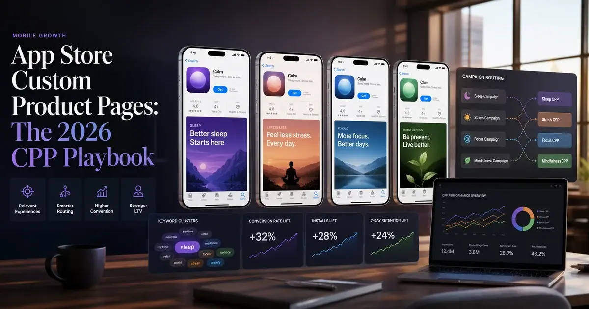
For iOS specifically, Apple's Custom Product Pages allow you to create up to 35 alternate store listings targeting different audience segments — different paid traffic sources, geographies, or feature hooks. Only 31% of apps use CPPs at all, yet those that do report conversion lifts of up to +8.6% per segment. This is the single most underused CVR lever in the App Store today. Our Custom Product Pages guide covers the full CPP setup and segmentation strategy.
Do not A/B test screenshots and your icon simultaneously. Multi-variable tests produce confounded results — you cannot attribute the lift to either change with confidence. One variable per test, always.
How Much Does Your App Icon Really Move Download Rates?
Icon changes can move CVR by ±15% in a properly isolated A/B test — making the icon the single highest-impact listing element you can change without touching your app's code. The icon's disproportionate weight comes from how store browsing actually works: in category chart views on iOS, the icon and app name are the only visible elements — no screenshots, no ratings visible at a glance. The icon does the entire first-impression job alone in that context.
What drives icon conversion uplift, based on our testing across the portfolio:
- Simplicity at small size: Icons render at 60×60 px on most home screens and smaller still in search results. Complex logos, multi-element compositions, and thin-line iconography become illegible at those sizes. The highest-converting icons are consistently a single bold shape on a clean background — recognisable in under 200 milliseconds.
- Category signal: Icons that telegraph the app's category at a glance (a heartbeat line for health, a chart for finance) outperform abstract or brand-first icons for users who have not seen your app before. For users who already know your brand, brand-first icons perform better. The right answer depends on whether your primary acquisition is category browse or brand search.
- Colour gap against competitors: Download the icon set of your top 10 category competitors. If your icon disappears into the visual noise, it is not working hard enough. One distinct colour that no major competitor uses is often worth more than superior design execution in a saturated visual field.
- Seasonal variants: Apple supports icon changes via app updates (no TestFlight required for icon-only submissions). Seasonal icon variants — tied to major cultural moments — produce measurable short-term CVR lifts in our portfolio data.
Run icon variants inside Apple's Product Page Optimisation tool before committing to any live change. A ±15% CVR delta is the realistic range from icon tests — get statistically significant data before you make it permanent. Our ASO A/B testing framework covers the exact sample-size calculation for icon tests.
One naming note: CBS Sports reported a +20% CVR gain from Custom Product Page variants combined with icon and screenshot testing. SoundCloud achieved a −39% CPI reduction (meaning better efficiency, not worse) through a combination of icon refresh and screenshot redesign. Both cases validate that visual creative testing is one of the highest-leverage activities in the entire App Store growth stack — and both were achieved without any change to the underlying product.
How Much Does an App Preview Video Lift Your Conversion Rate?
Apps with strong App Previews consistently convert 15–35% higher than equivalent listings without video — and on the App Store, App Previews autoplay silently in Apple Search Results, giving you the only motion asset in an otherwise static competitive row.
The autoplay behaviour is the key commercial insight. When a user scrolls through search results, App Preview videos play automatically and silently. Your video creative is competing not just with other apps' screenshots — it is competing against an entirely static row. Motion naturally captures human attention; a well-crafted App Preview in search results is a structural advantage that screenshots simply cannot replicate.
Apple's official App Preview guidelines specify that previews must show actual app footage — no lifestyle footage, no generic animations, no UI mockups. This constraint is a design forcing function: the best App Previews show the core user action completing successfully in 15–30 seconds of real UI footage.
The production decisions that determine App Preview performance:
- Lead with the outcome in the first 3 seconds. Autoplay starts muted. If your opening frames are a logo animation or a branded dissolve, users scroll past before your value proposition registers. Start with your most compelling UI moment — the outcome, not the journey to it.
- Caption every key claim. Because autoplay is muted, any audio-dependent content is invisible. Every critical product assertion needs text overlaid on the video. Assume 100% of your autoplay audience is watching silently.
- Produce a portrait variant regardless of app orientation. Portrait videos autoplay in search results; landscape requires a user to tap. For search-result conversion, a portrait variant is non-negotiable.
- Design the loop point intentionally. App Previews loop in search results. An abrupt cut between last and first frame signals poor production quality subconsciously. Design the loop to feel continuous.
On Google Play, the equivalent is the promotional video — Play does not autoplay video in search results by default, but a strong promo video lifts product page conversion meaningfully. The investment calculus is similar: a well-produced video amortises across every organic and paid visitor to your listing for the app's lifetime.
What Is the Google Play Feature Graphic and Why Is It So Often Ignored?
The Google Play Feature Graphic is a 1024×500 px banner displayed at the top of your store listing when your app is featured, promoted in a collection, or shared via a Google Play link — and it is the single most neglected creative asset in the Play Console. Most apps upload a generic brand banner created years ago and never revisit it, despite the fact that the Feature Graphic is the first visual element a user sees when opening your Play store page from outside search results.
Where the Feature Graphic appears and why it matters:
- Featured collections and editorial placements: When Google Play editors feature your app in a themed collection, the Feature Graphic is the primary visual in the collection tile. A low-quality or generic Feature Graphic limits your ability to benefit from editorial featuring even when you earn it.
- Social and messaging previews: When your app's Play Store URL is shared via WhatsApp, Twitter, LinkedIn, or email, the Feature Graphic is the image that renders in the link preview. Every time a user shares your listing, your Feature Graphic becomes your ad creative.
- Play Store search results (some layouts): Depending on the user's device and Play app version, the Feature Graphic can appear in certain search result card formats — particularly for apps with active promotional campaigns.
According to Google's Play launch best practices, the Feature Graphic should communicate your app's core value proposition independently of the app icon or screenshots — it needs to work as a standalone billboard, not as a decoration behind your icon. The most effective Feature Graphics follow the same principle as screenshot frame one: a clear benefit claim, legible at reduced size, differentiated from category competitors.
In our experience across 300+ managed apps, the Feature Graphic is updated at roughly a quarter of the frequency of screenshots — despite having equivalent or greater visual impact in featuring contexts. Updating it as part of any seasonal or campaign push takes less than an hour and costs nothing.
Treat your Feature Graphic like a billboard: single clear claim, benefit-first, brand colour that contrasts with the grey Play Store background. Resize it to 400px wide and view it — if the message is still legible, you have a working Feature Graphic.
How Do Apple PPO and Google Store Listing Experiments Actually Differ?
Apple's Product Page Optimisation (PPO) and Google's Store Listing Experiments are both free, native, in-store A/B testing tools — but they differ meaningfully in traffic eligibility, variable scope, and how they handle statistical confidence, and understanding those differences determines how you design and interpret tests on each platform.
Apple PPO
- Tests: icon, screenshots, App Preview video
- Traffic: organic only (paid traffic excluded by default)
- Max variants: 3 simultaneously
- Traffic split: you set the % (e.g. 50/50 or 90/10)
- Significance: Apple reports "improvement" when p < 0.05
- Localisation: supported — different variants per locale
- Access: App Store Connect → Your App → Product Page Opt.
Google Store Listing Experiments
- Tests: icon, screenshots, feature graphic, short description
- Traffic: organic and paid (broader sample)
- Max variants: 4 simultaneously
- Traffic split: 10–50% to variant(s)
- Significance: Play Console shows confidence percentage
- Localisation: supported — per-language experiments
- Access: Play Console → Store Presence → Store Listing Experiments
The most important practical difference: Apple PPO applies only to organic traffic by default. If your app's primary acquisition is paid, your PPO test results reflect how your listing performs with organic search intent — which may not predict how the same variant performs for cold paid audiences. Segment your analysis accordingly, and read our ASO A/B testing framework for the statistical discipline to apply to both platforms.
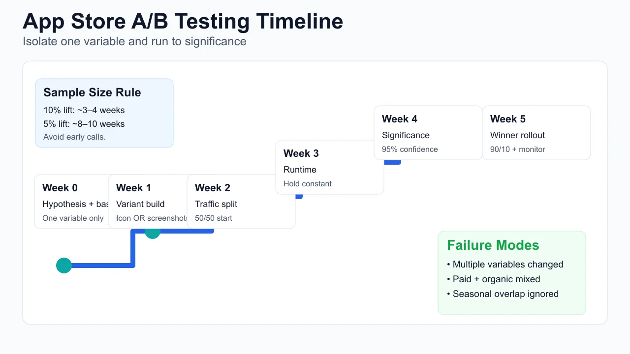
Test design protocol we apply across our portfolio:
- One variable per test. Screenshot set, icon, or Feature Graphic — never two simultaneously. Multi-variable tests produce confounded results you cannot act on.
- Pre-calculate your runtime before launch. For a 20% traffic split on 10,000 weekly store visits, reaching 95% significance on a 10% CVR lift takes 3–4 weeks. For a 5% lift: 8–10 weeks. Commit to the runtime before the test starts — early results are noise.
- Separate paid from organic cohorts in analysis. These audiences respond differently to the same creative changes. A variant that lifts organic CVR 8% may have zero or negative effect on paid CVR.
- Avoid seasonal transition windows. Do not run tests that span major seasonal shifts unless the hypothesis is specifically about seasonal response.
Only 31% of apps and 26% of games use Apple Custom Product Pages despite documented conversion lifts of up to +8.6% per audience segment. The underadoption is the opportunity.
How Do Ratings and Reviews Influence App Store Conversion?
Apps below 4.0 stars see up to 70% lower CVR compared to apps rated 4.5 and above — making the ratings badge one of the highest-impact pre-click filters in the entire App Store, visible in search results before a user ever reaches your screenshots.
The psychology is simple: in a search result row with comparable screenshots and icons, users default to the highest-rated option as a quality proxy. A 4.1 rating against a competitor's 4.7 is a visible trust disadvantage that no screenshot optimisation can fully overcome. The number is seen before the design work.
The levers that move ratings in our portfolio:
- Strategic prompt timing: Both Apple (SKStoreReviewRequest) and Google (In-App Review API) provide native rating prompts. Prompting after a "success moment" — completed transaction, level cleared, document saved — rather than immediately post-install produces ratings that reflect the product when it works as intended. The delta between a post-install prompt and a post-success prompt can be a full star over 60 days.
- Responding to negative reviews publicly: Developer responses to 1- and 2-star reviews produce two measurable effects: approximately 15–20% of users who receive a personal response revise their rating upward within a week, and prospective users reading the review section weight visible responsiveness as a trust signal.
- Routing negative feedback before the store prompt: An in-app feedback mechanism that surfaces before the rating prompt gives dissatisfied users a private channel. Users who receive a human response rarely go on to leave a public 1-star review. This is triage, not suppression.
- Post-fix recovery campaigns: After a major bug fix, a targeted push notification to affected segments prompting re-rating — within platform guidelines — can move the average rating by 0.2–0.4 stars within 30 days.
In our portfolio, moving from 3.8 to 4.4 stars has consistently produced 25–40% CVR uplift from the rating signal alone, independent of any screenshot or icon changes. For the full ratings recovery playbook including prompt timing frameworks and response templates, see our ASO services page.
Never incentivise or purchase ratings. Apple removes purchased reviews automatically and may permanently suspend developer accounts on repeat offences. Rating improvement must come from genuine user experience improvements and smart prompt timing — nothing else is sustainable.
Does Your App Description Copy Actually Move Conversion Rate?
Description copy has a genuine but secondary influence on CVR — most users never read it before installing, but for high-consideration categories (finance, health, productivity) the long description is the last trust-building asset for users who have decided they are interested but have not yet committed.
The keyword-first versus benefit-first debate has a clear answer in practice: the first line of your description (which appears truncated before the "more" tap in both stores) should lead with a sharp benefit claim, not a keyword string. Keywords in the description influence Google Play search indexing marginally — they do not affect Apple App Store ranking at all. Writing the opening line for the algorithm produces a first impression that feels like spam to real users, which depresses the conversion rate of the users who do read it.
Description copy elements that move CVR in the high-consideration segment:
- Social proof in the first paragraph: "Trusted by 2M users" or "Featured by Apple in 40 countries" — quantified credibility signals that appear in the truncated preview before the "more" tap. Users in high-consideration categories look for these signals before expanding the description.
- Scannable formatting: Both stores render emoji bullet points cleanly. A description formatted as dense prose has measurably lower engagement than the same information formatted with emoji section headers and short bullet lists. Users scan, they do not read.
- Localised copy for non-English markets: A Spanish-language user encountering an English-only description is meeting a trust gap at exactly the wrong moment. Localising the description (not just the metadata) produces measurable CVR lift in non-English markets, particularly when combined with localised screenshots. AppTweak's ASO research cites localisation consistently among the top three CVR levers for global apps.
- Updated "What's New" copy (iOS): The "What's New" section appears prominently for users who have the app installed (update prompt) and is visible on the product page. Vague update notes ("Bug fixes and performance improvements") miss an engagement and re-rating opportunity. Specific, benefit-oriented update notes ("Added dark mode, fixed checkout speed by 40%") re-engage lapsed users and build trust with prospective ones.
The practical recommendation: invest in description copy proportionally to your category's consideration level. For games and simple utilities, screenshots and icon are the only levers worth testing. For fintech, health, and enterprise productivity apps, a well-crafted description with social proof and scannable formatting can contribute a meaningful 3–8% CVR uplift among the subset of users who read it. Talk to our team if you need a full listing copy audit across multiple locales.
How Do Seasonal Updates and Custom Product Pages Lift CVR?
Seasonal listing updates and Apple Custom Product Pages are the two highest-leverage programmatic CVR levers in 2026 — and both are almost universally underused by app teams who treat the store listing as a set-and-forget asset rather than a live marketing channel.
Seasonal updates work because store algorithm signals (featuring probability, search result ranking) favour recently updated apps. An icon or screenshot refresh tied to a cultural moment — a major sporting event, a shopping festival, a seasonal shift — produces two simultaneous effects: a CVR lift from visual freshness and differentiation, and an algorithm signal from the update activity itself. In our portfolio, seasonal screenshot and icon updates typically produce 8–15% CVR uplift during the relevant window, which compounds into ranking gains that persist after the seasonal creative is retired.
The seasonal update protocol:
- Map the seasonal calendar three months ahead. Identify 3–4 moments per year that are relevant to your app's category — not generic holidays, but moments with genuine user intent overlap with your app's value proposition.
- Prepare seasonal variants in advance. Icon variants for iOS require an app update submission — plan for a 24–72 hour review window. Screenshot variants on both stores update immediately on approval.
- Coordinate with paid campaigns. Running a seasonal screenshot variant simultaneously with a themed paid creative produces a coherent message across the user journey from ad click to store page — consistent messaging between ad creative and store listing measurably lifts install rate.
- Revert to evergreen creative after the window. Seasonal creative left live past its moment reads as outdated and erodes trust. Build revert steps into your seasonal calendar at the time of planning.
Custom Product Pages extend this logic into always-on audience segmentation. Rather than showing all paid traffic the same store listing, CPPs allow you to serve a finance-audience segment a listing emphasising security and portfolio tracking, while a casual-user segment sees the same app emphasised for budgeting and ease of use. Across every successful scaling story in our portfolio, the teams that treat their store listing as a dynamic, segmented channel — rather than a static brochure — consistently outperform those that do not. For the full CPP setup guide see our Custom Product Pages deep-dive, and for results see our client results page.
CBS Sports achieved a +20% CVR lift by combining Custom Product Pages with audience-matched creative. SoundCloud reduced CPI by 39% through coordinated icon, screenshot, and CPP testing. Both results came from treating the store listing as a segmented performance channel, not a static brand asset.
Frequently Asked Questions
What is a good App Store conversion rate for my category?+
The US App Store averages 25% CVR across all apps, but the range by category is enormous: Business apps can hit 66%, iOS Utilities should target 33–38%, Finance sits at 18–22%, and Board Games average ~1.2%. Always benchmark against your specific subcategory, not the all-app average. Also separate paid traffic CVR (typically 2–5%) from organic CVR (25–40%) — blending them produces a meaningless composite metric.
How many screenshots should I have in my App Store listing?+
Both stores allow up to 10 screenshots on iOS and 8 on Google Play. Invest heavily in screenshots 1–3 because they drive roughly 80% of the install decision, and use remaining slots for feature demonstrations aimed at already-interested users. A brilliant set of 5 screenshots outperforms a mediocre set of 10. Quality and narrative coherence in the first three frames matters more than filling every available slot.
What is the difference between Apple PPO and Google Store Listing Experiments?+
Apple PPO applies to organic traffic only by default and lets you test icon, screenshots, and App Preview video. Google Store Listing Experiments covers organic and paid traffic and also allows testing the feature graphic and short description. Both are free native tools. Key difference: PPO results reflect organic intent and may not predict how variants perform for paid audiences — segment your analysis accordingly.
How long does an App Store A/B test need to run?+
For most apps, 3–4 weeks minimum to detect a 10% CVR lift at 95% statistical confidence with a 50/50 split. Detecting a 5% lift requires 8–10 weeks. Never declare a winner under 2 weeks — early data is noisy and produces high false-positive rates. Pre-calculate your required sample size before the test starts and commit to the runtime regardless of early directional signals.
Does an App Preview video help on Google Play as well as the App Store?+
On the App Store, App Preview videos autoplay silently in search results — a structural advantage over static competitors. On Google Play, promotional videos do not autoplay in search results by default but lift product page conversion for users who reach the listing. The App Store autoplay benefit makes video investment disproportionately valuable on iOS. Google Play video still earns its cost but at a lower marginal impact than on the App Store.
How do I improve my app rating quickly?+
The fastest legitimate approaches: (1) shift your in-app rating prompt to trigger after a success moment rather than immediately post-install — this alone can improve your average rating by 0.3–0.5 stars over 30 days; (2) respond publicly to every 1- and 2-star review — 15–20% of users who receive a personal response revise their rating upward; (3) after resolving a major reported bug, send a targeted re-rate request to affected users within platform guidelines. Apps below 4.0 see up to 70% lower CVR versus apps at 4.5+.
What are Custom Product Pages and should I be using them?+
Custom Product Pages (CPPs) are alternate store listings on iOS — up to 35 per app — that can show different screenshots, icons, and App Preview videos to different audience segments. They are used in Apple Search Ads and can be linked directly from paid campaigns. Only 31% of apps use CPPs despite documented lifts of up to +8.6% per segment. If you are running Apple Search Ads, not using CPPs means serving all paid traffic a single generic listing — a significant missed opportunity.
Sources
- Apple — Product Page Optimisation — Official Apple documentation on PPO, Custom Product Pages, and App Preview guidelines
- Google Play — Launch Best Practices — Google's own documentation on store listing quality, feature graphic, and install velocity
- AppTweak — App Store CVR Methodology — CVR by category benchmarks, paid vs. organic segmentation, and store-specific measurement definitions
- Adapty — App Store CVR by Category 2026 — Paid and organic CVR benchmarks segmented by category for iOS and Google Play
- SplitMetrics — ASO Research Hub — Aggregated A/B test data on screenshot, icon, and video conversion impact across thousands of apps
- StoreMaven — App Store CRO Research — First-screenshot conversion weight, CPP adoption data (31% apps, 26% games), and conversion lift benchmarks
- AppsFlyer — State of App Marketing — Category-level retention and CVR signals; rating impact on install conversion
- Sensor Tower — App Store Intelligence — CVR benchmark data by store, category, and geography; seasonal update impact analysis
About the author
Amol Pomane — Founder, Vmobify
Amol leads Vmobify, a mobile app growth agency that has driven 30M+ downloads and ranked 54K+ keywords across 300+ apps since 2013. He writes about ASO, paid user acquisition, retention, and the operational reality of scaling mobile apps in India and global markets.
Free Growth Audit
See exactly how to scale your app with 13+ years of expertise behind you.
Get My Strategy