Claude Code UI/UX Plugins and Skills: The 2026 Guide
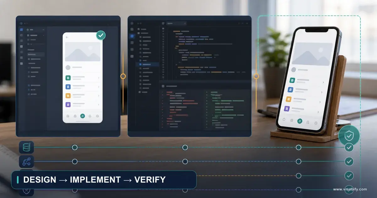
Ask any coding agent for a landing page and you recognise the output before you finish scrolling. The fix is not a better prompt — it is persistent design context. This guide reviews every Claude Code design plugin, skill and MCP server worth your time, and ends with a skill file you can install in one command.
On this page
- Why does AI-generated UI always look the same?
- What are the five things people call a Claude Code plugin?
- Which Claude Code design tools should you install first?
- How do you stop every AI interface looking identical?
- Which MCP servers give a coding agent design context?
- Why is an automated design review the highest-return addition?
- Where should you look for new Claude Code design tools?
- How do the design plugins and skills compare?
- Which tool stack should you run for your situation?
- Why should you decide the design before writing any CSS?
- What design tokens must exist before any component?
- Why is alignment the cheapest quality signal in an interface?
- What makes interface motion meaningful rather than decorative?
- Which interaction states must every element ship?
- How should you design the highest-leverage screen you own?
- Why is accessibility a constraint rather than a phase?
- Which UX laws are worth applying by name?
- Why is interface copy most of the design work?
- How do you spot the tells of an AI-generated interface?
- What goes into a copy-paste UI/UX skill file?
- What if you want design rules with zero install?
- How do you add a repeatable design-review command?
- What should you do first if you only have ten minutes?
- Frequently Asked Questions
Why does AI-generated UI always look the same?
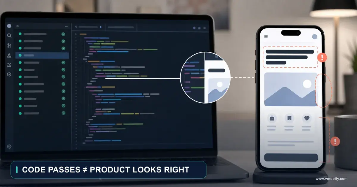
Absent explicit direction, a coding agent converges on the statistical centre of every tutorial landing page it has ever seen — which is why the output is recognisable before you finish scrolling. It is the same failure mode described in making an AI agent implement a design without damage: the agent is not short of capability, it is short of constraint.
Ask any coding agent to "build me a landing page" and you will recognise the output before you finish scrolling. Indigo-to-pink gradient hero. Inter at three weights. Three feature cards in a perfect 3-up grid, each with a lucide icon inside a tinted circle. border-radius: 8px on everything. A "Get started" button next to a "Learn more" button.
It is not that the model can't design. It is that, absent direction, it converges on the statistical centre of every tutorial landing page ever written. The fix is not a better prompt — it's persistent design context: rules, tokens, aesthetic anchors and review gates that live in your repo or your agent config and load automatically every time the agent touches a UI file.
That is exactly what the ecosystem of Claude Code design plugins, skills and MCP servers exists to provide. This guide reviews the ones worth your time, explains the mechanism behind each, and ends with a single copy-paste skill file that encodes the design principles most of them share.
Everything here is current as of September 2026. Star counts and install syntax move fast — verify against each repo before you commit to it.
What are the five things people call a Claude Code plugin?
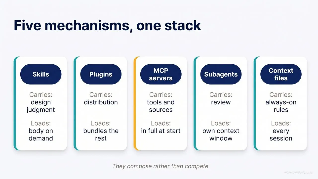
Skills, plugins, MCP servers, subagents and context files are five distinct mechanisms that compose rather than compete, and knowing which is which tells you where your design rules belong.
Most confusion in this space comes from treating five distinct mechanisms as one. They compose, they don't compete. Understanding which is which tells you where to put your design rules.
1. Skills (SKILL.md)
A folder with a SKILL.md file containing YAML frontmatter (name, description) and a markdown body. Claude reads the description of every installed skill at session start — that's cheap — and only loads the full body when the description matches what you're doing. That progressive disclosure is why a skill can be 300 lines without wrecking your context budget.
Skills live in:
~/.claude/skills/<name>/SKILL.md— available in every project.claude/skills/<name>/SKILL.md— checked into a specific repo
Use skills for: design judgment, rules, checklists, review criteria. This is where 90% of UI/UX value lives.
2. Plugins
A distributable bundle that can contain skills, slash commands, subagents, hooks and MCP server configs, installed from a marketplace:
/plugin marketplace add owner/repo
/plugin install plugin-name@marketplace-name
Use plugins for: shipping a whole opinionated workflow to a team in one command.
3. MCP servers
Live connections to external systems — Figma, a browser, a component registry, your docs. They give the agent tools, not judgment.
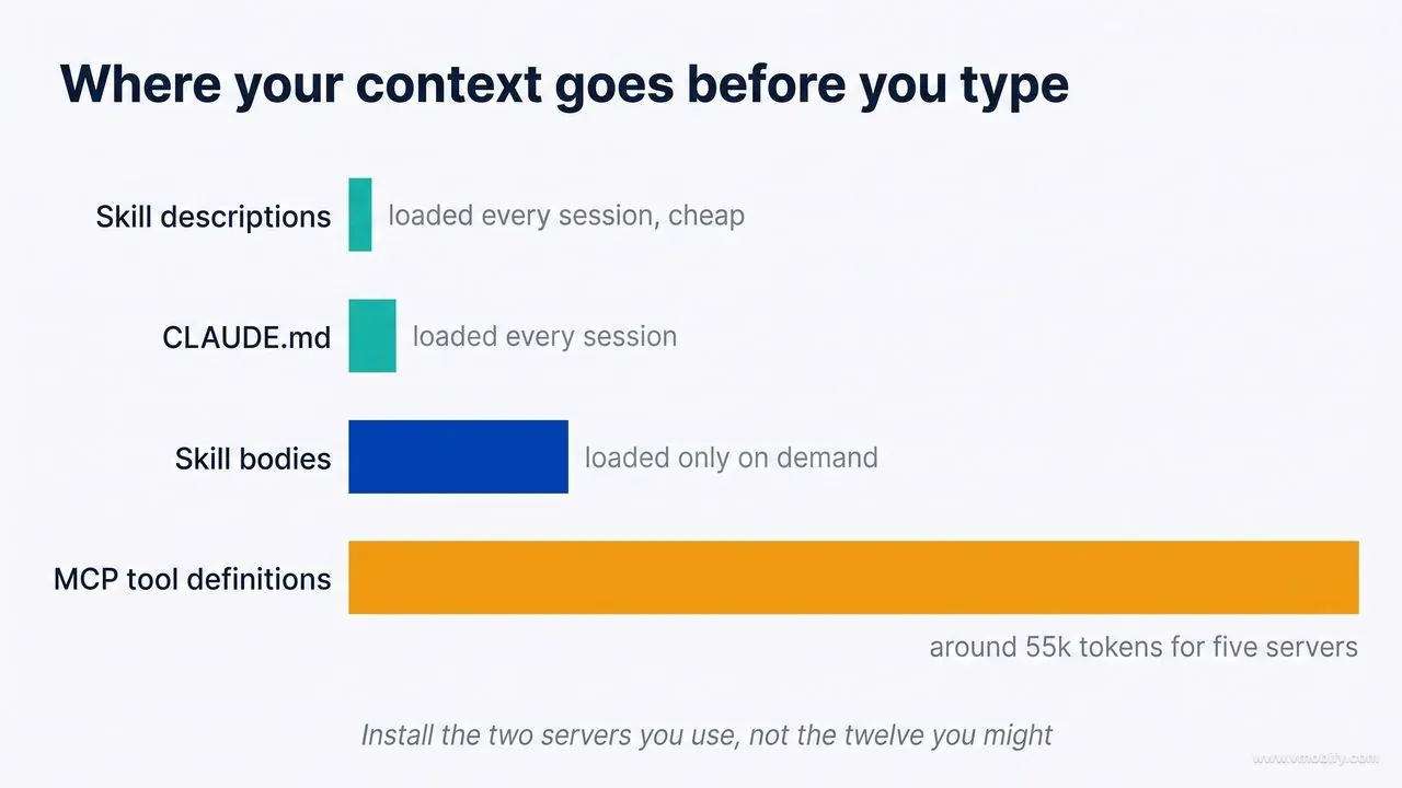
claude mcp add <name> -s user -- npx -y <package>Watch the cost: MCP tool definitions load into context at session start. Five servers can consume ~50k tokens before you type anything. Install the two you actually use, not the twelve you might.
4. Subagents
A separate agent with its own context window, own system prompt, own tool allowlist. Perfect for design review, because a fresh reviewer with no memory of writing the code catches what the author can't.
5. Context files (CLAUDE.md / AGENTS.md / DESIGN.md)
Plain markdown, always loaded, zero install. The fastest possible way to lock a design system: paste your tokens and rules into CLAUDE.md and every session inherits them.
The rule of thumb: CLAUDE.md for project-specific tokens · skills for reusable judgment · MCP for live data and browser access · subagents for review · plugins to package it all for a team. We covered how these mechanisms play together in a working marketing stack in the Claude MCP stack write-up.
Which Claude Code design tools should you install first?
Four installs cover most of the gap: Anthropic's Frontend Design plugin, Vercel's Web Interface Guidelines, one aesthetic engine and one review gate.
1. Frontend Design — Anthropic (official)
Link: anthropics/claude-code → plugins/frontend-design · plugin page
/plugin install frontend-design@claude-plugins-officialThe baseline, made by Anthropic, and with over a million installs it's the most widely deployed design skill in existence. It's also the shortest — deliberately.
What it actually does: it forces a context-establishing step before any code is written (purpose, audience, aesthetic direction), then explicitly steers away from AI defaults — system fonts, predictable purple gradients, cookie-cutter component grids. Its four levers are typography (unexpected pairings), motion (orchestrated, scroll-aware), composition (asymmetry, grid-breaking) and depth (gradients, texture, layering).
Where it wins: greenfield marketing pages, hero sections, anything where "distinctive" matters more than "consistent". It reliably breaks the model out of the generic attractor.
Where it doesn't: it is a taste skill, not a system skill. It won't enforce your tokens, won't audit accessibility, and on a mature product it can push toward expressive choices you don't want. Pair it with a rules skill (below).
2. Web Interface Guidelines — Vercel Labs
Links: vercel-labs/web-interface-guidelines · vercel-labs/agent-skills · vercel.com/design/guidelines
# installs as an agent command for Claude Code, Cursor, Gemini CLI, Windsurf...
curl -fsSL https://vercel.com/design/guidelines/install | bash

# or as a skill, alongside Vercel's other agent skills
npx skills add vercel-labs/agent-skills
If Anthropic's plugin handles taste, this handles correctness. It is a dense, opinionated checklist across seven areas — Interactions, Animations, Layout, Content, Forms, Performance, Design — and it is the single best free source of concrete, testable frontend rules I've found.
A sample of what it enforces:
- Every flow keyboard-operable, following WAI-ARIA authoring patterns
- Hit targets ≥24px (≥44px on mobile) — visual size may be smaller than the hit area
- Inputs must not lose focus or value after hydration
- Never disable browser zoom; never block paste
- Respect
prefers-reduced-motion; animate only GPU-friendly properties - Never
transition: all— enumerate the properties you mean - Animations respond to user action; they don't autoplay
- "Every element aligns with something intentionally"
- Test at mobile, laptop and ultra-wide (50% zoom)
- Let CSS handle sizing via flex/grid — not JavaScript
- Clicking a
<label>focuses its control; validation errors render beside the field; focus the first error on submit - Accept typed input even in number-only fields; validate server-side
autocompleteand meaningfulnameon every input- Icons have text labels for non-sighted users
- Semantic HTML before ARIA; hierarchical headings; a "skip to content" link
translate="no"on brand names- Mutating network requests under 500ms; virtualize long lists; lazy-load below-the-fold images; long tasks to Web Workers
The related web-design-guidelines skill in vercel-labs/agent-skills reviews existing UI code against 100+ accessibility and UX rules — which makes it a genuine audit tool, not just a generation prompt.
Why it belongs in every stack: these rules are objectively checkable. An agent can verify most of them itself. That makes them the highest-leverage lines of context you can add.
3. Superdesign — the design agent
Links: superdesigndev/superdesign-skill · superdesigndev/superdesign · superdesign.dev
npx skills add superdesigndev/superdesign-skill
# or, for Claude Code:
# /plugin marketplace add superdesigndev/superdesign-skill

npm install -g @superdesign/cli@latest
superdesign login
MIT-licensed, and the most workflow-shaped entry on this list. Instead of "generate a page", it runs a design process:
- Extract or create a design system from your existing codebase, persisted to
.superdesign/design-system.md - Replicate current UI as pixel-accurate HTML templates in
.superdesign/replica_html_template/so iterations start from your real product, not from zero - Generate drafts on an infinite canvas, then branch variations and steer with directional prompts
- Extract "design DNA" from a reference website you like, and apply it
- Design multi-page flows, not isolated screens
Where it wins: redesigns of an existing product, and any situation where you need to compare four directions side by side before committing. The branching canvas is the closest thing to a designer's actual process in this ecosystem.
Watch-out: it involves a CLI and an account. It's the heaviest setup here — worth it if you redesign often, overkill for a one-off.
4. UI/UX Pro Max — the design intelligence database
Link: nextlevelbuilder/ui-ux-pro-max-skill · MIT
npm install -g ui-ux-pro-max-cli
uipro init --ai claude       # also: --ai cursor, --ai windsurf

# or via marketplace
/plugin marketplace add nextlevelbuilder/ui-ux-pro-max-skill
/plugin install ui-ux-pro-max@ui-ux-pro-max-skill
Where most design skills give the model rules, this one gives it a lookup table — and it is enormous:
- 79 searchable UI styles (glassmorphism, claymorphism, minimalism, brutalism, and so on)
- 74 curated font pairings wired to Google Fonts
- 192 industry-specific reasoning rules plus 192 matched colour palettes, so "fintech dashboard" and "kids' learning app" resolve to genuinely different systems
- 119 UX guidelines covering accessibility and resilient layouts
- 25 chart-type recommendations for analytics screens
- 22 tech stacks supported (React, Vue, Flutter, SwiftUI…)
- Automatic pre-delivery validation against known anti-patterns
Where it wins: the cold-start problem. When you don't know what the thing should look like, this converts a one-line brief into a defensible palette + type + component system in seconds. Genuinely excellent for agencies pitching concepts.
Watch-out: it's a big skill. Style-database skills can over-specify — if you already have a design system, it will happily talk over it. Scope it to greenfield work.
5. StyleSeed — design judgment, not design data
Link: bitjaru/styleseed · MIT
npx skills add bitjaru/styleseedOr, with zero install, paste this into Claude Code:
Read https://styleseed-demo.vercel.app/llms-full.txt and apply StyleSeed's design rules to every UI in this project.
StyleSeed's thesis is the sharpest diagnosis in this whole space: "a junior designer with Toss's palette still ships ugly dashboards. A senior designer with only grayscale ships something refined." Tokens are data. Quality comes from judgment about where and how to apply them.
What's inside:
- 74 visual design rules across layout, composition, typography, colour discipline and coherence
- 48 React components on shadcn/ui patterns
- A named motion system — 5 seeds (Spring, Silk, Snap, Float, Pulse) plus 20+ keyword moves, so "make it snappier" becomes a real instruction
- 7 brand skins (Toss, Stripe, Linear, Vercel, Notion, Raycast, Arc) plus 58+ more from the DESIGN.md ecosystem
- A quality gate that scores the UI and auto-fixes common AI tells before you ever see it
STYLESEED.md— a design lock file that prevents drift across sessions
The 15 commands: /ss-setup · /ss-component /ss-page /ss-pattern /ss-motion /ss-review /ss-tokens /ss-a11y /ss-lint /ss-score /ss-update · /ss-flow /ss-audit /ss-copy /ss-feedback
Where it wins: long-running projects. The lock file plus the scoring gate is the only mechanism here that actively fights entropy across dozens of sessions.
How do you stop every AI interface looking identical?
Sameness is a direction problem, not a capability problem — an aesthetic engine forces the agent to commit to one named visual language instead of averaging all of them.
The single most effective trick in AI design is naming the direction before generating. These repos exist to make that easy.
6. Frontend Design (eight aesthetic anchors) — Ilm-Alan
Link: Ilm-Alan/frontend-design · MIT
git clone https://github.com/Ilm-Alan/frontend-design.git ~/.claude/skills/frontend-designEight anchors, each locking palette, typography and texture to specific CSS tokens: Swiss, Industrial, Brutalist, Aurora Maximalism, Chaotic Maximalism, Retro-Futuristic, Organic, Lo-Fi.
The mechanism is what makes it good: before generating code the skill demands three inputs — (1) which anchor, (2) one distinctive design move within that anchor, (3) CSS that matches those exact tokens. That third step is the discipline most design prompts lack; it's what stops an "aesthetic" from evaporating three components later.
Works with Claude Code, Codex and Gemini CLI.
7. Frontend Design Pro — 11 aesthetics with production code
Link: claudekit/frontend-design-pro-demo
/plugin install frontend-design-proEleven named directions, each with a master prompt, a palette, signature effects and working HTML/CSS you can read:
Minimalism & Swiss · Neumorphism · Glassmorphism · Brutalism · Claymorphism · Aurora/Mesh Gradient · Retro-Futurism/Cyberpunk · 3D Hyperrealism · Vibrant Block Maximalist · Dark OLED Luxury · Organic/Biomorphic
Framework-free (pure HTML/CSS), which makes it an unusually good teaching resource — you can see precisely which CSS produces each look, then port the idea into your stack.
8. awesome-claude-design — 68 ready-made DESIGN.md files
Link: VoltAgent/awesome-claude-design · previews at getdesign.md
No install. DESIGN.md is a plain-markdown format for describing a visual language in a way an agent can act on — it keeps token, rule and rationale in the same file, which is why it holds up when the agent hits a component the file never anticipated.
Every file follows nine sections: Visual Theme & Atmosphere · Color Palette & Roles · Typography Rules · Component Stylings · Layout Principles · Depth & Elevation · Do's and Don'ts · Responsive Behavior · Agent Prompt Guide.
68 systems reverse-engineered from real brands across AI platforms (Claude, Cohere, ElevenLabs, Mistral, Ollama), dev tools (Cursor, Raycast, Vercel, Warp), infrastructure (MongoDB, Supabase, Sentry, ClickHouse), fintech (Stripe, Coinbase, Revolut, Wise), commerce (Shopify, Nike, Airbnb) and automotive (Tesla, BMW, Ferrari).
How to use it two ways:
- Upload a
DESIGN.mdto Claude Design under "Add assets" and let it scaffold a full system (README, CSS variables, font substitutes, UI kit, and a portableSKILL.md). - Or — the zero-friction version — drop the
DESIGN.mdstraight into your repo next toCLAUDE.mdand reference it: "All UI follows DESIGN.md." That works in plain Claude Code with no tooling at all.
Companion repo: rohitg00/awesome-claude-design organises the same territory by aesthetic family — editorial minimalism, terminal-core, warm editorial, data-dense pro, cinematic dark, playful colour, glass/soft-futurism, neon brutalist, indie picks — and adds remix recipes (blending two brands' systems), prompt packs, video teardowns and honest community criticism. Use VoltAgent's for the files; use rohitg00's for choosing which family fits your brief.
9. LibreUIUX — the maximalist system
Link: HermeticOrmus/LibreUIUX-Claude-Code · MIT
A complete UI/UX system: 152 specialised agents, 70 domain plugins, 76 slash commands and 74 reusable skills spanning accessibility, animation and design systems — structured as a three-level curriculum (beginner prompts and design vocabulary → design-system templates and workflows → MCP configs and production automation).
Its core teaching is the most useful thing in it, and it costs nothing to adopt: stop saying "make it modern", start saying "shadow-md to shadow-lg", "increase section padding from 48 to 96", "tighten heading tracking to -0.03em". Precision of instruction is the actual skill.
Watch-out: you will not use 152 agents. Adopt the vocabulary and a handful of skills; ignore the rest. Installing everything is a fast route to a bloated, slow session.
10. UX Designer Skill — the reference library
Link: szilu/ux-designer-skill
git clone https://github.com/szilu/ux-designer-skill ~/.claude/skills/ux-designerStructurally the best-built skill on this list, and a model for anyone writing their own: a 297-line SKILL.md holding checklists, decision trees, key metrics and anti-patterns, backed by 24 reference files (~10,700 lines) that load only on demand. That's progressive disclosure done properly — deep knowledge, small context footprint.
Coverage spans foundations (core principles, Laws of UX, accessibility, visual design), structure (information architecture, interaction design, forms), modern concerns (AI interfaces — chat, copilots, agents; ethical design; emotional design) and specialisms (mobile, design systems, collaborative features, canvas apps, data visualisation). It targets WCAG 2.2 AA and explicitly flags dark patterns.
Invoke with /ux-designer, or let it trigger automatically on UX topics.
Which MCP servers give a coding agent design context?
MCP servers give an agent tools and sources rather than judgment, and their tool definitions load at session start, so install the two you use rather than the twelve you might.
Skills supply judgment. MCP servers supply ground truth. The difference between an agent that thinks it built a good UI and one that knows.
11. Figma MCP — design-to-code, and back
Link: Figma's setup guide
claude plugin install figma@claude-plugins-officialReads real design context — components, variables, layout data, FigJam content — rather than guessing from a screenshot. It generates code from selected frames, uses Code Connect to map Figma components to your actual codebase components (so it emits your <Button>, not a fresh div), writes back to canvas, and can push a live web interface into Figma as editable layers.
Figma recommends the remote server over the desktop one for most users.
Why Code Connect is the important part: without it, design-to-code produces one-off markup that immediately drifts from your component library. With it, the agent is constrained to the components you already ship.
12. shadcn MCP — component registry access
Link: ui.shadcn.com/docs/mcp
pnpm dlx shadcn@latest mcp init --client claudeOr manually in .mcp.json:
{
  "mcpServers": {
    "shadcn": {
      "command": "npx",
      "args": ["shadcn@latest", "mcp"]
    }
  }
}
Lets the agent browse and search public, private and third-party component registries and install components conversationally ("add the button, dialog and card components"). Verify with /mcp.
Why it matters for design quality: it replaces invented markup with accessible, tested primitives. Most accessibility failures in AI-generated UI come from hand-rolled dropdowns, dialogs and comboboxes. This removes that class of bug entirely.
13. Chrome DevTools MCP — the verification loop
Link: ChromeDevTools/chrome-devtools-mcp
/plugin marketplace add ChromeDevTools/chrome-devtools-mcp
/plugin install chrome-devtools-mcp@chrome-devtools-plugins
50+ tools: performance traces with actionable insights, network analysis, console messages with source-mapped stack traces, screenshots, heap snapshots, Lighthouse audits, and Puppeteer-backed input automation.
This is the one most people skip and shouldn't. Design skills make the agent intend well. This makes it check. "Build the page, screenshot it, read the console, run Lighthouse, fix what fails, screenshot again" is a qualitatively different workflow from open-loop generation.
14. Playwright MCP — structural checking
Link: microsoft/playwright-mcp
claude mcp add playwright npx @playwright/mcp@latestPlaywright MCP drives the browser through the accessibility tree rather than pixels — structured, deterministic, no vision model needed, far cheaper in tokens. Screenshots are for verification; the a11y snapshot is for reasoning and action.
That distinction is a gift for UI work: if the agent can navigate your page purely through the accessibility tree, your page is, by construction, navigable by a screen reader. If it can't, you've found a real bug.
Playwright vs Chrome DevTools MCP: Playwright drives, DevTools debugs. Use Playwright for flows, states and a11y structure; DevTools for performance, network and console truth. Many teams run both — but remember the context cost.
15. Context7 — stop the agent inventing APIs
claude mcp add context7 -s user -- npx -y @upstash/context7-mcp@latestFetches live, version-specific documentation for 1000+ libraries. Relevant to design because half of "bad UI" is actually wrong API usage — deprecated Tailwind v3 syntax in a v4 project, an outdated Framer Motion signature, a shadcn pattern from two majors ago. Context7 kills that failure mode.
Why is an automated design review the highest-return addition?
A fresh reviewer with no memory of writing the code catches what the author cannot, which is why a design-review subagent returns more quality per token than any generator.
16. Design Review workflow — OneRedOak
Link: OneRedOak/claude-code-workflows → design-review/
A subagent plus slash command that reviews frontend changes the way a design lead would: it opens the running app through Playwright MCP, interacts with the change, and reports on UI/UX consistency, accessibility compliance and design quality — rather than reading a diff and guessing.
Why a separate agent, not the same one: the agent that wrote the code is primed to believe it. A reviewer with a clean context window, a different prompt, and browser access catches contrast failures, missing focus states, broken 320px layouts and unhandled empty states that the author's context actively hides.
Set it up to run on every PR touching frontend files and it becomes the most valuable automation in the list. If you adopt only one thing from Tier 4, adopt this pattern — even a home-made version. This is the argument made at length in why code review cannot judge visual quality.
Where should you look for new Claude Code design tools?
Two curated lists track this ecosystem faster than any single guide can, and both are worth a bookmark rather than an install.
17. Claude Code Frontend Design Toolkit — wilwaldon
Link: wilwaldon/Claude-Code-Frontend-Design-Toolkit
Approaching 1,000 stars and the most practically-organised meta-resource in the space: "everything I've found that actually makes Claude Code output better-looking frontends", sorted by workflow stage rather than by category.
Ten sections: design skills · site-wide theming · animation & motion (23 animation skills across GSAP, Framer Motion, React Spring) · UI/UX intelligence (25 skills derived from UX research books; 66 accessibility and responsive skills) · design-to-code pipeline · testing & browser automation · documentation & context · framework skills (D3, Three.js, shadcn, TypeScript LSP) · deploy & preview · a polish pipeline (baseline UI, fixing accessibility, fixing motion/performance).
Two things make it stand out: copy-paste CLAUDE.md theme blocks (Cyberpunk, Editorial, Solarpunk and others — zero install, instant effect), and honest token budget guidance — noting that five MCP servers cost roughly 55k tokens at session start. Very few lists in this ecosystem tell you what a tool costs.
Its recommended stacks are a sane starting point: Essentials = Frontend Design + Context7 + Playwright MCP; Design-First adds Figma MCP and TypeScript LSP; MVP Speed adds UI/UX Pro Max; Full Stack adds Chrome DevTools MCP, visual regression and the polish pipeline.
18. awesome-claude-plugins — composio-community
Link: composio-community/awesome-claude-plugins
The broad plugin index — not design-specific, but the right place to check before you build something that already exists. Also see the claude-design, claude-code-plugin and ui-skills topic pages on GitHub, which surface new entries faster than any curated list can.
How do the design plugins and skills compare?
The table below is the whole ecosystem at a glance — what each tool is for, what it costs you in context, and whether it generates design or validates it.
| # | Tool | Type | Install | Best for | Cost to context |
|---|---|---|---|---|---|
| 1 | Frontend Design (Anthropic) | Plugin/skill | /plugin install frontend-design@claude-plugins-official | Distinctive greenfield UI | Low |
| 2 | Web Interface Guidelines (Vercel) | Rules file / skill | curl -fsSL https://vercel.com/design/guidelines/install | bash | Correctness, a11y, forms | Low |
| 3 | Superdesign | Skill + CLI | npx skills add superdesigndev/superdesign-skill | Redesigns, variant exploration | Medium |
| 4 | UI/UX Pro Max | Skill + CLI | uipro init --ai claude | Cold-start style + palette + type | Medium‑high |
| 5 | StyleSeed | Skill pack (15 cmds) | npx skills add bitjaru/styleseed | Consistency over long projects | Medium |
| 6 | frontend-design (8 anchors) | Skill | git clone … ~/.claude/skills/ | Locking one aesthetic hard | Low |
| 7 | Frontend Design Pro | Plugin | /plugin install frontend-design-pro | Learning the 11 aesthetics | Low |
| 8 | awesome-claude-design | 68 DESIGN.md files | copy a file into your repo | Brand-grade systems, free | Low |
| 9 | LibreUIUX | Mega system | selective copy | Design vocabulary, agent library | High if all-in |
| 10 | UX Designer Skill | Skill + 24 refs | clone to ~/.claude/skills/ | Deep UX reference, WCAG 2.2 AA | Low (on-demand) |
| 11 | Figma MCP | MCP | claude plugin install figma@claude-plugins-official | Design-to-code with Code Connect | High |
| 12 | shadcn MCP | MCP | pnpm dlx shadcn@latest mcp init --client claude | Accessible primitives | Medium |
| 13 | Chrome DevTools MCP | MCP | /plugin install chrome-devtools-mcp@chrome-devtools-plugins | Perf, console, Lighthouse | High |
| 14 | Playwright MCP | MCP | claude mcp add playwright npx @playwright/mcp@latest | Flows, states, a11y tree | High |
| 15 | Context7 | MCP | claude mcp add context7 -s user -- npx -y @upstash/context7-mcp@latest | Correct, current APIs | Medium |
| 16 | Design Review | Subagent + command | copy design-review/ | Automated PR design review | Low |
| 17 | Frontend Design Toolkit | Curated list | reading | Deciding what to install | — |
Which tool stack should you run for your situation?
The 10-minute starter — do this today, it covers most of the value:
/plugin install frontend-design@claude-plugins-official- Install the Vercel Web Interface Guidelines
- Drop the
ui-ux-masterskill below into~/.claude/skills/ - Add a
DESIGN.mdfrom awesome-claude-design to your repo
Zero MCP servers, near-zero context cost, and it eliminates most AI tells.
The design-led product team Starter + Figma MCP (with Code Connect mapped) + shadcn MCP + StyleSeed's STYLESEED.md lock file + the OneRedOak design-review subagent wired to your PR workflow.
The agency / freelancer (pitching many brands fast) Starter + UI/UX Pro Max for cold-start systems + Superdesign for branching variants + the DESIGN.md library for brand-flavoured references. Optimised for going 0→3 credible directions in an afternoon.
The production hardening pass Starter + Playwright MCP + Chrome DevTools MCP + the Vercel web-design-guidelines audit skill + a visual regression suite. Run it as its own session so the browser tooling's context cost doesn't crowd out the build session.
Token discipline: MCP tool definitions load at session start whether you use them or not. Five servers ≈ 55k tokens gone before you type. Split "build" sessions from "verify" sessions and install servers per-project (-s project) rather than globally wherever you can.
Strip away the branding and every good design skill in this ecosystem is teaching the same body of knowledge. Here it is directly, so you can apply it with or without a plugin. If you are choosing between tools rather than stacks, ChatGPT, Claude Code and design boards maps what each is actually for.
Why should you decide the design before writing any CSS?
Never write a line of CSS until you can name the user, the single job of the screen and the aesthetic direction, because every later decision inherits those three.
The highest-leverage moment in any interface is before the first line of CSS. Every strong skill on this list front-loads the same interrogation:
- Who is using this, on what device, under what pressure?
- What is the one job of this screen? Name a single primary action.
- What is the aesthetic direction, by name?
- What emotional register — calm, confident, energetic, precise, warm?
- What must never happen?
"Modern and clean" is not a direction; it is the absence of one, and it is precisely the prompt that produces the indigo gradient. "Swiss editorial, near-monochrome, one accent, huge tight-tracked headings, hairline rules" is a direction. This single change improves AI design output more than any plugin. Deciding the direction before the screens is the whole premise of setting UI/UX strategy before redesigning screens.
What design tokens must exist before any component?
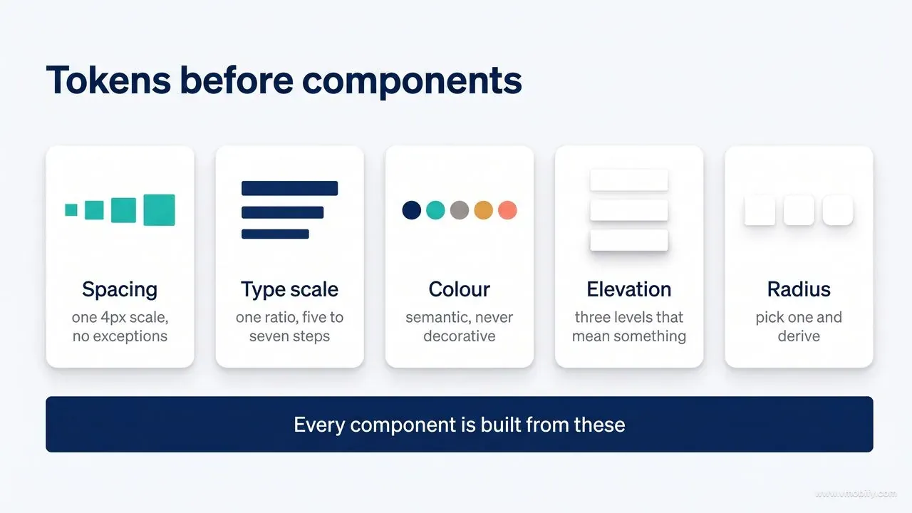
Spacing, type scale, colour, elevation and radius must exist as named tokens before the first component, or every component becomes a new negotiation.
Never hardcode a value twice. Emit a token block first — spacing, type scale, colour roles, radius, shadow, easing — then build everything from it. This is the mechanism behind StyleSeed's lock file, DESIGN.md, and every design system that has ever survived contact with a second contributor.
Spacing: one 4px-based scale — 4 8 12 16 24 32 48 64 96 128. Related elements sit closer than unrelated ones; proximity communicates grouping better than any border. Inside a card 16–24; between cards 24–32; between page sections 64–128.
Type: one ratio, five to seven steps. 1.200 for dense UI, 1.250 for marketing, 1.333 for editorial. Body 16px minimum on the web. Line length 45–75 characters (max-width: 65ch) — the most-ignored rule in AI output and the one that most reliably makes text feel professional. Line height 1.5–1.65 for body, 1.05–1.25 for headings: the larger the type, the tighter the leading. Negative tracking on big headings, positive only on all-caps labels. Two typefaces maximum. Carry hierarchy with weight before reaching for another size.
Colour: define roles, not swatches — --bg, --surface, --border, --text, --text-muted, --accent, --danger. Prefer OKLCH over hex or HSL: it's perceptually uniform, so a ramp from oklch(95%…) to oklch(25%…) actually looks evenly spaced, which HSL famously does not. Follow 60/30/10 — 60% neutral, 30% supporting surface, 10% accent. If the accent is everywhere, nothing is emphasised. And colour is never the sole carrier of meaning; pair it with an icon, a label or a shape.
Dark mode is not an inversion. Raise surfaces with lightness rather than shadow, avoid pure #000 for large fields (it makes text vibrate and shadows impossible), desaturate accents slightly, and render borders as a lighter surface rather than a grey line.
Elevation: three levels — flat, raised, overlay — and they must mean something. More shadow = closer to the user = more temporary. One shadow plus a 1px border beats four stacked shadows.
Radius: pick a base of 8–12px and derive. Nested radius = parent radius minus padding. Mixing 4px and 24px in one screen reads as broken, not eclectic.
Why is alignment the cheapest quality signal in an interface?
Alignment is the cheapest quality signal available to you: consistent edges read as considered design even when nothing else changes.
Vercel's guidelines put it best — "every element aligns with something intentionally." Most "off"-looking AI layouts are not ugly; they are unaligned and evenly-padded. Real design has rhythm: dense areas and open areas, deliberate asymmetry, one anchor that holds the composition.
Practical rules: 12-column grid on desktop, 4 on mobile, broken deliberately exactly once. Let CSS size things (grid, flex, clamp()), never JavaScript. Use clamp() for fluid type. Reach for container queries when a component appears at more than one width. Test at 320, 768, 1280 and 2560px. And when something looks wrong but measures right, trust your eye — optical alignment beats mathematical alignment for icons and glyphs.
Above all: when in doubt, double the whitespace and delete a border. Generous negative space is the most consistent visual difference between machine output and designed work.
What makes interface motion meaningful rather than decorative?
Motion earns its place when it explains a state change, and costs you when it decorates one.
Duration: 100–150ms for micro-feedback, 200–300ms for standard transitions, 300–450ms for a large surface entering. Past 500ms an interface feels broken. Ease-out for entrances, ease-in for exits, springs only for playful or direct-manipulation UI.
Animate transform and opacity — everything else triggers layout or paint. Never transition: all. Stagger lists 20–40ms per item and cap the total around 300ms. Motion should explain a relationship — where this came from, where it went — never decorate. And ship the prefers-reduced-motion fallback in the same commit, not the follow-up ticket.
Which interaction states must every element ship?
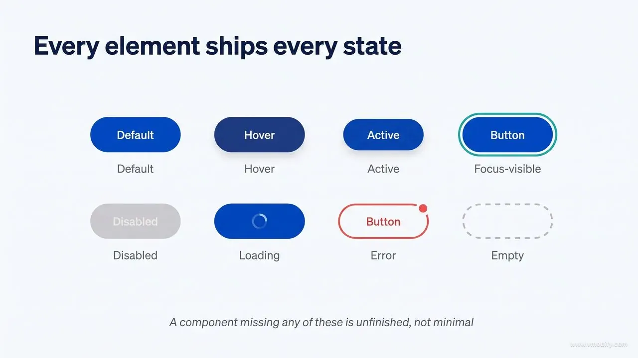
Every interactive element ships default, hover, active, focus-visible, disabled, loading, error and empty — a component missing any of them is unfinished, not minimal.
An interactive element is not finished until it has: default, hover, active, focus-visible, disabled, loading, error and empty. The skill file below adds success as a ninth, for flows that confirm rather than just complete. Missing states are the number one source of "it looked great in the demo".
- Empty states are a design surface. Say what belongs here, why it's useful, and give the one action that fills it.
- Loading: skeletons matching the final layout beat spinners; under ~300ms show nothing at all. Above 400ms perceived quality collapses (the Doherty threshold), so fake progress honestly with optimistic UI where the operation is reversible.
- Errors name what happened, why, and the exact next step — never "Something went wrong", never blame the user, never discard their input.
- Destructive actions should name the object ("Delete 3 invoices?"), default to the safe choice, and prefer undo over confirmation wherever the action is reversible.
How should you design the highest-leverage screen you own?
Forms are where most products lose most users, so they deserve the most design attention and usually receive the least.
One column, always — multi-column forms measurably reduce completion. Labels above fields and persistent; placeholders are not labels and vanish exactly when needed. Ask for the minimum: every removed field raises conversion. Validate on blur rather than keystroke, re-validate on submit, and move focus to the first error. Put error text beside its field, in plain words, wired with aria-describedby. State requirements before submission. Set correct type, inputmode and autocomplete on every input. Accept messy input — spaces in card numbers, any date format — and normalise server-side. Label buttons with the outcome: "Create account", not "Submit".
Why is accessibility a constraint rather than a phase?
Accessibility is a constraint you design within, not a phase you bolt on, and treating it as the latter guarantees a rebuild.
Target WCAG 2.2 AA as the floor:
- Contrast ≥ 4.5:1 body text, ≥ 3:1 large text and UI components/focus indicators
- Full keyboard operability with a visible focus ring, following WAI-ARIA authoring patterns
- Hit targets ≥ 24×24px (≥ 44×44 on touch) — pad the hit area rather than shrinking the visual
- Semantic HTML first; ARIA only to fill genuine gaps
- Hierarchical headings, landmark regions, a skip link
- Icons carry text labels; meaning never rides on colour alone
- Respect
prefers-reduced-motionandprefers-contrast - Don't disable zoom; don't block paste; don't trap focus
The commercial argument is simpler than the moral one: every accessibility rule above is also a usability rule, and most of them are legally required in the EU and increasingly enforced elsewhere.
Which UX laws are worth applying by name?
Naming the law you are applying turns a matter of taste into a matter of evidence, which is what makes a design decision reviewable.
- Jakob's Law — people expect your product to behave like the others they use. Innovate on value, not on where the close button lives.
- Hick's Law — every visible choice costs decision time. Progressive disclosure beats a full menu.
- Fitts's Law — important targets should be larger and closer; screen edges and corners are effectively infinite targets.
- Miller's Law — working memory holds around four to five chunks. Group accordingly.
- Von Restorff (isolation) effect — the distinct item is remembered, so make exactly one thing distinct.
- Doherty threshold — under 400ms feedback or perceived quality collapses.
- Aesthetic–usability effect — attractive interfaces are judged more usable and forgiven more readily. Polish is functional, not vanity.
- Tesler's law of conservation of complexity — complexity can be moved but not removed. Decide who absorbs it; it should be the system.
- Peak–end rule — an experience is remembered by its peak and its ending. Design the success state and the confirmation, not just the middle.
- Postel's law — be liberal in what you accept, strict in what you emit.
- Zeigarnik effect — visible progress on unfinished tasks pulls people back. Use honestly; this is one step away from a dark pattern.
Why is interface copy most of the design work?
Most of what users read in your interface is words, so the copy is the design — not a layer applied to it afterwards.
Sentence case everywhere except brand marks. Verb + object on every action. Second person for the user, first person for the product. Cut "please", "simply", "just", "in order to". Never "1 items". Microcopy answers the question the user has at that pixel, not the one the product team wants answered. And avoid the AI register entirely — "unlock", "seamless", "elevate", "supercharge", "delve" — because readers now pattern-match it instantly.
How do you spot the tells of an AI-generated interface?
There is a recognisable signature to unguided AI interface output, and removing it is a checklist rather than a talent.
Run this before you ship anything an agent generated. If you fix nothing else in this article, fix these:
- Purple/indigo → pink gradient hero (the single biggest tell)
- Inter or
system-uiwith no considered pairing - Identical cards in a perfect 3-up grid, forever
border-radius: 8pxon literally everything- Emoji used as icons
- Three feature columns, each with a lucide icon in a tinted circle
- Everything centered; no asymmetry, no anchor
- Shadows on flat colour with no consistent light source
- Placeholder copy left in — "Your Company", "Feature One"
- Full-viewport hero + "Get started" + "Learn more" and no third idea
- Uniform 24px padding on every container regardless of role
- Six accent colours with no hierarchy
- Glassmorphism with nothing behind it to blur
- Missing hover / focus / empty / error states
- Perfectly even whitespace — no rhythm, no density contrast
What goes into a copy-paste UI/UX skill file?
A single skill file can carry the whole design contract — tokens, states, aesthetic direction, accessibility floor and a review mode — and load only when the agent touches a UI file.
This is the file to hand someone who asks "how do I make Claude Code design better?" It distils the principles above into the form an agent actually consumes. It is self-contained — no CLI, no account, no MCP server.
Install:
mkdir -p ~/.claude/skills/ui-ux-master
# paste the file below into:
# ~/.claude/skills/ui-ux-master/SKILL.md
For a single project, use .claude/skills/ui-ux-master/SKILL.md and commit it so your whole team inherits it.
Download SKILL.md — or copy it from the block below, which carries the same file verbatim. Every code block on this page has a copy button in its top-right corner.
To install it for every project on your machine, run:
mkdir -p ~/.claude/skills/ui-ux-master
curl -fsSL https://vmobify.com/skills/ui-ux-master/SKILL.md \
  -o ~/.claude/skills/ui-ux-master/SKILL.md
For a single repository, drop it at .claude/skills/ui-ux-master/SKILL.md and commit it, so every person and every agent working in that repo inherits the same design contract. Restart Claude Code afterwards and the skill loads its description at session start, pulling the full body in only when you touch a UI file.
---
name: ui-ux-master
description: Design judgment for any user interface. Use whenever building, styling, reviewing or fixing a UI — web pages, apps, dashboards, landing pages, components, emails, forms, onboarding, dark mode. Triggers on "make it look good", "improve the design", "it looks off", spacing, typography, color, contrast, accessibility, motion, responsive, design tokens, design system, UI audit, UX review, conversion, friction, usability.
license: MIT
---

# UI/UX Master

You are a senior product designer and frontend engineer. Your job is not to
produce "a UI that works" — it is to produce a UI that a design-led company
would ship. Default AI output is recognisable and mediocre. This skill exists
to stop that.

## 0. The rule that governs everything

**Decide before you draw.** Never write a line of CSS until you can answer:

1. **Who** uses this, in what context, on what device, under what pressure?
2. **What is the one job** of this screen? (Name a single primary action.)
3. **What is the aesthetic direction?** Name it (see §3). "Modern and clean"
   is not a direction.
4. **What is the emotional register?** (Calm / confident / energetic / precise /
   warm / serious.)
5. **What must never happen?** (One anti-goal, e.g. "never make the user feel
   they might lose data".)

If the user has not told you, ask up to three short questions, propose a
default, and proceed. Never stall.

---

## 1. Non-negotiables (fail the build if any is violated)

- Body text contrast >= **4.5:1**; large text (>= 24px, or 18.66px bold) >= **3:1**;
  UI components and focus rings >= **3:1**.
- Every interactive element is keyboard reachable, has a **visible focus ring**,
  and follows WAI-ARIA authoring patterns.
- Hit targets >= **24x24 CSS px** (>= **44x44** on touch). Visual size may be smaller
  than the hit area — pad, don't shrink.
- Semantic HTML first: `button`, `a`, `label`, `nav`, `main`, `h1..h6`. ARIA only
  to fill gaps, never to patch a wrong element.
- Every input has a real `<label>`, an `autocomplete` value and a `name`.
- Respect `prefers-reduced-motion: reduce` — drop transforms and parallax,
  keep opacity fades under 100ms.
- **Never `transition: all`.** List the properties you mean.
- Never disable zoom (`user-scalable=no`), never block paste, never trap focus
  outside a modal.
- No layout shift on load: reserve space for images, embeds and fonts
  (`aspect-ratio`, `font-display: swap`, size attributes).
- Text over an image always sits on a scrim or a solid block. Never raw.

---

## 2. The token layer (build this first, always)

Never hardcode a value twice. Emit a token block before components.

### Spacing — one 4px-based scale, no exceptions
`4 8 12 16 24 32 48 64 96 128`
Related things sit closer than unrelated things (proximity beats borders).
Inside a card: 16–24. Between cards: 24–32. Between sections: 64–128.

### Type scale — one ratio, 5–7 steps max
Use 1.200 (dense UI / dashboards) or 1.250 (marketing) or 1.333 (editorial).
`12 14 16 18 20 24 32 40 56 72`

- Body **16px minimum** on web. 14px only for dense tables and meta text.
- Line length **45–75 characters** (`max-width: 65ch`).
- Line height: body **1.5–1.65**; headings **1.05–1.25**; the bigger the type,
  the tighter the leading.
- Letter-spacing: negative on large headings (`-0.02em` to `-0.04em`),
  0 on body, positive only on all-caps labels (`0.06em`).
- **Two typefaces maximum.** One is often better. A third only for code/mono.
- Weight carries hierarchy better than size. Prefer 400/500/600/700 over
  ten sizes.

### Color — semantic, not decorative
Define roles, then values. Prefer **OKLCH** for perceptually even ramps.

```css
:root {
  color-scheme: light dark;

  /* neutrals: 10 steps, this is 80% of your UI */
  --bg: oklch(99% 0.002 250);
  --surface: oklch(97% 0.004 250);
  --surface-raised: oklch(100% 0 0);
  --border: oklch(90% 0.006 250);
  --text-muted: oklch(55% 0.012 250);
  --text: oklch(22% 0.02 250);

  /* exactly ONE brand accent + its states */
  --accent: oklch(58% 0.17 258);
  --accent-hover: oklch(52% 0.17 258);
  --accent-fg: oklch(99% 0 0);

  /* status */
  --success: oklch(62% 0.15 150);
  --warning: oklch(75% 0.15 75);
  --danger:  oklch(58% 0.19 25);

  --radius: 10px;
  --shadow-1: 0 1px 2px oklch(0% 0 0 / 0.06);
  --shadow-2: 0 4px 12px oklch(0% 0 0 / 0.08);
  --shadow-3: 0 12px 32px oklch(0% 0 0 / 0.12);
  --ease: cubic-bezier(0.2, 0, 0, 1);
}
```

Rules:
- **60/30/10** — 60% neutral ground, 30% supporting surface, 10% accent.
  If the accent is everywhere, nothing is emphasised.
- Colour is never the only carrier of meaning (add icon, text or shape).
- Dark mode is not `invert()`. Raise surfaces with lightness, not pure black:
  bg `oklch(16%)`, surface `oklch(20%)`, never `#000` for large fields.
  Desaturate accents slightly in dark; pure saturated hues vibrate.
- Borders in dark mode = a lighter surface, not a grey line.

### Elevation — 3 levels, and they mean something
flat (page) -> raised (card, dropdown) -> overlay (modal, popover).
More shadow = closer to the user = more temporary. Never stack four shadows
to fake depth; use one shadow plus a 1px border.

### Radius — pick one and derive
Base 8–12px. Nested radius = parent radius − padding. Full-round only for
pills, avatars and icon buttons. Mixing 4px and 24px in one screen reads broken.

---

## 3. Aesthetic direction (pick exactly one, then commit)

Naming the direction is what stops generic output. Each locks palette,
type and texture together.

| Direction | Type | Color | Signature |
|---|---|---|---|
| **Swiss / editorial** | Grotesk, huge headings, tight leading | near-mono + 1 accent | strict grid, generous whitespace, rules/hairlines |
| **Data-dense pro** | 13–14px UI, tabular numerals | low-chroma neutrals | compact rows, subtle zebra, dense toolbars |
| **Soft / friendly SaaS** | Rounded sans, 500 weight | pastel tints, soft shadows | 12–16px radius, gentle motion |
| **Brutalist** | System or mono, oversized | primary colors, high contrast | thick borders, hard offset shadows, no radius |
| **Terminal-core** | Monospace throughout | near-black + one phosphor hue | grid lines, blocky cursors, ASCII accents |
| **Cinematic dark** | Display serif or tight grotesk | OLED black + gold/teal | large imagery, gradients, glow, slow motion |
| **Glass / soft-futurism** | Light-weight sans | translucent surfaces | backdrop-blur, mesh gradients, thin borders |
| **Warm editorial** | Serif headings + sans body | cream, ink, terracotta | asymmetry, pull-quotes, texture |
| **Neo-maximalist** | Clashing display faces | saturated blocks | grid-breaking, sticker-like layers |

Then pick **one signature move** the whole design is built around: an oversized
numeral, a hairline grid, a single duotone image treatment, a marquee, a
sticky ticker, an unexpected rotation. One. Not five.

---

## 4. Layout & composition

- **Everything aligns to something on purpose.** Alignment is the cheapest
  quality signal there is.
- Use a 12-column grid on desktop, 4 on mobile; break it deliberately, once.
- Let CSS do sizing (`grid`, `flex`, `clamp()`), not JavaScript.
- Prefer `clamp()` for fluid type: `font-size: clamp(2rem, 1.2rem + 3vw, 4rem)`.
- Container queries for components that live in more than one width.
- Whitespace is the #1 difference between "AI-made" and "designed". When in
  doubt, double the padding and remove a border.
- Visual hierarchy per screen: **one** primary action, styled as the only
  filled accent button. Everything else is secondary/ghost/link.
- Test at 320px, 768px, 1280px, and 2560px (or 50% browser zoom).
- Optical alignment beats mathematical alignment for icons and glyphs —
  nudge by 1px when it looks wrong.

---

## 5. Motion

- Duration: micro-feedback **100–150ms**, standard transition **200–300ms**,
  entrance of a large surface **300–450ms**. Anything over 500ms feels broken.
- Easing: `ease-out` for things entering, `ease-in` for things leaving,
  spring only for playful/direct-manipulation UI.
- Animate `transform` and `opacity`. Anything else is a paint/layout cost.
- Motion must explain a relationship (where did this come from, where did it
  go). Decorative loops on load are noise.
- Stagger lists by 20–40ms per item, cap the total at ~300ms.
- Always ship the `prefers-reduced-motion` fallback in the same commit.

---

## 6. Interaction states — every interactive element ships all of them

`default · hover · active/pressed · focus-visible · disabled · loading · error · empty · success`

- **Empty states** are a design surface, not a blank div: say what goes here,
  why it's useful, and give the one action that fills it.
- **Loading**: skeletons that match the final layout beat spinners. Under
  ~300ms show nothing at all (Doherty threshold — perceived speed dies above 400ms).
- **Errors**: say what happened, why, and the exact next step. Never "Something
  went wrong." Never blame the user. Keep their input.
- **Destructive actions**: confirm with the object named ("Delete 3 invoices?"),
  make the safe choice the default, offer undo instead of confirmation
  wherever the action is reversible.
- **Optimistic UI** for anything under ~1s; roll back visibly on failure.

---

## 7. Forms (the highest-leverage screen in most products)

- One column. Always. Multi-column forms halve completion.
- Labels above fields, persistent. Placeholders are not labels.
- Group related fields; use a section heading every 5–7 fields.
- Ask for the minimum. Every field you remove raises conversion.
- Validate on blur, not on keystroke; re-validate on submit and focus the
  first error.
- Error text sits next to its field, in words, plus `aria-describedby`.
- Show requirements before submission (password rules, file types, size).
- Never clear the form on error. Never disable submit without saying why.
- Correct `type` and `inputmode` (`email`, `tel`, `numeric`, `decimal`),
  and `autocomplete` on every field.
- Buttons say the outcome: "Create account", not "Submit".

---

## 8. UX laws to apply by name

- **Jakob's Law** — users expect your product to work like the others they use.
  Innovate on value, not on where the close button lives.
- **Hick's Law** — every extra visible choice costs time. Progressive disclosure.
- **Fitts's Law** — important targets should be bigger and closer;
  screen edges/corners are infinitely deep targets.
- **Miller's Law** — ~7 (realistically 4–5) chunks in working memory. Group.
- **Von Restorff** — the distinct item is remembered. Only make ONE thing distinct.
- **Doherty Threshold** — keep feedback under 400ms or perceived quality collapses.
- **Aesthetic–Usability Effect** — attractive UIs are perceived as more usable
  and forgiven more readily. Polish is functional.
- **Tesler's Law** — complexity is conserved; decide who absorbs it — the system
  should, not the user.
- **Peak–End Rule** — people judge an experience by its peak and its end. Design
  the success state and the confirmation, not just the happy path middle.
- **Postel's Law** — accept input liberally (spaces in card numbers, any date
  format), render output strictly.
- **Zeigarnik Effect** — visible progress on an unfinished task pulls people
  back. Use progress meters and checklists honestly, never as dark patterns.

---

## 9. Copy (the UI is mostly words)

- Sentence case everywhere except brand marks. No Title Case Buttons.
- Verb + object on actions. Second person for the user, first for the product.
- Cut hedges: "please", "simply", "just", "try to", "in order to".
- Numbers: real numerals, tabular figures in tables, humanise durations
  ("2 min read"), never "1 items".
- Microcopy answers the question the user has at that exact pixel, not the one
  the PM wants answered.
- No em-dash-heavy AI voice, no "unlock", "seamless", "elevate", "supercharge".

---

## 10. The AI-tell checklist — remove all of these before shipping

Default output gives itself away. Scan for and fix:

1. Purple/indigo -> pink gradient on the hero. (The single biggest tell.)
2. Inter / system-ui with no considered pairing.
3. Every card the same size in a perfect 3-up grid, forever.
4. `border-radius: 8px` on absolutely everything.
5. Emoji used as icons.
6. Three identical "feature" columns with a lucide icon in a tinted circle.
7. Centered everything, no asymmetry, no anchor.
8. Shadows on flat colour with no light source logic.
9. Placeholder copy: "Lorem", "Your Company", "Feature One".
10. Full-viewport hero + "Get started" + "Learn more" with no third idea.
11. Uniform 24px padding on every container regardless of role.
12. Six accent colours with no hierarchy.
13. Glassmorphism applied where there is nothing behind it to blur.
14. Missing hover/focus/empty/error states.
15. Perfectly even whitespace — no rhythm, no contrast in density.

---

## 11. Working method (follow in order)

1. **Brief** — answer §0. State the direction and the signature move in one line.
2. **Tokens** — emit the token block (§2). Nothing hardcoded after this.
3. **Skeleton** — layout and hierarchy in greyscale only. If it doesn't work in
   grey, colour won't save it.
4. **Components** — build with all states from §6.
5. **Type & colour pass** — apply the direction. Check contrast numerically.
6. **Motion pass** — add only motion that explains something.
7. **Responsive pass** — 320 / 768 / 1280 / 2560.
8. **Audit** — run §10 and §1 as a literal checklist and report pass/fail.
9. **Verify in a real browser** if a browser tool is available: screenshot,
   check console, check focus order with Tab, check reduced-motion.

Report at the end: direction chosen, tokens defined, states covered,
contrast results, and anything you knowingly compromised and why.

## 12. Review mode

When asked to review rather than build, output findings as:

`[Severity] Location — What's wrong — Why it matters — Exact fix`

Severities: **Blocker** (accessibility or data loss), **High** (hierarchy,
usability, contrast), **Medium** (consistency, spacing rhythm),
**Nit** (polish). Lead with the three that would most change the outcome.
Never list more than 10 items; rank ruthlessly.
What if you want design rules with zero install?
If you install nothing else, a design block in CLAUDE.md gives every session your tokens and rules at zero context cost and zero setup.
If you install nothing else, paste this into your project's CLAUDE.md. It costs one file and applies to every session, immediately.
## Design rules for this project

**Direction:** <name it — e.g. "Swiss editorial, near-monochrome, one accent">
**Signature move:** <one — e.g. "oversized tabular numerals as section markers">

**Tokens — never hardcode, never invent new values**
- Spacing scale: 4 8 12 16 24 32 48 64 96 128
- Type scale: 12 14 16 18 20 24 32 40 56 72 · body 16px min · max-width 65ch
- Line height: body 1.55 · headings 1.1 · tracking -0.02em on 32px+
- Colour: OKLCH tokens only — --bg --surface --border --text --text-muted
  --accent --success --warning --danger. ONE accent. 60/30/10 distribution.
- Radius base 10px · nested radius = parent − padding
- Elevation: exactly 3 levels (flat / raised / overlay)
- Easing: cubic-bezier(0.2, 0, 0, 1) · 150ms micro · 250ms standard

**Always**
- Semantic HTML before ARIA; visible focus ring on everything focusable
- Contrast ≥4.5:1 text, ≥3:1 UI and focus rings
- Hit targets ≥24px (≥44px touch)
- Every element ships default/hover/active/focus/disabled/loading/empty/error
- Labels above inputs; autocomplete + inputmode set; errors beside the field
- prefers-reduced-motion fallback in the same change
- Animate only transform and opacity; never `transition: all`
- Test at 320 / 768 / 1280 / 2560px

**Never**
- Purple→pink gradients, emoji as icons, lorem ipsum, placeholder brand names
- Three identical feature cards with an icon in a tinted circle
- More than two typefaces · more than one filled accent button per view
- Centering everything · uniform padding on every container
- Disabling zoom or paste · colour as the only signal
Fill in the direction and signature move, and you have removed roughly 80% of generic output for the cost of thirty seconds. A fuller version of this idea — one canonical file the agent must read first — is the project bible for AI coding agents.
How do you add a repeatable design-review command?
A slash command turns design review from something you remember to do into something the workflow does for you.
Save as .claude/commands/design-review.md. It works best with Playwright or Chrome DevTools MCP available, but degrades gracefully to a code read.
---
description: Review UI changes like a design lead would
---

Review the current frontend changes as a senior design lead. Do NOT read this
as the author — assume the code is wrong until verified.

1. Identify every screen/component touched by the current diff.
2. If a browser tool is available, run the app and visit each one. Otherwise
   read the code and the tokens.
3. Check, in this order:
   - **Blockers:** contrast below 4.5:1, missing focus states, keyboard traps,
     non-semantic interactive elements, data loss on error
   - **High:** unclear hierarchy (more than one primary action), broken layout
     at 320px, missing empty/loading/error states, hardcoded values that should
     be tokens
   - **Medium:** spacing rhythm, inconsistent radius/elevation, type scale
     violations, line length over 75ch
   - **Nits:** optical alignment, tracking, copy tone
4. Run the AI-tell checklist and name any hits.
5. Report as: `[Severity] Location — What's wrong — Why it matters — Exact fix`
6. Maximum 10 findings, ranked. Lead with the three that most change the outcome.
7. End with a one-line verdict: ship / ship with fixes / redo.
Tools are not the point; the loop is. Every team getting genuinely good output from Claude Code runs some version of this:
1. Establish context (once per project). CLAUDE.md with tokens and direction, a DESIGN.md if you're borrowing a brand-grade system, ui-ux-master in your skills folder. This is the step people skip and then wonder why every session drifts.
2. Brief, don't prompt. Name the direction, the signature move, the primary action and the anti-goal. Three sentences. This is where the design actually happens.
3. Greyscale skeleton first. Ask for layout and hierarchy with no colour. If the page doesn't work in grey, colour will not rescue it — it will only disguise the problem until launch.
4. Build with states. Insist on the full state matrix per component. Agents will happily produce a beautiful default state and nothing else unless told otherwise.
5. Close the loop. Screenshot it. Read the console. Tab through it. Run Lighthouse. Run the design-review command in a fresh session or subagent. Fix, then verify again. Open-loop generation is why AI UI plateaus at "looks fine in the screenshot."
The single biggest jump in quality most teams experience is not adding a fifth design skill — it is adding step 5.
What should you do first if you only have ten minutes?
Install four things, write down your tokens, name your direction and verify in a real browser — everything else in this guide is an optimisation on top of that.
The difference between AI-generated UI and designed UI is not model capability. It is context: a named aesthetic direction, a token layer, a full state matrix, an accessibility floor, and a verification loop that closes.
Install four things, write down your tokens, name your direction, and check your work in a real browser. Everything else on this list is an optimisation on top of that. If you would rather have this run as a service on your own product, talk to us.
Frequently Asked Questions
Do I need all of these tools?+
No. Four things — Anthropic's Frontend Design plugin, Vercel's guidelines, a ui-ux-master skill and a filled-in CLAUDE.md — get you most of the way at almost zero context cost. Add MCP servers only when you hit a specific wall.
Should I write a skill or a plugin for my team?+
Write skills. Package them as a plugin only when you need one-command distribution across a team, or when you are shipping slash commands, hooks and MCP configuration together.
Will multiple design skills conflict with each other?+
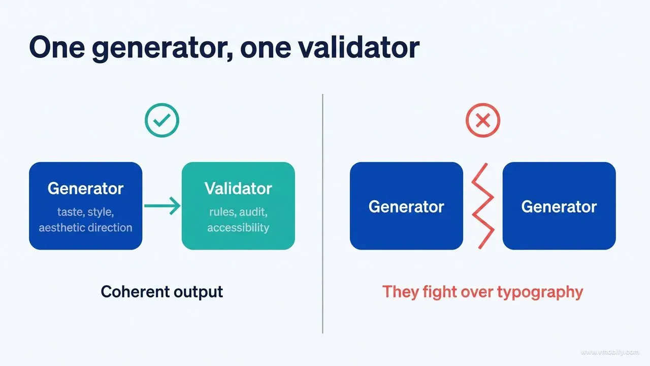
Sometimes, yes. A style-database skill and a hard-locked aesthetic skill will fight over typography. Pick one generator for taste and pair it with one validator for rules. Two generators is a recipe for incoherence.
How do you stop design drift over a long project?+
A lock file. A hand-written DESIGN.md or a tokens block in CLAUDE.md works: one canonical source the agent must read before every UI change, plus a review gate that fails the build on hardcoded values.
What is the real context cost of all this?+
Skill descriptions load at session start and are cheap. Skill bodies load on demand. MCP tool definitions load in full at session start — roughly 55k tokens for five servers — which is the cost most teams underestimate.
Is DESIGN.md an official standard?+
It is a community convention rather than a specification, but a useful one, because it keeps the token, the rule and the rationale in one file. The rationale is what lets an agent stay on-brand when it meets a component the file never described.
Can any of this replace a designer?+
No. What it replaces is the gap between having a design decision and having it applied consistently across two hundred components. The judgment still has to come from somewhere.
Sources
- Anthropic — Frontend Design plugin — Official design plugin shipped with Claude Code
- Claude Code documentation — plugins — Official reference for skills, plugins and marketplaces
- Vercel Labs — Web Interface Guidelines — Correctness, accessibility and form rules as an installable agent command
- Figma — Claude Code and Figma MCP setup — Official instructions for the design-to-code MCP connection
- shadcn/ui — MCP documentation — Component registry access for coding agents
- ChromeDevTools — chrome-devtools-mcp — Browser verification loop: render, measure and audit the built page
- OneRedOak — claude-code-workflows — The design-review subagent workflow referenced throughout this guide
- superdesigndev — superdesign-skill — Design agent that generates and iterates on interface variants
About the author
Amol Pomane — Founder, Vmobify
Amol leads Vmobify, a mobile app growth agency that has driven 30M+ downloads and ranked 54K+ keywords across 300+ apps since 2013. He writes about ASO, paid user acquisition, retention, and the operational reality of scaling mobile apps in India and global markets.