How to Create a UI/UX Strategy Before Redesigning Screens
Most redesigns start with the first screen someone opens, which is how a product ends up with twelve individually improved surfaces and no centre. A UI/UX strategy is the decision system that comes first: nine layers that turn product evidence into rules a designer, a reviewer or an AI agent can be held to. This is the method, with the one-page charter and the prompt we use to produce it.
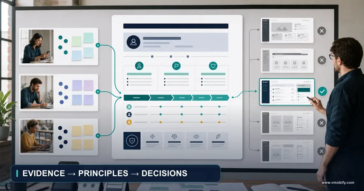
On this page
- What must a UI/UX strategy decide before you redesign a single screen?
- Why is a strategy a decision system rather than a design deliverable?
- Why does AI-assisted implementation make strategy more valuable, not less?
- Layer 1 — what evidence and constraints should the strategy inherit?
- Layer 2 — how do you write a product promise designers can act on?
- Layer 3 — how do you choose priority users and situations?
- Layer 4 — which journeys deserve the redesign energy?
- Layer 5 — how do you establish information hierarchy before layout?
- Layer 6 — which interaction and state principles actually settle arguments?
- Layer 7 — how do you turn visual adjectives into observable rules?
- Layer 8 — what stays consistent across platforms, and what stays native?
- Layer 9 — how do you write acceptance measures a design can fail?
- How do you compress the strategy into a one-page decision charter?
- Which prompt turns your evidence into a strategy an agent can follow?
- Which mistakes cost the most here?
- Frequently Asked Questions
What must a UI/UX strategy decide before you redesign a single screen?
A UI/UX strategy decides, in nine layers, what the whole product must consistently communicate, prioritise and protect: evidence and constraints, product promise, priority users and situations, critical journeys, information hierarchy, interaction and state principles, visual and content direction, platform and design-system rules, and acceptance measures. Screens are then expressions of that system rather than the system itself.
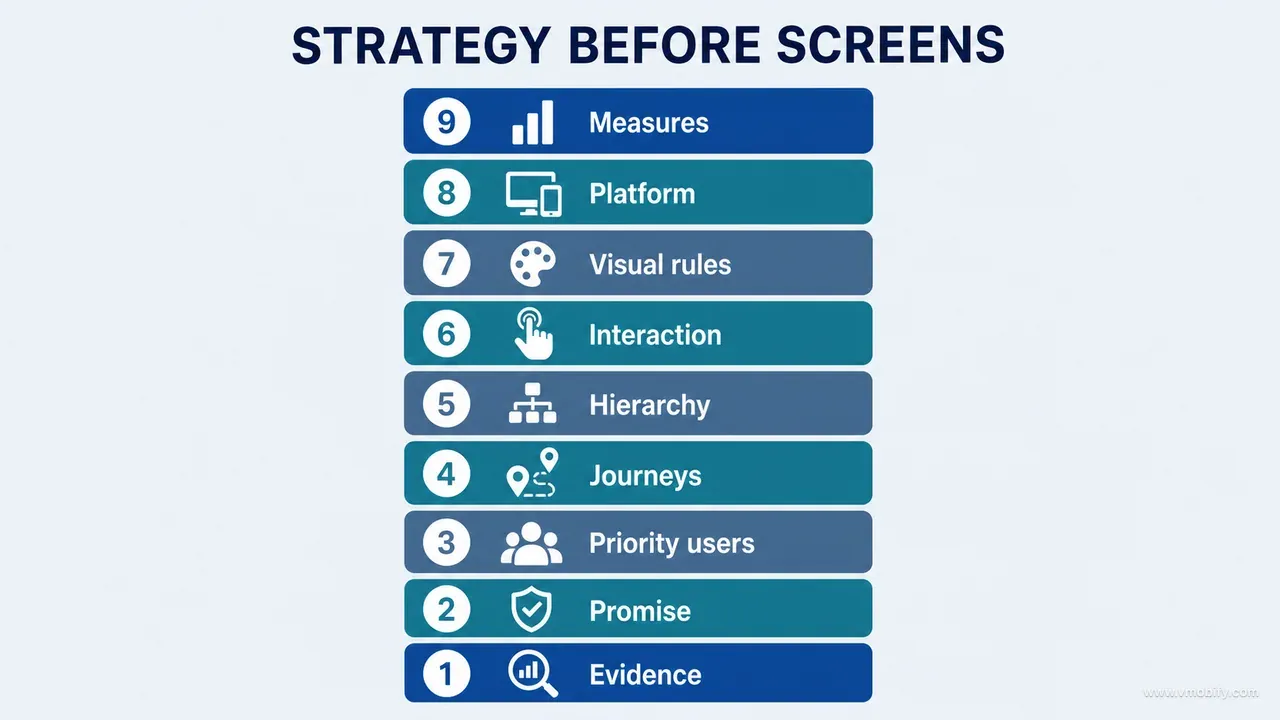
Do not begin a redesign by improving the first screen you open. That instinct feels productive and is the reason so many products end up with a dozen individually better surfaces and no centre. A strategy is not a mood board, a colour palette or a list of complaints. It is the connective tissue between the evidence you gathered and the decisions a designer, a reviewer or an AI agent will make a hundred times without asking you.
The output should be short enough to guide daily decisions and specific enough to reject a visually impressive but strategically wrong design. Those two properties are in tension, which is why most strategy documents fail: they are either a slogan or a fifty-page deck, and neither can settle an argument on a Tuesday afternoon.
Use this sentence as the test of whether you have one at all:
For [priority user] in [important situation], the product should make [valuable outcome] feel [experience qualities], while protecting [critical constraint].
We worked this method out while improving a child-growth product implemented separately on iOS and Android — profiles, measurements, charts, reports, AI explanations, subscriptions, notifications and privacy controls. For that product a useful direction was: for a caregiver reviewing a child's changing growth record, the product should make the current situation and next useful action feel calm, understandable and trustworthy, while protecting clinical meaning, privacy and correction paths.
That sentence does not prescribe a card radius. It establishes what every design decision must serve, and it makes certain proposals immediately answerable. Redesigning the dashboard in isolation could make it more attractive while making the product less coherent: a card promoted on Home might already be reachable elsewhere, a simplified chart might hide the provenance users needed to trust it, a new interaction might work naturally on one platform and fight the other. The strategy has to answer why the interface should change before anyone is asked how to change it.
This is part 05 of our AI product development methodology series. It assumes you already have the raw material from part 04 on choosing screenshots for a serious product audit — real runtime states, not marketing renders. If you do not have that evidence yet, gather it first; a strategy built on remembered screens inherits the memory's errors.
Why is a strategy a decision system rather than a design deliverable?
A strategy earns its name only when it tells the team what to optimise while goals are in conflict — everything else is supporting material. Teams routinely call four different artefacts "strategy": a visual inspiration board, a design audit, a list of features to add, and a component library. All four can support a strategy. None of them replaces one.
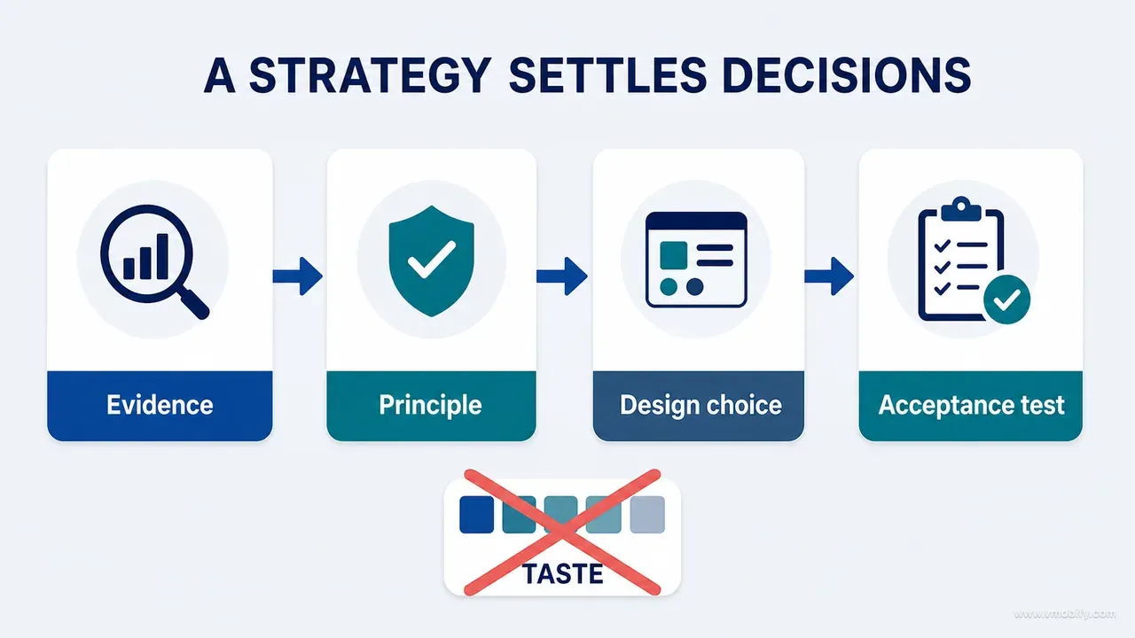
The difference shows up in the questions each artefact can answer. A mood board cannot tell you whether the dashboard should show more data or reduce cognitive load. An audit cannot tell you whether the primary action on the main surface is recording, understanding or sharing. A component library cannot tell you whether iOS and Android should look identical or express the same intent through native conventions. A feature list cannot tell you which forms deserve progressive disclosure, or which real-world claims need visible sources.
Those are the questions that recur weekly. If they are unanswered at the strategy layer, they get answered ad hoc at the screen layer — differently each time, by whoever is closest to the work. That is the mechanism by which redesign becomes local optimisation: every screen improves independently while the product loses its centre.
A working test we apply before accepting a strategy document: can it reject something? Take three real proposals that a reasonable person might make — add a streak counter to the home screen, unify the two platforms on a single custom navigation pattern, replace the chart with a single big number — and check whether the document produces a defensible yes or no for each. If it produces "it depends" three times, it is a description, not a strategy.
The second test is durability. A strategy should survive the arrival of a genuinely good-looking mockup that violates it. This is harder than it sounds, and it is why the acceptance measures in layer 9 matter more than the adjectives in layer 7. Adjectives lose arguments to visuals. Acceptance criteria do not.
Products hold their shape through repeated redesigns when somebody writes down the decision rule — prioritise X over Y because Z — and the team keeps enforcing it after the person who wrote it moves on. An elaborate design system cannot substitute for that product-level judgement.
Why does AI-assisted implementation make strategy more valuable, not less?
AI coding tools produce screens quickly and compound ambiguity just as quickly, so the faster implementation becomes, the more value a stable decision framework returns. The cost of a vague brief used to be a week of a designer's time. It is now a hundred generated components that all agree with each other and all miss the point.
Ask an agent to "make the app premium" and you will reliably get gradients, glass effects, elevated cards and motion, because those patterns statistically resemble polished work in the material the model learned from. The agent has no way to know whether they support your product's trust model. In a health-adjacent product, an animated confidence flourish on an AI explanation is not premium — it is a claim the product cannot back.
There are three distinct failure shapes we see with generated UI, and a strategy addresses each one differently:
Decoration mistaken for quality
- The agent adds visual weight because the brief supplied adjectives and no hierarchy.
- Fixed by layer 5 and layer 7 — information priority plus observable rules.
The happy path only
- Generated screens are nearly always the content state. Empty, loading, error, offline, restricted and unusual-data states arrive later, if at all.
- Fixed by layer 6, where state is declared part of the interface.
Local coherence, global drift
- Each screen is internally consistent; across twelve screens there are four button hierarchies and three words for the same object.
- Fixed by layer 8's platform contract and layer 7's terminology rules.
None of those is a model capability problem. They are specification problems, and they were specification problems before agents existed — agents just made the consequences arrive on the same afternoon. Our own build of an AI-assisted iOS app taught us this the expensive way; the narrative of what that cost is in our vibe coding launch post-mortem, and it is the worked example behind the method here. This series stays on the method itself.
The practical implication for anyone working with agents: the strategy document is not overhead you write for stakeholders. It is context you paste. A one-page charter that an agent reads before every design task is the single highest-return document in an AI-assisted product process, because it converts taste — which does not transfer — into rules, which do.
Layer 1 — what evidence and constraints should the strategy inherit?
The strategy should inherit its facts from the product inventory and the screenshot audit, and every one of those facts should carry a label saying how strongly it is known. Strategy built on unlabelled inputs is confident about the wrong things.
What to collect before writing a word of direction: existing capabilities, routes and states; high-value and high-risk journeys; real runtime screenshots; analytics and support evidence where it exists; platform differences; accessibility failures; content and terminology inconsistencies; technical constraints; regulatory, privacy and safety requirements; and known product and data invariants. Most of this comes straight out of the complete product inventory if you built one.
Then label every input with one of five evidence grades:
- Observed — seen in the running product.
- Measured — supported by analytics or timed testing.
- Documented — defined in an approved source.
- Inferred — reasonably deduced but not yet verified.
- Proposed — a direction to test.
The labels are not bureaucracy. They are the mechanism that stops an assumption from hardening into a rule. "Users want more AI insight" is not evidence because it sounds plausible; it is proposed. "Users abandon the insight screen after the consent step" is measured only if instrumentation actually supports it, and inferred otherwise. Six weeks later, when someone asks why the insight surface was promoted, the label is the only thing that will tell you whether the decision rested on data or on a meeting.
How you recognise this going wrong: the strategy contains a confident sentence that nobody can source. Ask "which screenshot, which query, which document?" of any three claims in your draft. If two of them cannot be answered in under a minute, the evidence layer is decorative.
Record non-negotiable constraints in the same pass. Constraints are not annoyances to hide from designers — they are part of the design problem, and a board that violates one has wasted everyone's week. On the case-study product they included: AI personalisation is off by default and requires explicit consent; a child's name, exact birth date and contact details must not be sent to the AI processor; real-world health references must remain traceable; users must be able to correct or delete measurements; subscription access cannot obscure essential data-ownership controls; dark mode is out of scope for this release; and the two platforms use different implementation stacks and native behaviours.
Some constraints are external and non-negotiable in a stronger sense. Both stores require an accurate privacy declaration covering exactly what leaves the device, and Apple's app privacy details requirements mean a design decision to send one extra field to a processor is also a store-listing decision. Write those into the constraint list so a designer never proposes something the submission will reject.
Layer 2 — how do you write a product promise designers can act on?
The product promise is the experience-level value users should repeatedly receive — narrower than a mission statement, broader than a feature, and written so that it generates design implications rather than agreement. A promise nobody could disagree with is a slogan.
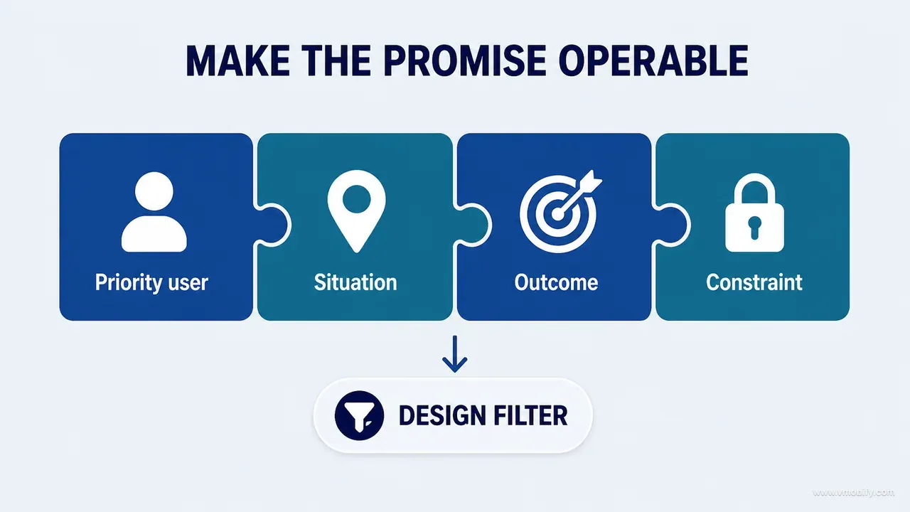
Compare two versions from the case study. Weak: track your child's growth with AI. That sentence tells a designer nothing; every screen either "tracks growth" or does not. Stronger: turn scattered growth records into a clear, explainable history that caregivers can understand, correct and share confidently.
The second version does work, because each clause names something the interface must earn:
- History matters, not only the latest value. A design that celebrates the most recent measurement and buries the trend fails the promise even if it looks better.
- Explanation matters, not only calculation. A number without its basis is a weaker product, not a cleaner one.
- Correction matters, not only entry. Edit, delete and conflict paths are promise-carrying journeys, not maintenance screens.
- Sharing matters, but must preserve context and privacy. An export that strips the reference basis is a broken promise wearing a nice layout.
Write the promise, then write the implications underneath it, then use them as a filter: if a proposed screen redesign does not strengthen at least one implication, ask out loud why it is being changed. Sometimes the answer is legitimate — a technical migration, a platform requirement, an accessibility fix. Often the honest answer is that the screen looked dated, which is a reason to schedule work, not a reason to prioritise it above a correction flow that loses data.
A test for whether your promise is doing work: invert each clause and check that the inverse is a real product somebody might build. "Show only the latest value, optimised for speed" is a real product. If the inverse of your promise is absurd, your promise is a platitude.
One caution specific to AI-assisted products. Promises that include explanation or personalisation are promises about epistemics, and they constrain the visual language more tightly than teams expect. Once you have promised explainability, every confident-sounding phrase, every animation that implies certainty and every hidden data source becomes a promise violation. That single clause ended up rejecting more design proposals on our case study than any other line in the charter.
Layer 3 — how do you choose priority users and situations?
Design for situations, knowledge states and pressure — not for demographic labels. "Parents" is too broad to guide a single layout decision; "a caregiver correcting a measurement they entered wrongly three weeks ago" decides half a dozen.
The situations that mattered on the case-study product were: a first-time caregiver entering an initial measurement; a returning caregiver checking a trend after a clinic visit; a user correcting a historical entry; a user with only one sparse data point; a user comparing metrics across time; a user deciding whether to enable AI personalisation; a user exporting information for a professional conversation; and a user recovering after a network or permission failure.
Prioritise those using three axes — frequency, consequence and uncertainty — and accept that the ranking will surprise you. A low-frequency account-deletion flow can outrank a frequently viewed decorative insight, because deletion is consequential and irreversible while the insight is neither. Frequency alone always promotes the home screen; frequency plus consequence promotes the places where trust is won or lost.
Write it as a short table in prose form — situation, user goal, current friction, consequence, strategic priority:
- First measurement — goal: record accurately. Friction: units and source unclear. Consequence: bad downstream data forever. Priority: critical.
- Sparse chart — goal: understand what one point means. Friction: the surface looks empty and broken. Consequence: loss of trust at the exact moment the product is being judged. Priority: high.
- AI consent — goal: make an informed choice. Friction: technical copy. Consequence: privacy misunderstanding, and a support burden that outlives the release. Priority: critical.
Two situations deserve explicit attention in any product with real reach in India and comparable markets, because in our portfolio they are consistently the ones that Western-designed products handle worst. The first is the constrained device: a mid-range Android phone with a small screen, an aggressive battery manager that kills background work, and a system font scale set well above default because the primary user's eyesight demands it. The second is the intermittent connection: not offline, which most teams at least consider, but a connection that succeeds slowly and fails halfway. A design that assumes a request either works or does not will produce a state your users see weekly.
There is a third, easy to miss: the shared device. One handset used by several family members changes what "your data" means on a home screen, what a notification may reveal on a lock screen, and whether a persistent login is a convenience or a privacy failure. None of that is visible if your situation list is a list of personas.
First-run situations deserve the most scrutiny of all, because they are where the product's promise is either demonstrated or postponed — the mechanics of that are in our guide to app onboarding, and the strategic point is simply that onboarding is not a screen sequence, it is the first four situations on your list.
Layer 4 — which journeys deserve the redesign energy?
Redesign the journeys that express the product promise and carry the most risk, and deliberately leave the rest alone. Spreading effort evenly across every route is how a redesign runs out of budget before it reaches the flows that actually lose users.
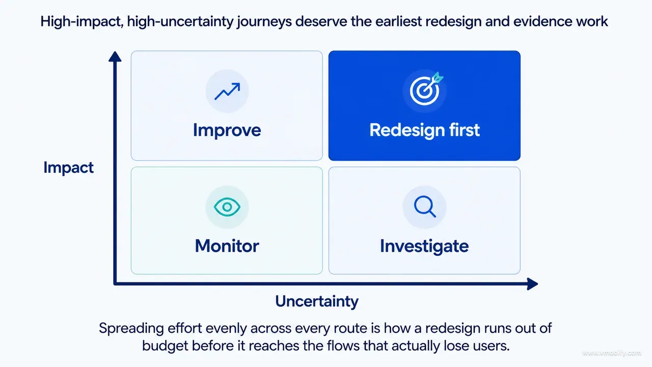
For each journey you select, map the full arc rather than the screens:
Trigger -> entry -> decision -> action -> system response -> outcome -> recoveryMeasurement entry, mapped properly, looks like this:
Review current growth
-> choose metric
-> enter value / date / source
-> validate
-> save
-> confirm
-> update history, chart, insight and report
-> recover from invalid, offline or conflicting state
Notice how much of that arc is not the form. The journey crosses several screens and, more importantly, several data consumers. A form redesign is incomplete if the resulting chart remains stale, and this is the single most common way a redesign ships a regression: the new entry screen is genuinely better, and the downstream surface it feeds was never in scope.
How you recognise the failure before release: pick any journey and ask what changes on every other surface when it completes. If the answer is "I would have to check", the journey map stops too early. Write the consumers into the map explicitly — history, chart, insight, report, notification, export — so that a design board covering the form is obliged to say what happens to each.
Then define the moment of confidence. Every critical journey has one point where the user should feel that the product understood the task and completed it. For an export, it is the preview showing the correct child, the correct dates and the correct measurements. For a restored purchase, it is access returning with a clear confirmation rather than a silent state change. For an AI explanation, it is transparent context about what data was used and what the explanation cannot establish.
Design toward that moment first, then design the path back when it is not reached. The recovery half is where products are actually differentiated, and it is the half that gets cut when a redesign runs late. We have seen more churn caused by an unrecoverable failed submission than by any amount of dated visual design — users forgive an ugly screen and do not forgive losing fifteen minutes of entered data.
A useful budgeting rule: no more than five critical journeys in a single redesign cycle. Fewer journeys taken all the way through recovery beats more journeys taken as far as the happy path, every time.
Layer 5 — how do you establish information hierarchy before layout?
Decide what is primary before deciding where anything goes, because a layout invented first will quietly redefine what the product means. Hierarchy is a product decision wearing a design costume.
For each major surface, classify every piece of information into five roles:
- Primary — required to understand or complete the main task.
- Secondary — helpful context that supports the decision.
- Tertiary — detail available on demand.
- System — loading, freshness, source, permission or error status.
- Action — the next meaningful user choice.
The classification is surface-specific and it should be, because the task changes. On a growth overview, the latest meaningful status and the recording action are primary, while exact reference metadata is secondary or available through an explanation. On a privacy consent surface, processor, data sent, data not sent and the control itself are all primary — because informed choice is the task, and demoting any one of the four turns consent into a formality.
Tertiary is where the discipline pays off. Everything a stakeholder wants "somewhere on the screen" can go there honestly, through progressive disclosure, rather than dishonestly, as a fourth equally weighted card. Nielsen Norman Group's work on progressive disclosure is the standard reference for why deferring detail beats hiding it.
Write the content hierarchy before the visual hierarchy. Draft each surface in plain text first:
Purpose: Understand current growth and what changed.
Primary: Latest measurement + direction over time.
Secondary: Reference context and date.
Action: Add or review measurement.
System: Data freshness and calculation status.
On demand: Detailed chart, source, method and export.
Only after that do you explore typography, spacing, containers and imagery. Six lines of plain text take ten minutes and settle arguments that would otherwise consume three rounds of mockups, because they move the disagreement to where it belongs — what matters — instead of where it will be mistaken for taste.
This plain-text draft is also the most useful thing you can hand an AI agent. A prompt containing this block produces materially different output from a prompt containing "design a modern growth dashboard", and the difference is not quality of rendering; it is that the first one can be wrong in a way you can point at.
Two failure modes to recognise. The first: a surface with three primaries. That is not a hierarchy, it is a deferred decision, and it will be resolved by whoever picks the type sizes. The second: system information treated as tertiary. Freshness, source and calculation status feel like footnotes until the moment a user doubts a number, at which point they are the only things on the screen that matter.
Layer 6 — which interaction and state principles actually settle arguments?
Principles are worth writing only if they resolve a choice that recurs — anything that reads like "keep it simple" is a sentiment, not a principle. The test is whether a reviewer can hold a design against it and say no.
Six that earned their place on the case-study product:
- One primary action per decision context. A screen may support several actions, but exactly one should correspond to the user's current objective. Secondary actions stay available without competing visually. This single rule resolves most "where does the button go" debates before they start.
- Explain before demanding. Permission prompts, consent, subscription and destructive actions all require context before the system dialog or the irreversible choice. A native permission sheet is the worst possible place to explain why you need the permission, because it is the one surface you cannot edit.
- Preserve user work across recoverable failure. Invalid, offline or failed submissions keep entered values wherever it is safe to do so, and recovery copy states what happened and what the user can do next. Recovery copy is a design deliverable rather than a string resource, and the product-specific part is deciding what counts as safe to retain.
- Show provenance where trust depends on it. Health references, calculations and AI explanations expose the relevant source, method or freshness — without flooding every surface with metadata.
- Correction is a first-class journey. Edit, delete, undo and conflict paths get the same care as creation.
- State is part of the interface. Every important surface is deliberately designed for empty, loading, content, error, offline, restricted and unusual-data conditions.
That last principle is the one that changes the most work, so make it operational rather than aspirational: a design board is not complete until it shows the states its surface can actually enter. Empty-state design in particular is a strategic surface rather than a consolation screen, and it deserves deliberate work before anyone writes "No data" anywhere.
If you want a checklist to sanity-test your own list against, Nielsen's ten usability heuristics remain the most useful general set in the field. Use them as a completeness check, not as your principles — heuristics are universal and your principles need to be about your product's specific conflicts, or they will never reject anything.
These principles become the filters for design-board review in part 06. That is their real function: a board arrives, and the reviewer works down the list asking which principle the board serves and which it violates. Without the list, review degenerates into preference, and preference loses to whoever presents most confidently.
Layer 7 — how do you turn visual adjectives into observable rules?
Every adjective in your visual direction must be paired with an observable expression, or it will be interpreted as permission to decorate. Adjectives are how a strategy loses control of its own output — particularly when the implementer is an agent that has seen a million "premium" interfaces.
The broad direction on the case study was: calm, warm, trustworthy and premium; centred on the child's information and the caregiver's next decision, not on the product advertising itself. On its own that sentence is unusable. Translated into observable rules it becomes enforceable:
- Calm — controlled density, stable layouts that do not reflow as data loads, restrained motion.
- Warm — soft neutrals and humane language, without childish decoration.
- Trustworthy — clear labels, visible sources, honest states, no exaggerated certainty in copy or animation.
- Premium — precise typography, spacing and transitions; not ornamental effects.
- Child-centred — meaningful profile context and growth story, not app-brand dominance.
Then write anti-principles, which do more work than the adjectives ever will. They are easier to apply because rejection is easier than judgement:
- Not a generic analytics dashboard.
- Not a toy-like baby app.
- Not a clinical portal that intimidates caregivers.
- Not an AI product that turns uncertainty into confident advice.
- Not a card grid where every item has equal importance.
- Not identical across platforms at the expense of native usability.
Every one of those sentences has rejected a real proposal. That is the bar for including an anti-principle: name a specific thing you have actually seen a competent person suggest.
Content behaviour belongs in this layer too, because copy is interface architecture rather than the thing you fill the boxes with. Define preferred terminology; voice in success, warning and failure; how uncertainty is expressed; how dates, units and values are formatted; how AI-generated text is labelled; when sources and disclaimers appear; maximum heading and action-label lengths; and empty-state structure. "No data" and "Add the first measurement to begin a trend" describe the same database state and create entirely different experiences.
Both platforms publish serious guidance here — Apple's writing guidelines and Material's content design overview are both stronger than most in-house style guides, and adopting one as your default saves you writing the eighty percent that is not product-specific.
Two constraints matter disproportionately in Indian and other multilingual markets, and both are content decisions made at this layer rather than translation problems discovered later. Maximum label lengths must survive the expansion of your longest supported language, and the familiar rule of thumb misleads badly here: the roughly thirty percent growth people quote applies to long passages, while short strings can expand far more. W3C's internationalisation guidance, citing IBM's globalisation guidelines, gives an expected expansion of 200–300% for English strings up to ten characters and 180–200% for strings of eleven to twenty characters. These are planning ranges for English-to-European-language translation, not guarantees for Hindi or Marathi, so use pseudolocalisation and real translations to test your supported locales. And decide number, date and unit formatting once, centrally, because a product that shows one date format in the chart and another in the export has undermined its own trustworthiness rule without changing a single pixel.
Layer 8 — what stays consistent across platforms, and what stays native?
A cross-platform strategy should target semantic consistency, not pixel identity — the same meaning everywhere, expressed through each platform's own conventions. Teams that get this backwards ship an app that is recognisably the same on both platforms and recognisably foreign on at least one.
Keep consistent across platforms:
- Product terminology — the same object has the same name everywhere.
- Information priority — what is primary on a surface does not change by platform.
- Data meaning — a number means the same thing and is calculated the same way.
- Capability availability — a feature that exists on one platform exists on the other, or its absence is a deliberate, documented decision.
- Consent and privacy logic — including defaults and what is sent where.
- Critical acceptance criteria.
- Core brand character.
Allow platform-specific expression for: navigation conventions; sheets, dialogs and back behaviour; system permissions; typography metrics; touch feedback and motion; accessibility services; and component behaviour. Apple's Human Interface Guidelines and Android's design guidance disagree with each other on purpose, and the disagreements encode what each platform's users already know. Back behaviour is the clearest example: an Android product that ignores predictive back to preserve a shared navigation model has traded a real usability property for a diagram that looks tidy.
Then define a minimum design-system contract — the smallest set of shared decisions that the priority journeys actually require:
Type roles and scaling
Colour roles and contrast
Spacing scale
Containers and maximum widths
Buttons and action hierarchy
Inputs and validation
Cards and grouped content
Navigation
Charts and legends
Status, feedback and recovery
Icon source and meaning
Motion duration and reduced-motion behaviour
Do not start by creating dozens of components. Start with the patterns the priority journeys demand, and let the system grow from real use. The alternative — a comprehensive component catalogue built ahead of the journeys — reliably produces a beautiful library with no component for the one surface that was actually causing churn.
Type scaling deserves a line of its own in the contract because it is the rule most often written and least often honoured. Both platforms let users increase system text size substantially, and a layout that is only verified at default scale is verified at the setting your most motivated users do not use. Make "renders correctly at the largest supported text size" a contract item, not a QA afterthought.
In our portfolio, the products with the least platform drift are the ones that wrote this contract down at around fifteen items and stopped. Longer contracts are not better enforced; they are less read.
Layer 9 — how do you write acceptance measures a design can fail?
A strategy becomes operational only when the team can judge whether a specific design supports it, which means every principle needs a criterion that a real design can fail. Without this layer, the previous eight are opinions with better formatting.
Use three classes of criteria, because they fail in different ways and are checked by different people.
Experience criteria — can the product be understood and used?
- A first-time user can identify the primary action without instruction.
- A sparse-data state explains what is known and what becomes possible next.
- Privacy choices state the recipient, the purpose, the data included, the data excluded and the control.
- Error recovery preserves safe user input and provides a next step.
Consistency criteria — does the product agree with itself?
- The same concept uses the same term across both platforms.
- Primary and destructive actions follow the defined hierarchy everywhere.
- Equivalent states use shared content and visual patterns.
- Charts use consistent units, legends and source access.
Verification criteria — how will anyone know?
- Critical journeys are tested from trigger through persisted outcome, not to the confirmation toast.
- Before and after screenshots use locked comparison conditions — same device, same data, same text size, same theme.
- Large text, narrow width and accessibility behaviours are inspected on both platforms.
- Design-board ideas are compared against the real implementation rather than against the board.
- Relevant analytics or usability measures have both a baseline and a target defined before the change ships.
Accessibility criteria are the easiest to make objective, so make them objective. Contrast, target size and reflow all have testable thresholds in WCAG 2.2, and Apple's accessibility guidance maps them onto native controls. "Accessible" is an adjective; "every interactive target meets the minimum size and every text pair meets its contrast ratio" is a criterion.
Resist the pull toward a single headline metric. Completion rate, error rate, recovery rate, comprehension and trust signals can all move independently, and a redesign that raises completion while raising silent error is worse than the thing it replaced. Baselines matter more than targets: measure the current product before you change it, because after the redesign ships nobody can reconstruct what it used to do. That instrumentation question is its own subject, and it needs settling before the redesign ships rather than after.
The most useful discipline here is writing the failure sentence. For each criterion, write what a violation looks like in one line. "A design fails this if the empty state says only 'No data'." A criterion you cannot write a failure sentence for is not yet a criterion.
How do you compress the strategy into a one-page decision charter?
The working strategy must fit on one page even when the research behind it runs to fifty, because a document nobody re-reads cannot govern daily decisions. The research is the appendix; the charter is the product.
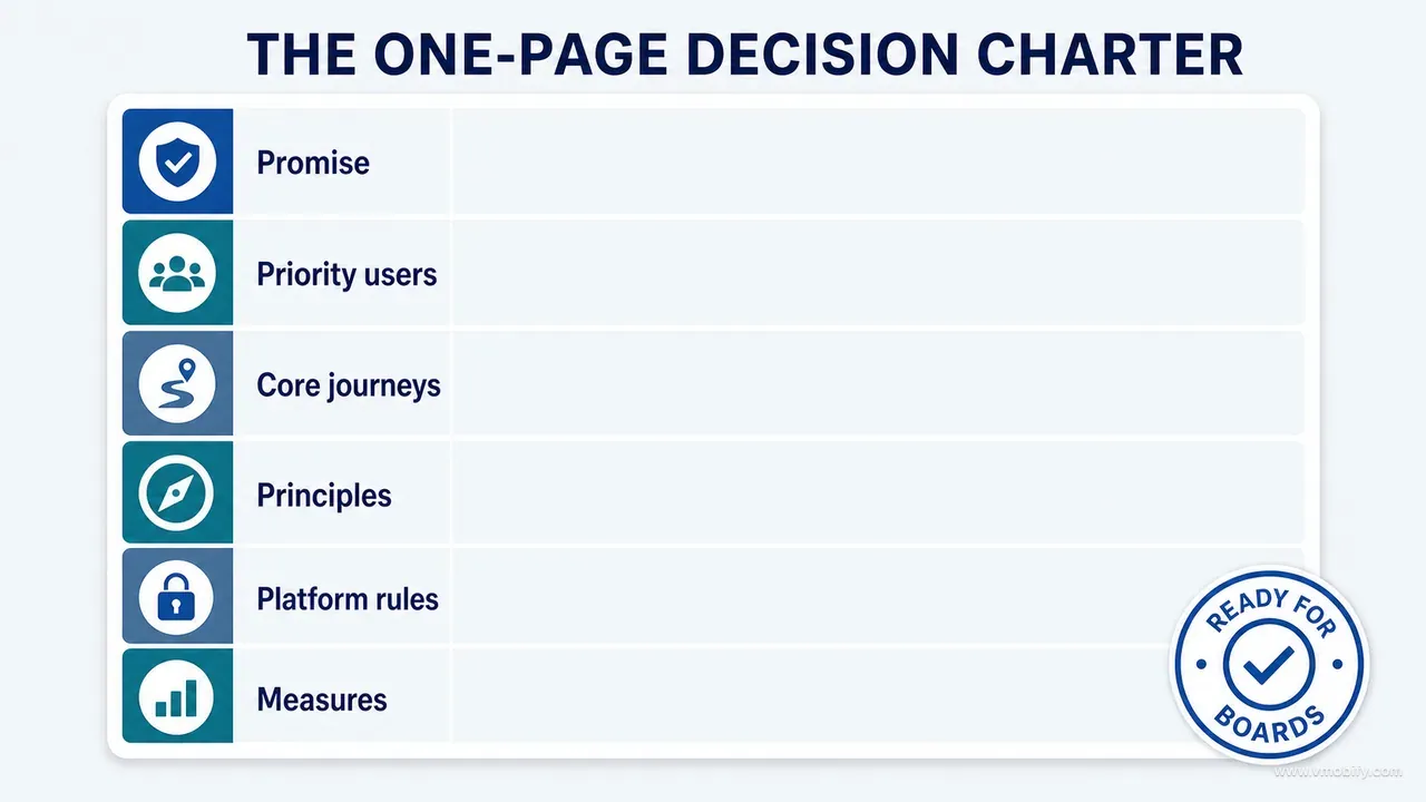
This is the template we use:
UI/UX STRATEGY - [PRODUCT / VERSION]

PRODUCT PROMISE
[The repeated user value the experience must deliver]

PRIORITY USERS AND SITUATIONS
1.
2.
3.

CRITICAL JOURNEYS
1.
2.
3.
4.
5.

EXPERIENCE QUALITIES
[3-5 qualities, each translated into observable rules]

INFORMATION PRIORITIES
Primary:
Secondary:
Tertiary:
System:
Action:

INTERACTION PRINCIPLES
1.
2.
3.
4.
5.
6.

CONTENT PRINCIPLES
1.
2.
3.

EVIDENCE BASIS
Observed:
Measured:
Documented:
Inferred:
Proposed:

NON-NEGOTIABLE CONSTRAINTS
1.
2.
3.

PLATFORM CONTRACT
Must remain semantically consistent:
May follow platform conventions:

ANTI-PRINCIPLES
The product must not feel or behave like:

ACCEPTANCE EVIDENCE
- Runtime states:
- Journey verification:
- Accessibility:
- Product/data checks:
- Before/after comparison:

DECISION RULE
When goals conflict, prioritise [X] over [Y] because [reason].
The evidence block is the one people are tempted to cut, and cutting it is what turns a charter back into a set of opinions. One line per grade is enough: the strongest thing you actually observed, the one number you can defend, the document you are bound by, the deduction you have not checked, and the direction you are still testing. A reviewer who can see that a priority rests on inferred rather than measured can argue with it; a reviewer looking at an unlabelled charter can only argue with the person who wrote it.
The decision rule is the one to write first and revise last. A charter without an explicit decision rule leaves the hardest question — what wins when two good things conflict — to be answered by seniority. On the case study the rule was: when clarity and completeness conflict, prioritise clarity of the current situation over completeness of the record, because a caregiver who misreads a trend is worse off than one who taps once for detail.
Three habits keep the charter alive rather than archived. Version it with the product, so a reviewer can tell which release a decision belonged to. Keep it in the repository, next to the code, rather than in a document tool the implementers do not open — this matters enormously when the implementer is an agent reading the project files. And record what changed and why when you revise it, because the second most valuable thing in a charter, after the current rules, is the trail of decisions that were reconsidered and re-confirmed.
Length discipline is not aesthetic. In our portfolio the charters that survive a year are the ones under a page; the ones that grow past three pages are re-read only by the person who wrote them, and a strategy nobody re-reads has already stopped being a strategy.
Which prompt turns your evidence into a strategy an agent can follow?
Use a prompt that explicitly forbids screen design, demands evidence separation, and finishes by naming what is missing — because the failure mode of a strategy prompt is a confident, complete-looking document built on gaps. This is the one we run before any agent is allowed to propose a surface.
Act as a principal product designer and UX strategist.

Do not redesign screens yet.

Using the supplied product inventory, runtime screenshots, user journeys,
constraints, evidence labels and known findings, produce a one-page UI/UX
decision charter.

You must:
1. Label every input as observed, measured, documented, inferred or
   proposed.
2. Define the product promise and its design implications.
3. Prioritise situations by frequency, consequence and uncertainty.
4. Map the critical journeys through outcome and recovery.
5. Establish information, interaction, content and state principles.
6. Define what must remain consistent across platforms and what should
   remain native.
7. Convert visual adjectives into observable design rules and
   anti-principles.
8. State non-negotiable privacy, safety, data and technical constraints.
9. Provide acceptance evidence for every strategic principle.

Do not recommend visual trends, new features or a component library unless
the evidence requires them. Name every missing input that prevents a
defensible decision. Finish with unresolved decisions requiring
product-owner approval.
Three clauses do most of the work, and they are the ones people delete when adapting it.
"Do not redesign screens yet." Without it the model will produce a strategy section followed by six screen proposals, and the proposals will get all the attention. The instruction is not about capability; it is about protecting the sequence.
"Name every missing input." This converts the model's strongest failure mode into its most useful output. A model asked for a charter will produce a complete-looking charter regardless of whether the inputs support one. A model asked to name gaps will tell you that it has no analytics for the consent step and no screenshots of the offline state — which is exactly the list you needed.
"Finish with unresolved decisions requiring product-owner approval." Some conflicts are genuinely for the business to settle: whether subscription prompts may appear inside a correction flow, whether a feature ships on one platform first. Making the model surface them stops it from silently resolving a commercial question with a design default.
Feed it the evidence with its labels intact, and read the output adversarially: check that anything marked as observed can be traced to a screenshot, and that nothing marked as measured lacks a number. The wider technique — writing prompts that return evidence instead of confident prose — is the subject of part 08 of this series, and it applies to every stage after this one.
One practical note from repeated use: run this prompt twice, with the evidence in a different order, and compare the two charters. The stable parts are what your evidence actually supports. The parts that move are where the model is filling gaps with plausibility, and those are the paragraphs to either source or delete.
Which mistakes cost the most here?
The expensive mistakes at this stage are all the same mistake in different costumes: deciding style before meaning, and then discovering the meaning at implementation time, when what would have been one revised sentence in a charter has become a migration across every screen that inherited it. Seven that recur:
- Choosing style before meaning. A palette cannot fix unclear hierarchy, missing recovery or contradictory journeys. It can, however, make all three harder to see for another quarter.
- Treating all users as one persona. Design for important situations and knowledge states, not for a demographic label. "Parents aged 25-40" has never resolved a layout decision.
- Redesigning the dashboard as if it were the product. The dashboard is an entry surface. Critical value and risk usually live in forms, corrections, permissions, errors and the downstream surfaces that consume them.
- Copying one platform onto the other. Preserve intent and data meaning; respect native behaviour. A shared navigation model that fights the platform costs more usability than it saves in build time.
- Writing principles nobody can reject a design with. "Simple, modern and intuitive" is not a strategy. If no proposal has ever failed one of your principles, they are decoration.
- Giving an AI agent adjectives without constraints. "Premium" invites decoration. Specify hierarchy, state behaviour, motion restraint, content trust rules and acceptance evidence instead, and expect exactly what you specified.
- Declaring the strategy finished before runtime inspection. A strategy is a hypothesis about how the product should work. It must be revised when implementation and real states expose contradictions — and they will, because no amount of upfront thinking surfaces the state where a chart has one point and the insight engine has an opinion about it anyway.
There is an eighth that is harder to see because it looks like diligence: writing the charter and never enforcing it. A strategy that exists but is not used in review is worse than none, because it provides the appearance of rigour while decisions continue to be made by preference. The enforcement mechanism is the design board review in the next part of this series, and if you are not going to run something like it, the charter will not survive its first busy sprint.
So: a serious redesign starts with decisions, not screens. Ground the work in product evidence. Define the promise, the priority situations, the critical journeys, the information hierarchy, the interaction principles, the content behaviour, the visual direction, the platform contract and the acceptance measures. Compress those decisions into a charter that both humans and AI agents can be held to — then, and only then, begin visual exploration.
Part 06 shows the enforcement half of the method: how to use bounded design boards to improve a product screen by screen without confusing concepts with implementation. If you would rather have this run on your product than run it yourself, talk to our team — the charter is usually a week of work and it is the week that decides whether the next three months compound or cancel out.
Frequently Asked Questions
How long should a UI/UX strategy take to produce?+
For an existing product with an inventory and an evidence set already gathered, a focused initial strategy takes days rather than months. The research behind it may take longer. The one-page charter itself should stay easy to update as evidence changes — if revising it feels expensive, it has grown too long.
Do we need user research before writing a UI/UX strategy?+
Use whatever research, analytics and support evidence exists, but do not delay every strategic decision until research is complete. Label your assumptions as inferred or proposed and define how each will be tested. Runtime and product evidence are necessary, but they are not a substitute for understanding users.
Can a design system come before the strategy?+
Foundational tokens can exist first, but the system should be shaped by the priority journeys and states. The harder version of this question is what to do when the design system belongs to another team and you cannot change it. Treat it as a platform you are building on: list the specific places where a priority journey needs behaviour the system does not offer, raise each as a request with the journey attached, and record the ones you have to work around as documented exceptions in the charter. An undocumented deviation looks like sloppiness to the next reviewer; a documented one is a decision they can uphold or overturn.
Should the strategy include competitor screenshots?+
Competitors reveal conventions and user expectations, which is genuinely useful. They should not become your source of truth. Record what problem a borrowed pattern solves and whether that problem exists in your product under your constraints — otherwise you inherit their trade-offs without their reasons.
How often should the charter change?+
Update it when strong evidence changes the product promise, the priority journeys, the constraints or the decision rule. Do not rewrite it for every screen iteration. Use the rate of change as a diagnostic: a charter that has not moved in a year is probably being ignored rather than obeyed, while one that is rewritten every sprint never had a real decision rule in it — the rule was being reverse-engineered from whatever the team had already decided to build.
What is the difference between a UI/UX strategy and a product requirements document?+
A PRD says what the product will do. The strategy says what the experience must consistently communicate, prioritise and protect while doing it, and what to optimise when those goals conflict. A PRD can specify a correction flow; only the strategy tells you whether correction outranks a new insight surface for this release.
How do you give a UI/UX strategy to an AI coding agent?+
Store it as plain markdown in the repository and reference it by path from the file your agent already reads on every task — CLAUDE.md, AGENTS.md, a rules file, whichever your tooling loads — with an instruction to read it before proposing or changing any interface. Then check it is actually being applied: ask the agent to name which principle a proposal serves and which anti-principle it risks. If the answer is generic, the file is not in context and a link in a ticket will not fix that. Adjectives transfer badly to agents; observable rules, anti-principles and acceptance criteria transfer well.
Sources
- Nielsen Norman Group — 10 Usability Heuristics for User Interface Design — Completeness check for your own interaction principles — universal heuristics, not a substitute for product-specific rules
- Nielsen Norman Group — Progressive Disclosure — The reference for deferring tertiary information rather than hiding it
- Apple — Human Interface Guidelines — Platform conventions for navigation, sheets, permissions and typography metrics
- Apple — Human Interface Guidelines: Accessibility — Maps testable accessibility thresholds onto native controls
- Android Developers — Design and UI guidance — The Android half of the platform contract, including back behaviour and component conventions
- W3C Internationalization — Text size in translation — Expected expansion ranges and the warning that short source strings can expand disproportionately in translation
- W3C — Web Content Accessibility Guidelines 2.2 — Objective thresholds for contrast, target size and reflow used in the acceptance criteria
About the author
Amol Pomane — Founder, Vmobify
Amol leads Vmobify, a mobile app growth agency that has driven 30M+ downloads and ranked 54K+ keywords across 300+ apps since 2013. He writes about ASO, paid user acquisition, retention, and the operational reality of scaling mobile apps in India and global markets.