App Onboarding Best Practices: Reduce Drop-Off & First-Week Churn
Most apps lose the majority of new users within three days, and onboarding is where that loss is decided. Here is the practical onboarding playbook — funnel diagnosis, time-to-first-value compression, the deferred sign-up decision tree, contextual permissions, and India-specific tactics — that turns first-session installs into week-one retained users.

Why does onboarding decide D1 retention?
Onboarding decides D1 retention more than any other surface in your product, because the first session is where a user makes the only decision that matters — whether your app is worth opening again tomorrow. Acquisition gets you the install; onboarding determines whether that install becomes a user. The two are not the same event, and conflating them is why so many teams pour budget into the top of the funnel while the floor of the funnel quietly drops away.
The scale of the loss is the part most teams underestimate. Directionally, 70-80% of new users are lost within the first three days of installing, and the bulk of that abandonment happens in the very first session — before the user has done anything you would recognise as using the app. UXCam's retention benchmark research describes the same shape: a steep cliff in the first 24-72 hours, after which the curve flattens. The flattening point is the habit. Everything before it is onboarding.
D1 retention is the leading indicator for the entire curve. A user who returns on day one is far more likely to return on day seven, and a user who reaches day seven is far more likely to still be active at day thirty. Because each window is conditional on the one before it, an onboarding fix is not a single-window improvement — it lifts every cohort that flows through it, permanently. That compounding is exactly why we treat onboarding as the highest-return retention work, and it is the entry point to the broader playbook in our app retention strategy guide, which this post deliberately sits upstream of.
There is a second reason onboarding matters that teams routinely miss: it is upstream of revenue. The only users who ever see your paywall with genuine intent are the users who reached their activation moment first. If onboarding leaks 60% of installs before value, your paywall is being shown to a pre-filtered, lower-intent remainder — and no amount of pricing experimentation recovers the users who never got far enough to care. The link between a strong first session and subscription monetisation is direct: onboarding sets the ceiling on conversion, and the paywall merely captures whatever the onboarding left room for.
Across our 300+ apps managed since 2013, the clearest pattern is that the apps which scale profitably fix the first session before they open the paid taps. The ones that struggle do the opposite — they buy more installs to compensate for an onboarding that cannot hold them, which is the most expensive way to grow an app that exists.
What does the onboarding funnel drop-off actually look like?
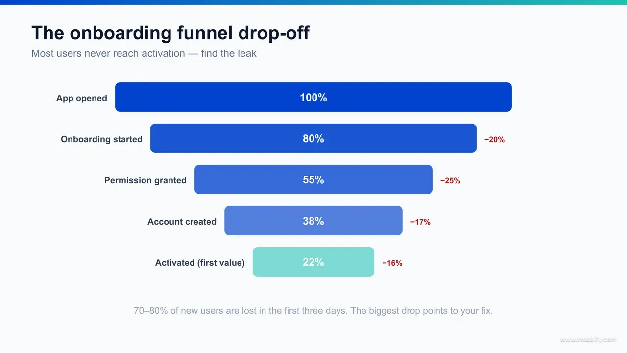
The onboarding funnel is a sequence of conditional steps, and at every step you lose a percentage of users — so a flow with six steps each retaining 85% delivers barely a third of your installs to the first value moment. The maths is unforgiving and most teams have never drawn it out: 0.85 to the sixth power is roughly 0.38. Each "small" screen you add multiplies against every other one, and the compounding is silent until you instrument it.
A typical leaky onboarding funnel, in the order users hit it, looks like this:
- App open and splash: a delay here on a cold start — especially on low-end Android — quietly costs you users before the first frame of content.
- Value-prop carousel: three-to-five swipeable slides that explain what the app does. Most users swipe through without reading; a meaningful share drop here because nothing has happened yet.
- Forced registration: the single largest cliff in most funnels. An account wall before any value has been delivered routinely loses 20-40% of users who got that far.
- Permission blasts: push, location, contacts, and tracking requested upfront. Every deny is a future retention lever lost; every prompt is friction.
- Setup and personalisation: forms, preference selection, profile completion before the user has any reason to invest.
- First value moment: the screen where the app finally does the thing it promised — and where, if users ever arrive, retention finally begins.
The diagnostic discipline is simple and almost nobody does it properly: instrument every transition as its own analytics event and read the funnel as a waterfall. The step with the largest single drop-off is, nearly always, your highest-ROI fix. In our portfolio, the median app has one onboarding step it did not know was bleeding 20-30% of installs until it was instrumented — most often a forced sign-up or a permission blast sitting in front of value rather than behind it.
It also matters how long the whole funnel takes. Amplitude's product analytics research on activation consistently shows that long time-to-first-value is corrosive: flows that drag past 30 minutes to reach value correlate with roughly 3x higher abandonment than flows that get a user there in under 10 minutes. The funnel is not only about how many steps; it is about how long the user has to wait, on a device they will happily put down for the next notification from somewhere else.
How do you compress onboarding to time-to-first-value?
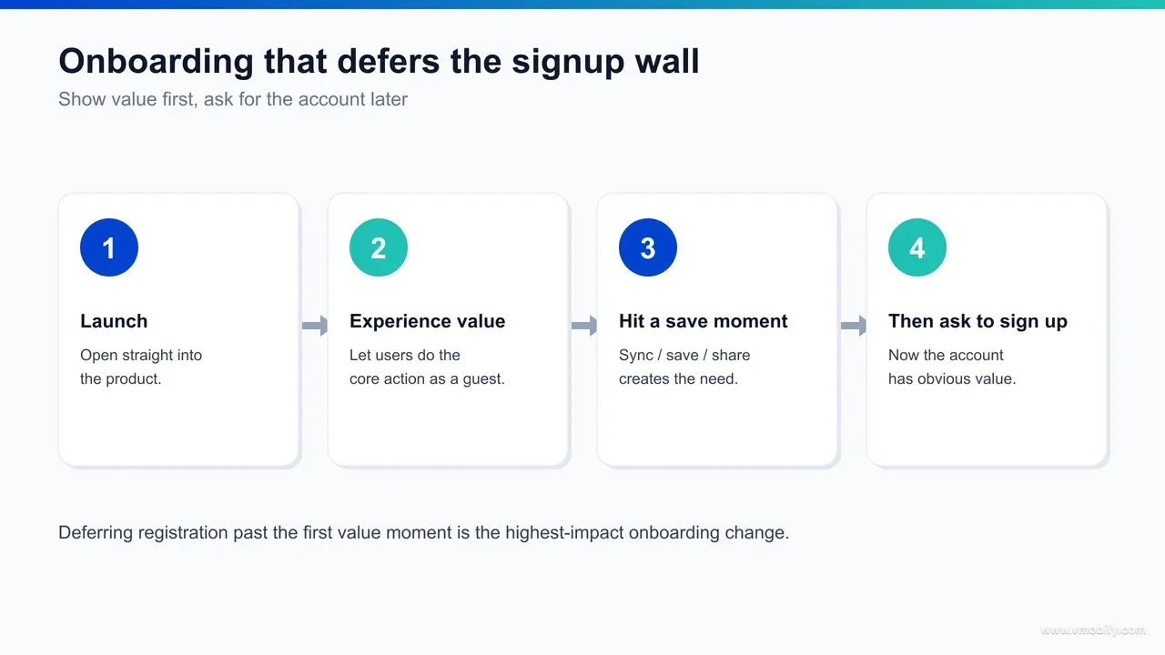
You compress onboarding by ruthlessly removing everything that stands between app open and the first value moment, then re-introducing the removed steps later, contextually, once the user has a reason to complete them. Time-to-first-value is the metric to optimise against, and the target is to reach it in the first session — ideally inside the first 60-90 seconds of meaningful interaction, well short of the 10-minute threshold above which abandonment climbs steeply.
The interventions that move time-to-first-value fastest, in priority order:
- Identify your single activation moment and engineer toward it. Name the one experience that defines what the app does well — the transaction that completes, the lesson that unlocks, the playlist that plays, the ride that gets booked. Everything in onboarding either moves the user toward that moment or it is overhead. This is the same "aha moment" thinking that underpins activation work; treat reaching it as the only success criterion of the first session.
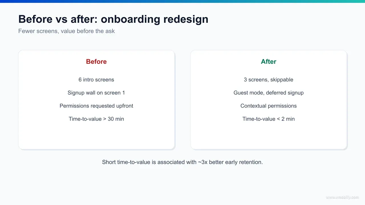
- Cut to three screens or fewer before value. Count everything — splash, carousel, permission prompts, sign-up, setup. Each additional screen before value typically drops completion by 10-15%. A six-screen pre-value flow usually loses more than half of users who got past the install.
- Defer everything that is not required to deliver value. Account creation, profile completion, notification opt-in, and most personalisation can all wait until after the user has experienced the product. Deferral is the highest-impact move available, and it has its own section below.
- Pre-fill and infer instead of asking. Use device locale for language, IP for region, and sensible defaults for preferences. Every field you can infer is a field you do not have to make the user complete before they reach value.
- Show a progress indicator on any flow you cannot cut. A simple "Step 2 of 3" reduces abandonment on the steps that survive, because users can see the end of the tunnel.
We deliberately keep this section tight on the broader habit-formation tactics, because the full D1-to-D7 bridge — push timing, streak mechanics, in-app messaging sequencing — is covered in depth in our retention strategy playbook. The point specific to onboarding is narrower and more urgent: get the user to value before they would otherwise switch back to the home screen, and you have earned the right to ask for everything else later.
One practical note from the field. When we audit a slow onboarding, the team almost always defends each individual step as "necessary." The funnel data rarely agrees. In our portfolio, removing a single forced step before value — most often the sign-up wall — moves D1 retention by 15-30% on its own, with no other change to the product. The user has not become more loyal; you have simply stopped asking them to pay a toll before they have any reason to.
Should you ask for permissions upfront or contextually?
Always request permissions contextually — at the exact moment the feature that needs them is about to deliver value — never in an upfront blast at launch. A user asked for location while they are tapping "find stores near me" understands the trade and grants it; the same user asked for location, push, contacts, and tracking on a blank launch screen denies most of them, because nothing on screen explains why any of it is needed.
Just-in-time permission prompts beat upfront prompts on every dimension that matters. Opt-in rates are dramatically higher because the request is legible — the value exchange is visible on screen. And the users who opt in after experiencing value retain better than users who granted permissions blindly at launch, because their consent is informed rather than reflexive. Appcues' onboarding research and Apple's own platform guidance both push hard in this direction: ask when the context makes the reason obvious.
The push permission is the one with the largest downstream consequence, because push opt-in rate is a hard ceiling on your single most effective retention channel. The pattern that works:
- Never request push at launch. A launch-time push prompt, before any value, gets denied by most users — and on iOS a denial is effectively permanent without a trip to system settings.
- Prime before you prompt. Show a soft, in-app explanation of what notifications the user will get and why they are useful, then trigger the real OS prompt only for users who say yes to the soft ask. This protects your one shot at the system dialog.
- Trigger after the first value moment. Ask once the user has experienced something worth being notified about — an order to track, a lesson to continue, a match to be alerted to.
The same logic applies to App Tracking Transparency on iOS, location, contacts, and camera. Sequence each request to the feature it powers. A camera permission belongs at the moment the user taps to add a photo, not in an onboarding checklist. Requesting it early, out of context, both lowers grant rates and burns trust you will want later. We have seen apps double their push opt-in rate purely by moving the prompt from launch to first-value — a free, permanent uplift on every push campaign that follows, and one that feeds directly into the retention mechanics covered in our retention guide.
Force sign-up, guest mode, or deferred registration — which should you choose?
Default to deferred registration or a guest mode for almost every consumer app, and force sign-up at the door only when the product is genuinely unusable without an identity — because letting users feel value before asking for an account consistently lifts activation. The forced-registration wall in front of value is the most common and most expensive onboarding mistake we see, and removing it is usually the highest-ROI change in the whole flow.
The decision is best made by monetisation and product model, not by habit. Use this as a decision tree:
- Content, utility, media, and discovery apps: defer registration entirely. Let users browse, search, play, read, or try the core action with zero account. Ask for the account only when they hit a point that genuinely needs one — saving, syncing across devices, or transacting. This is also the pattern Apple's App Store Review Guidelines (section 5.1.1) push toward: apps should let users access non-account features without forced registration, and Apple enforces it strongly enough that a forced wall can put your review at risk.
- Apps with a clear personalisation payoff: use a guest mode that captures lightweight preferences, delivers a personalised first session immediately, and offers account creation later to "save your progress." The guest experience does the selling; the account is the upsell.
- Fintech, banking, and regulated apps: identity is unavoidable, but you can still defer the heavy KYC. Let users explore rates, calculators, product information, or a sandboxed view before the full verification flow. Front-load the value of the app, back-load the compliance.
- Social and network apps: identity is the product, so a lightweight account early is defensible — but make it one-tap social sign-in, show a populated feed immediately, and never gate the first browse behind a profile-completion wall.
The mechanism behind why deferral works is straightforward: sign-up is friction, and friction is only tolerated in proportion to perceived value. Ask before value and the user has no reason to pay the cost. Ask after value and the same user, who now wants to keep what they have built, completes registration at a far higher rate. Amplitude's activation research repeatedly shows the same thing — the account is best positioned as a way to save something the user already cares about, not as a tollgate at the entrance.
One honest caveat: deferred registration creates anonymous users you have to reconcile when they finally sign up, and it adds engineering work to merge guest state into the account. That is a real cost. It is also, in our portfolio, almost always worth paying — the activation lift from removing the wall dwarfs the cost of the merge logic. In our portfolio, apps that moved from forced sign-up to deferred registration saw activation improve materially without touching anything else in the product.
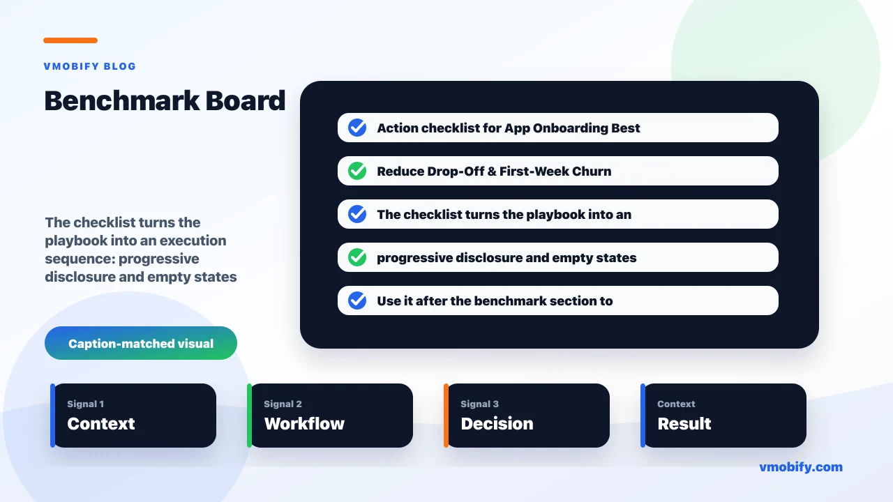
How do progressive disclosure and empty states keep new users moving?
Progressive disclosure keeps new users moving by revealing features only as they become relevant, and well-designed empty states convert the riskiest screens in the app — the blank ones — into clear next actions instead of dead ends. The instinct to teach users everything upfront is the enemy of activation; the better model is to teach nothing upfront and surface each capability at the moment it matters.
Progressive disclosure means your first session shows the user the minimum they need to reach value, and your product reveals depth over subsequent sessions through contextual prompts rather than a front-loaded tutorial. A coach mark that appears the first time a user approaches a power feature — in context, after they have already experienced the core value — converts into feature adoption far better than the same information delivered as slide four of an onboarding carousel nobody read. The discipline is to resist explaining a feature until the user is standing in front of it.
Empty states deserve far more design attention than they usually get, because they are the highest-intent, highest-risk moment in a new user's session. A fresh feed, an empty library, a zero-results search, a blank dashboard — each is a moment where the user is asking "what now?" and is one unsatisfying answer away from leaving. The fixes are concrete:
- Never ship a blank canvas with a generic "Get started" button. A new user's primary surfaces should arrive pre-populated with curated starter content, sample data, or a personalised recommendation — something to react to rather than create from nothing.
- Make the empty state prescribe the next action. Tell the user exactly what to do and why, with a single specific call to action, not a vague invitation. "Add your first holding to see live P&L" beats "Your portfolio is empty."
- Seed the first win. Where you can, complete the first meaningful action for the user — a starter playlist, a sample project, a pre-filled cart — so they experience the populated state before they have done any work.
In our portfolio, redesigning empty states with direct, personalised action prompts has lifted early-window retention on its own, without any change to the underlying features — because the change is not to what the app does, but to whether new users ever discover it. Progressive disclosure and strong empty states work together: disclosure controls when depth appears, and empty states make sure the user always has an obvious, valuable next move while that depth is still hidden. For how this feeds the wider retention curve, our retention benchmarks guide shows where feature discovery sits among the levers that move D7 and D30.
How should you adapt onboarding for India, low-end devices, and data limits?
Onboarding for India has to assume a low-end Android device, a constrained data plan, and a user who may navigate in a regional language — which means the global onboarding playbook needs three specific adaptations or it will underperform on the majority of your installs. The patterns that work in a metro-English, premium-iPhone context quietly fail on the devices that make up most of the Indian market, and the failure is invisible in blended metrics.
The three adaptations that matter most:
- Engineer for cold-start performance on entry-level Android. Sub-₹10,000 devices have RAM constraints, storage pressure, and aggressive battery-saver modes. A heavy splash, a large initial download, or a slow first render costs you users before onboarding even begins. Compress the APK, defer non-critical asset loading, and measure time-to-interactive on a real low-end device — not on the team's flagship phones. The user who abandons during a five-second cold start never reaches any of your clever onboarding.
- Make the first session data-light. Many users are actively managing a limited data plan and watching their consumption. An onboarding that streams heavy video, downloads large bundles, or auto-plays rich media upfront reads as a cost to the user. Offer a lighter first-run experience, lazy-load media, and make any data-heavy step explicitly optional. A visible data-saver posture earns trust with Tier-2 and Tier-3 users in a way a polished animation never will.
- Offer language choice before the first value moment. Surfacing content in the user's preferred regional language — Hindi, Tamil, Telugu, Bengali, Marathi and others — in the first session materially improves early retention versus English-only onboarding to the same user. A single, fast "choose your language" step before value, ideally pre-selected from device locale, is one of the highest-ROI onboarding investments for an India-first app.
Authentication is the other India-specific lever. Phone-number OTP is the expected, trusted pattern, and for any app with a transaction layer, a UPI-native flow reduces the abandonment that otherwise concentrates at the first-payment step. Treat the OTP and the payment method as part of onboarding, not as a separate concern — they sit on the critical path to value for commerce and fintech apps.
The broader point is that "the onboarding funnel" is not one funnel in India; it is at least three, segmented by device tier. Across our 300+ apps managed since 2013, the India-market apps that win instrument onboarding separately for low-end Android, mid-tier Android, and iOS, and routinely find that a flow which looks acceptable on average is catastrophic on entry-level devices. The fix there is engineering and localisation, not marketing — and it is invisible until you cut the data by device tier, which is exactly what the measurement framework below is for.
How do you measure onboarding so it produces decisions?
You measure onboarding by instrumenting every step as a discrete event, reading the funnel as a waterfall, and cutting it by acquisition source and device tier — because a blended "completion rate" hides every decision worth making. The goal of measurement is not a dashboard; it is a ranked list of the specific steps costing you the most users, in priority order, so the next sprint is obvious.
The measurement framework we deploy on every new onboarding engagement:
- Event-level funnel instrumentation. Fire a distinct event at every transition — app open, carousel viewed, sign-up shown, sign-up completed, each permission prompt, each setup step, and the first value moment. Read it as a step-by-step waterfall. The single largest drop is your highest-ROI fix, and you cannot see it without per-step events.
- Time-to-first-value as a tracked metric. Measure the elapsed time from app open to the activation moment, per user, and watch the distribution — not just the average. If a meaningful share of users take longer than 10 minutes to reach value, that tail is where your abandonment concentrates, consistent with the activation data on the 3x abandonment penalty for slow flows.
- Funnel by acquisition source. Paid Meta, paid Google, user acquisition channels, ASO, and referral users complete onboarding very differently — often 2-3x apart. A source that looks cheap on install CPA but collapses in the onboarding funnel is more expensive than it looks, and only source-segmented funnel data surfaces it.
- Funnel by device tier. Split low-end Android, mid-tier Android, premium Android, and iOS. As above, the India market in particular hides its biggest onboarding leak inside a device-tier split that the blended number averages away.
- Cohort retention by onboarding outcome. Compare D1 and D7 retention of users who reached the activation moment against those who did not. If activated users retain at 40% D7 and non-activated at 8%, your entire retention problem is an onboarding problem — and that single comparison tells you so.
This is the kind of instrumentation our analytics service builds first on any engagement, because every other retention and monetisation decision depends on it. The reporting cadence matters as much as the data: onboarding improves fastest when the funnel is reviewed weekly by the whole team, not quarterly by the analytics function. Apps that own onboarding as a shared, weekly metric improve markedly faster than apps where it lives in a monthly slide deck. The benchmark context for what "good" looks like sits in our retention benchmarks guide.
What are the most common onboarding mistakes?
The most common onboarding mistakes all share one root cause — asking the user to give something before the app has given them anything — and every one of them is fixable without changing what the product fundamentally does. These are the patterns we find most often in portfolio audits, ranked roughly by how much they cost:
- Forcing account creation before value. The single most expensive mistake. A sign-up wall in front of the first value moment routinely loses 20-40% of the users who reach it. Defer it, or offer guest mode, unless the app is genuinely unusable without an identity.
- Blasting all permissions at launch. Requesting push, location, contacts, and tracking on a blank launch screen earns denials and, on iOS, those denials are effectively permanent. Move every prompt to the moment its feature is used.
- A long value-prop carousel before anything happens. Five slides explaining the app are five chances to leave before the user has touched it. Replace explanation with experience — show the value, do not narrate it.
- Front-loaded setup and personalisation forms. Profile completion, preference selection, and configuration before value is overhead the user has no reason to tolerate. Infer what you can, defer the rest, and collect it progressively.
- Blank empty states. A "Get started" button on an empty screen is a dead end at the highest-intent moment in the session. Pre-populate, prescribe the next action, and seed the first win.
- Treating all devices and markets as one funnel. A flow tuned on a flagship iPhone can be catastrophic on entry-level Android. Without device-tier and market segmentation, your worst leak stays invisible.
- Shipping onboarding once and never instrumenting it. Onboarding that is not measured per step cannot be improved with intent — you are guessing. The teams that win treat the funnel as a living surface, reviewed weekly.
The encouraging thing about this list is that every item is correctable in a sprint or two, and the gains compound across every future cohort. AppsFlyer's resources on activation point to the same conclusion we see in practice: the first session is where the largest, cheapest retention gains in the entire product live. Fix onboarding before you spend more on acquisition, and tie the work directly to the paywall and the broader curve covered in our monetisation strategy and retention strategy guides.
If you want a structured onboarding diagnostic — funnel instrumentation, device-tier segmentation, and a prioritised fix list scoped to your specific app and market — that is exactly the work our team does across hundreds of apps. Talk to us and we will start with the step that is costing you the most.
Frequently Asked Questions
How many screens should app onboarding have?+
As few as possible before the first value moment — three or fewer is the working target. Every additional pre-value screen typically drops completion by 10-15%, so count splash screens, carousels, permission prompts, and sign-up as part of the budget, not as exceptions to it.
What is time-to-first-value and why does it matter?+
Time-to-first-value is the elapsed time from app open to the moment the user experiences the core value of the app. It matters because flows that take longer than about 30 minutes to reach value correlate with roughly 3x higher abandonment than flows under 10 minutes, per activation research. Aim to reach value inside the first session, ideally in 60-90 seconds of meaningful interaction.
Should I force users to create an account during onboarding?+
For most consumer apps, no. Deferred registration or a guest mode that lets users feel the product before asking for an account consistently lifts activation. Force sign-up at the door only when the app is genuinely unusable without an identity, such as core social or regulated fintech flows — and even then, defer heavy verification until after the user has seen value.
When should an app ask for push notification permission?+
After the first value moment, never at launch. Prime the user with a soft in-app explanation first, then trigger the real OS prompt only for users who say yes, to protect your single shot at the system dialog. Contextual, just-in-time prompts earn far higher opt-in than an upfront blast, and push opt-in rate is a hard ceiling on your most effective retention channel.
Is social sign-in better than email and password?+
For reducing friction, yes. Native platform sign-in (Sign in with Apple, Google one-tap) and social sign-in remove typing and the need to invent a password, which is the highest-friction part of the account step. For an India-first audience, phone-number OTP is usually the best primary method because it matches how users already authenticate. Email and password should be the last option, if offered at all.
How does onboarding affect paywall and subscription conversion?+
Directly. Only users who reach their activation moment ever see your paywall with genuine intent, so a leaky onboarding pre-filters your paywall audience down to a lower-intent remainder. Onboarding quality sets the ceiling on subscription conversion — no amount of pricing experimentation recovers the users who never got far enough to care.
What is the single biggest onboarding mistake teams make?+
Forcing account creation before delivering any value. A sign-up wall in front of the first value moment routinely loses 20-40% of the users who reach it, and removing it — by deferring registration or adding a guest mode — is usually the highest-ROI change in the entire flow, often lifting D1 retention 15-30% with no other product change.
Sources
- UXCam — Mobile App Retention Benchmarks — Early-window retention loss and the first-three-days drop-off curve
- Amplitude — Product Analytics Blog — Activation, time-to-first-value, and the abandonment penalty for slow flows
- Appcues — Onboarding Blog — Onboarding flow design, progressive disclosure, and contextual permission prompts
- AppsFlyer — Resources — Activation, retention, and acquisition-source benchmarks for mobile apps
- Apple — App Store Review Guidelines (section 5.1.1) — Requirement to allow access to non-account features without forced registration
- Vmobify — App Retention Strategy — The broader D1/D7/D30 retention playbook this post sits upstream of
- Vmobify — App Retention Benchmarks — Retention benchmarks by vertical and the levers that move each window
About the author
Amol Pomane — Founder, Vmobify
Amol leads Vmobify, a mobile app growth agency that has driven 30M+ downloads and ranked 54K+ keywords across 300+ apps since 2013. He writes about ASO, paid user acquisition, retention, and the operational reality of scaling mobile apps in India and global markets.
Free Growth Audit
See exactly how to scale your app with 13+ years of expertise behind you.
Get My Strategy


Social sign-in or email — which reduces more friction?
When you do ask for an account, one-click and social sign-in reduce friction more than email-and-password, so offer them first — but the bigger win is removing the password step entirely, whichever provider the user picks. Every character a user has to type at the account step is a chance to abandon, and an email-and-password form is the most typing-heavy option you can present at the most fragile moment in the flow.
The hierarchy of friction, from lowest to highest:
Two practical rules sit on top of the hierarchy. First, do not present a wall of six sign-in buttons; choice overload at the account step is its own friction. Lead with the one or two methods your audience actually uses and tuck the rest behind a "more options" link. Second, match the method to the market — Sign in with Apple and Google one-tap make sense globally, but for an India-first audience a phone-number OTP flow will out-convert a Facebook button, because it maps to how users already authenticate everywhere else in their day.
The account step is also where you should be honest about what you ask for alongside it. Do not bolt a profile-completion form, a marketing opt-in, and three permission prompts onto the sign-in screen. Get the identity, get the user back to value, and collect everything else progressively. The whole point of reducing sign-in friction is undone if you immediately replace it with a different wall.