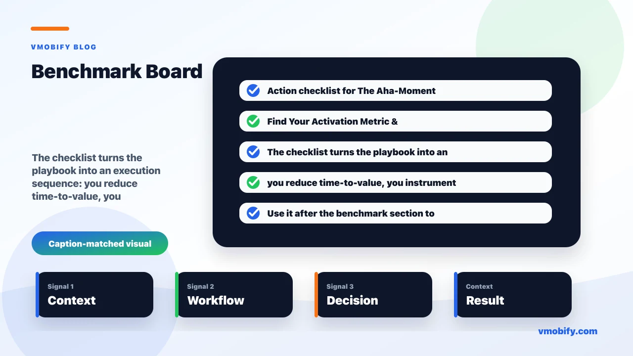
The Aha-Moment Playbook: Find Your Activation Metric & Time-to-Value
Activation is the moment a new user first feels your app's core value — and it predicts retention better than any vanity metric. This playbook shows how to find your activation metric, shorten time-to-value, instrument it properly, and run experiments that move the number.

What are app activation and the aha moment?
Activation is the moment a new user first experiences the core value your app exists to deliver — the "aha moment" — and the activation rate is the percentage of new users who reach that moment within a defined window. Everything before it is cost: an install, a sign-up, a permissions prompt, a tour. Activation is the first point where the user gets something back.
The terms get used loosely, so it is worth separating them. The aha moment is the qualitative experience — the instant the product "clicks" and the user understands why it is worth their time. The activation metric is the measurable proxy for that moment: a specific event, or sequence of events, that reliably stands in for "this user got the value." The activation rate is the share of a new-user cohort that hits the metric. Amplitude's widely-read primer on the aha moment frames it as the point where a user realises the product's value for the first time — and the whole discipline of activation is about engineering that realisation to happen earlier and for more people.
Why does this deserve a playbook of its own rather than a line in an onboarding doc? Because activation is the hinge between acquisition and retention. You can buy installs and you can polish a sign-up flow, but neither matters if users never reach the value. Across our 300+ apps managed since 2013, the single most common growth pathology we diagnose is not a traffic problem or a creative problem — it is a leaky funnel between install and first value, where users arrive, never reach the aha moment, and quietly churn inside the first week.
The practical definition we work from with clients: an activation metric is a single, observable user action (or short chain of actions) that (a) correlates strongly with users sticking around, (b) is achievable early, and (c) a meaningful fraction of new users currently fail to reach. Hold those three properties in mind — the rest of this playbook is about finding the metric that satisfies all three, then moving the rate that hits it.
What do famous activation metrics teach you?
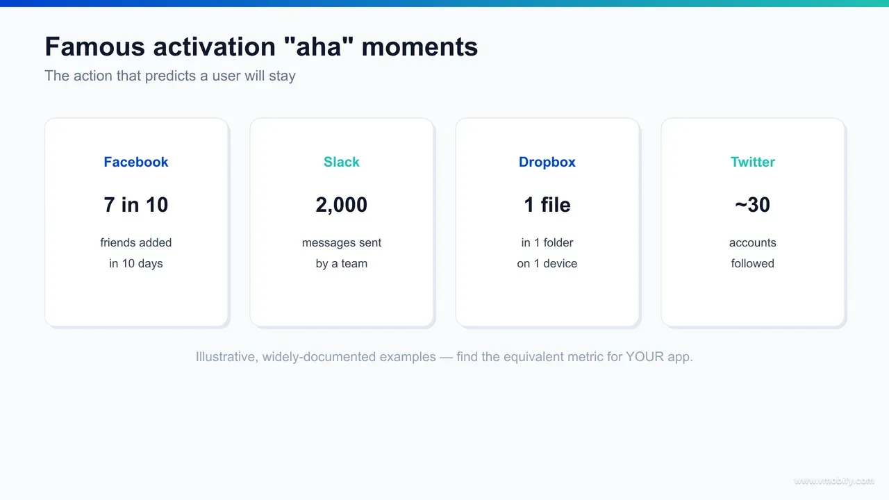
The famous activation metrics — Facebook's "7 friends in 10 days", Slack's "2,000 messages sent", Dropbox's "put one file in one folder", and Twitter's "follow around 30 accounts" — are widely-cited product teardowns, and they all teach the same lesson: tie activation to the action that delivers value, not the action that registers a user. These are illustrative, well-documented cases worth reasoning about rather than copying.
- Facebook — "7 friends in 10 days": the value of a social network is the social graph. A user with no connections sees an empty feed and leaves. Facebook's early growth team is famous for identifying that users who reached a threshold of friends within their first stretch of days were dramatically more likely to stick. The lesson: the metric points at the source of value (your network), and it is time-bounded so it forces urgency.
- Slack — "2,000 messages sent": Slack's value is a team habit, not an individual feature. A team that has exchanged thousands of messages has woven the tool into its daily work; a team that sent twenty has not. The famous threshold is a team-level activation metric, which is the lesson — for collaboration tools, the unit of activation is often the account or workspace, not the single user.
- Dropbox — "put one file in one folder": the genius here is how low the bar is. The core value of Dropbox is "your file is now everywhere", and you only feel it once a file is actually in the system. The activation metric is a single, concrete, achievable action that crosses the threshold from "empty product" to "my data is in it." The lesson: the action should be the smallest step that delivers real value, not a grand milestone.
- Twitter — "follow ~30 accounts": like Facebook, Twitter's value is the feed, and the feed is only good once you follow enough people to fill it. The widely-discussed "around 30 follows" figure is the point where a new user's timeline becomes alive rather than barren. The lesson: for content products, activation is about populating the experience to a density where it sustains itself.
Read across the four and a pattern emerges. None of them is "completed sign-up" or "finished the tour." Each names the specific action that crosses the user from empty product to working product — and each is set at the threshold where value becomes self-evident. That is the template. Your number will be different, but its shape — value action, achievable early, time-bounded, correlated with retention — will rhyme with these. As Lenny Rachitsky's writing on activation and growth repeatedly stresses, the teams that win do not borrow another company's number; they borrow the method and derive their own.
Why does activation predict retention?
Activation predicts retention because it is the first behavioural proof that a user understands and wants what your app does — and a user who has felt the value once has a reason to come back, while one who never reached it does not. Retention is not random; it is downstream of whether the early experience paid off.
The mechanism is straightforward. Retention is a repeat-behaviour problem, and repeat behaviour needs a reason. The aha moment supplies that reason: it is the memory the user carries forward of "this app did something useful for me." Users who activate enter their second session with intent. Users who never activated enter it — if they enter it at all — with nothing but the friction they remember. This is why activation rate is a leading indicator while retention is a lagging one: activation happens in the first session or two, but its consequences play out over the following weeks.
This is also why activation is so much more actionable than retention itself. Day-30 retention is a number you cannot influence for thirty days; activation rate is a number you can move this week and watch ripple forward. The strongest activation metrics are the ones where the gap between activated and non-activated cohorts in later-week retention is large and stable — the metric earns its place precisely because that gap is wide. For a structured view of what "good" looks like downstream, our breakdown of app retention benchmarks shows how steeply most apps lose users in the first seven days, which is exactly the window activation is fighting over.
There is an important caveat that we will return to in the pitfalls section: correlation between an early action and later retention does not, on its own, prove the action caused the retention. Heavy users do lots of things early; some of those things are causes of stickiness and some are just symptoms of an already-engaged user. The reason activation is predictive when done well — and misleading when done badly — comes down entirely to whether you validated the metric or merely observed a correlation. The famous examples earned their status because the teams behind them tested the metric, not just charted it. Industry retention data from sources like AppsFlyer's State of App Marketing consistently shows the steepest drop-off occurring in the first days after install — the period activation is designed to survive.
How is activation different from onboarding and retention?
Onboarding is the guided path you build, activation is the value milestone at the end of that path, and retention is the repeat behaviour that follows once the value has landed — three different things that teams routinely conflate, to their cost. Getting the distinction right is what stops a team from optimising the wrong layer.
- Onboarding is the means: the sequence of screens, prompts, permission requests, sample data, and nudges that move a new user toward value. It is a designed experience you control end to end.
- Activation is the milestone: the moment, somewhere in or just after onboarding, where the user actually reaches the core value. It is an outcome you can measure but cannot directly draw — you can only make it more likely.
- Retention is the result: the user coming back, repeatedly, because the value was real and is worth returning for. It is the lagging consequence of activation done well.
The most common failure we see is optimising onboarding in isolation — A/B testing the colour of a button on screen three, shortening a tour from five steps to four — with no defined activation metric to optimise toward. That is motion without direction. You can make onboarding shorter, prettier, and more "completed" while making activation worse, if the steps you cut were the ones that delivered the value. The number that tells you whether onboarding is working is the activation rate, not the onboarding-completion rate. A user who finishes your tour but never does the value action is not activated; a user who skips your tour entirely and goes straight to the value action is.
The right mental model is a chain: install → onboarding → activation → retention → habit. Each link has its own metric, and you diagnose by finding which link leaks most. If installs are healthy but activation is low, your onboarding is failing to deliver value fast enough — fix the path. If activation is healthy but retention is low, the value is real but not recurring — that is a product or habit-loop problem, not an onboarding one. Treating these as one undifferentiated "growth" problem is how teams pour effort into the wrong place. For the path-design half of this equation, our guide to app onboarding best practices covers the screens; this post covers the milestone they should be aiming at, and our app retention strategy guide covers what happens after the value lands.
How do you find your own activation metric?
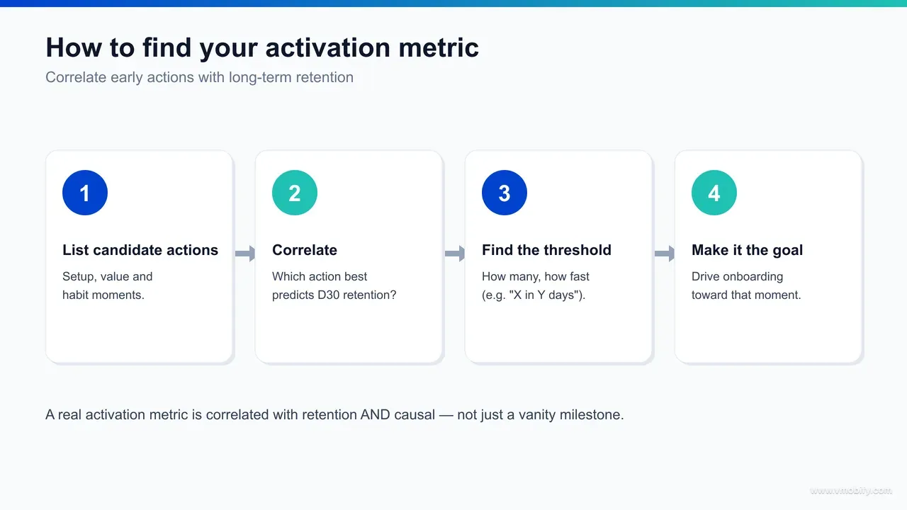
You find your activation metric by comparing the early behaviour of users who retained against users who churned, then isolating the action — at the threshold and within the timeframe — that best separates the two groups and that you can plausibly cause more users to take. It is part data analysis, part product judgement, and it cannot be skipped by copying someone else's number.
The method, the way we run it with clients, has four stages:
- Split your cohort by outcome. Take a cohort of new users old enough to have a retention verdict — say, everyone who installed 8-12 weeks ago. Label each user "retained" or "churned" by whatever your meaningful retention definition is (still active in week 4, for instance). You now have two populations to contrast.
- List candidate value actions. Brainstorm the actions that plausibly represent "got value" — not sign-up or tour-completion, but the things your product is for: sent a message, completed a workout, made a transfer, saved an item, invited a teammate, finished a lesson. These are your candidate aha moments.
- Test each candidate for separation and timing. For each candidate action, measure how strongly "did this action in the first N days" correlates with being in the retained group, and find the threshold (one time? three times? a count like Slack's 2,000?) and the window (first session? first 10 days, like Facebook?) that maximise the gap. The best candidate is the one where activated users retain far better than non-activated ones, where the bar is reachable early, and where a sizeable share of users currently miss it (so there is room to improve).
- Pressure-test causality, not just correlation. Before you commit, ask the hard question: is this action a cause of retention or merely a symptom of an already-engaged user? The way to settle it is an experiment (covered below) — nudge a random half of new users toward the action and see if their retention rises. If it does, you have an activation metric. If it does not, you have a vanity correlation.
The three properties from the opening section are your filter throughout: correlation with retention, reachability early, and current miss rate. A metric that 95% of users already hit is useless as a lever — there is nothing to improve. A metric that correlates perfectly but takes three weeks to reach is too late to design onboarding around. You are hunting for the action that sits in the sweet spot of all three. Amplitude's broader writing on product analytics and the North Star describes the same triangulation — find the behaviour that is both predictive and movable, then make your whole funnel point at it. This analysis is exactly the kind of work our analytics service runs as a first engagement: before touching onboarding, define the number it should be optimising toward.
How do you reduce time-to-value?
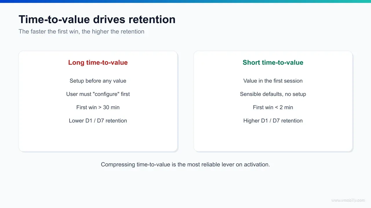
You reduce time-to-value (TTV) by removing everything between install and the aha moment that is not strictly required to deliver value — cutting setup steps, deferring non-essential friction, pre-filling and importing data, and front-loading the payoff so the user feels the value before you ask anything of them. TTV is how long it takes a new user to reach activation, and shortening it is usually the highest-impact retention work available.
The logic is simple: every second and every step between install and value is a chance to lose the user, and the curve is brutally front-loaded — most abandonment happens in the first minutes. So the question for every element of your first-run experience is the same: does this help the user reach value faster, or does it delay value? Anything in the second category is a candidate for deletion or deferral. The tactics that move TTV most:
- Cut and reorder setup steps. Audit your onboarding for steps that exist for your convenience, not the user's value — profile fields you could collect later, settings with sensible defaults, "let us explain everything first" tours. Defer them past the aha moment. Dropbox's "one file in one folder" works because the path to it is almost nothing; copy that ruthlessness.
- Defer friction that does not gate value. Permission prompts, account creation, and paywalls placed before the aha moment are TTV killers. Where the value can be delivered first, deliver it — let users feel the payoff, then ask for the notification permission or the sign-up. A user who has felt value says yes far more often.
- Pre-fill, import, and template. An empty product has a long TTV because the user must build the value themselves. Seed it: import contacts to populate a graph, offer templates, suggest accounts to follow (Twitter), surface sample content. Every bit of value you can manufacture for the user shortens the distance to their own aha moment.
- Front-load the payoff. Restructure the flow so the most valuable moment comes as early as possible. If your app's magic is a transformation, show the transformation on step one with sample data rather than after a five-minute setup. Demonstrated value beats promised value.
In our portfolio, TTV reduction is consistently the fastest win we can deliver on a struggling app — faster than new acquisition channels and far cheaper. We have repeatedly seen apps lift early-week retention by reordering a first-run flow so the value action moved from step six to step one, with no change to the underlying product at all. The cost of that work is days; the return compounds across every future cohort, because a TTV improvement applies to every user you will ever acquire, not just this week's. Mobile engagement data from sources like Adjust's resource hub reinforces the same point — the apps that retain are the ones that deliver value before the first session ends, while the rest leak users in the opening minutes. Reducing TTV is also what makes paid acquisition pay off: there is no point driving installs through user acquisition into a funnel that loses them before they ever reach value, because you are simply paying to fill a bucket with a hole in the bottom.
How do you instrument and measure activation?
You instrument activation by defining the activation event explicitly in your analytics, firing it the instant a user crosses the threshold, and then reporting the activation rate per acquisition cohort alongside the time-to-value distribution — so you can see not just how many users activate, but how long it takes them. If the event is not defined and tracked, activation is a slogan, not a metric.
The instrumentation checklist we apply:
- Define one explicit activation event. Translate your activation metric into a single tracked event — e.g. activated fires when a user reaches the threshold (their Nth message, first transfer, completed first lesson). Fire it once, server-side where possible for reliability, and stamp it with the cohort and time-since-install. Do not infer activation by stitching together five events at report time; define it once, cleanly.
- Report activation rate by cohort, not in aggregate. A single lifetime activation rate hides everything. Break it by acquisition cohort (week of install), by channel, and by platform. A drop in activation for one channel's users usually means that channel is sending low-intent traffic — an acquisition-quality signal you would otherwise miss.
- Track the time-to-value distribution, not just the average. Average TTV is misleading because it is skewed by a long tail. Look at the distribution: what share activate in the first session, the first day, the first week? Where the curve flattens is where you are losing people permanently — those users will almost never come back to activate later.
- Build the activation funnel. Instrument each step between install and the activation event so you can see where non-activating users fall out. The biggest single drop-off step is your highest-priority fix. This funnel is the diagnostic that turns "activation is low" into "activation is low because 40% of users abandon at the permission prompt on step three."
A measurement discipline worth stating plainly: segment retention by activated-versus-not on an ongoing basis, because that gap is the ongoing proof your metric is still valid. If the retention gap between activated and non-activated cohorts ever collapses, your activation metric has stopped meaning what it used to — products change, and a metric that was predictive at launch can decay. We treat activation instrumentation as a living system, not a one-time setup, and revisit the definition whenever the product shifts materially. Getting this measurement layer right is foundational; it is the same rigour our analytics work brings to every retention engagement, and it is the prerequisite for the experiments in the next section.
How do you run an activation experiment?
You run an activation experiment by forming a hypothesis about why users fail to activate, randomly assigning new users to a control and a treatment that changes one thing in the path to value, and then comparing activation rate and downstream retention between the groups — proving the change caused the lift rather than merely correlating with it. This is the step that separates a validated activation metric from a hopeful guess.
The structure of a good activation experiment:
- Start from the funnel's biggest leak. Use your activation funnel to find the step where most non-activating users drop out, and form a specific hypothesis: "users abandon at the empty-state because there is nothing to act on — if we seed sample data, more will reach the value action." A hypothesis names the cause, the change, and the expected effect.
- Change exactly one thing. Treatment alters a single variable in the path to value — defer the permission prompt, pre-fill the first item, move the value action earlier, add a single guiding nudge. One variable keeps the result interpretable; bundle five changes and a win tells you nothing about which one worked.
- Randomise and power the test. Randomly assign incoming new users to control or treatment, and run until you have enough users per arm to detect a realistic effect. Under-powered activation tests are the norm and the reason so many "inconclusive" results are really just too-small samples.
- Measure activation rate and retention, not just clicks. The treatment must lift the activation rate — but you also check that downstream retention rises with it. A change that increases the activation event but not retention has gamed the metric, not improved the product. This dual check is your guard against optimising a vanity number.
- Ship the winner, then attack the next leak. Activation work is iterative. Ship what wins, re-cut the funnel, find the new biggest drop-off, and repeat. Each cycle compounds, and the cumulative lift across a year of disciplined iteration is typically far larger than any single redesign.
The non-negotiable principle running through all of it: an experiment is how you earn the right to call something an activation metric. Observing that users who follow 30 accounts retain better is a correlation; nudging a random half of users to follow more accounts and watching their retention rise is causal proof. The famous examples are famous because the teams behind them ran this loop, not because they charted a correlation and stopped. Reaching the value moment faster, for more users, validated by experiment — that is the entire job. To go deeper on the measurement and benchmarking side, our retention benchmarks guide gives you the downstream numbers to judge whether an activation lift is actually moving the business.
Which pitfalls cost teams the most?
The costliest activation mistakes are the vanity aha moment, confusing correlation with causation, optimising onboarding-completion instead of activation, setting the threshold or window wrong, and letting a once-valid metric decay without revalidating it. Each one quietly sends a team's effort in the wrong direction while the dashboard looks busy.
- The vanity aha moment. This is the big one. A vanity aha moment is a milestone that correlates with engaged users but does not cause retention — typically because it is just something heavy users happen to do early. Build your whole onboarding around it and you will herd users toward an action that does not actually make them stick, while feeling productive the whole time. The antidote is the experiment in the previous section: never crown a metric on correlation alone.
- Correlation mistaken for causation. Closely related, and worth stating twice because it is so seductive. "Users who do X retain better" is the start of an investigation, not the end. Until you have nudged X and watched retention move, you do not know whether X causes retention, retention causes X, or a third factor causes both.
- Optimising onboarding-completion. As covered earlier, a finished tour is not an activated user. Teams that report "onboarding completion up 20%" while activation is flat have optimised the wrong number. Always tie onboarding changes back to the activation rate.
- Wrong threshold or window. Set the bar too high (a count almost no one reaches early) and your activation rate is uselessly low and unmovable; set it too low (something nearly everyone does) and it predicts nothing. Set the window too long and the metric is too late to design around. The threshold and timing are part of the metric, not afterthoughts — derive them from the data, as in stage three of the finding method.
- Letting the metric decay. A metric that was predictive at launch can stop being predictive after a redesign, a new feature, or a shift in who you acquire. In our portfolio we have seen activation metrics quietly go stale after a major product change — the team kept optimising a number that no longer separated retained from churned users. Revalidate the activation-versus-non-activation retention gap on a schedule.
The thread connecting every pitfall is the same: activation is a causal claim about value, and causal claims have to be earned with evidence, not assumed from a chart. Get the metric right — validated, correctly thresholded, instrumented, and kept honest over time — and it becomes the most useful single number your growth team owns. Get it wrong and it becomes an expensive way to feel productive. If you want help deriving and validating your activation metric, shortening time-to-value, and building the experiment loop around it, that is exactly the work our team does — talk to us and we will start where every good activation programme starts: with the data on who stays and who leaves.
Frequently Asked Questions
What is an aha moment in an app?+
The aha moment is the point where a new user first experiences your app's core value — when the product "clicks" and they understand why it is worth their time. The activation metric is the measurable event that stands in for that moment, and the activation rate is the share of new users who reach it.
What is the difference between activation and onboarding?+
Onboarding is the guided path you design to move a new user toward value; activation is the value milestone at the end of that path. A user can complete onboarding without activating, and can activate without completing onboarding — so you should measure the activation rate, not the onboarding-completion rate.
What is time-to-value (TTV)?+
Time-to-value is how long it takes a new user to reach the aha moment after installing. Shortening it — by cutting setup steps, deferring non-essential friction, pre-filling data, and front-loading the payoff — is usually the highest-impact retention work an app can do, because most abandonment happens in the first minutes.
How do I find my app's activation metric?+
Compare the early behaviour of users who retained against those who churned, list your candidate value actions, then find the action, threshold, and timeframe that best separate the two groups and that a meaningful share of users currently miss. Finally, validate it with an experiment to confirm it causes retention rather than merely correlating.
Are famous activation metrics like Facebook's 7 friends something I should copy?+
No — copy the method, not the number. Facebook's "7 friends in 10 days", Slack's "2,000 messages", Dropbox's "one file in one folder", and Twitter's "follow ~30 accounts" all tie activation to the value action at a threshold where value becomes self-evident. Your own number will be different; derive it from your own retention data.
What is a vanity aha moment?+
A vanity aha moment is a milestone that correlates with engaged users but does not actually cause retention — usually because it is something heavy users happen to do early rather than a driver of stickiness. Building onboarding around it wastes effort. Avoid it by validating every candidate metric with a controlled experiment before committing.
How does Vmobify help with activation?+
We start with the data on who stays and who leaves to derive and validate your activation metric, then instrument it properly through our analytics service, shorten time-to-value by reworking the path to the aha moment, and run the experiment loop that proves each change lifts retention. See /services/analytics for the measurement side of that work.
Sources
- Amplitude — The Aha Moment — Definition of the aha moment as a user's first realisation of product value
- Amplitude — Product analytics blog — North Star metric and time-to-value framing for activation
- Lenny's Newsletter — Activation method and growth teardowns — derive your own metric, do not copy
- AppsFlyer — State of App Marketing — Early-window retention drop-off that activation is designed to survive
- AppsFlyer — Performance Index — Acquisition-quality context for activation rate by channel
- Adjust — Resources hub — Mobile retention and engagement benchmarks
- data.ai — State of Mobile — Industry context on app engagement and retention trends
About the author
Amol Pomane — Founder, Vmobify
Amol leads Vmobify, a mobile app growth agency that has driven 30M+ downloads and ranked 54K+ keywords across 300+ apps since 2013. He writes about ASO, paid user acquisition, retention, and the operational reality of scaling mobile apps in India and global markets.
Free Growth Audit
See exactly how to scale your app with 13+ years of expertise behind you.
Get My Strategy

