How to Choose Screenshots for a Serious Product Audit
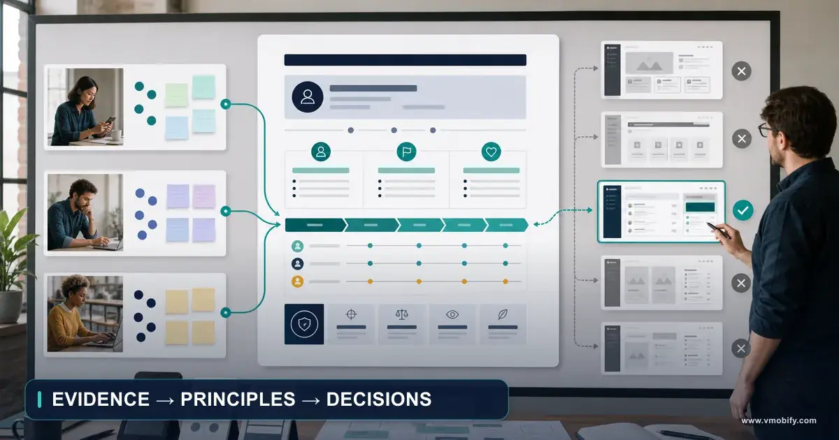
Most audit folders contain hundreds of images and almost no evidence: polished happy paths, inconsistent crops, no error states, and design concepts sitting unlabelled beside production captures. This is the method we use instead — choosing every screenshot backward from the claim it has to prove.

On this page
- What must a screenshot prove before it belongs in a product audit?
- Why do most screenshot collections fail as evidence?
- How do you build the capture plan from the product inventory?
- Capture 1 — what makes a baseline screenshot authoritative?
- Capture 2 — how do you isolate a problem without destroying the evidence?
- Capture 3 — how should exploration and design-board images be labelled?
- Capture 4 — what has to stay identical between baseline and result?
- Capture 5 — which difficult states must you capture deliberately?
- Capture 6 — how do you prove behaviour rather than appearance?
- How do you build a screenshot selection matrix before capturing?
- Why must geometry-only edits never regenerate the product interface?
- How do you make a before-and-after comparison fair?
- How do you stop a proposal being mistaken for a shipped screen?
- How do you redact safely and name assets so they survive the project?
- Which capture-quality standards actually matter?
- What does a ready-to-use screenshot evidence brief look like?
- Which mistakes cost the most here?
- Frequently Asked Questions
What must a screenshot prove before it belongs in a product audit?
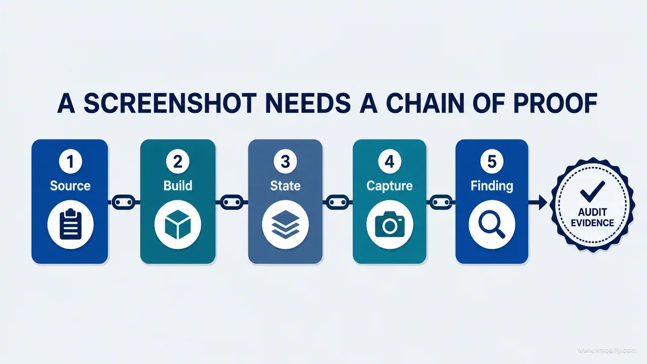
A screenshot belongs in an audit only when it proves a claim: what existed, under which conditions, why it mattered, or whether the shipped result actually solved the problem. If an image does none of those jobs, it is decoration, and decoration is what turns an audit into a slide deck.
The distinction sounds obvious until someone opens the evidence folder and finds four hundred files called IMG_4821, final-home-new and Screenshot 2026-07-18 at 14.32. Every happy path is beautifully captured. The crops are all slightly different. Not one error state is present. Design concepts sit next to production captures with nothing to separate them, and nobody can say which platform or build any of it came from. That folder has volume. It has no evidence.
For every claim that matters, capture a sequence rather than a picture:
- Baseline — what the user actually saw before the change.
- Problem — the specific defect or ambiguity, annotated narrowly.
- Exploration — the concept or design board used to test a direction.
- Implementation — the result running in a real build.
- Difficult state — the same surface when empty, loading, offline, denied, unentitled or fed unusual data.
- Verification — evidence that the result behaves correctly, not merely that it looks different.
Not every finding needs all six frames. Every conclusion you intend to defend needs enough of them that a second person can reconstruct the decision without asking you what happened. That is the whole test: could a reviewer who was not in the room reach the same conclusion from these images alone?
This is part 04 of our AI product development methodology series. It takes the surfaces and states catalogued by the inventory stage and turns them into images somebody can be held to, which is what the strategy stage after it consumes.
The governing rule follows from it. Choose screenshots from the claim backward, never from the camera roll forward. Capture-first produces a gallery and then hunts for a story. Claim-first produces a shot list, and a shot list can be reviewed, delegated, and checked off before a single image is taken.
We worked this method out while auditing a child-growth tracking app we had built independently for iOS and Android — profiles, measurements, percentile charts, exported reports, AI-generated explanations, subscriptions, notifications and privacy controls, almost all of it data-dependent. One attractive dashboard capture could not tell us whether an empty profile made sense, whether an offline edit recovered safely, whether a premium gate was legible, or whether a corrected measurement propagated into last month's report. The screenshot method had to represent the product as a system, not make the audit look convincing.
Why do most screenshot collections fail as evidence?
Most collections fail in four predictable ways: three of them follow from capture starting before the claims existed, and the fourth is introduced later, while the document is being assembled. Each one has a recognisable symptom, which is useful — you can diagnose a folder in about two minutes without reading a word of the audit.
The gallery problem. A gallery answers "what does the product look like?" An audit has to answer "what is true about the product?" You can recognise this failure by counting: ten variations of the dashboard, and nothing at all for account deletion, failed export, permission denial or subscription restoration. Coverage has followed visual appeal instead of product risk. The fix is mechanical — coverage is allocated by consequence, which is the subject of the next section.
Happy-path bias. Teams capture screens with complete data and successful actions, because those are easier to stage and more flattering. They are also precisely where a mature product is least likely to fail. Trust is tested when data is missing, delayed, invalid, stale or contradictory. The symptom here is an evidence folder with no red in it anywhere — no error copy, no empty illustration, no disabled button.
The concept-production blur. A design board expresses intent; it cannot prove implementation. Put an unlabelled concept beside a production capture and a reviewer will read the aspiration as shipped behaviour. This one is genuinely dangerous because it is invisible in the moment and only surfaces later, when someone asks why the feature they signed off on is not in the build. The symptom is a caption that says "new measurement screen" without saying whether that screen exists.
Fidelity loss in presentation. Screenshots are damaged most often during layout, not during capture. A tool regenerates a phone frame, rewrites tiny interface text, nudges spacing, or replaces real content while "improving" the composition. A crop removes the navigation context that made the problem legible. Two before-and-after images end up using different devices, different datasets and different scroll positions. The result is visually persuasive and evidentially worthless, and it is the failure we now guard against hardest.
In our audit work, the useful evidence sets have not been the ones with the most images. They have been the ones where every image was attached to a sentence somebody was willing to defend.
How do you build the capture plan from the product inventory?
Build the shot list from the product inventory, never from memory — the inventory already knows every surface, state and dependency that a walkthrough will forget. If you have not built one yet, that is the previous step in this series: a complete product inventory before any redesign.
Give every surface a stable identifier first. Identifiers are what let a screenshot, a finding, a fix and a verification frame all point at the same thing six weeks later:
AUTH-01   Welcome
HOME-01   Overview
DATA-02   Add measurement
CHART-01  Growth chart
REPORT-03 Export preview
SET-04    Privacy controls
Then add a coverage column to the inventory, one row per claim rather than one row per screen:
SURFACE | CLAIM OR RISK                          | REQUIRED STATE   | PLATFORM      | STATUS
DATA-02 | Invalid entry explains the correction  | Validation error | iOS + Android | Needed
CHART-01| Sparse history stays understandable    | One data point   | iOS + Android | Needed
REPORT-03| Failure preserves the user's work     | Export failure   | Android       | Needed
SET-04  | Revoking consent is understandable     | Confirmation     | iOS           | Captured
The change in question is what makes this work. The team stops asking "which screens should we include?" and starts asking "which claims and risks currently have no evidence?" The second question has a finite, checkable answer.
Allocate evidence by consequence, not evenly. Give more frames to decisions that are safety- or privacy-sensitive, financially consequential, hard to reverse, dependent on asynchronous work, divergent across platforms, frequently used, easy to misunderstand, historically unreliable, or connected to several downstream surfaces. A decorative onboarding page needs one baseline image. A measurement edit that changes a chart, an insight, a timeline and an export needs a full sequence across four surfaces.
If the product ships in India or any similar market, add three coverage rows that Western-default capture plans almost always skip. First, a low-end Android device on a small screen — the layout that survives a 6.7-inch flagship often breaks at 360dp with the system font scaled up. Second, an intermittent-network state rather than a clean offline state, because a request that hangs for eleven seconds and then half-succeeds behaves differently from one that fails immediately. Third, a Devanagari or Tamil string in every field where a name, a title or a unit appears; the same label that fits comfortably in English will wrap, truncate or clip its ascenders, and you want that in the audit rather than in a store review.
Capture 2 — how do you isolate a problem without destroying the evidence?
The problem frame should annotate the smallest defensible area and leave everything else inspectable, because an annotation that covers the interface removes the reader's ability to check your reading of it. Annotation is argument, and an argument that hides its own source material is weak.
The problem image is usually the baseline with one or two numbered callouts, or a second capture taken at the moment the issue becomes visible. Either way, it must connect to a written claim precise enough to be wrong:
CHART-01 / E017
With one recorded measurement, the growth chart renders an
empty-looking grid and does not explain that a trend requires
at least two measurements.
Evidence: CHART-01-sparse-ios-2.8.0-E017-baseline.png
That is a claim. "Chart is confusing" is a mood. The first names the surface, the condition and the observed consequence, so an engineer can reproduce it and a designer can disagree with it.
What to do when annotating:
- One numbered marker per finding, with the legend underneath the image rather than on top of it.
- Thin outlines around precise regions — a rectangle around the empty grid, not around the whole screen.
- Short arrows that stop before the control they point at.
- High-contrast colours that cannot be confused with the product's own palette. Do not rely on red and green alone to carry meaning; WCAG's use-of-colour criterion applies to your audit document as much as to the product it is auditing.
- Zoomed details only when the full-context frame stays available beside them.
What destroys the evidence:
- Large opaque boxes parked over the part of the screen a reader might want to check.
- Rewriting interface copy inside the screenshot to make the point clearer. This is falsification, however well intentioned.
- Decorative arrows with no corresponding finding.
- A dozen findings stacked onto one image because recapturing felt like effort.
- Device frames that crop away the system or navigation context the finding depends on.
Always keep an unannotated original next to every annotated derivative. The derivative explains; the original is the evidence. When someone challenges a finding — and on a good team someone will — you hand over the original, not a redraw.
Capture 3 — how should exploration and design-board images be labelled?
Every exploration image must be labelled as a proposal in the image itself, not only in the caption, because captions get separated from images the moment anyone pastes one into a chat. A sketch, a design board, a prototype frame or a generated concept exists to show which alternatives were considered — never to imply that one of them shipped.
The label we use is deliberately ugly, because ugly labels survive:
PROPOSED — design board, not production UI
Generated concept. Copy, icons and data are illustrative.
Do not treat any control shown here as implemented.
Burn that into the image, in the image's own margin. A caption in a document is metadata; a burned-in label travels with the pixels into Slack, into a screenshot of the audit, into a deck someone rebuilds three months later from the images alone.
Be specific in the caption about what the concept is reliable for. Generated and hand-drawn concepts are genuinely useful for discussing hierarchy, density, mood and composition — the questions of what should dominate a screen and what should recede. They are unreliable for exact functionality, for copy, for iconography and for any number rendered inside them. If a generated visual contains invented labels or invented data, say so explicitly rather than hoping nobody reads them closely. Somebody always reads them closely, usually in the meeting where you least want the conversation.
A practical convention that removes most of the remaining ambiguity: keep exploration images in a separate directory from evidence, with a different filename prefix, and never let an exploration file cross into the evidence folder. Directory boundaries enforce themselves; conventions inside a single folder do not. In our portfolio, the audits where proposals and production captures shared a directory are the same audits where somebody eventually asked why a feature had been "removed" that had never been built.
One thing exploration frames should carry that people often omit: the reason the direction was rejected, when it was. A board with a one-line note reading "rejected — hides the source field that the support queue asks about weekly" is worth more later than the three boards that were accepted, because it stops the same idea being re-proposed every quarter.
Capture 4 — what has to stay identical between baseline and result?
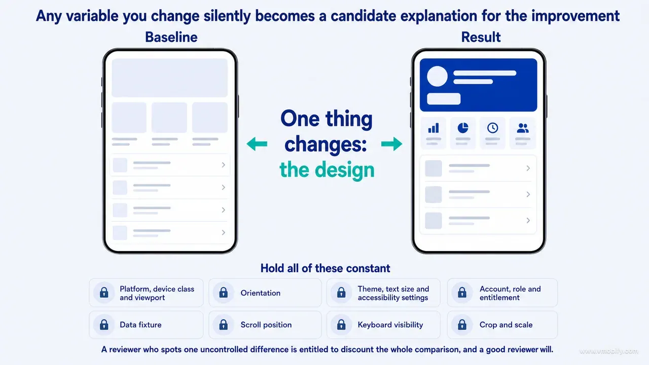
The implementation capture must come from a runnable build and reproduce the baseline's scenario exactly, because any variable you change silently becomes a candidate explanation for the improvement. A reviewer who spots one uncontrolled difference is entitled to discount the whole comparison, and a good reviewer will.
Hold all of these constant between the baseline and the result:
- Platform, device class and viewport
- Orientation
- Theme, text size and accessibility settings
- Account, role and entitlement
- Data fixture
- Scroll position
- Keyboard visibility
- Crop and scale
Where one of them genuinely has to change, disclose it in the caption in plain words: "captured on a taller device because the redesigned form no longer fits the original viewport" is honest and still persuasive. Silence is what turns a legitimate change into a credibility problem.
The single most common uncontrolled variable is the dataset. A fuller, tidier set of data makes almost any screen look better, and it is the easiest thing in the world to introduce accidentally — you rebuilt the app, the seed data changed, and now the "after" chart has eight points where the "before" had one. This is why a named, versioned fixture matters more than any capture technique in this article. Fixtures make comparisons repeatable; ad-hoc test data makes them anecdotes.
Note also what an implementation capture does not establish. It shows that a screen renders. It says nothing about whether the value was written, whether the dependent surfaces refreshed, or whether the operation survives a restart. That is a separate frame, and it is the one teams skip most often.
Capture 5 — which difficult states must you capture deliberately?
Difficult states are the whole point of a screenshot audit, because a mature product almost never fails on the happy path — it fails when data is missing, delayed, denied or strange. These states also have to be staged deliberately; you will not stumble into them during a walkthrough.
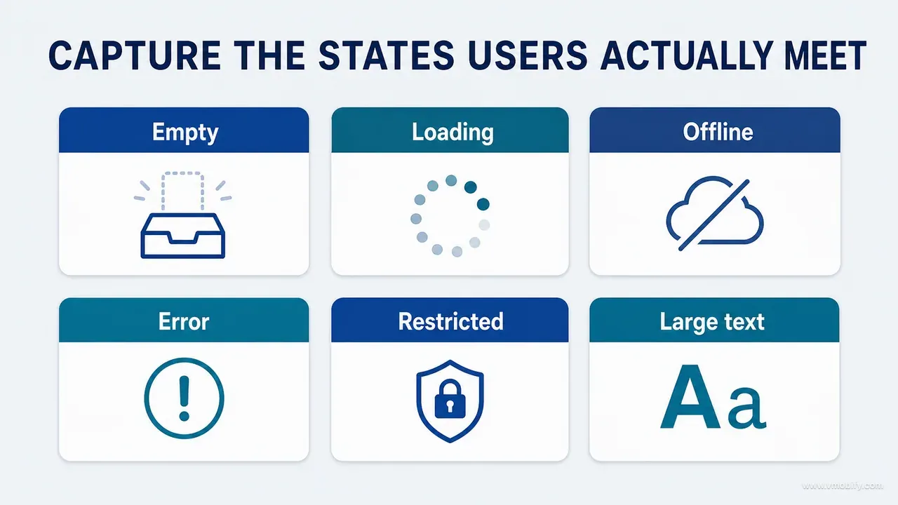
Work through this list for every consequential surface and capture the ones that can occur:
- Empty data, and first-run empty versus deliberately-cleared empty
- Loading, and slow loading past the point where a user expects feedback
- Recoverable error, with the retry affordance visible
- Offline, and stale-but-shown content
- Permission denied, and permission revoked after previously being granted
- Authentication expired mid-task
- Subscription required, expired, or restored
- Invalid input, and input that is valid but implausible
- Partial data, where one dependency answered and another did not
- Very large values, very long names, and deeply unusual units
- Largest supported text size at the narrowest supported width
- Destructive confirmation
- Interrupted or cancelled work
Empty states deserve particular attention because they are the state most likely to be treated as a rendering accident rather than a designed screen. Nielsen Norman Group's guidance on empty-state design is blunt about what an empty screen owes the user: an explanation of why it is empty and a clear next action. Capture yours and check it against that bar. Error copy deserves the same treatment: capture the message, then check it against Nielsen Norman Group's error-message guidelines, cited at the end of this article, rather than against taste — does the message say what went wrong, in the user's language, and what to do next?
On the growth product, a chart with a full year of data told us nothing useful. What told us something was a single measurement, an age boundary where the reference curves change, a metric switch mid-session, and a failed refresh that left last week's numbers on screen with no indication they were stale. That last one is the state we now look for first in every audit, on every product: does the interface admit when what it is showing is old? Finance, health, commerce and logistics products all fail in the same place.
Capture text-size and width extremes as a pair rather than separately. Apple's guidance on accessibility in the Human Interface Guidelines and the WCAG reflow criterion both point at the same failure mode, and the failure only appears when large text and a narrow container happen together.
Capture 6 — how do you prove behaviour rather than appearance?
A verification frame shows the condition that closes the claim — a persisted record, a propagated correction, a restored entitlement — because a screen can render perfectly while writing the wrong value. Implementation and verification are different evidence classes, and conflating them is the most expensive mistake in this article.
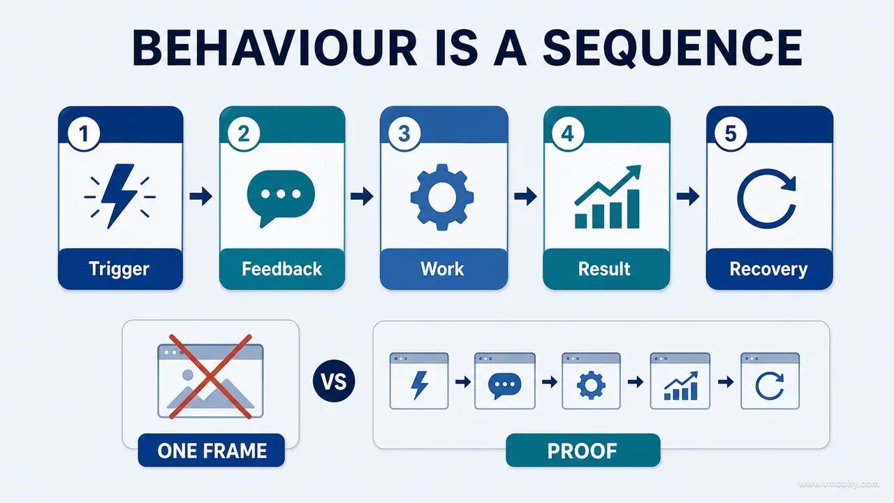
Verification is usually a short sequence rather than one image. Anything that involves saving, deleting, restoring, retrying or granting permission is a transition, and a transition needs three frames:
- Trigger — the state immediately before the action, with the input visible.
- Response — progress, confirmation, error or intermediate state.
- Outcome — the persisted result, captured on the destination or on a dependent surface rather than on the screen where the action started.
The third frame is the one that matters and the one that gets dropped. A corrected measurement that shows the new value in the form proves that the form's local state updated. Only the chart, the history list and the exported report can show that the write landed and that everything downstream noticed. On the growth product, this is exactly where we found real defects: values that saved correctly and reports that kept quoting the pre-correction number until the app was relaunched.
This is also the point where AI-assisted audits go wrong in a specific, repeatable way. An agent reading a composable, a view or an API method will happily confirm that a save action exists, is wired to a handler, and calls the repository. That is a claim about source, not about runtime. It cannot tell you whether the user received feedback, whether the write survived, or whether the observer that was supposed to refresh the chart was actually subscribed. We wrote about how far agent review does and does not reach in our post-mortem on shipping an app with an AI coding agent; the short version for this article is that agent review and runtime evidence answer different questions, and neither substitutes for the other.
Screens are also not the only place verification lives. For anything numeric — a percentile, a total, a price, a projected date — the authoritative check is the data behind the screen, which is the subject of auditing data rather than screens later in this series. Use the screenshot to prove what the user was told, and the data to prove whether it was true.
How do you build a screenshot selection matrix before capturing?
Write one matrix row per visual claim before anyone opens the app, and capture only what the matrix asks for. The matrix is what converts "go and take some screenshots" into a task that can be delegated, reviewed and finished.
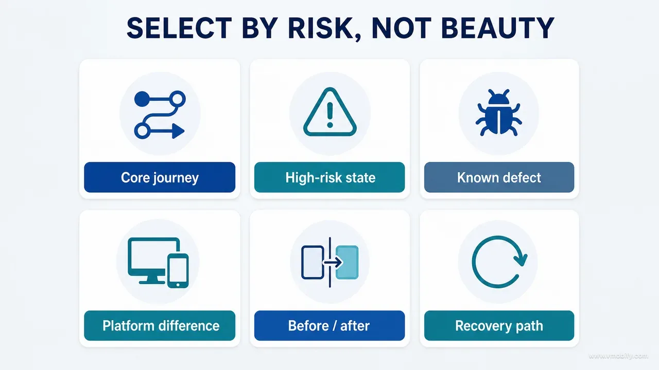
Each row answers a fixed set of questions:
Evidence ID        How will this image be referenced?
Audit claim        What statement must it support?
Audience           Who has to understand it?
Surface and state  Where, and under what conditions?
Platform / build   Which implementation is authoritative?
Capture type       Baseline, problem, exploration,
                   implementation, difficult state, verification
Annotation         What needs highlighting, and nothing else?
Privacy treatment  What must be removed or replaced?
Comparison lock    Which crop, data, device and settings are fixed?
Status             Needed, captured, rejected, approved, superseded
Two things happen once this exists. Capture becomes parallelisable, because two people working from the same rows produce compatible images. And the argument about what to publish moves to before the work rather than after it, which is when the argument is cheap.
Then score each captured candidate against five questions, and be willing to throw images away:
- Relevance — does it directly support the claim, or merely relate to it?
- Authority — is it from the correct runtime, build and state?
- Clarity — can a reader find the important area within a few seconds?
- Comparability — can it be fairly compared with its counterpart frame?
- Safety — is sensitive data removed without changing the behaviour being demonstrated?
Authority failures cannot be repaired at all. An image from the wrong build, runtime or state is not evidence of anything, and no amount of editing makes it so; recapture it or drop the claim. Safety failures are repairable, but only in one specific way — permanent, manifest-recorded redaction of the kind set out further down, never a reversible blur on a layered file. Relevance, clarity and comparability failures are usually fixable by recapturing, recropping, or annotating more narrowly — all of which cost minutes if the fixture and the matrix row still exist, and cost an afternoon if they do not.
Keep the status column honest. "Superseded" is a real and useful state: it tells a future reader that an image was correct once and is no longer authoritative, which is far better than deleting it and leaving a gap in the record.
Why must geometry-only edits never regenerate the product interface?
When the task is geometric, do not alter the product — cropping, scaling, positioning and adding background are geometry; redrawing the device, regenerating the interface, correcting copy or inventing data are not. This is the rule that most often gets broken by accident, and breaking it destroys the evidential value of an image without leaving any visible trace.
We ran into this preparing product visuals from existing mobile captures. The instruction was narrow: rebuild the composition at a different aspect ratio and keep the supplied phone and interface exactly as they were. A generative edit produced a cleaner-looking result that had, on close inspection, altered small interface details and subtly changed the device geometry. Nothing about the output announced that it was no longer a screenshot. It looked better and proved less, which is the worst possible trade in an audit.
The workflow that replaced it is deterministic by construction:
- Keep the original capture as an immutable source file. Never edit it in place.
- Create the target canvas at exact pixel dimensions.
- Scale the source proportionally. Never stretch to fit.
- Position or crop using fixed, recorded geometry rather than by eye.
- Fill only the background or an approved empty area.
- Compare the embedded screenshot against the source pixel-for-pixel where practical.
- Export to a new file; never overwrite the source.
The division of labour is simple enough to write on a wall. Use image generation for editorial heroes, conceptual scenes and clearly labelled proposals. Use deterministic transforms for anything that claims to show the product. An audit can contain both, as long as no reader has to guess which is which.
If your pipeline runs through an AI agent, put this rule in the task text every time, because it is not a default any tool will assume for you. The phrasing that has held up for us is: geometry only — you may crop, scale proportionally, position and add background; you may not regenerate, redraw or rewrite any part of the supplied image. An instruction that specific is hard to interpret loosely.
How do you make a before-and-after comparison fair?
Lock every variable except the one you changed, write the lock down before capturing, and re-read it before publishing. Before-and-after pairs are the most persuasive visuals in an audit and the easiest to bias without meaning to, which is exactly why they need the most process.
Fill this in for the pair, not per image:
COMPARISON LOCK — E017 (CHART-01 sparse history)
Device / viewport:   iPhone 13, 390x844
OS and app build:    iOS 17.5 / app 2.8.0 vs 2.9.0
Theme:               Light
Locale:              en-IN
Text size:           Default
Account role:        Parent, single child profile
Subscription state:  Free
Permission state:    Notifications denied
Data fixture:        sparse-history-v3 (one measurement)
Network condition:   Online, unthrottled
Scroll position:     Top
Keyboard state:      Dismissed
Capture crop:        Full screen, no device frame
Use identical framing and scale for both frames. Where the redesign changes the layout's height, align on a stable landmark — the title bar, or the primary action — rather than stretching one image to match the other's dimensions. And never enlarge the "after" image to make it feel more legible; if legibility is the claim, prove it at the same scale.
Captions should carry the decision rather than restate the obvious. "Before" and "after" are already visible from the layout. What is not visible is the reasoning:
Before:   Source, date and value carried equal visual weight,
          so the primary task competed with its own metadata.
After:    Value and unit form the primary task; source
          information remains available as secondary context.
Verified: Invalid and offline submissions preserve the entered
          value and explain how to recover it (E023, E024).
That caption describes hierarchy, behaviour and evidence in three lines, and it names the frames that back the last claim. A reader who doubts it knows exactly which file to open.
How do you stop a proposal being mistaken for a shipped screen?
Give every visual exactly one evidence label, in the caption and in the manifest, drawn from a fixed vocabulary that separates what was seen from what was assumed. Most arguments in a design review are not disagreements about quality — they are two people holding evidence of different authority and not knowing it.
Six labels cover everything we have needed:
- Observed — captured from the running product.
- Documented — shown in an approved specification or decision record.
- Inferred — deduced from code, data or related behaviour, but not directly observed.
- Proposed — a concept, recommendation or design-board direction.
- Implemented — present in a runnable build, but not verified against an acceptance condition.
- Verified — tested against the stated acceptance condition, with the outcome captured.
The vocabulary earns its keep by making two uncomfortable statements sayable without insult. A design can be excellent and still be only Proposed. A screen can be in the build, demoed, and applauded, and still be merely Implemented — because nobody has yet shown the value persisting, the dependent surface refreshing, or the failure path recovering.
Inferred is the label that saves the most time on AI-assisted work, because it is the honest status of almost everything an agent reports from reading source. "The export writes all measurements in the selected range" is Inferred until an export file has been opened. Marking it as such is not a criticism of the agent; it is an accurate description of the evidence class, and it tells you precisely which claims still need a runtime frame.
One rule keeps the vocabulary from decaying: a label may only be raised by producing the evidence that the higher label requires. Nobody upgrades Implemented to Verified in a meeting. They upgrade it by attaching an outcome frame.
How do you redact safely and name assets so they survive the project?
Prefer synthetic fixtures to redaction, redact permanently when you must, and name every file so that its surface, state, platform, build and claim are readable without opening it. Redaction and naming are the two disciplines that decide whether your evidence is still usable in six months or has quietly become a liability.
Product screenshots routinely contain names, email addresses, faces, precise dates, health data, location, account identifiers, transaction records and internal infrastructure hostnames. A purpose-built synthetic fixture removes all of it at source, and has the second advantage of making captures reproducible. Build the fixture to represent realistic lengths, formats, relationships and edge cases — a synthetic dataset where every name is "Test User" hides exactly the truncation problems you are trying to find.
When redaction is unavoidable:
- Remove or replace the data permanently. A blur or a pixelation filter applied in a layered file is reversible, and layered files get shared.
- Redact the system bar, notifications and any background surfaces too — a banner notification has ended more than one audit's privacy review.
- Preserve the layout effect. If a long name causes truncation and truncation is the finding, replace it with a synthetic name of comparable length.
- Record every change in the asset manifest, so a reader knows the difference between the product's behaviour and your editing.
- Review the exported files, not the editing canvas.
- Check filenames and image metadata, which carry device names, locations and account fragments more often than people expect.
Never redact away the condition being audited. If the finding is that a long name overflows its container, an image showing a tidy short name proves the opposite of your claim.
Then name the files so they explain themselves:
SURFACE-STATE-PLATFORM-BUILD-EVIDENCE-CAPTURETYPE.png

CHART-01-sparse-ios-2.8.0-E017-baseline.png
CHART-01-sparse-ios-2.9.0-E017-verification.png
REPORT-03-export-error-android-142-E024-difficult-state.png
SET-04-consent-revoke-ios-2.9.0-E031-verification.png
The final slot is always one of the six capture types — baseline, problem, exploration, implementation, difficult-state, verification — and never an evidence label. Keeping the two vocabularies apart is what makes the folder sortable: the capture type is a fact about how the image was taken and never changes, while the evidence label can be raised from Implemented to Verified later, and you do not want that to mean renaming files that other documents already reference. The label lives in the manifest, one column along from the filename.
Ban final, new, fixed and latest outright. Each of them stops meaning anything the moment a second revision exists, and the second revision always exists. Keep a manifest alongside the files recording, per image: the claim it supports, its source runtime, the state, its evidence label, what was redacted, and where it has been published. The manifest is the visual equivalent of a test inventory — it makes reuse safe and stops obsolete images drifting back into new documents.
Which capture-quality standards actually matter?
Consistency matters far more than production value: a plain native capture from a known build beats a polished device mockup for every factual claim in an audit. Mockups add perspective, glare, rounded corners and inconsistent cropping, all of which make honest comparison harder.
The standards worth enforcing:
- Capture from a known build, never from an unidentified personal installation.
- Use native captures — Android Studio's screenshot capture or the simulator and device tools on iOS — rather than photographing a screen.
- Record the device class and viewport with the file.
- Preserve original resolution and avoid lossy re-exports of text-heavy interfaces; JPEG artefacts around small type are what make an audit image unreadable at publication width.
- Keep scale consistent across every frame in a comparison.
- Include system UI when permission, keyboard or notification behaviour is part of the claim; crop it only when it contributes nothing, and disclose the crop.
- Verify dark mode and large text as separate captures where either is supported.
- Check that annotations remain legible at the width the document will actually publish at, not at the width you edited them.
- Export a high-resolution master and let the publishing pipeline generate derivatives.
How many images should a serious audit or guide contain? Enough to remove ambiguity, not enough to simulate depth. One visual per major decision or evidence transition is a workable rhythm: a conceptual hero, a methodology diagram, one baseline-and-problem pair, one proposed-and-implemented pair, one difficult-state sequence, one verification sequence, and one reusable matrix or checklist. A single strong four-frame sequence teaches more than twenty unrelated captures.
Every caption should answer four questions: what are we seeing, why did it matter, what changed, and what evidence closes the claim? If a caption cannot answer the first two, the image probably does not belong in the document.
Finally, keep audit evidence and store marketing strictly apart. Store screenshots are persuasion assets, built to Apple's screenshot specifications with captions, framing and staged data — we cover that craft separately in our guide to App Store screenshots. Audit evidence is the opposite discipline: unstaged, unflattering where the product is unflattering, and reproducible. Using one for the other corrupts both.
What does a ready-to-use screenshot evidence brief look like?
Everything above compresses into one brief you can paste into an issue, a content plan or an AI-agent task — and pasting it is what makes the method survive contact with a deadline. A method that lives only in an article gets skipped; a method that lives in a template gets followed.
TASK: Build screenshot evidence for [audit claim or product decision]

CLAIM
- Evidence ID:
- Exact claim to prove:
- Why this claim matters:
- Intended audience:

AUTHORITATIVE SOURCE
- Product / repository:
- Platform:
- App / build version:
- Device / viewport:
- Runtime, or approved document:

SCENARIO
- Surface ID and name:
- Entry path:
- Account / role:
- Entitlement:
- Permission state:
- Data fixture:
- Network condition:
- Theme / locale / text size:

REQUIRED CAPTURES
- Baseline:
- Problem:
- Exploration (label PROPOSED):
- Implemented result:
- Difficult state:
- Verification outcome:

COMPARISON LOCK
- Keep device, crop, scale, data, scroll and system settings identical.
- If any variable changes, disclose it in the caption.
- Do not regenerate, redraw or rewrite the product UI.
- Geometry-only edits: crop, scale proportionally, position, add background.

ANNOTATION
- One numbered callout per finding.
- Preserve an unannotated original.
- Do not cover relevant controls or context.

PRIVACY
- Use synthetic data where possible.
- List every redaction or replacement.
- Check system bars, notifications, metadata and exported files.

DELIVERABLES
- Original captures
- Annotated derivatives
- Asset-manifest rows
- Caption: what / why / change / verification
- Filenames: SURFACE-STATE-PLATFORM-BUILD-EVIDENCE-CAPTURETYPE
  (capture type, not evidence label; the label goes in the manifest)

ACCEPTANCE
- Every published image supports a written claim.
- Proposed and production evidence are unmistakably labelled.
- Before/after comparisons are fair and locked.
- Difficult states are represented where relevant.
- Verification shows behaviour or persistence, not appearance alone.
Two notes on using it with an agent. Fill in the authoritative-source block yourself rather than letting the agent choose a build; "the latest one" is not a build. And treat the acceptance block as a checklist the agent must report against line by line, because an agent asked "did you follow the brief?" will say yes, while an agent asked to answer five acceptance criteria individually will tell you which one it could not meet.
Which mistakes cost the most here?
Eight failures account for nearly every unusable evidence set we have reviewed, and all eight are cheap to avoid and expensive to discover late. They are worth reading as a pre-publication checklist rather than as a list of other people's errors.
- Capturing every screen once. Produces breadth with no state coverage. Map captures to claims and risk instead.
- Reusing old screenshots because they look cleaner. An obsolete build is not authoritative. Recapture, or label it explicitly as a historical baseline.
- Presenting a design board as the shipped result. Always pair a proposal with a runtime capture, and disclose where the two diverge.
- Letting a generative tool tidy up evidence. Regeneration alters copy, controls and geometry invisibly. Deterministic transforms only, for anything claiming to show the product.
- Comparing different datasets. A richer dataset flatters the "after" frame all by itself. Use named, versioned fixtures.
- Hiding errors from a polished case study. Errors, empty states and recovery paths are usually the most instructive evidence in the whole audit.
- Treating implementation as verification. A screen can compile, render and demo beautifully while saving the wrong value or leaving dependent surfaces stale.
- Publishing without an asset manifest. Untracked images become detached from their build, claim and redaction decisions, and can never be trusted again.
The thread running through all eight is the same: screenshot quality in an audit is not about resolution, device frames or beautiful composition. It is about evidential integrity. Start with the claim, choose the authoritative runtime and the exact state, capture the baseline, problem, exploration, implementation, difficult state and verification the claim needs, keep the comparison locked, label proposals honestly, preserve the actual interface, redact safely, and name and manifest every approved asset.
Do that and the output is more than a better audit document. It is a shared visual record that designers, engineers, product managers, writers and AI agents can all reason from without confusing what was proposed with what was built, or what was built with what actually works. That record is the input to the next step in this series — turning evidence into a UI/UX strategy before you redesign individual screens — because a strategy built on a gallery is a strategy built on nothing.
If you are auditing an existing app and would rather have a second set of eyes on the evidence before you act on it, talk to us — we run this method on our own products before we run it on anyone else's.
Frequently Asked Questions
Should every audit finding have a screenshot?+
No. Plenty of findings are better supported by tests, logs, source traces, accessibility output or direct data inspection. Use screenshots when the claim is visual, state-dependent or interaction-related, and pair them with stronger technical evidence whenever the claim is about behaviour rather than appearance.
Are AI-generated images acceptable in a product audit?+
Yes for editorial heroes, conceptual explanations and clearly labelled proposals. No for anything that implies it shows an implemented interface or an observed runtime state. Generated visuals should explain the methodology, never impersonate the evidence — and the label belongs burned into the image, not only in the caption.
What if iOS and Android intentionally differ?+
Capture both wherever the difference affects the claim. Consistency across platforms does not mean identical pixels. The audit question is whether each platform follows its own conventions while preserving the same product intent, the same data meaning and the same critical behaviour.
Should the screenshot include the whole device frame?+
Only when hardware context, safe areas, system UI or a marketing composition genuinely matters. For detailed product evidence, a native full-screen capture or a consistent crop is clearer, and a device frame that crops away navigation context can hide the very thing the finding depends on.
How do you capture an intermittent error?+
Create a controlled condition rather than waiting for luck: disable the network, throttle it, use a stubbed failing response, revoke a permission, or load a known bad fixture. Record the setup so another reviewer can reproduce it. An accidental, unreproducible frame is an observation, not verification.
Can one screenshot support several findings?+
It can, but legibility decides. Once a single image carries more than two or three numbered callouts, produce separate annotated derivatives from the same untouched original. The original stays the evidence; each derivative argues one point.
How is this different from preparing App Store screenshots?+
They are opposite disciplines. Store screenshots are persuasion assets with staged data, captions and framing, built to the platform specifications. Audit evidence is unstaged, reproducible, and unflattering wherever the product is unflattering. Keep them in separate folders and never let one be reused as the other.
Sources
- Nielsen Norman Group — Designing Empty States in Complex Applications — What an empty screen owes the user, and why it is a designed state.
- Nielsen Norman Group — Error-Message Guidelines — A checkable standard for the error copy you capture.
- W3C — WCAG 2.2: Use of Colour — Applies to audit annotations as much as to the product being audited.
- W3C — WCAG 2.2: Reflow — The criterion behind large-text and narrow-width capture pairs.
- Apple — Human Interface Guidelines: Accessibility — Text size, contrast and interaction states worth capturing separately.
- Apple — Human Interface Guidelines: Dark Mode — Why dark mode needs its own captures rather than an inverted derivative.
- Android Developers — Take a screenshot with Android Studio — Native capture from a known build, including emulator frames.
- Apple — App Store Connect screenshot specifications — The marketing-asset spec, kept deliberately separate from audit evidence.
About the author
Amol Pomane — Founder, Vmobify
Amol leads Vmobify, a mobile app growth agency that has driven 30M+ downloads and ranked 54K+ keywords across 300+ apps since 2013. He writes about ASO, paid user acquisition, retention, and the operational reality of scaling mobile apps in India and global markets.