Design Boards: How We Improved a Product Screen by Screen
Design boards are useful when they make decisions visible and dangerous when they make speculation look implemented. This is the bounded, screen-by-screen board method we used on a real iOS and Android product: one surface, one question, every state that matters, a fixed evidence pack, and a runtime comparison that decides whether the board was right.

On this page
- What is a design board — and what is it not?
- Why does a whole-app redesign brief fail?
- Step 1 — what belongs in the evidence pack?
- Step 2 — how do you write a board question worth answering?
- Step 3 — how do you separate fixed, flexible and forbidden?
- Step 4 — how do you explore alternatives instead of decoration variants?
- Step 5 — how do you critique against strategy rather than taste?
- Step 6 — what does a decision record have to contain?
- Step 7 — how do you turn a board into an implementation contract?
- Step 8 — how do you compare the implementation against the board?
- Step 9 — why does the last check have to happen on real devices?
- How should you organise the board set across a whole product?
- What does a complete board look like, and what prompt produces one?
- What did the sparse-chart board actually change?
- Which mistakes cost the most here?
- Frequently Asked Questions
What is a design board — and what is it not?
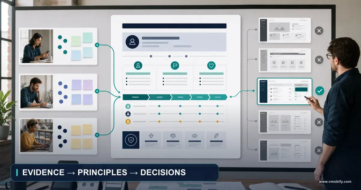
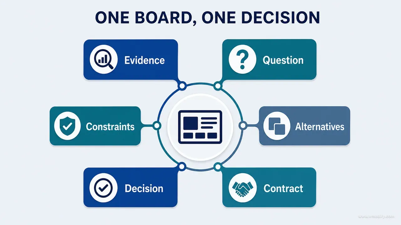
A design board is a bounded visual workspace that puts evidence, constraints and candidate decisions in one frame, and the loop that makes it work is fixed at nine steps: evidence pack, board question, brief zones, bounded exploration, critique, decision record, implementation contract, runtime comparison and device verification — with the product inventory as its prerequisite and refinement as the edge that returns you to the top. Boards are useful when they make decisions visible. They are dangerous when they make speculation look implemented.
This is part 06 of our AI product development methodology series. Part 05 produced the UI/UX strategy — the principles, priorities and non-negotiables a board is argued against — and this guide assumes that document exists. If it does not, write it first: a board with no strategy behind it has no standard to fail against, and every review of it collapses into preference.
We used boards to work through a real iOS and Android product surface by surface: onboarding, dashboard, profiles, measurement entry, charts, insights, reports, subscription states, privacy and settings. They let us compare hierarchy, composition, content and interaction direction far faster than coding every option. But the board was never the product. It was a controlled hypothesis sitting between evidence and implementation.
Every board should state, on its face:
- Which surface and which state it addresses
- Which observed problem it responds to
- Which product and design principles apply
- Which content and functions are fixed
- Which elements may be explored
- Which ideas are only proposed
- What evidence will decide whether the direction survives implementation
A board can legitimately contain the current runtime screenshot, annotated findings, content hierarchy, alternative compositions, typography and spacing direction, component behaviour, state variations, motion notes, accessibility notes, platform-specific considerations, decision rationale and acceptance criteria. That is a lot of surface area, which is exactly why the second list matters more.
A board is not automatically a final specification, a complete state model, a guarantee of technical feasibility, a source of accurate product copy, proof that a capability exists, permission to invent new functionality, or a substitute for runtime inspection. Its authority stays at Proposed until the selected direction has been built and inspected. After implementation it may become a decision record — but the running product, not the board, remains the visual source of truth.
That boundary is what the whole method protects. It also assumes the layer underneath it already exists: the principles a board is critiqued against come from the UI/UX strategy you write before redesigning any screens. A board without a strategy behind it has nothing to lose an argument to.
Why does a whole-app redesign brief fail?
A whole-app redesign brief fails because it changes navigation, hierarchy, visuals, content, interaction and feature scope simultaneously, so when the result looks impressive nobody can say which decision was good and which one quietly broke the product. Freedom is not the scarce resource in AI-assisted design. Attribution is.
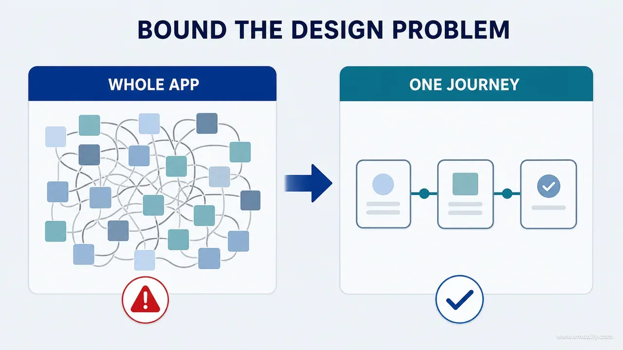
A bounded screen board reduces the number of variables until attribution becomes possible again. Take a growth-chart board. It might allow exploration of:
- Metric switcher placement
- Time-range hierarchy
- Chart-to-summary balance
- Legend clarity
- Sparse-data explanation
- Source access
And it might explicitly prohibit changes to the growth calculation, the reference dataset, the supported metrics, date semantics, editing rules, subscription behaviour and the data passed to any AI feature. Now the team can argue about design for an hour without accidentally authorising a product change, because the things that were not up for debate were written down before the debate started.
This is also the difference between a board that an AI tool improves and a board it damages. Given a wide brief, a capable model will produce a confident, attractive composition containing invented affordances — a filter that does not exist, a comparison the data cannot support, a settings toggle nobody built. Given a narrow brief with an explicit prohibition list, the same model produces two genuinely different structural readings of the same fixed content, which is the useful output.
One board can still cover several states. "One screen per board" does not mean one perfect screenshot. A meaningful board usually holds the default, empty, loading, error and unusual-data states of the same surface, because a hierarchy that only works when every card is populated is not a hierarchy — it is a screenshot. The unit of work is the product decision, not the PNG.
Incremental redesigns make a regression easier to trace to a specific decision. A single dramatic release changes too many variables at once, so even when a metric moves the team cannot tell which navigation, hierarchy, content or interaction change caused it.
Step 1 — what belongs in the evidence pack?
Never start a board with a blank canvas — start with a controlled evidence pack that fixes what is true about the surface before anyone proposes what it should become. The pack is the difference between exploration and invention.
Include, at minimum:
- A stable surface ID and route
- Current runtime screenshots
- The relevant states and their entry conditions
- Audit findings with evidence IDs
- The user goal and the surface's position in the critical journey
- Data read, written or transformed on this surface
- Existing content and terminology, quoted exactly
- The design-strategy principles that apply
- Platform conventions in play
- Accessibility and technical constraints
The instinct to include only the happy path is the single most common failure here. For a measurement form, the pack should show validation, the keyboard-open layout, unit handling, date selection, source information, edit mode, offline failure and the saved outcome — not the populated form on a large device with a short name and a two-digit value. Most of the design problems live in the states people skip.
Keep the original screenshots untouched. Put annotations on derivatives and retain the unannotated source. Never let a generative tool redraw the real interface while arranging the board — resizing and placing a screenshot is fine, regenerating it is not. The moment a model re-renders your product's UI to make it fit a layout, the board stops being evidence and becomes a mood board with a plausible screenshot in it. We treat any redrawn runtime capture as a corrupted exhibit and discard it.
Evidence IDs matter more than they look. When a board says it responds to F-017 and F-021, a reviewer six weeks later can check whether those findings were real, whether they were fixed, and whether the fix was the one the board proposed. Without IDs, the board's justification decays into "someone thought this screen felt cluttered", which is not something a later decision can be tested against.
Step 2 — how do you write a board question worth answering?
A good board answers exactly one product question, phrased so that a wrong answer is possible. If any competent-looking layout would satisfy the question, the question is decoration.
Weak: make the dashboard modern and premium. That brief has no failure condition. Every output satisfies it, so critique collapses into preference.
Strong: how might the overview make the latest growth status and the next meaningful action immediately clear, without increasing information density or hiding profile context? That question names the outcome, names two explicit constraints, and can be answered badly in ways you can point at.
Other questions that did real work for us:
- How should a one-point chart explain the absence of a trend?
- How can privacy consent support an informed choice without becoming legal prose?
- How can edit and delete stay discoverable without competing with the primary task?
- How should premium access be explained without obscuring ownership and privacy controls?
Notice the shape. Each one contains a goal and a constraint joined by "without". That construction is doing something specific: it forces the board to hold two things in tension, which is where design decisions actually live. A question with a goal but no constraint produces maximalist concepts. A question with a constraint but no goal produces timid ones.
Write the question before you open the canvas, and put it at the top of the board where it cannot be quietly renegotiated. In practice the most common form of board drift is not a bad answer — it is a slowly substituted question. Someone explores the overview, finds the profile switcher awkward, and by the third iteration the board is about navigation. That may be a real problem, but it is a different board, and it needs its own evidence pack.
One question per board also keeps the critique honest later. When two questions share a board, a direction that answers one brilliantly and the other badly gets approved on the strength of its better half.
Step 3 — how do you separate fixed, flexible and forbidden?
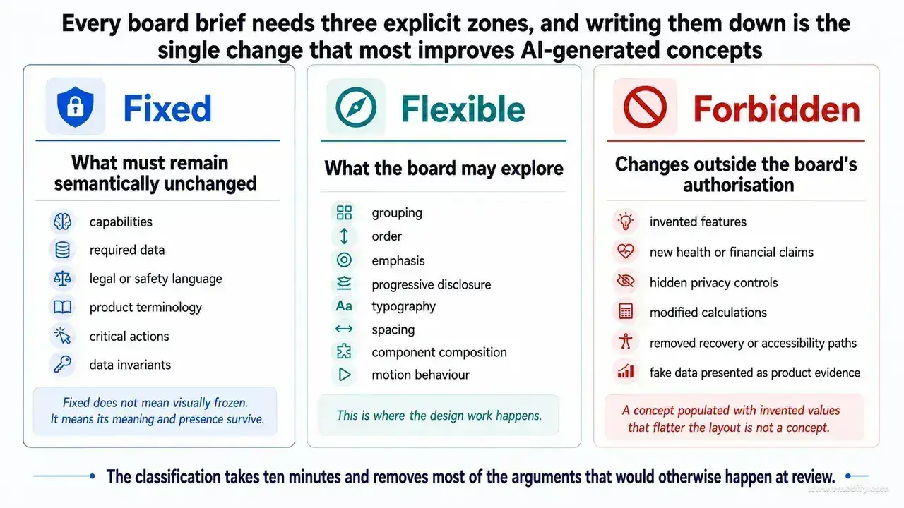
Every board brief needs three explicit zones — fixed, flexible and forbidden — and writing them down is the single change that most improves AI-generated concepts. The classification takes ten minutes and removes most of the arguments that would otherwise happen at review.
Fixed
- Covers what must remain semantically unchanged: capabilities, required data, legal or safety language, product terminology, critical actions, platform behaviour and data invariants.
- Fixed does not mean visually frozen — a required disclosure can move, be restyled or be progressively disclosed. It means its meaning and presence survive.
Flexible
- Covers what the board may explore: grouping, order, emphasis, progressive disclosure, typography, spacing, component composition, illustration or imagery treatment, and motion behaviour.
- This is where the design work happens, and it is larger than most teams assume once the fixed layer is written out honestly.
Forbidden
- Covers changes outside the board's authorisation: invented features, new health or financial claims, hidden privacy controls, modified calculations, removed recovery or accessibility paths, unapproved dependencies, cross-platform pixel copying, and fake data presented as product evidence.
- The last one deserves emphasis. A concept populated with invented values that flatter the layout is not a concept — it is a demo of a product you do not have.
The forbidden zone is what makes the method safe to use with a generative tool at all. A model has no way of knowing that the number on the chart is derived from a reference dataset with defined semantics, that the disclosure text was reviewed, or that the delete path is the only recovery route a user has. It will optimise for visual coherence, and visual coherence is served by removing awkward elements. Awkward elements are frequently the ones that carry obligations.
The same discipline applies to the onboarding sequence, where pressure to shorten a flow can delete the permission rationale, the account-recovery route, or the explanatory screen that made a later step make sense. If those behaviours belong in the fixed layer, write them down before exploring a shorter sequence; otherwise a visually cleaner board can conceal a functional regression.
Step 4 — how do you explore alternatives instead of decoration variants?
Three boards with different colours are not three concepts — genuine alternatives test different structural hypotheses about what the screen is for. If you cannot state each direction's hypothesis in one sentence, you have variants, not alternatives.
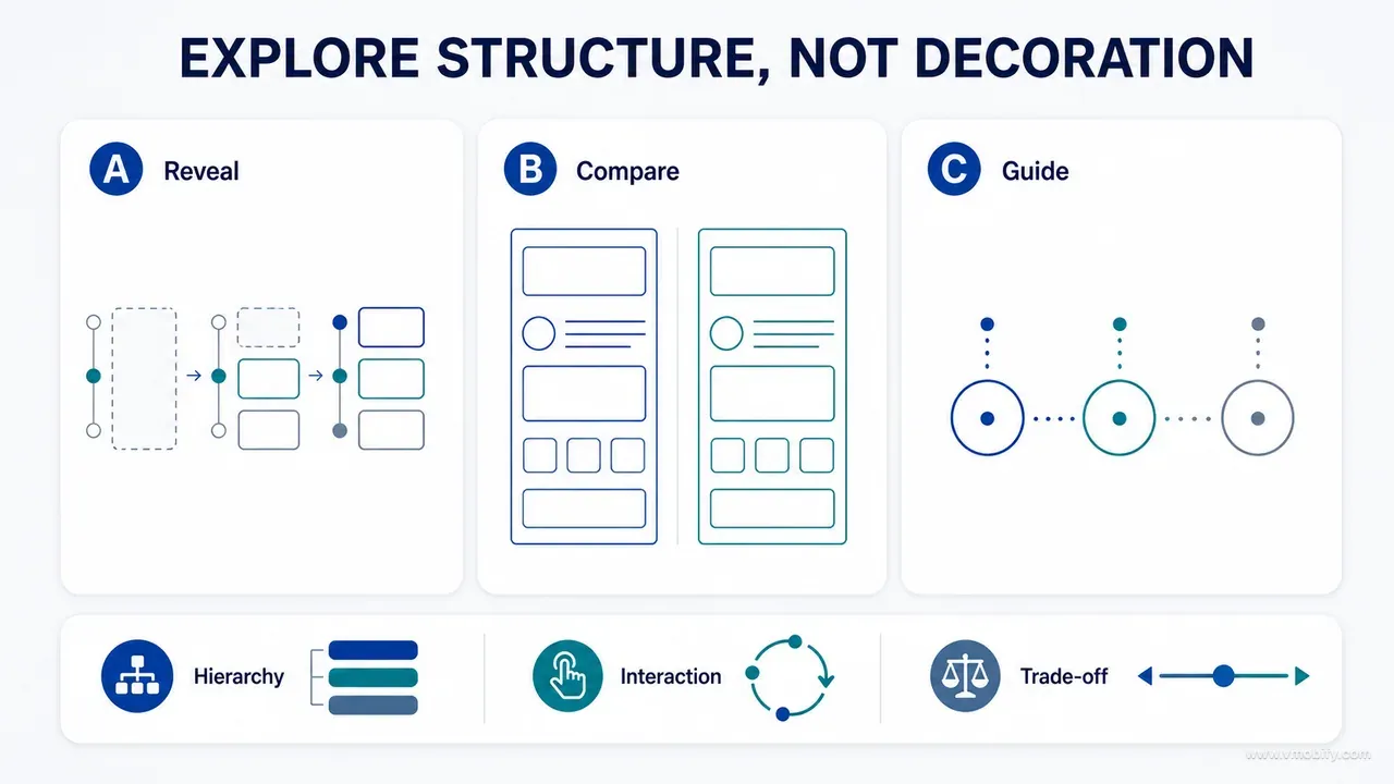
For an overview surface, three real directions look like this:
- Direction A — action first. Recording is primary; interpretation follows.
- Direction B — status first. Current status and change are primary; recording is contextual.
- Direction C — journey first. History and the next incomplete step carry the screen.
Keep the content and the scenario constant across all three. Use one reproducible data fixture — the same profile, the same values, the same dates, the same name lengths. The moment the alternatives carry different data, the comparison stops being about hierarchy and becomes about whose sample looked better, and the direction with the friendlier dataset wins for the wrong reason.
Limit the count to two or three. Excessive variants create false optionality and invite subjective voting, which is precisely the failure mode the method exists to prevent. That count is a deliberate house deviation, and it is worth naming as one. Nielsen Norman Group's work on parallel and iterative design makes the case we are borrowing — explore structurally distinct directions before refining one — but its own numbers are a floor of three alternatives and a practical ceiling of five, and its recommended endgame is to user-test the parallel versions and merge the best ideas into a single design rather than crown a winner.
We take the argument and not the arithmetic, for a specific reason. A board is a decision instrument reviewed against a written strategy, not a test artefact: there is no user session in the loop, so the merge step has nothing to merge on. We select one direction and record why the others were rejected. Under those conditions two well-separated hypotheses interrogate a bounded question harder than five that differ at the margin, and every additional direction dilutes the critique time each one receives. If you do have users and time to run parallel testing properly, follow NN/g's range and merge — the usability advantage they report for merged designs over picked winners is real, and it is a better method than this one when you can afford it.
Each direction should carry six pieces of metadata, written before critique:
- Its hypothesis
- What becomes primary
- What becomes quieter
- The expected benefit
- The new risk it introduces
- The state most likely to break it
That last field is the one teams skip and the one that saves the most time. A direction whose author cannot name the state that breaks it has not been thought through, and the review will discover the answer anyway — usually two weeks later, in a build.
It is also worth being explicit that "quieter" is a decision, not a side effect. Every direction demotes something. If a team cannot say what each direction gives up, all three are secretly the same direction with different padding.
Step 5 — how do you critique against strategy rather than taste?
Never ask which one people like — run each direction through a fixed critique matrix so the discussion produces reasons rather than votes. Nine criteria have been enough for every surface we have taken through this method.
- Product promise — does it make the core value clearer?
- User goal — can the priority situation be completed confidently?
- Information hierarchy — is the primary content unmistakable?
- State resilience — does it survive sparse, error and unusual data?
- Trust — are source, uncertainty and control handled honestly?
- Accessibility — does hierarchy survive large text and reduced motion?
- Platform fit — can it feel native without losing product intent?
- Technical fit — can it work with the real architecture and data?
- Scope — does it avoid unapproved capabilities?
Score only to structure the discussion. The rationale in the margin matters more than the arithmetic, and a direction that wins on points while failing state resilience has not won. Several of these criteria are just Jakob Nielsen's ten usability heuristics applied to a specific screen — visibility of system status, recognition over recall, help users recover from errors — which is a good sign rather than a redundancy.
Then critique the strongest failure case. For each direction, ask one question: which real state would make this concept fail fastest?
The answers are usually concrete and unglamorous. A layout that depends on three populated cards collapses for a first-time user with none. A compact chart summary breaks when the metric label is localised into a language whose rendered label is materially longer than the English source. A bottom-anchored primary action conflicts with the keyboard, or with gesture navigation, or with a system back affordance. Long text at the largest Dynamic Type setting reflows a two-line summary into five and pushes the value below the fold — Apple's typography guidance tells teams to test layouts across all font sizes, while WCAG2ICT provides the bridge for applying WCAG principles to non-web software.
Testing the strongest failure case on the board costs an afternoon. Discovering it after implementation costs a sprint, and discovering it after release costs a rating.
Step 6 — what does a decision record have to contain?
After critique, write a short decision record — because the purpose of the record is to stop the next person, or the next agent, reopening a settled question without new evidence. It is ten lines and it prevents weeks of circular debate.
Decision ID: UX-CHART-004
Surface: CHART-01
Selected direction: Status-first with progressive source detail
Evidence addressed: F-017, F-021
Reason: Best supports sparse and populated states while preserving provenance
Rejected alternative: Action-first
Reason rejected: Makes record creation dominate a review task
Required deviations: Native metric selector differs by platform
Open questions: Large-text legend behaviour
Acceptance evidence: Runtime captures for one point, many points, offline and source view
Two fields carry most of the weight. Reason rejected is the one that survives longest: six months later, someone will look at the shipped screen and propose the action-first layout as a fresh idea, and the record answers them in one line without anyone having to re-derive the argument. Acceptance evidence is the field that converts the record from an opinion into a testable claim — it names, in advance, the screenshots that will prove or disprove the decision.
Keep the IDs stable and machine-greppable. A decision ID that appears in the board title, the implementation contract, the pull request description and the runtime capture filenames makes the whole chain traceable with a single search. This matters far more in an AI-assisted workflow than a human one, because agents have no memory of last month's review and will happily re-litigate anything that is not written down where they will read it.
Record rejected directions briefly and without ceremony. Keep the hypothesis and the rejection reason; do not keep every decorative variant. The goal is to prevent repeated debates, not to build an archive of images nobody will open. One paragraph per rejected direction is the right weight.
Finally, date the record and name who approved it. A decision made before a constraint changed is not wrong — it is superseded, and the two need to be distinguishable.
Step 7 — how do you turn a board into an implementation contract?
Never hand an engineer or a coding agent only an image — visuals are ambiguous in exactly the places that matter, so the selected board travels with a written implementation contract. The image says what it should look like. The contract says what must remain true.
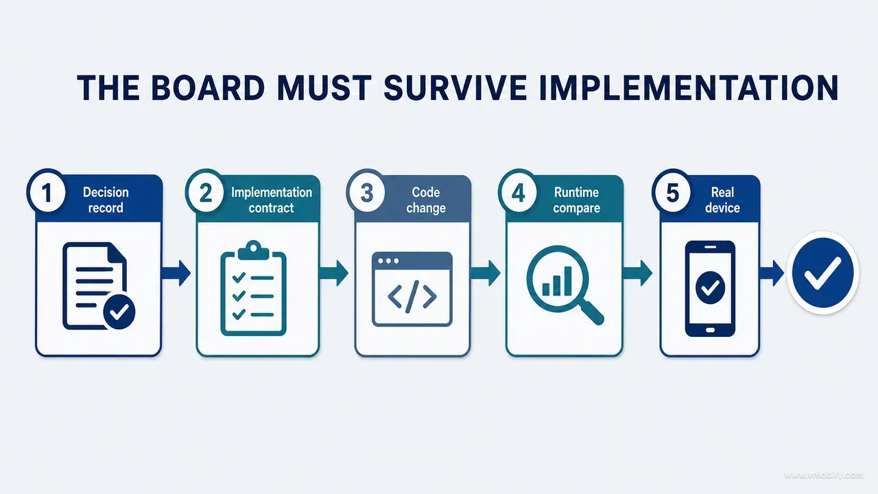
The contract specifies:
- The surface and the files in scope
- Capabilities that must remain intact
- The data and state model
- The exact content hierarchy
- Component reuse expectations
- Behaviour of any new component
- Responsive and device behaviour
- Accessibility requirements
- Motion and reduced-motion behaviour
- Analytics events that must survive
- Tests to run
- Screenshots to capture
- Explicit exclusions
The analytics line is easy to overlook and expensive to lose. A redesign that renames a button, merges two screens or moves an action into a sheet will silently break the event that measured it, and the first sign is a funnel that appears to collapse on release day. Whoever owns the funnel instrumentation should read the contract before the work starts, not after the dashboard goes flat.
Describe relationships, not coordinates. Instead of "put the button 24 pixels below the card", write: "the primary action follows the summary as the next decision, remains visible without covering chart content, and uses the established spacing token." Exact measurements matter in production, but relationships explain why the measurement exists and adapt correctly when the platform, the text size or the screen changes.
This is also what makes the contract portable across iOS and Android. A coordinate is a fact about one rendering; a relationship is a rule that survives adaptive layout on Android and Dynamic Type on iOS. Where a relationship genuinely cannot hold on one platform, that is a deviation to document in the decision record — not a discrepancy to resolve by copying pixels across.
Write the exclusions section even when it feels obvious. "Do not change the growth calculation, the entitlement check, or the persistence layer" costs one line and closes the most expensive class of accident in agent-assisted implementation.
Step 8 — how do you compare the implementation against the board?
Once the direction is coded, capture the real screen under the same scenario the board used, and compare four columns rather than two. A before-and-after pair hides the two things you most need to see.
- Baseline runtime — what existed before
- Selected board — what was proposed
- Implemented runtime — what actually shipped in the build
- Verification state — whether it holds under the risky condition
Then classify every difference between the board and the build into one of seven buckets:
- Intentional platform adaptation
- Technical constraint
- Content correction
- Accessibility correction
- Implementation defect
- Board oversight
- Scope change requiring approval
The classification is the entire value of this step. "Implementation defect" and "board oversight" look identical in a screenshot and demand opposite responses: one is a bug to fix, the other is a lesson the board owes the next board. Collapsing them into "close enough" throws away the only feedback the method generates about its own quality.
Do not silently make it close enough. The difference frequently contains the most useful information in the whole exercise — it is where the board's assumptions met the architecture and lost. A summary that wraps differently, a chart container that needs different vertical behaviour, a control that has no native equivalent: each of these is a fact about your product that no amount of further boarding would have produced.
A related habit worth building: the store assets should follow the implemented runtime, never the board. It is a recurring failure: teams ship store screenshots generated from an approved concept that the build never quite matched, which produces exactly the install-then-uninstall pattern you would expect. The board is a proposal; the store listing is a promise.
Capture the four columns as files with the decision ID in the filename. When the same surface is revisited a year later, that folder is the fastest available answer to "why is it like this?"
Step 9 — why does the last check have to happen on real devices?
A board and a simulator cannot reveal the class of problems that decide whether a redesign actually feels better in a hand. The final inspection runs on hardware, on the priority journey, from entry through outcome.
What only a device shows:
- Keyboard interaction and what it covers
- System permission flows interrupting a sequence
- Safe areas and navigation affordances
- Touch-target comfort for a thumb, not a cursor
- Font rendering at real pixel densities
- Scroll and gesture conflicts
- Animation timing under load
- Performance with real data volumes
- Screen brightness and contrast perception outdoors
- Screenshot crops created by different device classes
The device set matters as much as the practice. In our portfolio, the modal Indian user is not on the phone the design was built on — they are on a mid-range Android device with a smaller viewport, a lower pixel density, aggressive battery management and, very often, the system font scaled up a notch or two because the phone is shared and read at arm's length. A layout validated only on a current-generation flagship is validated on a device most of your users do not own.
Two failure modes show up repeatedly on those devices and are easy to miss when the simulator matrix does not include them. First, text expansion: Hindi and Marathi strings can require more horizontal or vertical space than their English source, and a two-line summary that was tight in English can become four lines and a truncation. Second, gesture and inset conflicts — a bottom-anchored action that works with gesture navigation can collide with a three-button navigation bar unless system insets are handled correctly, which Android's edge-to-edge guidance covers and static boards rarely model.
Inspect the whole priority journey, not the redesigned screen in isolation. If the board improved a static screen but the flow through it is unchanged, the redesign is not yet proven — it is only rendered. The screen that got better in the board is frequently not the screen that was costing you the conversion.
How should you organise the board set across a whole product?
Group boards by product journey rather than by file structure, because the problems worth finding are the ones that cross screens. Five groups covered an entire consumer product for us.
- Entry and identity — welcome, authentication, onboarding, profile creation, profile switching
- Recording and correction — add, edit, validate, delete, undo and failure recovery
- Understanding — overview, charts, trend summaries, reference context, AI explanations
- Sharing and continuity — history, reports, exports, reminders, notifications
- Trust and commercial state — consent, privacy centre, subscription offer, entitlement errors, restoration, settings
Organising this way made cross-screen problems visible in a way a screen-by-screen file listing never does. The clearest example: the terminology used for a measurement's source in the entry flow could be checked directly against the chart, the report and the AI-explanation board. Three of the four used different words for the same concept, and none of the individual screens looked wrong on its own.
Journey grouping also exposes the states that only exist between screens. An entitlement error is not a screen — it is a condition that can arrive on four surfaces, and it needs one answer rather than four improvised ones. Same for offline, same for a profile with no data, same for a stale cached value.
Sequence the groups by evidence, not by enthusiasm. Teams reliably want to start with the dashboard because it is the most visible surface and the most fun to redraw. The product inventory usually says otherwise: the surfaces carrying the most findings are the correction and error paths nobody demos. Start where the evidence is heaviest, and the dashboard board will be better when you reach it, because you will know what the rest of the product can actually support.
Keep the set small enough to finish. A board set that covers 40 surfaces at the depth described here is a quarter of work, and an unfinished board set is worse than none — it leaves half the product designed against the new principles and half against the old ones.
What does a complete board look like, and what prompt produces one?
Use one fixed board layout so that provenance is visually unavoidable — evidence on the left, proposals in the centre, decision on the right, contract along the bottom. Anyone glancing at the board can tell within a second which parts are observed and which are proposed.
TOP: Surface ID, question, evidence label and scope

LEFT: Current runtime
- Untouched screenshot
- Numbered findings
- State and build metadata

CENTRE: Alternatives
- Two or three structural directions
- Fixed content and shared data fixture
- State variations

RIGHT: Decision
- Selected direction
- Rationale
- Rejected risks
- Platform adaptations

BOTTOM: Implementation contract
- Acceptance criteria
- Required states
- Tests and runtime captures
- Open questions
The layout is not decoration. Putting the untouched runtime physically to the left of the proposals means a reviewer cannot look at a concept without first seeing what exists, which is the habit the method is trying to build.
Here is the prompt we use to produce a board. It is deliberately long, because every section of it removes a category of confident nonsense.
Create a bounded design board for [SURFACE ID / NAME].

AUTHORITY
- Runtime screenshots are OBSERVED evidence and must remain unchanged.
- The UI/UX strategy and approved requirements are constraints.
- Generated layouts are PROPOSED, not implemented product UI.

BOARD QUESTION
[One specific product/UX question]

USER SITUATION
- Entry path:
- Goal:
- Knowledge/state:
- Consequence of failure:

FIXED
- Capabilities:
- Required content/data:
- Terminology:
- Privacy/safety rules:
- Critical actions:
- Platform behaviour:
- Data invariants:

FLEXIBLE
- Hierarchy:
- Grouping:
- Progressive disclosure:
- Components:
- Visual treatment:
- Motion:

FORBIDDEN
- No invented features or data.
- No removal of edit, recovery, privacy or accessibility paths.
- No changes to formulas, entitlement or persistence.
- No unapproved dependencies.
- No cross-platform pixel copying.
- Do not redraw supplied runtime screenshots.

DELIVER
1. Annotated reading of the current screen.
2. Two or three structurally distinct directions using identical content and scenario.
3. Default plus the highest-risk state for each direction.
4. Trade-off table against the strategy.
5. Recommended direction with reasons and risks.
6. Platform adaptation notes.
7. Implementation contract and acceptance evidence.
8. Unresolved decisions requiring approval.
The AUTHORITY block is the part that does the heaviest lifting. Without it, a model treats every input as material to be improved, including your screenshots. With it, the same model reliably keeps the evidence intact and labels its own output as proposal — which is the behaviour that makes the rest of the method possible.
What did the sparse-chart board actually change?
The most instructive board we ran was for a chart containing exactly one measurement — a state the original design treated as a degraded version of the real screen rather than a legitimate one. It shows the whole loop in one surface.
The runtime showed axes and a single mark. Technically correct, and completely misread: the composition implied the chart was incomplete or had failed to load. The board question was not "how can we make the chart prettier?" It was: how can the product explain the meaning and the limitation of one measurement without manufacturing a trend?
The evidence pack held the populated chart, the one-point state, the measurement form, the reference-source view and the report output. The fixed layer held the measurement value, its date, the metric, the unit, the reference basis and the available actions. The flexible layer held summary placement, explanatory copy, the graph's visual weight and progressive disclosure. The forbidden layer prohibited a trend arrow, reassuring language the data did not support, and any fabricated second point.
Three directions were explored: chart-first, keeping the plot dominant with a small explanation; explanation-first, leading with what one point can establish before showing the plot; and next-step-first, emphasising the recording of a future measurement.
Explanation-first supported comprehension best — but its first version pushed the actual value too far down the screen, which the critique caught before any code was written. The board was refined so the measurement and date stayed primary, the explanation became secondary, and the next action remained available without promising when another measurement should be taken. That restraint mattered: this is the kind of surface where an unsupported reassurance is not a copy problem but a safety one. The prohibition on implying a trend or a precision the data cannot carry is our own board rule, written into the forbidden layer — it is not something Apple's guidance says, and it should not be presented as though it were. What Apple's guidance on charting data does supply is the instruction the winning direction was built on: keep a chart simple, let people choose when they want additional detail, and aid comprehension by adding descriptive titles, subtitles and annotations that highlight the actionable takeaway. Explanation-first is that instruction applied to a dataset of one, with the house rule supplying the limit on what the explanation is allowed to claim.
Implementation then exposed two board oversights. The explanation wrapped to additional lines at large text sizes, and the Android chart container needed different vertical behaviour from iOS. Neither was a reason to abandon the direction — both were implementation evidence. The final record documented the platform adaptation, adjusted the copy hierarchy, and required large-text plus one-point runtime captures as acceptance evidence.
That product is the same iOS and Android build we wrote up in our account of shipping an app with AI coding agents, which covers what the build took and what we would change. This series stays on the method; the board work above is the part that generalises to any product.
Which mistakes cost the most here?
Eight failure modes account for nearly every board that wasted time, and all of them are recognisable early if you know the shape.
- Starting with an empty board. Without runtime evidence and constraints, exploration becomes invention, and the invention arrives looking finished.
- Putting too many screens on one board. The decision boundary disappears. Organise by journey, but keep each board on one coherent question.
- Changing data between alternatives. Different content makes hierarchy comparison meaningless. One reproducible fixture, every time.
- Treating visual polish as feasibility. Generated concepts routinely ignore safe areas, keyboard behaviour, accessibility, localisation, chart rendering and the architecture that has to render them.
- Approving by preference. Run the nine criteria. "I prefer B" is not a reason anyone can inherit.
- Sending only a picture to the coding agent. Pair the selected board with the written implementation contract, always.
- Failing to document deviations. Runtime differences are signals. Classify them and decide whether the board, the implementation or the constraint should change.
- Never closing a board. A board must reach a recorded decision or an explicit rejection. Endless visual iteration consumes attention without improving the product.
Before closing any board, ask three questions. What did this exploration teach us that the baseline alone could not? Which risky state most strongly challenged the selected direction? What must the runtime prove before the board can be treated as a successful decision? If the answers are vague, the board is still a collection of visuals rather than a completed design instrument.
Archive the approved board under its decision ID, never as an unnamed "final" image, and name the runtime build that implemented it. That closes the chain from observation to proposal to shipped evidence, and it is what lets a reviewer distinguish the selected direction from superseded exploration at a glance.
Design boards made our redesign faster because they slowed down the right moment — the decision before the code. By grounding each board in runtime evidence, constraining what could change, exploring structural alternatives, critiquing against strategy, recording the decision and comparing the real implementation, we gained visual breadth without surrendering product truth. We have seen the same thing on every product we have run this on: the boards that changed the most were the ones whose evidence pack was assembled before the question was written rather than after it.
The next guide in this series divides the labour: what strategic AI, coding agents and design boards should each actually do, so that every tool is doing the work it is best positioned to verify. If you would rather have this run on your product than run it yourself, tell us which surfaces are costing you the most and we will start with the evidence.
Frequently Asked Questions
Which tool should create the design boards?+
Whichever tool supports fast visual comparison and preserves source evidence — the method is tool-independent. A board can live in Figma, FigJam, an image canvas, a slide deck or a carefully structured document. The only hard requirement is that the original runtime screenshots survive unaltered and that proposals are visibly labelled as proposals.
Can AI generate the alternatives?+
Yes, and it is good at it, provided you supply fixed content, explicit constraints and one board question. Treat every output as a hypothesis rather than a design. AI is particularly useful for breadth — producing two structurally different readings of the same content quickly — while evidence and critique decide which one is worth building.
How many screens should be redesigned at once?+
Work in coherent journey slices. A measurement form, its confirmation and the downstream chart may need coordinated implementation because they share terminology and data, but their board questions stay separate. Coordinating the release is a delivery decision; merging the questions is a design mistake.
Should the boards match iOS and Android exactly?+
No. Share the strategy and the semantics, then document the native adaptation in the decision record. Enforcing identical visuals across platforms usually reduces usability, because it overrides the navigation, control and typography conventions users already know. Pixel copying between platforms belongs in the forbidden zone of the board brief.
What happens to rejected boards?+
Keep a short record of the direction and the reason it was rejected — one paragraph is enough. Do not keep every decorative variant. The purpose is to stop the same debate reopening in three months without new evidence, not to build an image archive nobody opens.
How long does one board take?+
For a single surface with its states, expect half a day to a day: an hour or two assembling the evidence pack, an hour on the brief and question, a short generation cycle for alternatives, an hour of critique, and the decision record. The evidence pack is the part teams try to shorten, and it is the part that determines whether the rest is worth anything.
What if the implementation cannot match the approved board?+
Classify the gap rather than closing it quietly. If it is a technical constraint or a platform adaptation, document it in the decision record and update the board so future work inherits the truth. If it is a board oversight, say so — that is the method working. Only an implementation defect should be fixed by changing the code to match the board.
Sources
- Nielsen Norman Group — 10 Usability Heuristics for User Interface Design — The heuristics several of the nine critique criteria are derived from
- Nielsen Norman Group — Parallel and Iterative Design — The case for exploring structurally distinct directions before refining one; its three-to-five count and its merge step are both deviations we state in the text
- Nielsen Norman Group — Progressive Disclosure — The mechanism behind the flexible layer in most of our board briefs
- Apple — Human Interface Guidelines: Typography — Dynamic Type ranges every board direction has to survive
- Apple — Human Interface Guidelines: Charting Data — Chart simplicity, progressive detail and the descriptive text the explanation-first direction was built on
- Android Developers — Adaptive layouts in Compose — Why implementation contracts describe relationships rather than coordinates
- W3C — WCAG2ICT 2.2 — Informative guidance for applying WCAG principles to native software
- Android Developers — Display content edge-to-edge — System inset handling for gesture and three-button navigation modes
About the author
Amol Pomane — Founder, Vmobify
Amol leads Vmobify, a mobile app growth agency that has driven 30M+ downloads and ranked 54K+ keywords across 300+ apps since 2013. He writes about ASO, paid user acquisition, retention, and the operational reality of scaling mobile apps in India and global markets.