Why Code Review Cannot Tell You Whether a Product Looks Good
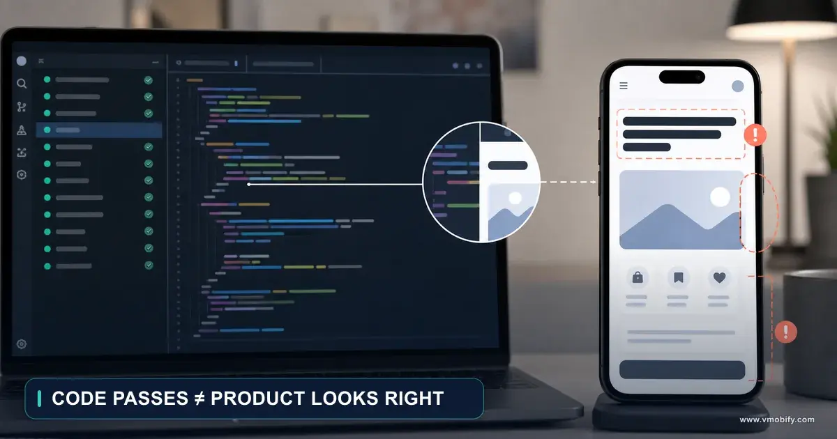
Code review can confirm that a colour token was used. It cannot tell you whether the screen feels balanced, whether the heading wraps badly at accessibility text sizes, or whether the success message disappears before anyone reads it. This is part 10 of the AI Product Development Methodology series: the four evidence layers a real audit needs, and the rule that stops one layer closing another layer’s claim.
On this page
- Which four review layers does a serious product audit need?
- What is code review genuinely good at?
- What can source code never reveal about how a product looks?
- Why are previews and screenshots both traps?
- How do you build a visual-review inventory instead of a screen list?
- Step 1 — what does a five-second first impression reveal?
- Step 2 — how do you judge typography, spacing and colour as rendered?
- Step 3 — why does content quality belong in a visual review?
- Step 4 — which states must you render before trusting a layout?
- Step 5 — how do you review interaction as time rather than frames?
- How do you reconcile code findings with visual findings?
- Why must the black-box pass come before the white-box pass?
- What do testable visual acceptance criteria look like?
- How do you choose a representative device and data matrix?
- How do you run a visual review without subjective voting?
- What does a runtime visual review prompt look like?
- Which checklist should you run after every interface change?
- Which mistakes cost the most here?
- Frequently Asked Questions
Which four review layers does a serious product audit need?
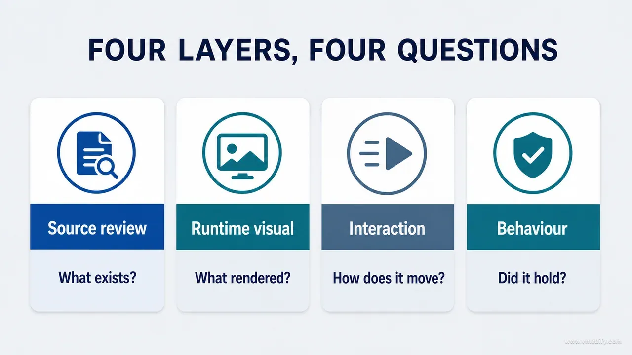
Four, and they are not interchangeable: source review, runtime visual review, interaction review and behavioural verification. The single rule that makes them work is that evidence from one layer may never close a claim in another.
Code review can tell you that a colour token was used. It cannot tell you whether the screen feels balanced. It can confirm that a text style supports scaling. It cannot tell you whether the resulting heading wraps badly on the device you actually ship to. It can locate an animation and inspect its duration. It cannot tell you whether that motion is distracting in the middle of a complete journey.
Here is what each layer is responsible for:
Source review
- Architecture, component use, state ownership, token consistency, accessibility semantics and known code risks.
Runtime visual review
- Hierarchy, composition, typography, spacing, colour, content and how each required state presents.
Interaction review
- Navigation, feedback, keyboard, motion, gestures, recovery and real-device behaviour.
Behavioural verification
- Persistence, downstream updates, permissions, entitlements, analytics and data correctness.
We arrived at this split the expensive way, auditing a real iOS and Android child-growth product repeatedly over five months. Components could be clean, reusable and technically correct while the rendered surface still felt dense, repetitive or visually weak. The reverse held too: an attractive screenshot concealed broken persistence, missing accessibility semantics and, in one case, a value that was simply wrong. The full account of what that build cost us is in our post-mortem on shipping an AI-built iOS app — this guide is the method that came out of it, generalised to any product.
Code can explain why a surface might render a certain way. Only the rendered surface can prove how it actually appears. Everything below is a way of holding that line under deadline pressure, when the temptation to accept a plausible explanation instead of an observation is at its strongest.
This is part 10 of the AI Product Development Methodology series. Part 9 covered making an AI agent implement a design without collateral damage; part 11 goes below the interface to audit the data that moves through the screens rather than the screens themselves.
What is code review genuinely good at?
Code review is excellent at everything that is a property of the source rather than of the render — and that list is long enough that skipping source review is never the answer. The argument in this post is about boundaries, not about downgrading code review.
Source review reliably finds:
- Duplicated components and near-identical styles that should have been one thing
- Hard-coded colours or dimensions bypassing the design system
- Incorrect state ownership — a value living in a view when it should live in a store
- Missing loading and error branches that no happy-path demo will ever surface
- Inconsistent token use across features built weeks apart
- Accessibility properties present or absent — labels, traits, grouping, focus order declarations
- Navigation and lifecycle risks, including work that continues after a screen is gone
- Performance hazards such as work on the main thread or unbounded list rendering
- Unhandled null or optional data that will only present in production
- Dead code, unreachable routes and unsafe side effects
- Test coverage gaps and maintainability problems
An AI coding agent accelerates this work substantially. It can search a large repository, trace references across files, and summarise patterns faster than any human reviewer. What it gives you is a strong implementation hypothesis — a well-evidenced statement about how the product is built and where it is likely to be fragile.
The word doing the work in that sentence is hypothesis. Source describes a potential rendering under conditions. The user experiences exactly one concrete rendering at runtime, on one device, at one text size, with their own data. A review process that never leaves the source is a process that has verified the conditions and never checked the outcome.
The recurring problem is not bad code review. It is good code review whose conclusions are reported as though they were conclusions about the whole product.
What can source code never reveal about how a product looks?
Seven categories, and each of them is a property of the composition rather than of any single file — which is why no amount of reading the file will produce them.
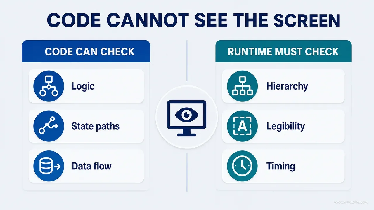
Perceived hierarchy. Several components can each use the correct style token and still compete for attention. Hierarchy is a property of the whole composition: position, scale, contrast, density, grouping, content length and everything surrounding the element. A dashboard where every card is technically correct and equally elevated is tidy in source and strategically flat on screen.
Real text behaviour. Preview strings are short and tidy. Production strings contain long names, localised labels, dynamic values, error messages and text rendered at accessibility sizes. Line breaks, truncation and vertical rhythm emerge only with real content. Apple's typography guidance is explicit that supporting Dynamic Type is a layout obligation, not a text-style setting — and the layout half is invisible in a diff.
Optical spacing. A mathematically consistent spacing scale can still look wrong when icons, typefaces, shapes and baselines carry different optical weight. Eight points between a glyph and a label is not eight points between two text baselines, perceptually.
Colour in context. Contrast ratios matter and are computable. Perceived balance is not: it depends on surface area, adjacent colours, the physical display and the current state. A technically valid accent applied to six elements dominates a screen that was designed around one.
Motion quality. Duration and easing values do not reveal whether three animations overlap, whether a transition interrupts reading, or whether the motion responds naturally to the speed of a finger.
Platform chrome and system integration. Safe areas, status bars, keyboards, permission sheets, back gestures and navigation containers all shape the experience around your application code. Android's edge-to-edge guidance exists precisely because the system insets are the part that most often goes wrong, and they are the part your component never sees.
Performance perception. A screen can meet its timing threshold and still feel unstable because content jumps as it loads, placeholders do not match final geometry, or feedback arrives at the wrong moment. The web formalised this measurement as cumulative layout shift; the perceptual problem is identical on mobile and just as invisible in source.
Why are previews and screenshots both traps?
Because they fail in opposite directions, and teams usually fall into one while congratulating themselves for avoiding the other. A preview strips the product away from the component; a screenshot strips time away from the product.
Design previews and component stories are genuinely useful during development. They are also controlled environments, and they routinely omit real navigation containers, system bars, production data, slow asynchronous work, actual permission state, account and subscription state, keyboard behaviour, device-specific sizes, long-term data density and any running accessibility service. A component that looks excellent in isolation can produce visual repetition the moment it appears ten times on one dashboard. A chart preview populated with beautiful sample data says nothing about the sparse real dataset that renders as an almost-empty canvas — which, on a new product, is what most users see.
Treat previews as component evidence, never as product evidence.
The opposite mistake is treating one attractive runtime screenshot as proof of product quality. A still frame cannot show tap feedback, scroll behaviour, focus order, gesture conflict, the loading transition, error recovery, whether anything persisted, whether the downstream screen refreshed, what a screen reader announces, or what happens when reduced motion is enabled.
Both traps share a structure: partial evidence presented as complete evidence, usually in good faith, because the person presenting it genuinely did look at something. The correction is not more screenshots. It is state sequences and observed interaction — capturing the same surface across its required states and recording the journey through it, rather than assembling a gallery of the surfaces that photographed best. We wrote about the selection problem specifically in how to choose screenshots for a serious product audit, which is the part 4 companion to this guide.
One rule worth stating plainly, because it comes up constantly now: generated or mocked-up visuals can support a concept, but they are never runtime evidence. If an image was not captured from a running build, it cannot close a finding about a running build.
How do you build a visual-review inventory instead of a screen list?
By recording, for every surface, the eight things that determine whether it will hold up — and then reviewing surfaces in priority order rather than in navigation order. A screen list treats a decorative settings row and the primary conversion surface as equal work.
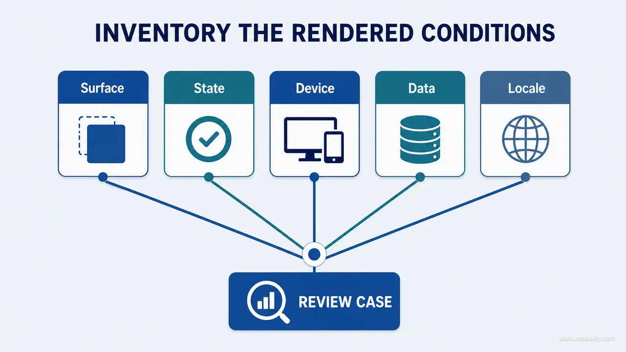
Start from the product inventory you built earlier in this series and identify the surfaces where visual quality materially affects comprehension, trust or action. For each of those, record:
- Purpose — what must the user understand or do here?
- Primary content — what should be noticed first?
- Required states — empty, loading, content, error, restricted?
- Data stress — what happens with long, sparse, dense or unusual values?
- Interaction stress — keyboard, scroll, gesture, modal?
- Accessibility — large text, contrast, reading order?
- Platform — which native container or convention applies?
- Comparison — which baseline, board or design-system expectation is this judged against?
Filling those eight fields takes a few minutes per surface and immediately changes what you test. A surface whose data stress field reads "measurement values that can be three digits or one, with a unit and a date" tells you which fixture to build before you have looked at a single pixel.
The prioritisation matters as much as the inventory. Rank by user consequence: surfaces on the activation path, surfaces where money or consent is involved, surfaces where a misreading has a real-world cost. Everything else can be reviewed at lower depth. A review plan that treats every surface equally will run out of time somewhere in the middle and, by pure accident of navigation order, will have skipped something that mattered.
If you are building for India or another market where the emerging-market device mix is wide, add one more field: the lowest-end target device and the longest supported script. A layout validated on a flagship in English is not validated. Devanagari and Tamil labels run considerably longer than their English equivalents, and the narrower layout width of a mid-range handset is where that shows up first.
Step 1 — what does a five-second first impression reveal?
It reveals the hierarchy the product actually has, before your knowledge of the product rationalises the hierarchy it was supposed to have. Five seconds is short enough that you record perception rather than analysis.
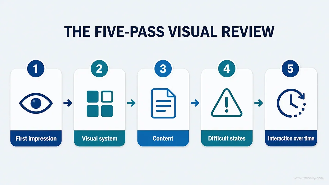
Open the surface, look for five seconds, close it, and write down five things:
- What attracted attention first?
- What seemed actionable?
- What felt trustworthy, and what felt questionable?
- Did the screen feel calm, dense, empty or fragmented?
- Did it belong to the intended product character?
The first impression is not the verdict. It is the only moment in the whole review when you are seeing the screen the way a user sees it, and it is unrepeatable per person per surface — once you have studied it, you cannot get it back.
Then move to purpose and hierarchy properly:
- Can the surface's purpose be stated in one sentence?
- Does the most prominent element serve that purpose?
- Is there exactly one primary action for the current context?
- Are secondary actions reachable without competing for attention?
- Does the reading order match the decision order?
That last question is the one that finds the most defects and gets asked the least. A screen can present every piece of information the user needs, in a visually pleasant arrangement, in an order that requires them to read the bottom before the top makes sense.
In the child-growth product, the dashboard could contain a profile, latest measurements, chart summaries, insight cards, reminders and recording actions. Each was implemented correctly. Each appeared as an equally elevated card. The result was technically tidy and strategically flat: nothing on the screen said what the screen was for. No code review would ever produce that finding, because there was nothing wrong with the code. The strategy work that prevents this belongs earlier in the series, before any screen is redesigned.
Step 2 — how do you judge typography, spacing and colour as rendered?
By inspecting the outcome against the intent in three separate passes, and by treating numbers on screen as a distinct category with its own failure modes.
Typography. Check the type hierarchy, line length, wrapping and truncation, numeric alignment, the treatment of units and dates, weight distribution, contrast, scaling behaviour and platform rendering. Numbers deserve their own attention: a measurement, a percentile and a date can each be individually legible and collectively ambiguous when the unit or the reference context is visually detached from the value. If a user has to infer whether 14.2 is kilograms or centimetres, the typography has failed regardless of what the style token says.
Spacing and composition. Check both token consistency and optical outcome — outer margins, section rhythm, grouping, alignment, repeated container density, whitespace around critical content, sticky or floating elements, and keyboard and safe-area overlap. The goal is not maximum whitespace. It is meaningful separation: space that tells the eye which things belong together. A screen with generous, uniform padding everywhere communicates nothing about grouping at all.
Colour and elevation. Ask whether colour roles are consistent, whether semantic colour is used only for meaning, whether cards genuinely need elevation or are simply generating visual noise, whether the primary action dominates appropriately, whether error and warning states stay distinct and accessible, and whether the system stays coherent once real charts and imagery are present.
Two of these have testable floors rather than opinions. Contrast and non-colour cues are covered by WCAG 2.2's use-of-colour criterion — if colour is the only thing distinguishing a state, that is a defect and not a preference. Reflow and text-spacing criteria give you the same kind of hard line for layout under enlarged text.
Run these passes separately. Reviewing typography, spacing and colour simultaneously produces a general impression that something is off, which is not a finding anyone can act on.
Step 3 — why does content quality belong in a visual review?
Because words are the majority of what is on the screen, they set the height of every container, and the interface's credibility is carried almost entirely by them. Splitting content review out of visual review is how a product ends up with immaculate spacing around a sentence nobody understands.
Review the actual rendered words, not the string file:
- Is terminology consistent across surfaces? The same concept called three things is three concepts to the user.
- Does the interface explain uncertainty, or does it present an estimate with the confidence of a fact?
- Are error messages actionable — do they say what to do, not only what failed?
- Does the empty state explain the value and the next step, or is it a shrug with an illustration?
- Are privacy and AI statements specific enough to be true? "Your data is secure" is not a claim, it is a mood.
- Are action labels unambiguous out of context, given that a screen reader may read them out of context?
Code review may locate a string key. It cannot determine whether the full screen tells a coherent story, because coherence is a property of the assembled surface. This is doubly true when part of the copy is generated at runtime — an AI-written explanation is content whose length and tone you do not control, and it must be reviewed as rendered output rather than as a template.
Content is also the most common cause of silent visual regression. Remote copy updates, a new localisation, changed prices, longer generated text and live data all alter height and density without a single line of component code changing. In our portfolio the version of this that bites hardest is localisation: a layout signed off in English, shipped to a market with a longer script, and quietly broken for that entire market until someone files a support ticket with a screenshot.
The practical consequence is that high-risk content changes need visual QA of their own, and fixtures must include realistic extremes rather than the polite sample text everyone tests with.
Step 4 — which states must you render before trusting a layout?
Twelve, and a layout that has only been seen with ideal content is not a reviewed layout — it is a screenshot of a best case.
Render each of the highest-risk states deliberately, with a named fixture behind it:
- No data — the first-run state, which is the only state a brand-new user will ever see
- One item — where lists, charts and averages most often look broken
- Many items — density, scroll performance, sticky element behaviour
- Loading — does the placeholder match the final geometry?
- Slow refresh — throttled network, not a spinner in a preview
- Offline — including a write attempted while offline
- Failed save — where the error appears, and whether the entered data survives
- Permission denied — the state most products render as a blank screen
- Expired entitlement — a paying user who stopped paying still has data on screen
- Large text — at the largest size you claim to support, not one step up from default
- Narrow width — the smallest supported viewport, plus split-screen if you support it
- Long localised content — the longest string in the longest supported language
The two that find the most defects, consistently, are large text on the narrowest viewport and failed save. The first breaks layouts that a spacing scale said were fine. The second reveals whether the product protects the user's work, which is a visual question as much as a data one: an error message rendered below the keyboard is an error message that does not exist.
Test these with reproducible fixtures rather than by manipulating a live account. A state you cannot re-enter on demand is a state you cannot verify a fix against, and "I saw it once last week" is not evidence anyone can act on. Where the platform supports it, pin the deterministic states into automated capture — Android's Compose screenshot testing is a reasonable floor for catching unintended layout change, though what it proves is that nothing changed, not that what exists is good.
Step 5 — how do you review interaction as time rather than frames?
By reviewing the journey as a sequence with six stages, and asking perceptual questions at each transition rather than inspecting the endpoints. Every defect in this section is invisible in a static diff and invisible in a screenshot.
The sequence to record or observe:
Entry -> orientation -> action -> feedback -> outcome -> recoveryAt each transition, ask:
- Does the interface acknowledge the touch immediately, or does it appear to have ignored it?
- Does loading preserve context, or does the screen you were reading disappear?
- Does the success indication appear before navigation removes it?
- Does focus move correctly after a validation failure, and does a screen reader announce it?
- Does the motion explain the spatial change, or merely decorate it?
- Can the user recover without re-entering data they already entered safely?
- Does the destination visibly reflect the completed action, or does it require a manual refresh?
The third and the last of those are the two we find most often. A success toast shown for 400ms as a navigation transition is already running has technically been shown. The user did not see it, and their next action is to repeat the operation they already completed — which, depending on what the operation was, is anything from an annoyance to a duplicate charge.
Feedback timing has a well-established perceptual floor. Nielsen Norman Group's response-time limits put roughly 0.1 seconds as the threshold for a system feeling instantaneous and about 1 second as the limit for uninterrupted flow of thought. Those thresholds are why acknowledgement of a tap and completion of the work behind it need to be two separate signals; collapsing them means the interface stays silent for the length of the network call.
Capture short screen recordings for anything temporal. Name them with the same surface, state, platform, build and evidence identifiers as your still captures, so that the recording of a defect and the recording of its fix can be placed side by side. A temporal defect described in prose will be re-argued in every review meeting until someone records it.
How do you reconcile code findings with visual findings?
With a cross-evidence table that records the source evidence and the runtime evidence for the same claim separately, then states a conclusion that neither column could have produced alone. This is the artefact that turns a binary review into a consultative one.
Four rows from a real reconciliation, in the shape we use:
Claim: uses shared spacing tokens
- Source evidence: token references located in every container.
- Runtime evidence: sections still read as compressed at default text size.
- Conclusion: technically consistent, visually unresolved.
- The scale itself is the defect, not its application.
Claim: an error state exists
- Source evidence: the error branch is present and correct.
- Runtime evidence: the message renders below the keyboard and is never seen.
- Conclusion: implemented, interaction defect.
Claim: large text is supported
- Source evidence: scalable text styles used throughout.
- Runtime evidence: the primary action label truncates at the largest supported size.
- Conclusion: source intent present, runtime failure.
Claim: the chart animates on load
- Source evidence: animation code present with a sane duration.
- Runtime evidence: the transition delays reading the value and distracts from it.
- Conclusion: functional, UX revision needed.
Notice that in every row, both columns are true. Nobody wrote bad code and nobody imagined the visual problem. The value of the table is that it removes the argument entirely — there is no debate to have about whether the error branch exists, only about whether the user can see it.
This structure also protects against the failure mode that appears the moment an AI agent is in the loop: a confident source-based explanation dismissing a runtime observation. An agent that has read the code will tell you, correctly and helpfully, that the error state is implemented. If the table has only one evidence column, that answer closes the finding. With two columns, it fills one cell and leaves the other empty, and an empty cell is a visible gap rather than a silent one. That is the same evidence discipline part 8 of this series applies to prompt design.
Why must the black-box pass come before the white-box pass?
Capture the black-box pass first to reduce hindsight bias. Once reviewers know why something renders the way it does, they are more likely to rationalise the outcome or describe the implementation instead of the user's experience. The sequence protects the first impression before causal knowledge changes it.
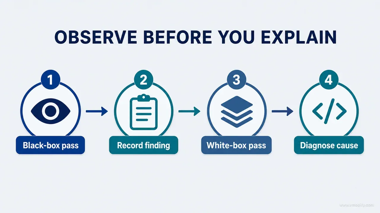
Pass 1 — black box. Review the running product without reading the implementation. Record what a user would experience, in user language, with no causal explanation attached. "The number is hard to find" is a complete finding at this stage. Resist the urge to append "probably because the card padding is inherited" — that sentence is the beginning of dismissing it.
Pass 2 — white box. Now inspect the code behind each recorded finding and determine the cause. There are eight causes worth distinguishing, because each routes to a different owner and a different fix:
- Component misuse — the right component used in the wrong place
- Token problem — the design system itself produces the wrong outcome here
- State timing — the render is correct but arrives at the wrong moment
- Content source — the string, not the layout, is the problem
- Platform wrapper — the container, insets or navigation chrome, not your code
- Data condition — this only happens with a specific shape of data
- Technical constraint — a genuine platform limitation, which changes the conversation to trade-offs
- Missing design decision — nobody ever decided this, and the code is faithfully implementing the absence
That last category is the most common and the most frequently misfiled. A screen where nothing is emphasised usually has no bug at all: it has a strategy gap, and filing it as an engineering defect guarantees it gets fixed cosmetically and reappears in the next feature.
One practical note on running this with an agent. If the same session has already read the codebase, it cannot perform a genuinely blind pass. Prefer a separate session with no implementation context for pass 1 and hand it only the build and the fixtures. If that is impractical, require runtime observations before explanations and label the limitation: the evaluator already knows the intent and may grade it more generously.
What do testable visual acceptance criteria look like?
They name an observable outcome and the conditions under which it is observed. "Looks like the design" names neither, which is why it can be neither passed nor failed honestly.
Criteria we use, and would give to anyone starting:
- The primary action is identifiable within five seconds by a reviewer who has not seen the screen before.
- Default, empty and error states preserve the same information hierarchy — the eye goes to the same region in all three.
- No text truncates at the largest accessibility text size you claim to support, on the smallest supported viewport.
- The system keyboard never covers the active input, its validation message or its recovery action.
- Before and after captures use an identical fixture, viewport, scale and text size. This one criterion eliminates most fake improvements.
- Differences between the proposed board and the runtime result are documented and classified, not silently absorbed.
- Motion supports a state change and is gated behind the reduced-motion setting.
- Touch targets meet the platform minimum, checked against WCAG 2.2's minimum target size criterion where no stricter platform rule applies.
- Content remains readable at both the publication size and the device size — a chart legible on a laptop is not automatically legible on a handset.
- Platform navigation and permission conventions remain native rather than reimplemented.
The fifth is the one worth defending hardest. An "after" image that looks better because its content is shorter is the most common form of self-deception in redesign work, and it is completely invisible unless the fixture is locked. We have seen redesigns approved on the strength of a comparison where the before shot used a real user's long name and the after shot used a two-letter placeholder.
Some criteria remain qualitative — "the screen feels calm" is not measurable and does not become measurable by pretending. What you can do is make the evaluation conditions explicit: who evaluates it, under what conditions, against what reference, and what evidence gets attached to the verdict. A qualitative criterion with explicit conditions is reviewable. A qualitative criterion without them is a vote.
How do you choose a representative device and data matrix?
Select for risk rather than accumulating superficially broad coverage. A compact matrix combining the narrowest viewport, largest text and hardest data state often exposes more distinct failures than repeating an ideal fixture across many similar devices.
The minimum matrix:
- Smallest supported viewport
- Common target viewport for your actual install base, not the market's
- Largest layout or split-screen configuration, if supported
- Default text size and the largest required text size
- Primary locale and the longest supported high-risk locale
- Empty, sparse and dense fixtures
- The permission or entitlement state relevant to the journey being reviewed
Then prioritise the combinations most likely to break. Large text on the smallest viewport with the longest localised string is worth more than the ideal fixture repeated across five similar handsets. The five handsets feel like thorough work and produce five near-identical screenshots.
Choose the common target viewport from your own analytics rather than from a device popularity chart. This is where teams building for India go wrong most often: the market's flagship mix and your install base's device mix are rarely the same, and a product acquired through performance marketing typically skews further down the device ladder than the team's own phones. If your median user is on a mid-range Android device with a 720p-class display, that is the device the review runs on.
Use stable, semantically named fixtures. Give them names that describe the condition, not the data:
profile-first-use
profile-one-measurement
profile-dense-history
profile-long-name
account-premium-expired
network-offline-pending-write
Stable fixtures make screenshots and regressions reproducible, they make a fix verifiable against the exact condition that produced the defect, and they prevent an after image from looking better merely because its content is shorter. They also give an AI agent something unambiguous to reproduce: "check the dense state" is a request it will interpret; "run profile-dense-history" is a request it will execute.
How do you run a visual review without subjective voting?
With a fixed sequence that captures perception before it captures opinion, and a severity scale that classifies findings by user consequence rather than by how strongly anyone feels about them.
The sequence, in order, with no reordering permitted:
- State the surface purpose and the priority situation being reviewed.
- Show the unannotated runtime for five seconds.
- Let each reviewer independently record what they saw first, before anyone speaks.
- Show the strategy and the selected design decision.
- Review the default state plus the highest-risk states.
- Classify every observation by user consequence.
- Inspect source only after the visible findings are captured.
- Assign an acceptance evidence requirement and an owner to each accepted finding.
Step 3 is the one people skip and the one that carries the meeting. If the most senior person in the room speaks first, everyone else's first impression is gone and what you have measured is their agreement. Independent recording takes thirty seconds and is the difference between five data points and one.
Then classify. The scale we use:
- Critical — prevents the task, hides consequential information, or creates an unsafe misunderstanding.
- High — serious comprehension, accessibility or recovery failure.
- Medium — noticeable hierarchy, consistency or interaction issue affecting quality.
- Low — local polish problem with limited user consequence.
- Observation — a directional note that requires evidence before any change.
That last tier is what makes the scale survivable. "Not premium enough" is an Observation until someone connects it to a concrete principle and a concrete effect. Observations are not dismissed — they are the seed of most good redesigns — but they do not enter the backlog as work until they have been converted into a finding with evidence. Without that tier, taste arguments either dominate the meeting or get suppressed entirely, and neither outcome produces a better product.
Defer taste discussion until purpose, state and constraints are all on the table. Most disagreements that present as taste dissolve once everyone is looking at the same state on the same device with the same fixture.
What does a runtime visual review prompt look like?
It names the three passes explicitly, forbids source-only visual conclusions, and specifies both the per-finding output and the reconciliation that must follow it. This is the prompt we hand to an agent with browser or device access.
PERFORM A RUNTIME VISUAL + INTERACTION REVIEW

Do not judge visual quality from source code alone.

INPUTS
- Product inventory:
- UI/UX strategy:
- Selected design decision/board:
- Target builds/devices:
- Reproducible data fixtures:

PASS 1 - BLACK-BOX
Inspect the rendered product before reading implementation details. For each
priority surface and state, assess purpose, first impression, hierarchy,
typography, spacing, colour, content, accessibility, platform fit and state
resilience. Record screenshots and journey observations.

PASS 2 - INTERACTION
Execute entry, orientation, action, feedback, outcome and recovery. Include
keyboard, permission, offline, error, entitlement, large-text and unusual-data
conditions.

PASS 3 - WHITE-BOX
Trace each observed issue to the owning code, state, content or data condition.
Do not use code intent to dismiss runtime evidence.

OUTPUT FOR EACH FINDING
- Surface/state/build
- Observed evidence
- User consequence
- Source cause or hypothesis
- Strategy/design criterion violated
- Recommended change
- Acceptance capture or journey

FINISH WITH
- Coverage reconciliation
- Board-to-runtime deviation table
- Issues code review alone would have missed
- Issues visual review alone could not prove
- Remaining device/accessibility gaps
The four items under FINISH WITH are what make it more than a checklist run. The third and fourth force the agent to state the boundary of each evidence type explicitly, which is the habit this entire post is trying to install.
For each accepted finding, preserve a fixed evidence packet:
Finding ID:
Surface/state/build:
Purpose and user situation:
Unannotated screenshot/video:
Annotated derivative:
Observed consequence:
Strategy or accessibility criterion:
Source cause:
Proposed correction:
Acceptance condition:
Implemented evidence:
Deviation classification:
Keeping the unannotated capture alongside the annotated one is deliberate. Annotation is interpretation, and six weeks later the arrows and boxes are what everyone remembers. The packet gives design, engineering and content a single shared object to discuss, and it gives an AI coding agent a bounded contract — the acceptance condition tells it when to stop, which is the field most implementation prompts are missing.
Which checklist should you run after every interface change?
This one — and it deliberately mixes visual and interaction inspection while making no claim about formulas, privacy or data correctness, which route to their own protections.
CONTEXT
[ ] Correct build, platform, viewport and fixture
[ ] Entry path and surface purpose confirmed
[ ] Selected board/decision available

VISUAL
[ ] Primary hierarchy is immediate
[ ] Typography wraps, scales and aligns correctly
[ ] Spacing communicates grouping
[ ] Colour and elevation preserve semantic meaning
[ ] Real content, units, dates and long values inspected

STATES
[ ] Loading
[ ] Empty/sparse
[ ] Populated/dense
[ ] Validation/error/offline
[ ] Permission/entitlement where relevant

INTERACTION
[ ] Touch, focus and keyboard
[ ] Scroll, navigation and back
[ ] Feedback, success and recovery
[ ] Motion and reduced motion

ACCESSIBILITY
[ ] Reading order and labels
[ ] Large text
[ ] Contrast and non-colour cues
[ ] Touch targets

EVIDENCE
[ ] Baseline and implementation use locked comparison conditions
[ ] Board-to-runtime deviations classified
[ ] Persisted or downstream outcome captured
[ ] Source cause linked for accepted findings
[ ] Remaining untested devices/states named
Two additions earn their place on top of the checklist itself.
Re-review after content changes. Visual quality regresses without any component code changing. Remote copy, a new localisation, price updates, longer names, generated explanations and live data all alter height and density. Route high-risk content changes through visual QA, and keep fixtures representative of the real extremes rather than the tidy sample.
Review the whole surface family. When a shared component changes, render representative consumers rather than trusting the abstraction. The same card can appear inside onboarding, settings and reports with entirely different surrounding rhythm, and source reuse increases the visual blast radius rather than reducing it. Record which consumers were actually rendered — "shared component updated" is not coverage evidence until the important contexts have been observed. The onboarding path deserves particular attention here, because it is where a first-run user forms their judgement of the product, and it is the path most likely to be reviewed only in its ideal state; we covered what good looks like there in app onboarding best practices.
Code quality and visual quality intersect, but neither contains the other. Review source to understand construction. Review runtime to understand appearance. Review interaction to understand time and recovery. Verify behaviour to understand whether the outcome is true. A mature audit does not ask one evidence type to answer every question — and the next guide in this series applies exactly that principle below the interface, following the critical data through the whole system instead of auditing screens as isolated objects.
Which mistakes cost the most here?
Seven, and every one of them is a way of accepting partial evidence as complete — which is the single failure this method exists to prevent.
- Reviewing code and calling it a UI review. Token and component inspection is source review. It is valuable and it is not a statement about how anything looks. Add runtime evidence before the claim leaves the room.
- Reviewing only polished states. The default state with ideal data is the state least likely to be broken and least likely to be seen by a new user. Use reproducible difficult states and realistic data.
- Letting implementation knowledge bias the critique. Knowing why a screen renders badly makes it stop looking bad. Do the black-box pass first, in a separate session, with no source access.
- Measuring only pixel similarity. Automated visual regression detects change against a baseline. Hierarchy, comprehension, state behaviour and platform fit matter more than literal fidelity to a board, and none of them are pixel comparisons.
- Treating visual QA as inherently subjective. Tie every finding to purpose, strategy, an accessibility criterion, a platform convention or an observed consequence. What remains genuinely subjective after that is a small and manageable set.
- Ignoring content. Words, values, dates and expressions of uncertainty are part of the visual hierarchy, and they are the part most likely to change without a code review.
- Using generated screenshots as runtime proof. Generated visuals support a concept. They cannot evidence a claim about a running build, and accepting them once makes it impossible to refuse them later.
There is an eighth that is less a mistake than a structural trap: reviewing the layer you can see and trusting the layer you cannot. On the child-growth build, the review findings that mattered clustered in persistence, sync and account identity — not in the UI that everyone was looking at every day. Watching screens is the default because screens are what is visible, and it is exactly backwards as a distribution of attention. That is the argument for part 11, and for treating visual review as one of four layers rather than as the review.
If you want a second pair of eyes on a product before it ships — a full audit across all four layers, with the evidence packets to go with it — talk to us.
Frequently Asked Questions
Can automated visual regression testing solve this?+
No, and it is important to be precise about why. Visual regression detects pixel differences against a stored baseline, which makes it excellent at catching unintended change. It cannot decide whether the baseline was good in the first place, whether a deliberate change improved the hierarchy, or whether a newly added state is understandable. Use it as a change detector under the review, never as a substitute for it.
Should designers review code?+
They benefit enormously from understanding constraints and which patterns are reusable, and that understanding makes their feedback more actionable. They do not need to replace engineering review. The goal is cross-evidence collaboration — the designer brings the runtime observation, the engineer brings the source cause, and the reconciliation table is where the two meet.
Can an AI agent perform a visual review?+
Yes, when it has actual rendered images or controlled browser or device access, and when the prompt requires state coverage, comparison conditions and explicit evidence labels. What you must never accept is a source-only visual conclusion — an agent that has read the code will produce a confident and completely unfounded statement about how the screen looks if you let it.
How many devices are enough for visual QA?+
Fewer than most teams assume, chosen better. Take the smallest supported viewport, your actual median device from analytics rather than from a market chart, the largest text size you claim to support, the longest supported locale, and any device-specific feature your product depends on. Risk determines the matrix. Seven conditions selected to break the design beat thirty selected to demonstrate it.
What if the implementation deliberately differs from the design board?+
Document the reason and judge the result against the strategy and the acceptance criteria rather than against the board. The board is proposed intent, not sacred pixels — a deviation made for a good platform reason is a decision to record, and a deviation nobody noticed is a defect. The difference between those two is whether it was classified.
Where does accessibility review sit in these four layers?+
It spans three of them, which is why it gets lost. Semantics and labels are source review, contrast and text scaling are runtime visual review, and focus order and screen-reader announcements are interaction review. Assign each accessibility criterion to the layer that can actually observe it, otherwise everyone assumes it was checked in one of the others.
How long does a full four-layer review take on a typical mobile product?+
For a product with fifteen to twenty priority surfaces, budget two to three days for a first pass once the fixtures exist, with fixture preparation the largest variable. Fixtures are the part worth investing in, because they are reusable — the second review of the same product is materially faster than the first, and every fix afterwards becomes verifiable against a named condition rather than against a memory.
Sources
- W3C — WCAG 2.2 Recommendation — The testable success criteria a visual review can treat as pass/fail rather than opinion.
- W3C — Understanding Target Size (Minimum) — The floor for touch target sizing where no stricter platform rule applies.
- W3C — Understanding Reflow — Why layouts must survive enlarged text and narrow viewports without loss of content.
- W3C — Understanding Use of Color — Colour alone is never sufficient to convey state — a defect, not a preference.
- Apple — Human Interface Guidelines: Typography — Dynamic Type support as a layout obligation rather than a text-style setting.
- Android Developers — Display Content Edge-to-Edge — System insets and platform chrome as the layer your component code never sees.
- Android Developers — Compose Screenshot Testing — Automated capture of deterministic states as a change detector under a human review.
- Nielsen Norman Group — Response Times: The 3 Important Limits — The 0.1s and 1s perceptual thresholds behind feedback and acknowledgement timing.
About the author
Amol Pomane — Founder, Vmobify
Amol leads Vmobify, a mobile app growth agency that has driven 30M+ downloads and ranked 54K+ keywords across 300+ apps since 2013. He writes about ASO, paid user acquisition, retention, and the operational reality of scaling mobile apps in India and global markets.