The Mobile UI/UX Rules AI Agents Get Wrong
Coding agents write mobile layouts that look right in a screenshot and fail on a real device. The failures are consistent and enumerable: safe-area insets, Dynamic Type, touch-target size and the states nobody screenshots. Here is the full list, with a skill file that encodes the fixes.

On this page
- Why does mobile design break agents specifically?
- Which ten failures show up most often?
- Which iOS numbers actually matter?
- How do you use Liquid Glass correctly?
- Which Android numbers actually matter?
- What is the onCheckedChange = null trap?
- What can nobody actually tell you about thumb zones?
- Which five states does mobile need?
- What does the mobile-ui-ux skill encode?
- How do you verify rather than hope?
- Frequently Asked Questions
Why does mobile design break agents specifically?
Mobile design fails agents because the rules that matter are invisible in a screenshot: physical insets, system text scaling, minimum touch targets and states that only appear under real conditions.
An agent writing web code is working in a domain where its training data and its runtime assumptions mostly agree. There is a viewport. There is a pointer, and it hovers. Layout is a box model the model has seen ten million times. Failure looks like a scrollbar in the wrong place.
Mobile removes every one of those assumptions and adds constraints that have no web analogue.
There is no viewport, only a physical screen with parts of it spoken for. A notch, a Dynamic Island, a home indicator, a status bar, a three-button navigation bar, a gesture strip. The drawable region is what is left over, and it differs per device, per orientation, and per OS version. An agent that reaches for paddingTop: 44 because that was the status bar height on the phone in its training data has written a bug that will not appear on the simulator it was tested on.
There is no hover, which means there is no cheap way to show affordance or preview state. Every interaction is a commitment. The web pattern of "reveal the delete button on hover" has no mobile equivalent, and agents reproduce it as an always-visible delete button in a list row — a destructive action one mis-tap away.
The operating system owns gestures at the screen edges, and it wins. Swipe from the bottom, swipe from the left, three-finger swipe: those belong to the OS, and your carousel does not get them. Agents place horizontally scrolling content flush to the screen edge constantly, because on the web that is fine.
Text resizes by a factor of three at the user's discretion. Not by a browser zoom that scales everything proportionally — by a system setting that changes point sizes while your fixed-height container stays fixed. Body text runs from 17 pt to 53 pt on iOS. Any container with a hardcoded height is broken at the top four accessibility sizes.
Reach matters. A one-handed screen has regions that are comfortable, awkward and effectively unreachable, and the primary action should not be in the third one.
And the network is a state, not an assumption. Mobile apps go offline mid-flow, resume from background with stale data, and get killed by the OS. An agent that models "loading" and "success" has modelled the demo, not the app.
None of this is exotic and all of it is documented. The gap is that the documentation is not in a form the agent reads — and on Apple's side it is literally not fetchable, which I wrote up in stop feeding your agent empty pages. Point an agent at developer.apple.com/design/human-interface-guidelines/ and it retrieves an empty page, because the site is JS-rendered. Tell it to "follow the HIG" and it follows nothing. The desktop-side version of this problem is covered in the Claude Code design plugins guide.
Which ten failures show up most often?
Ten failures account for most of what goes wrong, and every one of them is checkable rather than a matter of taste.
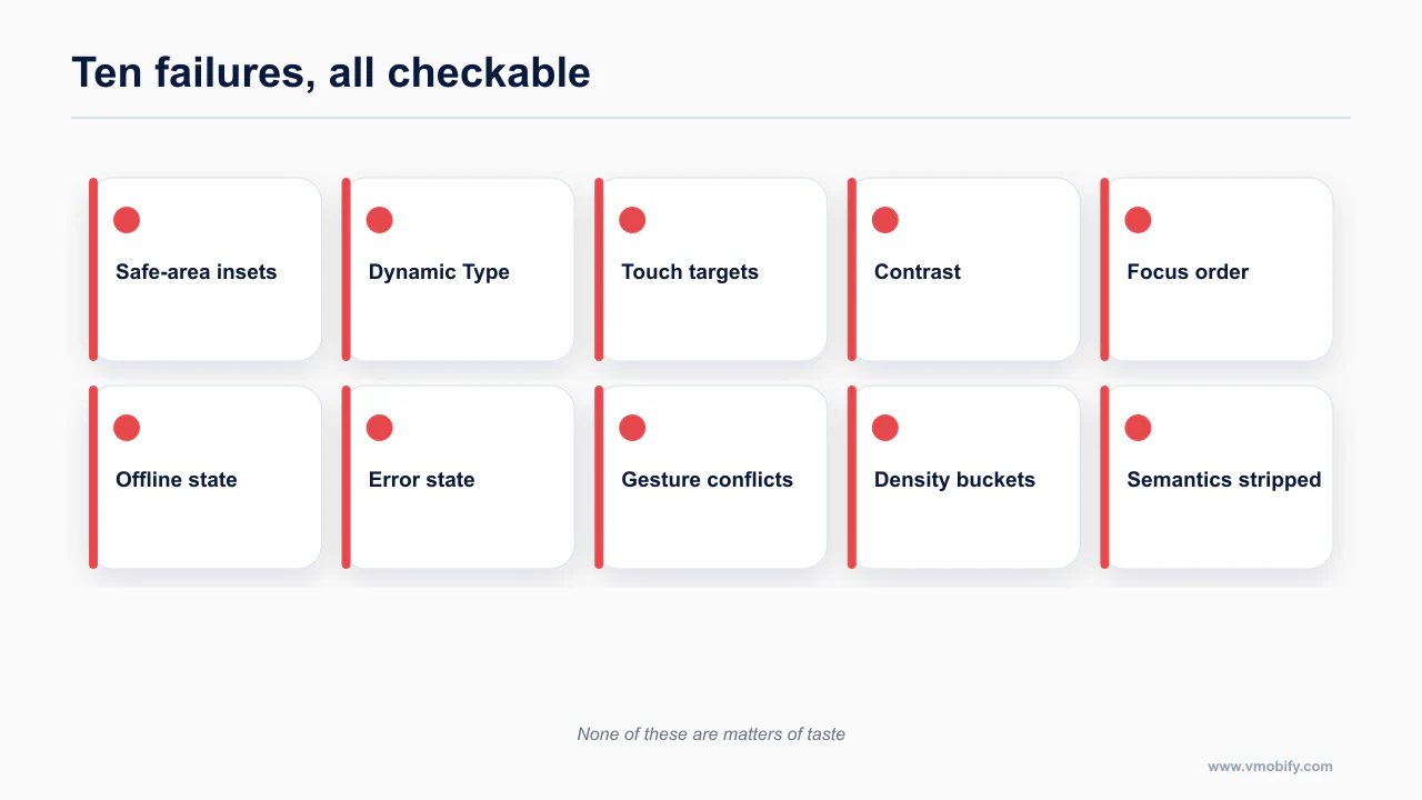
This is the audit list. If you read nothing else, read this and grep your repo for the left column.
| # | What agents ship | What the platform requires |
|---|---|---|
| 1 | Hardcoded top and bottom padding | Real insets. iOS: .safeAreaInset. React Native: react-native-safe-area-context (SafeAreaProvider + useSafeAreaInsets) — not RN's built-in SafeAreaView, which is iOS-only and ignores Android navigation bars. Android: WindowInsets, and it is mandatory under API 36 |
| 2 | Copy-pasted KeyboardAvoidingView | It needs a different behavior per platform and breaks with native headers unless you get keyboardVerticalOffset right. The 2026 consensus is react-native-keyboard-controller, which drives the keyboard frame on the UI thread |
| 3 | Bottom padding on scroll content | Padding on the content clips scroll indicators and breaks over-scroll. Use contentInset plus scrollIndicatorInsets on iOS; contentPadding on LazyColumn in Compose, not Modifier.padding |
| 4 | .map() over an array to render a list | FlashList v2 on React Native — full new-architecture rewrite, estimatedItemSize removed, maintainVisibleContentPosition on by default, and Shopify claims up to 50% less blank area than v1. In Compose, LazyColumn with a stable key = {}; agents omit the key and force full recomposition |
| 5 | Only loading and success | Mobile needs five states. Section eight |
| 6 | Permission dialog on launch | Google's own guidance is "as late into the flow as possible." Prime with your own dialog first; show the OS dialog only after a soft yes. The OS dialog is effectively one-shot and a hard deny is near-permanent |
| 7 | A four-screen onboarding carousel | Defer to first-use context. Note, with appropriate uncertainty, that "three screens max" is folklore — I could not find rigorous research on onboarding length; every source is a vendor blog |
| 8 | Deep links declared and never verified | iOS: apple-app-site-association at https://domain/.well-known/, Content-Type: application/json, no redirects, no query string, plus the applinks: entitlement. Android: /.well-known/assetlinks.json, android:autoVerify="true", and the SHA-256 of the Play App Signing certificate, not just your upload cert — the single most common failure. Both fall back silently to the browser |
| 9 | Full-width buttons on iOS | Now explicitly against the HIG. Section four |
| 10 | Fixed height on a text container | Breaks at AX1 and above, where Body goes from 17 pt to 53 pt. Use intrinsic sizing |
Failures 1, 3, 9 and 10 are layout; 2 and 4 are library choices; 5 is architectural, 6 and 7 are product, 8 is configuration. An agent will fix any of them on request. It will not fix them unprompted, because nothing in its context says it should.
Here is number one, the most common of the lot, in the two forms you will actually see it.
// Wrong — a magic number for a status bar that is not that height on your device
<View style={{ paddingTop: 44, paddingBottom: 34, flex: 1 }}>
  <Header />
  <Content />
</View>

// Also wrong — RN's built-in SafeAreaView is iOS-only and no-ops on Android
import { SafeAreaView } from 'react-native';
<SafeAreaView style={{ flex: 1 }}>
  <Content />
</SafeAreaView>
// Right
import { SafeAreaProvider, useSafeAreaInsets } from 'react-native-safe-area-context';
function Screen() {
const insets = useSafeAreaInsets();
return (
<View style={{ flex: 1, paddingTop: insets.top, paddingBottom: insets.bottom }}>
<Header />
<Content />
</View>
);
}
// Wrap the app once, above the navigator
export default () => (
<SafeAreaProvider>
<Screen />
</SafeAreaProvider>
);The Android half of this is not optional any more, which I get to in section five.
Several of these are the mobile expression of a general problem: an agent optimises for what it can evaluate, and it can only evaluate a rendered screenshot at default settings. Making an agent implement a design without damage covers the same failure mode on the web, where the consequences are milder because the viewport is forgiving.
Which iOS numbers actually matter?
A small set of iOS numbers decides whether a layout is usable: safe-area insets, the 44pt minimum target and the Dynamic Type range you must survive.
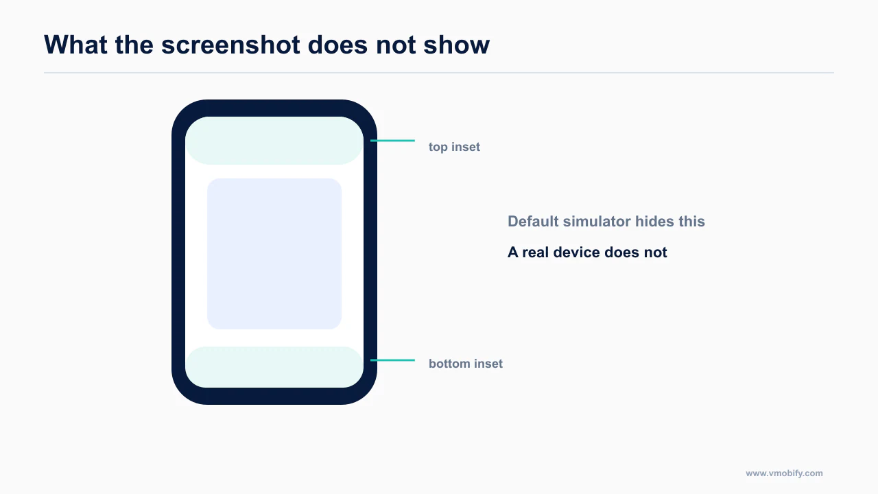
Start with the ones that never change.
| Rule | Value |
|---|---|
| Minimum control size, iOS and watchOS | 44×44 pt |
| Minimum control size, macOS, tvOS, visionOS, iPadOS with a pointer | 28×28 pt |
| Padding around bezeled elements | about 12 pt |
| Padding around unbezeled elements | about 24 pt |
| Contrast | 4.5:1 body text, 3:1 large text, 3:1 UI components |
| Dark Mode custom colours | at least 4.5:1, and strive for 7:1 on small text |
| Minimum recommended custom type size | 17 pt on iOS, 12 pt watchOS, 11 pt macOS |
| tvOS safe area | 60 pt top and bottom, 80 pt sides |
The 7:1 dark-mode target is the one agents never apply. Dark Mode is not the light palette with the values flipped; colours that pass AA on white often fail on a dark surface. Apple's guidance is to aim past AA on small text.
Dynamic Type, the table agents ignore
Seven standard sizes and five accessibility sizes, AX1 through AX5. Body runs 17 pt to 53 pt — a 3.1× range on the size your entire layout is built around. Values are size over line height.
| Style | Large (default) | AX5 |
|---|---|---|
| Large Title | 34 / 41 | 60 / 70 |
| Title 1 | 28 / 34 | 58 / 68 |
| Title 2 | 22 / 28 | 56 / 66 |
| Title 3 | 20 / 25 | 55 / 65 |
| Headline | 17 / 22 Semibold | 53 / 62 |
| Body | 17 / 22 | 53 / 62 |
| Callout | 16 / 21 | 51 / 60 |
| Subhead | 15 / 20 | 49 / 58 |
| Footnote | 13 / 18 | 44 / 52 |
| Caption 1 | 12 / 16 | 43 / 51 |
| Caption 2 | 11 / 13 | 40 / 48 |
Two things follow from this table, and agents miss both.
The first is that a fixed height anywhere near text is a bug. A 44 pt row with a Body label inside it is fine at Large and unreadable at AX3.
The second is the rule people never quote. The HIG asks you to "aim to display as much useful text at the largest accessibility font size as at the largest standard size." That is not "let it wrap." It means restructuring: an inline row with a label on the left and a value on the right becomes a stacked layout at accessibility sizes, and secondary columns get dropped rather than crushed.
// Wrong — fixed height, and the row never restructures
HStack {
    Text("Notifications")
    Spacer()
    Text(status)
}
.frame(height: 44)

// Right — restructures at accessibility sizes, no fixed height
struct SettingRow: View {
    @Environment(\.dynamicTypeSize) private var typeSize
    let title: String
    let value: String

    var body: some View {
        if typeSize.isAccessibilitySize {
            VStack(alignment: .leading, spacing: 4) {
                Text(title)
                Text(value).foregroundStyle(.secondary)
            }
            .frame(maxWidth: .infinity, alignment: .leading)
        } else {
            HStack {
                Text(title)
                Spacer()
                Text(value).foregroundStyle(.secondary)
            }
        }
        .padding(.vertical, 8)
    }
}
@ScaledMetric is the other half of this. Any spacing or icon size that sits next to text should scale with it, or your layout drifts apart as the type grows.
While you are in the HIG: the tab bar is for navigation, never for actions; five or fewer tabs; never hide or disable a tab item; avoid the overflow "More" tab, which buries content. Sheets get .medium and .large detents, custom values are allowed, and Apple notes detents are designed for iPhone. Always include a grabber on a resizable sheet — it is both the visual affordance and the VoiceOver resize control. And do not ship an in-app light/dark toggle: the HIG says it creates duplicate settings and reads as broken.
Apple states the minimum tappable target and the Dynamic Type ranges in the HIG layout guidance, and the type behaviour itself in the typography section. Both are worth reading once rather than inferring from a component library's defaults.
How do you use Liquid Glass correctly?
Liquid Glass is a material with rules, not a finish to apply everywhere, and using it indiscriminately is now a recognisable tell.
iOS 26 is the sharpest training-data cliff in mobile right now. Most models were trained before Liquid Glass shipped, so they do one of two things: produce iOS 17-era chrome, or hallucinate an API like .liquidGlass() that does not exist. Either way you need to supply the rules and the API surface, because the model does not have them. I go into the framework-level consequences in Flutter, SwiftUI or React Native.
The rules, in the order they get broken.
It is a controls and navigation layer, not a content layer. Liquid Glass belongs on tab bars, toolbars and sidebars — the floating layer above your content. Apple's guidance is explicit: do not use Liquid Glass in the content layer. The one exception is transient interactive elements such as a slider or a toggle while it is being manipulated. Standard materials — ultra-thin, thin, regular, thick — still exist and are what you use inside content.
There are two variants and they are not interchangeable. .regular is the default: it blurs and adapts luminosity, and it is what you use for alerts, sidebars, popovers and anything text-heavy. .clear is highly translucent and is only appropriate over media-rich backgrounds, and it requires a dimming layer underneath for legibility. An agent given "make it glassy" will reach for the most dramatic option; .clear over a plain white list is unreadable.
Use it sparingly. Apple says so in those words. Never stack glass on glass.
Avoid full-width buttons. This is the new rule that contradicts the default output of every React Native and Tailwind habit an agent has. iOS 26 wants buttons inset from screen edges so their corner radii harmonise with the hardware corner curvature. w-full on a CTA — the single most common button class in the Tailwind corpus — is now off-pattern on iOS. It is also failure number nine in the table above, and it will be in whatever an agent hands you unless you say otherwise.
// Wrong on iOS 26 — the Tailwind/NativeWind default
<Pressable className="w-full rounded-lg bg-blue-600 py-4">
  <Text className="text-center text-white">Continue</Text>
</Pressable>

// Better — inset from the edge, capsule shape, room for the corner curvature
<View className="px-6">
  <Pressable className="self-center rounded-full bg-blue-600 px-8 py-4">
    <Text className="text-center text-white">Continue</Text>
  </Pressable>
</View>
// Native, iOS 26
Button("Continue") { start() }
.buttonStyle(.glassProminent)
.buttonBorderShape(.capsule)
.padding(.horizontal, 24)Scroll edge effects are built in. Content passing under a bar is blurred by the system. Do not hand-roll a gradient scrim over your header; you will get two effects stacked.
The API surface, so you can paste it into your agent's context: .glassEffect(_:in:isEnabled:), Glass.regular / .clear / .identity, .tint(), .interactive(), GlassEffectContainer(spacing:), .glassEffectID(_:in:), .glassEffectUnion, .glassEffectTransition, .buttonStyle(.glass) and .glassProminent, .buttonBorderShape(.capsule / .circle / .roundedRectangle(radius:)), ToolbarSpacer(.fixed / .flexible), .tabBarMinimizeBehavior(.onScrollDown), .tabViewBottomAccessory { }, .searchToolbarBehavior(.minimized), DefaultToolbarItem(kind: .search, placement: .bottomBar), and .navigationTransition(.zoom(sourceID:in:)) paired with .matchedTransitionSource. Requires iOS 26 and Xcode 26; iPhone 11 and later.
If you want a single file to point an agent at, conorluddy/LiquidGlassReference is a complete Swift and SwiftUI API reference with do/don't guidance and the three-condition test for .clear. The author's stated purpose is literally "a document I can point Claude at." One caveat: it was last updated in November 2025, so it may lag iOS 26 point releases — check the dates before you trust a specific signature. Prisma-Labs-Dev/apple-skills is the other one worth knowing about; it includes a dedicated hig skill and a Liquid Glass reference, and it is the best iOS design-rule source I found.
One accessibility consequence that is easy to miss: @Environment(\.accessibilityReduceTransparency) is now load-bearing. Under Liquid Glass, a user with Reduce Transparency on gets a materially different UI, and if your contrast only works because of the blur, it fails for them.
Apple documents the material and its usage rules under Materials in the HIG; there is no standalone Liquid Glass page, which is worth knowing because several guides link to one that does not exist.
Which Android numbers actually matter?
Touch target: 48×48 dp minimum. That one is stable, and section six is about the specific way it silently fails in Compose.
The M3 type scale, taken from TypeScaleTokens.kt in the androidx source rather than from m3.material.io — which, like Apple's design site, is fully JS-rendered and returns nothing to a fetcher. Values are size / line height / tracking, in sp.
| Role | Large | Medium | Small |
|---|---|---|---|
| Display | 57 / 64 / −0.2 | 45 / 52 / 0.0 | 36 / 44 / 0.0 |
| Headline | 32 / 40 / 0.0 | 28 / 36 / 0.0 | 24 / 32 / 0.0 |
| Title | 22 / 28 / 0.0 | 16 / 24 / 0.2 (Medium) | 14 / 20 / 0.1 (Medium) |
| Body | 16 / 24 / 0.5 | 14 / 20 / 0.2 | 12 / 16 / 0.4 |
| Label | 14 / 20 / 0.1 (Medium) | 12 / 16 / 0.5 (Medium) | 11 / 16 / 0.5 (Medium) |
This is the table that settles the error in awesome-skills/mobile-app-design. The smallest body role is bodySmall at 12sp. The 11sp value is labelSmall — a label, used for things like a chip's caption, not for reading. If a skill tells your agent that 11 is the body minimum, your body copy is one step below spec everywhere.
M3 Expressive adds *Emphasized variants of every role.
Window size classes: there are five width buckets now, not three. Compact under 600dp, Medium 600–840, Expanded 840–1200, Large 1200–1600, X-Large 1600 and up. Height splits Compact under 480, Medium 480–900, Expanded 900 and up. The API is currentWindowAdaptiveInfo().windowSizeClass. Agents reliably write the three-bucket version, because that is what the older documentation said, and then a foldable or a desktop-mode window lands in a bucket the code does not handle.
Android 16 / API 36 changes three things with no opt-out. These apply to you now, not eventually — the Play deadline for targeting API 36 was 31 August 2026, and it has passed. Apps below API 36 can no longer ship updates. Treat it as a floor.
- Edge-to-edge is enforced.
windowOptOutEdgeToEdgeEnforcementis deprecated and ignored. Your content draws under the system bars whether you planned for it or not, and you consume insets viaWindowInsetsor the Compose inset APIs. This is the single thing agents get wrong most often on Android, because the failing state looks fine on a gesture-navigation emulator and clips badly on a three-button device. - Predictive back is on by default.
onBackPressed()is no longer called, andKEYCODE_BACKis not dispatched. Migrate toOnBackInvokedCallback, orBackHandlerin Compose. Theandroid:enableOnBackInvokedCallback="false"escape hatch is temporary. - Orientation and resizability locks are ignored on sw600dp and above.
screenOrientation,resizableActivity, min and max aspect ratio, andsetRequestedOrientation()all stop working on large screens. The opt-out property will not work at all at API 37. Games are exempt viaappCategory.
Two more from the same release that catch people out. android:elegantTextHeight is deprecated and ignored, which changes text metrics for Arabic, Thai, Lao, Myanmar, Tamil and most Indic scripts — layouts tuned to the old metrics clip. If you ship to India, check this. And BODY_SENSORS has been split into granular android.permission.health.* permissions that require a privacy-policy activity, or the permissions get revoked.
// Wrong — status bar and nav bar draw over this
Column(modifier = Modifier.fillMaxSize().padding(16.dp)) { /* … */ }

// Right — consume the insets the system tells you about
Column(
    modifier = Modifier
        .fillMaxSize()
        .windowInsetsPadding(WindowInsets.systemBars)
        .padding(16.dp)
) { /* … */ }

// For a scrolling list, insets belong in contentPadding, not in Modifier.padding
LazyColumn(
    contentPadding = WindowInsets.systemBars.asPaddingValues(),
    modifier = Modifier.fillMaxSize()
) {
    items(rows, key = { it.id }) { row -> RowItem(row) }
}
Note the key = { it.id }. Agents omit it, and the list recomposes entirely on every change.
One more caveat worth stating plainly, because it affects what you should let an agent reach for. M3 Expressive components are only production-usable on an alpha dependency. The expressive Button family, FAB Menu, ToggleButton, SplitButton, ButtonGroup, FloatingToolbar, the flexible top app bars, the new search bar slot APIs, LoadingIndicator and MaterialTheme.motionScheme all landed in compose-material3 1.5.0-alpha19 in May 2026, with alpha27 out in August. The last stable release is still 1.4.0. If your agent writes SplitButton, it has just put you on an alpha. That may be fine. It should be a decision.
Google's equivalent floors are documented in Android's layout foundations, and the accessibility minimums in the accessibility guide. They are separate numbers derived from a different density model, so meeting Apple's does not satisfy Google's.
What is the onCheckedChange = null trap?
Passing null to disable a control is the most common accessibility defect in agent-written Compose, because it looks correct and silently removes the semantics.
This one deserves its own section because it is an accessibility bug baked into a pattern Google itself recommends, and it is invisible in code review.
Compose's Checkbox, RadioButton, Switch, Slider and Surface enforce the 48dp minimum touch target internally by expanding their own interaction bounds. But they only do that when they are interactive. Pass onCheckedChange = null and the component becomes decorative — and the minimum-size enforcement goes with it. No warning, no lint error, no visual difference. The checkbox looks identical; its touch target is now the size of the drawn box.
The reason this matters is that onCheckedChange = null is exactly the idiom in the recommended pattern for a toggleable row. The intent is correct: when the whole row is the target, the checkbox inside it must not be independently clickable, or you get two overlapping targets and a confused screen reader. So you null the handler and put Modifier.toggleable on the row.
Which is right — as long as the row is actually there.
// Wrong. Copied from the recommended pattern without the outer toggleable.
// The Checkbox is now sub-48dp and nothing tells you.
Row(verticalAlignment = Alignment.CenterVertically) {
    Checkbox(checked = checked, onCheckedChange = null)
    Spacer(Modifier.width(16.dp))
    Text("Email me about new features")
}
// Right. The row is the 48dp+ target and owns the semantics.
Row(
modifier = Modifier
.fillMaxWidth()
.heightIn(min = 48.dp)
.toggleable(
value = checked,
onValueChange = onCheckedChange,
role = Role.Checkbox
)
.padding(horizontal = 16.dp),
verticalAlignment = Alignment.CenterVertically
) {
Checkbox(checked = checked, onCheckedChange = null)
Spacer(Modifier.width(16.dp))
Text("Email me about new features")
}// Also right, when the control genuinely stands alone.
// Keeping the handler restores the component's own 48dp enforcement.
Checkbox(checked = checked, onCheckedChange = onCheckedChange)
// And if you have a small custom control with no built-in enforcement:
Modifier.minimumInteractiveComponentSize()
// or explicitly
Modifier.sizeIn(minWidth = 48.dp, minHeight = 48.dp)An agent asked for "a settings row with a checkbox" will produce the first block roughly as often as the second, because both appear in its training data and only one of them appears with the enclosing row intact. This is the strongest single argument for having a design skill in context at all: the fix is one sentence of guidance, and no amount of general capability substitutes for it.
Compose's enableAccessibilityChecks() in UI tests will catch the resulting target size. That is the CI-runnable version of this section, and section ten covers it.
What can nobody actually tell you about thumb zones?
Thumb-zone percentages circulate everywhere and rest on 2013–2016 research; treat the shape of the finding as useful and the numbers as unverified.
Here is where I break with almost everything currently ranking for this query.
The thumb-zone heat maps everybody reproduces — the green/yellow/red hand overlays showing what a thumb can comfortably reach — come from Steven Hoober's 2013 observational work and Luke Wroblewski's 2016 syntheses of it. That research was conducted on phones that were substantially smaller than what people carry now. It predates 6.7-inch displays entirely.
I looked for a 2026 primary reachability study. I did not find one. Everything currently ranking for "thumb zone 2026" is a restatement of ten-year-old research with a new date on it, frequently with invented percentages attached. So take the directional guidance for what it is — a reasonable inference from old data, not a measured fact — and do not repeat a percentage you cannot source.
What is not in doubt, because it is in the platform documentation:
Android honours a 200 dp limit on the vertical extent of the gesture-exclusion rectangles you register via View.setSystemGestureExclusionRects (API 29 and up). Exclusion applies to the back gesture only. Google's own guidance is to register exclusion rects only for precision small-area gestures, not for whole scroll views or ordinary buttons.
The home and quick-switch gestures at the bottom edge cannot be opted out of at all. Only immersive mode, intended for games, defers them. The iOS equivalent is preferredScreenEdgesDeferringSystemGestures, or .defersSystemGestures(on:) in SwiftUI, and the home-indicator region is likewise non-negotiable.
The HIG's framing is the one to give an agent: avoid conflicting with gestures that access system UI, and any shortcut gesture must supplement a tappable control, never replace it. iOS and iPadOS reserve three-finger swipe for undo and redo and three-finger pinch for copy and paste.
From that, the practical rules that survive the caveat:
- Primary actions and navigation go in the bottom third of the screen.
- Destructive and rare actions go in the top corners, where they are hardest to hit accidentally.
- Any mid-flow decision should be a bottom sheet, not a top-anchored modal.
- Never put a horizontally scrolling carousel or a slider flush against a screen edge; it will fight the back gesture. Inset it.
- Never place a tap target inside the home-indicator strip.
Those hold regardless of whether the 2013 percentages are still accurate, because they follow from the gesture ownership rules, which are documented and current.
Which five states does mobile need?
Every mobile surface needs empty, loading, error, offline and success — and offline is the one agents omit almost every time.
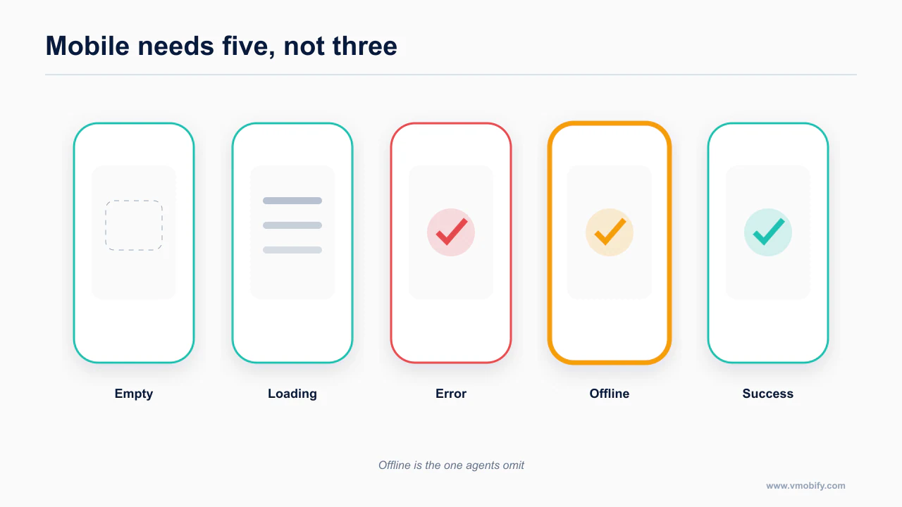
Agents build two states: loading and success. Occasionally three, if you ask for error handling and get a catch block that logs to the console.
Mobile needs five, and the two extras are the ones that decide whether your app feels solid or broken.
- Loading — a skeleton, not a spinner. A spinner communicates "something is happening." A skeleton communicates what is about to appear and stops the layout jumping when it does.
- Empty — not the same as loading, and not the same as error. An empty list with no explanation reads as a bug. Empty state gets a reason and an action.
- Error, with retry — the retry affordance is the whole point. An error message with no way forward is a dead end, and on mobile the most common error is transient.
- Offline — distinct from error. The user is not broken and neither are you; the network is gone. Say so, and keep whatever functionality does not need the network alive.
- Stale but cached — you have data, it is old, you are refreshing. Show the data, mark it as stale, refresh underneath. This is the state that makes an app feel fast, and it is the one agents never produce unprompted.
The corollary is that optimistic UI plus a write queue is the mobile default, not an optimisation. A user who taps "save" on a train expects the row to appear, and expects it to still be there when the tunnel ends.
type ScreenState<T> =
  | { kind: 'loading' }
  | { kind: 'empty' }
  | { kind: 'error'; message: string; retry: () => void }
  | { kind: 'offline'; cached?: T }
  | { kind: 'stale'; data: T; refreshing: true }
  | { kind: 'ready'; data: T };
Handing an agent that union type as part of the brief changes its output more than any amount of prose about error handling, because it makes the missing states structurally impossible to skip. The compiler asks for them.
This is also where design and store review overlap. Reviewers test offline, invalid input, empty states and expired sessions — the paths a demo never takes. Teams ship demo-ready rather than review-ready, and it is a documented rejection cause; I cover the mechanics in why your AI-built app got rejected. Retention consequences of getting these wrong are in mobile UX and retention.
What does the mobile-ui-ux skill encode?
The skill file collects every rule above into one artifact the agent loads whenever it touches a mobile UI file.
Everything above is the reasoning. The skill is the same rules in the form an agent consumes: terse, imperative, no narrative, structured so the model can act on it without re-deriving anything.
Use the checklist below as the source for a project-level mobile UI skill.
What is in it:
- The cross-platform baseline: 44×44 pt and 48×48 dp targets, contrast ratios including the 7:1 dark-mode target, and the minimum type sizes with the correct Android values.
- Safe areas and insets for all three stacks, including the
SafeAreaViewversusreact-native-safe-area-contextdistinction and the API 36 edge-to-edge requirement. - The full Dynamic Type table and the stacked-layout rule at accessibility sizes.
- The M3 type scale, the five window size classes, and the M3 Expressive alpha caveat.
- Liquid Glass rules and the API list — layer discipline,
.regularversus.clear, use sparingly, avoid full-width buttons. - System gesture ownership, the 200 dp exclusion limit, and the reach rules with the honest provenance caveat attached.
- The five states, as a type definition the agent is told to implement.
- The
onCheckedChange = nulltrap, with both correct forms. - Permission priming, deep-link verification, and the list-rendering rules.
- A short self-check the agent runs against its own output before it hands work back.
Save the rules in your repository's agent-instruction format so they travel with the code and remain reviewable by collaborators.
Two notes on getting value out of it.
First, a skill is not a substitute for the platform documentation — it is an index into it. Pair it with the fetchable HIG and Material URLs from post eight so the agent can go and read the primary source when it needs a detail the skill does not carry.
Second, the skill assumes the agent can see its own output. Design rules applied open-loop plateau at "looks fine in the screenshot." The step change comes from letting the agent build, run and tap through the app, which is driving simulators and devices from Claude Code. And the component library you point it at changes how much of this it gets right by default — a system whose files the agent can read beats one whose API it has to remember, which is the argument in which mobile design system gets the best AI output.
If you would rather adopt a general design skill first and add mobile rules on top, the Claude Code design plugins and skills guide covers the desktop-side equivalents, and setting UI/UX strategy before redesigning screens covers the decision that should precede either.
How do you verify rather than hope?
Verification means running the layout at the largest Dynamic Type size on a device with a notch, not looking at a simulator screenshot at default settings.
A skill improves the first draft. It does not prove anything. These four checks do, and three of them are automatable.
eslint-plugin-react-native-a11y is the highest-leverage thing you can add to an agent-written React Native repo, and the reason is mechanical rather than technical: it is lint. The agent sees the errors in its own loop and fixes them without being asked. Presets are basic, ios and android. Nothing else in this list has that property.
Xcode's Accessibility Inspector runs an audit against a live simulator and will simulate Dynamic Type sizes, which is how you check the AX5 column of that table without a device and a settings crawl. It catches missing labels, low contrast and undersized targets.
Android's Accessibility Scanner is the manual counterpart; accessibility-test-framework with Espresso's AccessibilityChecks.enable(), or enableAccessibilityChecks() in Compose UI tests, is the CI-runnable version and the one that catches the section-six bug.
Screenshot the extremes. The fastest manual check that finds real bugs: smallest supported device at AX5, largest device in dark mode with Reduce Transparency on, and both orientations. If your agent can drive a simulator, this is a scripted pass rather than a chore.
Two things none of them catch. Label quality is invisible to every automated tool — a button labelled "Button" passes every check and helps nobody. And Apple's new Accessibility Nutrition Labels on the product page now declare VoiceOver, Larger Text and Captions support publicly, which means a label-quality problem is a marketing problem too.
The reason this post exists is that the gap is real and checkable. Two candidate skills, one with a factual error in a number your agent will use on every screen, one emitting web code. Neither covers gestures, insets, reach and both platforms' guidelines together.
That is a low bar. Clear it, keep the file in your repo, and the failure list at the top of this post stops being what you find in review and starts being what your agent avoids in the first place.
If you are earlier in the process than this, start at how to actually ship a mobile app with Claude Code, which covers the whole path and where people fall off it. The full shipping path this sits inside is the Claude Code mobile pillar.
Frequently Asked Questions
Why do agent-built mobile screens look fine and feel wrong?+
Because the failures are physical rather than visual. Safe-area insets, touch-target size and text scaling do not show up in a default-settings simulator screenshot, which is the only thing the agent can evaluate.
What is the single most common mobile accessibility defect?+
Disabling a control by passing null to its change handler in Compose. It renders correctly and removes the semantics that assistive technology depends on.
Are 44pt and 48dp the same requirement?+
No. Apple specifies 44pt minimum, Google specifies 48dp, and they derive from different density models. Meeting one does not automatically satisfy the other.
Should I use Liquid Glass in my app?+
Only where Apple documents it as appropriate. It is a material with usage rules; applied everywhere it reads as a default rather than a decision.
Which states do agents forget most often?+
Offline first, then error. Empty and loading get generated reasonably often; offline almost never appears unless the rule is written down.
Can I trust thumb-zone percentages?+
Treat them as directional. Every figure in circulation restates research from 2013-2016 and no current primary study exists, so cite the originals with their dates or drop the numbers.
Does a skill file actually change the output?+
Yes, because it loads whenever the agent touches a UI file rather than depending on you remembering to paste the rules into a prompt.
Sources
About the author
Amol Pomane — Founder, Vmobify
Amol leads Vmobify, a mobile app growth agency that has driven 30M+ downloads and ranked 54K+ keywords across 300+ apps since 2013. He writes about ASO, paid user acquisition, retention, and the operational reality of scaling mobile apps in India and global markets.