Mobile App UX That Retains: Friction, Habit Design & Gamification
Retention is won and lost in the user experience, not the visual design. This is a practitioner's guide to the UX changes that actually move retention — reducing friction, designing habits with the Hook Model, and using gamification that engages instead of annoying.

How does UX actually affect retention, versus how it looks?
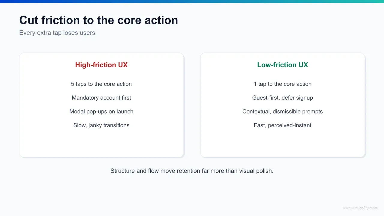
UX affects retention through structure and flow — how quickly and how reliably a user reaches the value they came for — far more than through visual polish, and confusing the two is the single most common reason redesigns fail to move the numbers. A beautiful app that buries its core action three screens deep retains worse than a plain one that delivers value on the first tap.
It helps to separate two things that get bundled under "design". Visual design is what the app looks like: colour, type, spacing, illustration, motion. Experience design is what the app does to the user: the order of steps, the number of decisions, the clarity of each choice, the speed of each response, the recovery path when something breaks. Retention lives almost entirely in the second category. Users do not churn because a button was the wrong shade of blue; they churn because they could not work out what to do next, or because doing it took too long, or because the app never made them feel they had gained anything.
The evidence points the same way. Analytics teams who study activation and retention — the kind of behavioural work that Amplitude documents across its product-analytics writing — consistently find that the strongest predictor of week-four retention is whether a user reached a meaningful first outcome quickly, not whether they rated the interface attractive. Structure beats surface. A clear flow that gets someone to value in two steps will out-retain a gorgeous flow that takes five, almost every time.
This matters because of where teams spend their effort. The instinct, when retention sags, is to commission a visual refresh — new palette, new icons, a motion pass. Across our 300+ apps managed since 2013, we have seen those refreshes ship to applause and land with no measurable retention change, because the thing that was leaking users was never the look. The flow was the problem. The redesign that does move retention is usually the unglamorous one: fewer screens, fewer fields, faster responses, clearer next steps, and a first session engineered to deliver value before the app asks for anything in return.
So the mental model for the rest of this guide is simple. Treat retention as a flow problem first and a visual problem second. Map the path from install to first value, count the friction on it, design a habit loop around the value once users reach it, and only then worry about how the pixels look. The order is not arbitrary — it is the order that the retention curve responds to. For the full strategic frame around this, our guide to app retention strategy sets out how UX sits inside the wider retention system of lifecycle messaging, value delivery and re-engagement.
What is the Hook Model, and how does habit-forming design work?
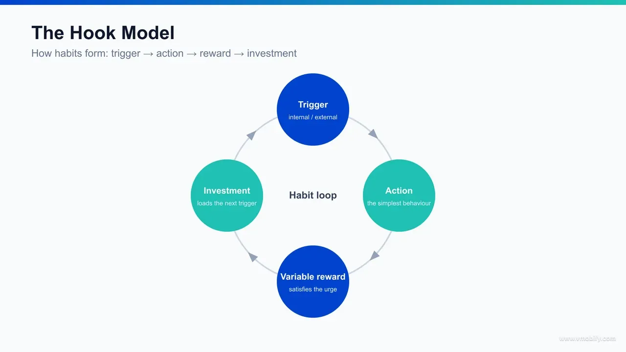
The Hook Model, formulated by Nir Eyal, describes habit-forming products as a four-part loop — trigger, action, variable reward, investment — and habit-forming UX is the deliberate engineering of that loop so that returning to the app becomes automatic rather than a decision the user has to consciously make. Apps that retain over months are almost always running a version of this loop, whether or not their teams named it.
The four stages each have a UX job. A trigger brings the user back — external triggers such as a push notification or a widget, and, more powerfully, internal triggers where an emotion or routine (boredom, a commute, the urge to check progress) pulls the user in without prompting. The action is the simplest possible behaviour the user takes in anticipation of reward; the easier the action, the more often it happens, which is exactly why friction reduction and habit design are the same project. The variable reward is the payoff — and crucially it is variable, because unpredictable rewards hold attention far better than predictable ones. The investment is the small piece of work the user puts in — adding data, building a streak, customising, following — that both improves the app for them and loads the next trigger.
The reason this framework matters for retention rather than just engagement is the investment stage. Each investment a user makes — a saved playlist, a configured dashboard, a 40-day streak, a network of follows — raises the cost of leaving and improves the experience on the next visit. This is how an app moves from "useful when I remember it" to "part of my routine". The whole arc is described in Eyal's work on the Hook Model, and it is the closest thing the industry has to a unifying theory of why some apps become habits.
Designing the loop deliberately changes what you build. Instead of asking "what features should this screen have", you ask: what internal trigger does this serve, what is the smallest action that delivers value, is the reward varied enough to stay interesting, and what can the user invest that makes tomorrow's session better than today's. In our portfolio, the apps with the strongest long-term curves are the ones whose first session does not just demonstrate a feature — it completes one full turn of the loop, so the user leaves having received a reward and made a small investment that pulls them back.
A caution worth stating early, because we return to it at the end: the same model that builds genuinely valuable habits can be bent into compulsion and manipulation. The loop is ethically neutral; the reward you attach to it is not. The right use builds a habit around real value the user wants. The wrong use builds a habit around a metric you want. We cover where that line sits in the pitfalls section.
How do empty states, defaults and microcopy shape retention?
Empty states, default settings and microcopy are the highest-impact, lowest-cost UX surfaces for retention because they shape the moments where users are most likely to stall, abandon or misunderstand — and they almost never get the attention they deserve in design reviews. Each one quietly decides whether a confused or first-time user pushes forward or drops out.
Start with empty states. The first time a user opens a list, a feed, a dashboard or an inbox, it is empty — and a blank screen is a dead end that says "you have nothing and we will not help you". A retention-minded empty state does the opposite: it explains what will appear here, shows the value of filling it, and gives a single clear action to populate it. A to-do app with no tasks should not show a void; it should show one tap to add the first task, or a sample to learn from. The empty state is often a user's very first interaction with a feature, and turning it from a dead end into an on-ramp directly affects whether that feature ever gets adopted — and adopted features are what retain.
Now defaults. Most users never change a default — they accept whatever the app pre-selects — which makes defaults one of the most powerful and most under-used retention levers you have. Defaulting notifications to a sensible, non-spammy cadence, defaulting the most valuable view to the home tab, defaulting privacy to a respectful setting, pre-filling forms with known information: each removes a decision and nudges the user toward the path that retains. The discipline is to choose defaults that serve the user's success, not just the metric you are chasing, because a default that serves only the business erodes the trust that retention depends on.
Then microcopy — the small text on buttons, labels, error messages, tooltips and confirmations. Microcopy is where comprehension is won or lost. A button that says "Continue" tells the user nothing; one that says "Save and see your plan" tells them what they get. An error message that says "Something went wrong" abandons the user; one that says "We couldn't reach the server — tap to retry" keeps them moving. Error and recovery copy deserve particular care, because failures are exactly the moments where users are most primed to quit, and good recovery copy is the difference between a retry and an uninstall.
None of these surfaces shows up well in a portfolio shot, which is precisely why they get skipped — and precisely why fixing them is cheap, fast and disproportionately effective. We have seen empty-state and microcopy passes, shipped in days rather than the weeks a redesign takes, move activation and early retention more than the visual refreshes they were competing with for engineering time. The pattern recurs because these surfaces sit exactly on the path from confusion to value. For how this connects to the broader activation problem, see our guide to the activation aha moment.
Why is perceived speed a retention lever, not just a metric?
Perceived speed is a retention lever because users do not experience milliseconds — they experience waiting, and an app that feels slow gets abandoned regardless of what its performance dashboards say, while an app that feels instant earns the repeat opens that compound into retention. Speed is a feeling first and a metric second, and the two can be managed separately.
The hard numbers still matter as a floor. Slow startup, janky scrolling and laggy responses correlate with abandonment, and the field data behind Google's Core Web Vitals work shows how quickly users bounce when load and responsiveness degrade. On mobile, where networks are variable and devices range from flagship to four-year-old budget hardware, real performance — small bundles, efficient rendering, lazy loading, sensible caching — is the foundation. You cannot make a genuinely slow app feel fast for long.
But perceived speed is where a lot of the retention value actually sits, because it can be engineered on top of the same underlying performance. Several techniques change how fast an app feels without changing the raw timings. Skeleton screens that sketch the layout while content loads make the wait feel shorter than a blank screen or a spinner. Optimistic UI, where the interface shows the result of an action immediately and reconciles with the server in the background, makes taps feel instant. Progressive loading that shows the most important content first lets the user start engaging before everything has arrived. Instant feedback on every tap — a state change, a subtle animation — tells the user the app heard them, which removes the anxious double-tap and the sense of a frozen screen.
The retention mechanism behind all of this is anticipation and trust. An app that responds instantly to every interaction feels reliable, and reliability is what makes a user comfortable returning. An app that hesitates — even briefly, even when the underlying request is fast — plants a small doubt each time, and those doubts accumulate into the quiet decision to stop opening it. Perceived speed is not cosmetic; it is the texture of trust, repeated dozens of times per session.
In our portfolio, performance work is one of the most reliable retention investments precisely because it compounds: every user, every session, every interaction benefits, with no per-user content cost. Across our 300+ apps managed since 2013, the apps that treat speed — real and perceived — as a feature rather than an engineering chore consistently hold their early-week retention better than feature-rich competitors that feel sluggish. When you measure UX against retention, as our analytics service does, perceived-speed changes are among the most consistent winners.
Where do you find and remove the friction that costs retention?
You find retention-killing friction by mapping the path from install to first value and counting every tap, field, decision, permission prompt, load and error on it — then you remove or defer everything that is not strictly required to deliver that first value. Friction is the most controllable retention lever you have, and most apps carry far more of it than their teams realise.
The place friction does the most damage is the stretch between install and first value — onboarding, sign-up, and the first real use. Every barrier there compounds, because the user has the least invested and the least patience. The usual culprits are predictable once you go looking:
- Forced registration before value: demanding an account, email and password before the user has seen anything worth signing up for. Letting people experience the core value first, and registering later when they have a reason to, is one of the largest single friction wins available.
- Long forms and redundant fields: every field is a chance to abandon. Cut to the minimum, pre-fill what you know, and defer the rest to when it is actually needed rather than collecting it all up front.
- Permission prompts at the wrong moment: asking for notifications, location or contacts on first launch, before the user understands why, gets the request denied and the trust dented. Ask in context, at the moment the permission unlocks a clear benefit.
- Hidden or buried core actions: if the main thing the app is for takes several taps to reach, every user pays that tax on every session. The core action should be one tap from open.
- Unhandled errors and dead ends: a failed load with no retry, a validation error with no guidance, a flow that loops back on itself. Each is a place where a willing user is forced to give up.
To find friction systematically rather than by guesswork, instrument the funnel and watch where users actually drop. Session-replay and behavioural-analytics tools — the category UXCam writes about extensively — let you see the rage taps, the dead taps, the abandoned forms and the screens where users hesitate or back out. The drop-off points on a funnel chart are a map of your friction; the replays tell you why. Pair the quantitative funnel with a handful of qualitative replays and the priority list writes itself.
The discipline that turns this into retention is ruthless deferral. For every step in the install-to-value path, ask: is this required to deliver the first value, or can it wait? Most things can wait. Permissions, profile completion, settings, secondary features — all of it can come later, after the user has a reason to care. In our portfolio, the onboarding flows that retain best are the ones that delivered value in the fewest possible steps and pushed everything else downstream. For the full treatment of getting this stretch right, our guide to app onboarding best practices goes step by step.
How does accessibility and inclusive design drive retention?
Accessibility and inclusive design drive retention because the choices that make an app usable for people with disabilities — clear contrast, legible type, large touch targets, screen-reader support, no reliance on colour alone — make it more usable for everyone, in every imperfect real-world condition, and usability is what keeps people coming back. Accessibility is not a compliance checkbox bolted on at the end; it is a retention multiplier.
The reason is that the conditions accessibility designs for are not rare edge cases — they are the normal conditions most usage happens in. Low contrast that fails a user with low vision is the same low contrast that fails every user reading in bright sunlight. Tiny touch targets that block a user with a motor impairment are the same targets every user fat-fingers on a moving train. Tiny type that excludes older eyes is the same type every user squints at one-handed at the end of a long day. Designing for the demanding case lifts the experience for the median case, and the median case is your retention curve.
The concrete practices are well established and codified in the W3C's WCAG guidelines: sufficient colour contrast between text and background; type that scales with the system font-size setting rather than locking to a small fixed size; touch targets large enough to hit reliably; labels and roles that let screen readers describe the interface; and never using colour as the only way to convey meaning, so that a status or error remains legible to colour-blind users and in greyscale. Each of these removes a barrier that, multiplied across a real user base, is quietly costing you sessions.
Inclusive design extends the same logic beyond disability to the full range of real-world contexts your users live in: one-handed use, interruptions, poor lighting, slow networks, unfamiliarity with the conventions your team takes for granted. An interface that holds up under those conditions retains a broader audience than one tuned only for an ideal user on a fast connection with full attention. The breadth of who can succeed in your app is, fairly directly, the breadth of who you can retain.
There is a market-size argument too, and it is not small. A meaningful share of any population has some form of disability, and an app that excludes them excludes both those users and the people around them who notice. But the retention case stands even without it: building for the demanding case produces an app that is calmer, clearer and more forgiving for everyone, and calm, clear, forgiving apps are the ones that survive in a user's routine. We treat accessibility as core UX work, not a separate track, precisely because the two goals point the same way.
What does retention-first UX look like for India?
Retention-first UX for India is built for the conditions most Indian users actually have — budget and mid-range devices, constrained and intermittent data, smaller screens, and a strong preference for the user's own language — rather than the flagship-on-fast-wifi assumptions that quietly designed-in churn for the next several hundred million users. The same app that retains well in a metro can leak users badly in Tier-2 and Tier-3 India if it ignores these realities.
The first reality is the device. A large share of India runs on budget and mid-range Android phones with limited RAM, modest processors and constrained storage. UX that retains here is lean: a small app size so the install completes and survives storage cleanups, efficient rendering so scrolling stays smooth on older silicon, and graceful behaviour when memory is tight. A heavy, animation-laden app that delights on a flagship can stutter into uninstall on the device the majority actually use. Performance, as covered above, is not a nicety in this market — it is the entry ticket to being retained at all.
The second is data. Many users are price-sensitive about every megabyte, on networks that drop and slow without warning. Retention-first UX respects that: it loads the essential first and the optional later, caches aggressively so repeat sessions cost little data, compresses images, and — critically — behaves sensibly offline rather than collapsing into a blank screen the moment the signal drops. An app that keeps working through a tunnel, a lift or a weak-signal village earns the trust that an app demanding a constant fast connection never will.
The third is language. A large and growing share of Indian users prefer to use apps in a regional language rather than English, and an interface available only in English is, for them, a permanent layer of friction on every screen. Vernacular UX — genuine localisation of the interface and content, not just a translated splash screen — widens both who can adopt the app and who keeps using it. The retention difference between "usable in my language" and "usable only in a language I half-read" is large, and it grows as you move beyond the metros. Voice and visual-first patterns help too, for users less comfortable with dense text input.
In our portfolio, the India-focused apps that retain best are the ones that designed for the budget device, the metered connection and the vernacular user from the start, rather than retrofitting after the metro launch underperformed in the rest of the country. The principle is the same one running through this whole guide — design for the demanding real-world case, not the ideal one — applied to the specific conditions of the world's largest mobile market. For benchmarks on what good retention looks like by market and category, see our app retention benchmarks.
How do you test UX changes against retention rather than opinion?
You test UX changes against retention by tying every change to a measurable activation or retention metric, shipping it as a controlled experiment where you can, and reading the cohort curve over weeks rather than trusting the launch-day applause or the loudest opinion in the design review. Opinion-led UX produces redesigns that feel better and retain the same; metric-led UX produces changes you can actually defend.
Start by defining what the change is supposed to move before you build it. A friction cut should move activation — the share of new users reaching first value. A habit-loop change should move week-two and week-four return rates. A perceived-speed change should move session frequency or early retention. Naming the target metric up front does two things: it forces the change to have a real hypothesis, and it gives you an honest scorecard afterwards instead of a vibe.
Where volume allows, run an A/B test so the comparison is clean. Hold everything else constant, expose a slice of new users to the new flow, keep a control on the old one, and compare retention cohorts rather than instant metrics. The trap to avoid is judging a retention change on a same-day conversion number — a flashier flow can lift day-zero sign-ups while lowering week-four retention, which is a loss disguised as a win. The metric that matters for a retention change is the retention curve, and that takes weeks to read.
Where volume does not allow a clean test — early-stage apps, low-traffic flows — combine a before/after cohort comparison with qualitative evidence. Watch session replays of the new flow, run a handful of moderated sessions, and read the funnel drop-offs. You will not get statistical certainty, but you will get directional confidence and, more importantly, you will catch the changes that quietly made things worse before they compound across the whole base.
The cultural shift this requires is treating UX as a hypothesis rather than a deliverable. A redesign is not "done" when it ships; it is a bet that resolves on the retention curve a month later. In our portfolio, the teams that improve retention reliably are the ones that instrumented every meaningful UX change, accepted that some of their best-looking ideas lost, and kept only what the cohorts rewarded. That is the loop our analytics service and our ASO team run with clients — instrument, ship, measure against retention, keep the winners, kill the rest.
Which gamification mechanics retain, and when do they backfire?
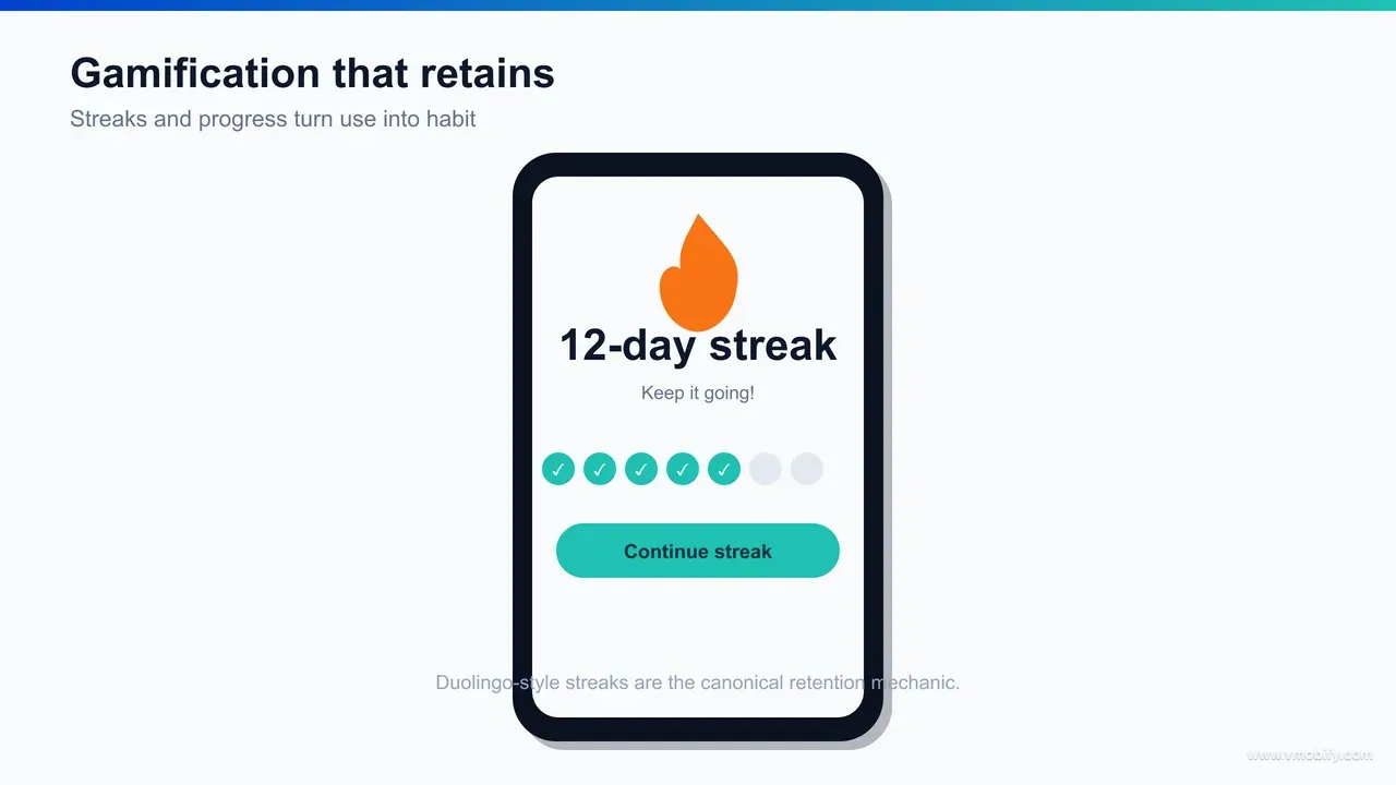
The gamification mechanics that retain are the ones that reflect and reinforce real progress — streaks, visible progress toward a goal, and meaningful rewards — and they backfire the moment they reward an empty metric, manufacture anxiety, or pressure users instead of motivating them. Done well, gamification is associated with materially higher engagement and retention; done badly, it is just a manipulation tax that users eventually resent and leave.
Three mechanics carry most of the value. Streaks — an unbroken run of daily use — are the most powerful, because they create an internal trigger (the urge not to break the chain) and an escalating investment (the longer the streak, the more there is to lose). The canonical example is Duolingo, whose streak is widely credited as a central driver of its daily habit; StriveCloud's analysis of Duolingo's gamification walks through how the streak, paired with reminders and recovery mechanics, turns occasional learners into daily returners. Visible progress — bars, levels, completion percentages, milestones — works because humans are pulled to finish what they have started; showing someone they are 70% of the way to a goal is a stronger motivator than the goal alone. Meaningful rewards — points, badges, unlocks — work when they recognise something the user genuinely values, and they pair best with the variable-reward principle from the Hook Model: a reward that varies holds attention far longer than one that is identical every time.
The reason these mechanics retain is that they map onto the Hook Model loop directly. A streak is an investment that loads tomorrow's trigger. A progress bar is a variable reward that pulls the next action. A milestone is a payoff that makes the user feel they have gained something worth returning for. Gamification, at its best, is just the Hook Model made visible and motivating.
But the failure modes are real and common. Gamification backfires when it rewards a vanity metric the user does not actually care about, so the points feel hollow and motivation collapses. It backfires when it manufactures anxiety — aggressive streak-loss warnings, guilt-laden notifications, fear-of-missing-out pressure — because stress-driven engagement is brittle and breeds resentment. It backfires when the game layer obscures the core value instead of reinforcing it, turning a useful tool into a chore of collecting points. And it backfires when rewards are so easy or so meaningless that they cheapen the experience. The test is simple: does the mechanic celebrate progress the user is proud of, or does it pressure them into behaviour that serves your metric? The first retains; the second churns with a bad taste.
The honest framing we give clients is that gamification is a multiplier on an already-valuable app, not a substitute for value. Bolting streaks onto an app nobody wants to use does not create a habit; it creates an annoyance. We have seen gamification lift engagement and retention meaningfully when it sits on top of genuine value and reflects real progress — and we have seen it actively harm trust when it was used to paper over a weak core experience. Build the value first, then use these mechanics to help users stick with something already worth sticking with.
Which UX pitfalls and dark patterns quietly destroy retention?
The UX pitfalls that quietly destroy retention are the ones that trade short-term metrics for long-term trust — dark patterns that trick users, gamification that pressures instead of motivates, and optimisation that improves a launch-day number while degrading the cohort curve — because every one of them works until the user notices, and once they notice, they leave. Retention is a trust account, and these pitfalls spend it down.
The most damaging category is dark patterns: design choices engineered to manipulate rather than serve. The common ones are familiar to every user who has felt cheated by an app — and that feeling is the retention cost:
- Forced or hidden consent: pre-ticked boxes, buried opt-outs, and permission grabs disguised as required steps. They harvest a yes the user did not mean to give, and the resentment lands later.
- Roach motels: easy to get into a subscription or commitment, deliberately hard to get out. Nothing poisons word-of-mouth and retention faster than a cancellation flow built to obstruct.
- Confirmshaming and guilt: manipulative copy that shames the user for declining ("No, I don't want to save money"). It coerces a tap and loses respect.
- Disguised ads and fake urgency: ads dressed as content, countdown timers that do not mean anything, false scarcity. Each one teaches the user not to trust what the app tells them, and distrust is the opposite of retention.
The second pitfall is gamification gone wrong, covered above but worth repeating as a warning: pressure-based mechanics, hollow rewards, and game layers that obscure value all engage in the short term and corrode in the long term. Stress-driven streaks and guilt notifications can lift this week's daily-active number while teaching users to associate the app with anxiety — and anxiety-associated apps get muted, then deleted.
The third, subtler pitfall is optimising the wrong metric. A team that A/B tests purely for day-zero conversion or session count will, over time, evolve an app full of small manipulations — each one a local win, the aggregate a slow retention decline. This is why the testing discipline above insists on measuring against retention cohorts, not instant metrics: the instant metric is exactly the thing dark patterns inflate. If your optimisation target is short-term and your dark-pattern detector is off, you will optimise your way into churn while your dashboards look healthy.
The throughline is that all of these pitfalls borrow against trust to buy a metric, and retention is the bill coming due. The apps that retain over years are the ones that consistently chose the user's interest where it conflicted with a short-term number, because that is what earns the repeat opens habit is built from. Across our 300+ apps managed since 2013, the pattern is consistent: sustainable retention comes from genuine value delivered with low friction and honest motivation — never from a clever trick. If you want help auditing where your UX is quietly leaking retention, and rebuilding the flow around value rather than manipulation, that is exactly the work our team does — talk to us.
Frequently Asked Questions
Does UX design really affect app retention, or is it about features?+
It strongly affects retention, but through structure and flow rather than visual polish. How quickly and reliably a user reaches value — fewer steps, less friction, faster responses, a clear habit loop — predicts retention far better than how attractive the interface looks or how many features it has.
What is the single most effective UX change for retention?+
Reducing friction on the path from install to first value. Letting users experience the core value before forcing registration, permissions or long forms is consistently one of the largest single retention wins, because it gets more users to the moment that makes them want to come back.
What is the Hook Model and why does it matter for retention?+
The Hook Model, by Nir Eyal, describes habit-forming products as a loop of trigger, action, variable reward and investment. It matters because the investment stage — streaks, saved data, customisation — raises the cost of leaving and improves the next session, which is how an app moves from occasionally useful to part of a routine.
Does gamification improve retention?+
Gamification that reflects real progress — streaks, visible progress, meaningful rewards — is associated with materially higher engagement and retention, with Duolingo streaks the canonical example. It backfires when it rewards empty metrics, manufactures anxiety or obscures the core value, so it works as a multiplier on a genuinely useful app, not a substitute for one.
How do I find the friction that is hurting my retention?+
Map the install-to-value path and count every tap, field, permission and load, then instrument the funnel and watch where users drop. Session-replay and behavioural-analytics tools reveal rage taps, dead taps and abandoned forms, so the drop-off points become a map of exactly where to cut.
How should I test whether a UX change actually improved retention?+
Tie the change to a specific activation or retention metric before building it, run an A/B test where volume allows, and read the retention cohort curve over weeks. Never judge a retention change on a same-day conversion number — a flashier flow can lift day-zero sign-ups while lowering week-four retention.
What are dark patterns and why do they hurt retention?+
Dark patterns are design choices that manipulate users — forced consent, hard-to-cancel subscriptions, confirmshaming, fake urgency. They lift short-term metrics but spend down trust, and once users notice they feel tricked and leave, so they trade long-term retention for a temporary number.
Sources
- Amplitude — Product analytics and retention blog — Activation, experimentation and retention-driver research
- UXCam — Mobile UX and behavioural analytics blog — Friction discovery via session replay and funnel analysis
- StriveCloud — Duolingo gamification breakdown — How streaks and progress drive daily-habit retention
- Nir Eyal — The Hook Model — Trigger, action, variable reward and investment loop
- Nielsen Norman Group — Usability and UX research — Evidence base for flow, microcopy and usability over aesthetics
- web.dev — Core Web Vitals — Performance and load thresholds behind perceived speed
- W3C — Web Content Accessibility Guidelines (WCAG) — Contrast, type scaling, touch targets and screen-reader standards
About the author
Amol Pomane — Founder, Vmobify
Amol leads Vmobify, a mobile app growth agency that has driven 30M+ downloads and ranked 54K+ keywords across 300+ apps since 2013. He writes about ASO, paid user acquisition, retention, and the operational reality of scaling mobile apps in India and global markets.
Free Growth Audit
See exactly how to scale your app with 13+ years of expertise behind you.
Get My Strategy

