Figma to Mobile Code: What Actually Works in 2026
Design-to-code demos look convincing and production results rarely match them. This is what Figma MCP actually emits for each mobile platform, the two things that genuinely improve output, and the problem no converter solves.

On this page
- What does Figma MCP actually emit for React Native?
- Why is it worse for SwiftUI and Compose?
- Which two things genuinely move quality?
- What is the correct call order?
- What state problem does no converter solve?
- How do the commercial tools rank for mobile?
- What pattern actually works for native?
- What should you do on Monday?
- Which claim should you be suspicious of?
- Frequently Asked Questions
What does Figma MCP actually emit for React Native?
What comes out is closer to a faithful transcription of the frame than to code you would have written, and the difference matters most where the design was implicit.
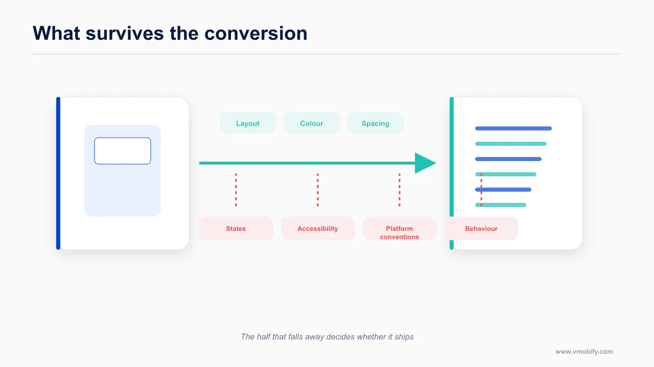
Point Figma's Dev Mode MCP server at a frame, ask for React Native, and you get compilable code. That is not nothing. The layout tree is usually right, the flex directions are usually right, and the visual hierarchy survives.
Then you read it.
Every dimension is a hardcoded pixel value. The design was drawn at one frame size, so that frame size is what you get. Paddings, widths, font sizes, corner radii — all literals. Nothing scales, nothing responds, and the numbers carry no meaning you can trace back to a token.
There is no safe area handling. Not a useSafeAreaInsets call, not a SafeAreaProvider, nothing. The generated screen assumes the content area starts at y=0 and ends at the bottom of the viewport. On any modern iPhone your header sits under the status bar and your bottom CTA sits under the home indicator. This is the single most common failure in agent-generated mobile UI generally, and design-to-code output reproduces it perfectly, because a Figma frame has no notion of an inset.
There is no Dynamic Type or sp scaling. Font sizes come out as fixed numbers. On iOS that means the layout breaks the moment a user moves off the default text size — and Body scales from 17 pt to 53 pt across the accessibility sizes, a 3.1x range. On Android it means you are ignoring the user's font scale entirely. Neither is a rounding error; both are the kind of thing that shows up in an accessibility review.
There is no platform branching. One Figma frame becomes one component. Shadows, header treatments, back affordances, sheet behaviour, haptics — all the places where iOS and Android genuinely differ — collapse into whatever the designer drew.
So the realistic assessment for React Native: the generated file is a decent starting layout and a bad component. You will keep the structure and rewrite the values.
The concrete version of that gap
Take an ordinary screen: a header, a scrolling list, a primary action pinned to the bottom. What comes out of the generator and what you actually need differ in five specific places, every time.
- Top padding. Generated: a literal
paddingTopmatching whatever the designer drew. Needed:useSafeAreaInsets()fromreact-native-safe-area-context, because the built-inSafeAreaViewis iOS-only and ignores Android navigation bars entirely. - The list. Generated:
.map()over the array, because that is what the frame implies. Needed: a virtualized list with a stable key, or you have shipped a screen that janks at 200 rows. - Bottom spacing on the scroll view. Generated: bottom padding on the content. Needed: content insets — padding on scroll content clips the scroll indicator and breaks over-scroll behaviour.
- Text containers. Generated: fixed heights, because Figma frames have fixed heights. Needed: intrinsic sizing, or every string clips the moment a user raises their text size.
- The primary button. Generated: full-width, edge to edge, because that is the modern web convention the designer imported. On iOS 26 that is now explicitly off-pattern — the guidance is to inset buttons from screen edges.
None of these are subtle. All of them are invisible in the screenshot the vendor shows you.
The primary reference for this is Figma — worth reading in full rather than taking a summary of it, because the details here change more often than the shape of the advice does.
Why is it worse for SwiftUI and Compose?
Native targets fare worse because the gap between a Figma frame and idiomatic platform code is wider.
The React Native output is mediocre because the model is translating a box tree into a box tree. React Native's layout model is close enough to Figma's that a lot survives the trip.
SwiftUI and Compose are not box trees. They are declarative frameworks with idioms, and the idioms are where the quality lives.
Generated SwiftUI does not reliably know VStack and HStack conventions, does not get modifier order right — and modifier order in SwiftUI is semantic, not cosmetic — and does not hoist state. Generated Compose does not know Column and Row idioms, does not hoist state, and does not reach for the semantic Material components that would have given you correct behaviour for free.
The result compiles more often than it works, and it is almost never closer to shippable than writing the view yourself with a good design-system skill in context. The consensus across everything I could verify is blunt: none of these tools produce shippable native iOS or Android code, and Figma to SwiftUI in particular remains effectively unsolved.
Read that as a scoping decision, not a complaint. If you are building native, do not budget time for a design-to-code step. Budget it for the pattern at the end of this post instead.
The documentation worth reading before you act on this is Locofy — worth reading in full rather than taking a summary of it, because the details here change more often than the shape of the advice does.
Which two things genuinely move quality?
Two changes improve output more than any tool choice, and both are about what the design file contains.
Both of them are about giving the model your vocabulary rather than asking it to invent one.
get_variable_defs — pull tokens, not hex
This is the highest-value call in the entire Figma MCP surface and it is not the one anybody demos.
get_variable_defs returns the design system's variables as named tokens. Instead of the model emitting #4F46E5 and 16 it emits colors.primary and spacing.md, because it has been told those names exist and what they resolve to.
The downstream effect is larger than it sounds. Named tokens are portable across platforms in a way hex values are not. A token map is something you can hand to a SwiftUI target and a Compose target and a React Native target and get consistent output from all three. Hardcoded values are something you have to find and replace three times.
If you do one thing from this post, make it this: pull the variables first, put them in your repo as a real token file, and reference them in your agent instructions. Everything the model writes afterwards gets better, including code it writes with no Figma involvement at all.
Code Connect — make the model emit your components
Code Connect is the mapping layer between a Figma component and the component in your codebase. With it in place, the model stops generating a fresh View that looks like a button and starts emitting <Button variant="primary"> — your button, from your repo, with your props.
This is the difference between design-to-code producing a throwaway and producing something that belongs in your app. A generated screen made of your own components is reviewable. A generated screen made of anonymous styled views is a rewrite with extra steps.
Mobile support, accurately stated. Code Connect supports React and React Native, HTML, SwiftUI and Jetpack Compose through framework-specific APIs. Figma is now steering everyone toward framework-agnostic TypeScript template files instead, which is also the only route available for UIKit — because UIKit is not documented as supported. If you are on a UIKit codebase, treat Code Connect as a template-file exercise you will build yourself, not a supported path. The token layer this depends on is covered in which mobile design system gets the best AI output.
This is documented directly in Builder.io — worth reading in full rather than taking a summary of it, because the details here change more often than the shape of the advice does.
What is the correct call order?
The order you ask for things in changes the result, because later calls inherit the assumptions of earlier ones.
Most bad Figma MCP output is a context problem, not a model problem. People select a page, ask for the code, and get soup — a single enormous response that has burned the context window and understood none of it.
The order that works:
get_metadatafirst. This is the cheap structural tree. You are looking at the shape of the file, finding the frame you actually want, and confirming names before you spend tokens on content.get_design_contexton one frame at a time. One. Not a page, not a section, not "the whole flow". A single frame produces a response the model can reason about end to end. A page produces a response it summarizes and then guesses about.get_variable_defsfor the tokens. Do this once per session and keep the result. It is the vocabulary for everything else.get_code_connect_maplast. Now the model knows which of your components correspond to which Figma nodes, and it can rewrite what it just built in terms of them.
Feeding a whole page in step 2 is the mistake that makes people conclude the tooling is useless. It is not useless. It is context-bound, and a page of mobile screens is a lot of nodes.
One practical addition: after step 4, pull a screenshot of the frame and keep it in context. The model is markedly better at catching its own layout errors when it can compare its output to an image rather than to a node tree. This costs one tool call and catches spacing mistakes that no amount of prompt tuning does.
What state problem does no converter solve?
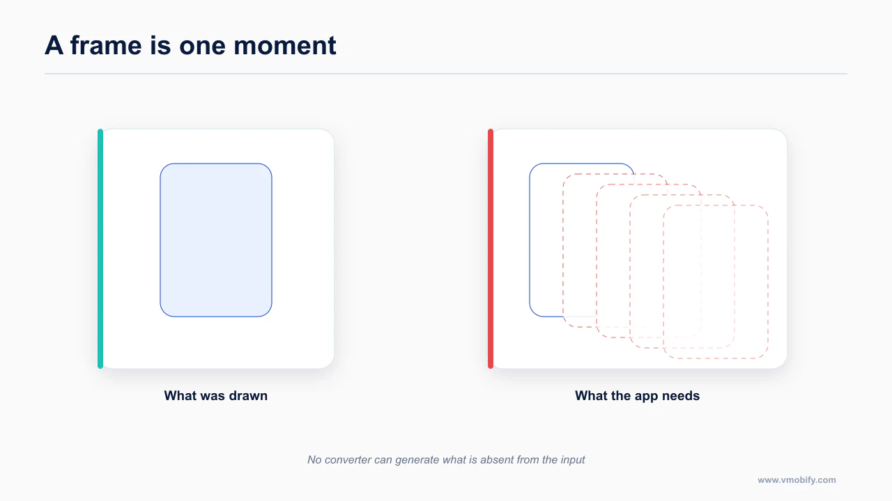
A design file shows one state; an app needs all of them, and no converter can invent what was never drawn.
Here is the structural limit, and it is worth understanding before you evaluate any tool in this category.
A Figma frame is one state. Usually the happy one — data loaded, list populated, user signed in, network fine.
A mobile screen needs five: loading, empty, error with a retry path, offline, and stale-but-cached. Offline and stale are not optional extras on mobile; they are the default condition on a train, in a lift, on a bad connection in a building. An app that only handles loaded and errored is an app that shows a spinner forever the first time someone opens it in the London Underground.
No design-to-code tool invents the four states your designer did not draw. It cannot — there is nothing in the file to translate. So even a perfect converter would deliver you 20% of the screen and hand you the rest, and the rest is where the bugs live.
This is why the value of these tools sits in tokens and component mapping rather than generation. Tokens and mappings apply to all five states. Generated markup applies to one. The full state matrix is in the mobile UI/UX rules agents get wrong.
This is worth stating plainly because it bounds the whole category. A design file is a picture of one moment. An application is a set of behaviours over time, most of which were never drawn: what appears while data loads, what appears when it fails, what appears when there is nothing to show, what happens with no network. No converter can generate these, not because the tools are immature but because the information is not present in the input. Improving the converter cannot solve an absence in the source.
The practical consequence is that conversion output is always a partial screen, and the missing part is disproportionately the part that decides whether the app feels finished. Budget for building the states by hand regardless of how good the conversion looks.
How do the commercial tools rank for mobile?
The commercial options rank differently for mobile than for web, and the mobile-specific gaps are consistent.
Web-first tools with a mobile checkbox are the norm here. Only one of these has a genuine first-class mobile target.
Locofy — first place, and it is not close. It is the only one of the three with a real first-class React Native target rather than React output you port. The cost is discipline in Figma: it depends on LocoTagging and on the file actually using auto-layout properly. If your designer builds with absolute positioning and ungrouped layers, Locofy will produce exactly the mess you gave it. There is no SwiftUI or Compose output.
Builder.io Visual Copilot — second, with a caveat. Its raw mapping quality is the best of the three. It is also unambiguously web-first, so the mobile story is derived rather than native. Worth reading regardless of whether you use it: Builder's own engineering blog is the most technically candid writing anyone has published about the MCP approach to design-to-code, including its limits. That is rarer than it should be.
Anima — third. The weakest mobile story of the three. Fine for web handoff; not the tool to reach for if your target is a phone.
None of the three changes the SwiftUI or Compose verdict. That gap is not a product gap any of these vendors is close to closing.
For the authoritative version, see Anima — worth reading in full rather than taking a summary of it, because the details here change more often than the shape of the advice does.
What pattern actually works for native?
For native targets the workable pattern is not conversion at all.
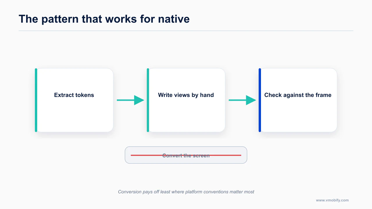
If you are writing SwiftUI or Compose, stop looking for a converter. The working pattern is three inputs in context, and no code generation step at all:
1. A screenshot of the frame. Not the node tree, not a JSON export. An image. The model reads a layout from an image about as well as a junior developer does, and — unlike a node tree — an image does not lie to it about hierarchy.
2. Design tokens as a real file in the repo. Pulled once from get_variable_defs, committed, and referenced everywhere. Colors, spacing, radii, type scale, all named. This is the piece that makes output consistent across sessions instead of consistent within one.
3. A design-system skill in context. The rules the framework will not enforce for you: 44x44 pt minimum touch targets on iOS, 48x48 dp on Android, safe-area insets from react-native-safe-area-context rather than the built-in SafeAreaView, Dynamic Type support, edge-to-edge on Android where it is now mandatory, contrast minimums, the "avoid full-width buttons" rule that iOS 26 introduced and every Tailwind habit violates.
Then you ask for the screen. What you get is not a transcription of the Figma frame — it is an implementation of the design in idiomatic framework code, written against your tokens, obeying the platform rules. It is worse at matching the mock pixel for pixel. It is dramatically better at being code you ship.
That trade is the right one, and it is the reverse of what design-to-code vendors optimize for.
For the design-system skill itself, the mobile UI/UX rules AI agents get wrong has the full rule set. For where those rules come from and why your agent probably cannot fetch them, see stop feeding your agent empty pages.
What should you do on Monday?
Start with the design file rather than the tool, because that is where the achievable ceiling is set.
If you are on React Native and you have a Figma file:
- Run
get_variable_defsonce. Commit the tokens. This is the highest-return 20 minutes in the whole workflow. - Set up Code Connect for your ten most-used components. Not all of them — the ten that appear on every screen.
- Generate one frame at a time, and expect to rewrite dimensions, add safe-area handling, add Dynamic Type support, and add platform branching every time.
- Treat generated output as a layout sketch that you refactor, not a component you accept.
If you are on SwiftUI or Compose:
- Pull the tokens anyway. They are useful regardless of how the code gets written.
- Skip the code generator.
- Screenshot plus tokens plus design-system skill, and write the view.
And if you are still choosing a stack, the fact that React Native is the only mobile target with a working design-to-code path is one input among several — see Flutter, SwiftUI or React Native for the rest of them, and which mobile design system gets the best AI output for the component-library layer that sits underneath all of this. The desktop-side tooling comparison is the Claude Code design plugins guide.
Which claim should you be suspicious of?
One category of claim recurs in this space and does not survive contact with a real project.
"Design to code" is marketed as a replacement for implementation. In mobile it is not one, and the honest framing is narrower and more useful: it is a token extraction and component mapping tool that happens to also emit code.
Used that way — variables and Code Connect first, generation second, frame by frame — it earns its place. Used as advertised, it produces a screen that looks right in a screenshot and fails the moment someone with large text opens it on a phone with a notch.
The rest of the pipeline, from setup through submission, is in how to actually ship a mobile app with Claude Code in 2026.
The general form of the claim is any demonstration that shows the conversion and stops. A screen appearing in code is the easy half and the visually impressive half. The half that decides whether it shipped is what happened to its states, whether it survives the largest accessible text size, whether it respects safe areas on a device with a notch, and whether the components it produced are reusable or a single-use transcription. A demo that does not show those is not showing you the part that costs time.
Frequently Asked Questions
Can Figma MCP produce production React Native code?+
It produces a faithful transcription of the frame, which is a useful starting point and not production code. The gap is largest wherever the design left something implicit.
Why is SwiftUI output worse than React Native?+
The distance between a Figma frame and idiomatic SwiftUI is greater. React Native’s flexbox model maps onto auto-layout more directly than SwiftUI’s layout system does.
What single change improves output most?+
Named tokens in the design file. If colours and spacing are named rather than raw values, the generated code inherits a system instead of hardcoded numbers.
Does it handle interaction states?+
No, and no converter does. A frame is one state. Empty, loading, error and offline exist in the app and not in the file, so they cannot be converted.
Are the commercial tools better?+
For web, often. For mobile the gaps are consistent across all of them, because they share the same underlying problem of inferring intent from geometry.
What is the right workflow for native apps?+
Extract the tokens, then write the views by hand against them. Conversion pays off least exactly where platform conventions matter most.
Which claims should I be sceptical of?+
Any demo that shows a screen converting cleanly without showing what happened to its states, its accessibility, or its behaviour at the largest text size.
Sources
About the author
Amol Pomane — Founder, Vmobify
Amol leads Vmobify, a mobile app growth agency that has driven 30M+ downloads and ranked 54K+ keywords across 300+ apps since 2013. He writes about ASO, paid user acquisition, retention, and the operational reality of scaling mobile apps in India and global markets.