Evidence-First AI Product Development: A 10-Stage Method
AI can make a product look finished in a weekend. Looking finished and being trustworthy are different states, and only one of them survives contact with users. This is the ten-stage method we settled on for using AI to investigate broadly while letting evidence — not confidence — decide what is true.

On this page
- What does evidence-first AI product development actually mean?
- Why does asking AI to build a better product fail?
- Stage 1 — which version of the truth should win?
- Stage 2 — how do you reconstruct a product before reviewing it?
- Stage 3 — how do you inventory states rather than screens?
- Stage 4 — why should you audit integrity before aesthetics?
- Stage 5 — what makes an experience strategy operational?
- Stage 6 — how do design boards stay exploration rather than specification?
- Stage 7 — why build the system before multiplying screens?
- Stage 8 — which role should each AI tool own?
- Stage 9 — what must an agent state before it changes a screen?
- Stage 10 — how do you verify claims and stop fixed bugs returning?
- How do you choose screenshots that prove a decision?
- What does the evidence-first master prompt look like?
- Which mistakes cost the most here?
- Frequently Asked Questions
What does evidence-first AI product development actually mean?
It means using AI to increase the speed and breadth of investigation, and using evidence — running behaviour, executed tests, traced source, authoritative references — to decide what is true. Those are two different jobs, and many failures in AI-assisted product work come from letting the first one quietly do the second one.
AI can make a digital product look finished remarkably quickly. It can generate a polished interface, produce dozens of components, write plausible documentation and return a reassuring audit report. None of those artefacts proves that the product is coherent, correct or ready to ship. They prove that a very capable pattern-completer was asked to complete a pattern.
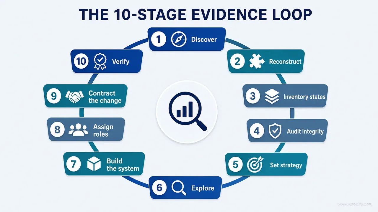
The method below has ten stages, and the order is the method:
- Define the hierarchy of truth — decide in advance which source wins when two disagree.
- Reconstruct the existing product before reviewing it, and label every finding as verified or inferred.
- Inventory states rather than screens, so conditional, failure and recovery behaviour is in scope.
- Audit product integrity before visual polish.
- Define an experience strategy that resolves conflicts.
- Explore solutions through bounded design boards.
- Build the design system before you multiply screens.
- Give each tool — human and AI — a defined role.
- Implement in bounded passes without losing existing behaviour.
- Verify important claims and add protection so corrected problems cannot quietly return.
Skip forward and the failure modes are predictable. Start with high-fidelity design before understanding the product and you improve the presentation of the wrong experience. Start coding from a concept board and you remove useful behaviour or add capabilities the system cannot support. Accept an AI audit without demanding evidence and you receive confidence in the shape of correctness.
We developed this working on a real child-growth product across iOS and Android — profiles, measurements, growth charts, percentiles, health-reference data, AI-generated explanations, privacy controls, exports, subscriptions, notifications and dozens of user-facing states. It was a demanding case study precisely because the stakes were uneven: a visual inconsistency makes an experience feel cheap, while a calculation, privacy or data-lifecycle error damages trust in a way no redesign repairs. The narrative of that build — the commit counts, the rules file, the findings we missed — is told in what shipping an AI-built iOS app taught us. This post is the method, generalised: it applies just as well to a SaaS platform, a dashboard, a marketplace, an internal tool or an entirely AI-generated application.
Why does asking AI to build a better product fail?
Because a broad prompt produces a broad answer, and a broad answer about a specific product is indistinguishable from a guess. The output is not wrong so much as ungrounded — and ungrounded advice is expensive to act on.
The prompt almost everyone starts with looks like this:
Review this product and make it more premium, modern and user-friendly.The agent will respond with entirely reasonable suggestions: improve hierarchy, simplify navigation, add whitespace, use consistent colours, strengthen onboarding, make calls to action clearer. Every item is defensible in isolation. The problem is that none of it is anchored to your product, because at the moment the prompt was written the agent did not know:
- Which features are actually implemented and which screens are aspirational
- Where data is stored, and what happens after a failed save
- Whether an undo restores every dependent value or only the visible one
- Which components are shared, so a change in one place lands in five
- Which accessibility behaviours already exist and must not regress
- Which settings are duplicated across two surfaces with different defaults
- Whether a visual status badge reflects a meaningful calculation or a placeholder
- Whether a design board depicts a future feature rather than a current requirement
AI is extremely good at completing patterns. Show it a polished health dashboard and it will infer the usual cards, charts, insights and status badges — because that is what dashboards of that kind contain. A plausible completion is not a faithful reconstruction, and the gap between them is invisible in the output. You cannot tell by reading an audit report whether the agent traced a data path or recognised a genre.
So the first change we made was procedural rather than technical: the agent was not allowed to recommend a redesign until it could prove that it understood the current product. Proof meant file paths, route lists, state owners and the specific behaviour of the failure branches — not a summary. That single rule removed most of the noise, and it is the whole subject of part 02 on understanding an existing product before pointing AI at it.
Across the 300+ apps we have managed since 2013, the pattern holds outside AI work too. The reviews that changed anything were the ones that named a screen, a number and a data path. The reviews that changed nothing were the ones that could have been written about any product in the category.
Stage 1 — which version of the truth should win?
Rank your sources of truth before you start, because every product contains several competing versions of reality and they will disagree at the worst possible moment. The running experience, the current code, the tests, the requirements, the design-system documentation, the audit reports, the boards, the roadmap, the marketing copy and what people remember are ten different accounts of one product.
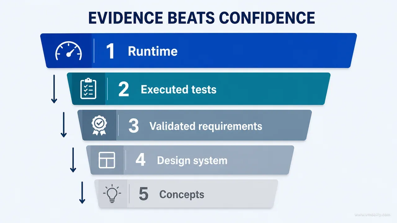
The authority order we settled on, strongest first:
- Running implementation. What a real user can currently do is the strongest evidence of the user experience. It reveals actual layouts, transitions, keyboard behaviour, loading time, clipping, stale states and recovery paths — none of which are reliably legible in source.
- Current source and executed tests. Source explains why the product behaves as it does. Executed tests are far stronger evidence than the existence of test files.
- Validated product and data requirements. Requirements define intended behaviour, but only current, validated requirements should influence implementation. Old requirements and ambitious roadmaps are not product truth.
- Design-system documentation. It should explain tokens, components and rules that cannot be inferred easily. It should not override live behaviour without an explicit decision.
- Concept boards and aspirational material. Excellent for exploring hierarchy, composition and mood. Weak evidence of functionality.
The second item deserves its own warning, because it is where a source-first audit goes wrong most convincingly. In one such audit we found hundreds of passing tests — and then found that important transaction tests were skipped, and that critical UI tests failed before any meaningful interaction because the target application path was not configured. Saying "the project has tests" would have been technically true and practically misleading. Android's testing fundamentals make the same distinction in different words: a test only tells you something about the layer it actually exercised.
The fifth item is the one that costs the most in AI-assisted work, because boards are simultaneously the weakest evidence and the most persuasive artefact in the room. On our project, several genuinely attractive concepts included integrations, AI capabilities and health-status representations that were not safe to copy — not because they were badly designed, but because nothing behind them existed. This hierarchy exists to prevent one specific mistake: implementing what looked most polished rather than what was best supported.
Stage 2 — how do you reconstruct a product before reviewing it?
Stop asking agents to check the app and start requiring a reconstruction: a written account of what the product promises, what exists, what data matters, which journeys matter and what remains unverified. Review is a judgement; reconstruction is a description, and you cannot trust the first without the second.
The reconstruction answers five questions.
What does the product promise? Document the central outcome, not the feature list. What should a user understand, accomplish or feel? For our case study the deeper promise was not "show charts" — it was to help a parent understand a child's recorded growth without making the interface feel like a spreadsheet or implying a diagnosis. That sentence later settled a dozen design arguments that a feature list could not have settled.
What actually exists? The agent must identify routes, screens, sheets, dialogs, components, background processes, exports, integrations and gated features from source rather than from documentation. Our Android project reference pointed to 51 screens and seven sheets — fifty-eight distinct surfaces before a single conditional state is counted. That number alone demonstrates why a homepage-first visual glance is inadequate: at fifty-eight surfaces, a reviewer who looks at eight has seen 14% of the product and will still write a confident summary.
What data makes the product valuable? Most products revolve around a small number of critical objects — a transaction, document, booking, measurement, post, account or order. For each one, document the full lifecycle:
Object
Creation paths
Modification paths
Deletion paths
Import paths
Sync paths
Restore paths
Undo paths
Derived values
Validation points
Failure branches
Recovery behaviour
Which user journeys matter most? A screen inventory tells you what exists; a journey map tells you whether the product helps someone finish something. First visit to first meaningful result. Create, edit and delete a record. Upgrade and restore access. Enable or revoke an optional AI feature. Export information. Change an input that affects historical calculations. Recover from a failed network operation. That last one is where trust is usually lost, and where the least design attention has typically been spent.
What is verified and what is unknown? Every finding carries an evidence label: code-confirmed (traced in current source), test-confirmed (reproduced through an executed test), runtime-confirmed (observed in the running product), externally verified (checked against an authoritative source), inferred (reasonable but unproven) and unverified (needs a device, backend, account, clinical or production evidence you do not have). This vocabulary makes audit reports less impressive-sounding and far more useful, which is exactly the trade you want. Part 02 of this series walks through the reconstruction itself, question by question, on a product nobody on the team built.
Stage 3 — how do you inventory states rather than screens?
Treat every screen as a set of possible states rather than one fixed picture, because an inventory that lists surfaces leaves most of the product unaudited. The default screenshot is the state your users spend the least anxious time in.
A single upload surface, designed properly, needs an initial state, a file-selected state, an uploading state, a success state, a validation error, a network failure, a permission failure, a duplicate-file warning, a cancelled upload, a retry state and an offline state. That is eleven states. If your inventory contains the line "Upload screen", you have inventoried roughly 9% of it.
The template we expanded to:
Surface:
Purpose:
Entry points:
Exit points:
Primary action:
Secondary actions:
Data read:
Data written:
Loading state:
Empty state:
Error state:
Offline state:
Permission state:
Authentication state:
Entitlement state:
Destructive action:
Recovery path:
Accessibility requirements:
Runtime evidence:
The same principle applies well outside mobile. A SaaS table has no-data, filtered-empty, loading, stale, permission-restricted and request-failed states. A checkout has validation, authorisation, inventory, payment and confirmation failures. A dashboard has the state where one of six data sources is late and the other five are current — which is the state that produces the support ticket.
Two states deserve specific attention because AI-generated interfaces get them wrong in a consistent direction. The first is loading. Agents reach for spinners by default, where Apple's guidance on loading asks you to show something as soon as possible — placeholder text, graphics or animation in the shape of the content that is coming — and treats a progress indicator as the tool for the waits a placeholder cannot cover on its own. The second is empty. A generated empty state is almost always decorative — an illustration and a cheerful line — when the useful version explains why it is empty and what single action changes that.
In emerging markets this stops being a refinement and becomes the product. On a mid-range Android handset on an intermittent Indian mobile connection, the offline, stale, retry and partially-loaded states are not edge cases; for a meaningful share of sessions they are the experience. Across the apps we have managed, day-one abandonment concentrates in states that were never designed, only inherited — the retry that loops, the stale figure with no timestamp, the empty screen that cannot tell absence from failure. Part 03 of this series turns this principle into a complete product inventory you can actually finish.
Stage 4 — why should you audit integrity before aesthetics?
Because the biggest visual problems are often not visual, and polish applied on top of an integrity problem makes the problem more persuasive rather than more correct. This was the single most important UI/UX finding of the whole project.
Consider what that looks like concretely. A chart can be elegant and still communicate false geometry — an axis that does not start where the reader assumes, a smoothed curve implying data points that were never recorded, a band whose width means nothing. A privacy centre can look reassuring while deletion behaviour is incomplete underneath it. A status card can present a value whose semantics differ from the same value elsewhere in the product. Redesign each of those and you have produced a more confident wrong answer.
So every review finding was forced into one of five decisions:
Keep
- The behaviour and presentation already work.
Polish
- The underlying experience is sound; improve clarity or craft.
Visual redesign
- Preserve behaviour, materially change presentation.
UX rethink
- The flow, model, promise or behaviour needs correction.
Functional correction
- The behaviour itself is wrong, and it must be fixed before any presentation change is worth making.
The last category is the one teams forget to create, and it is the reason integrity comes first: a surface can be beautifully composed, perfectly consistent with the design system and still report a value that is simply not true. Filed as a polish item it waits behind a colour argument. Filed as a functional correction it blocks the redesign of the surface it sits on, which is the correct blast radius.
Forcing the choice matters more than the taxonomy. A finding written as "the growth chart feels cluttered" hides which of the five it is; a reviewer who must pick one has to work out whether the problem is density or meaning.
Then work in priority order, integrity before decoration:
- Data correctness
- Privacy and lifecycle truth
- Critical journey completion
- Recovery behaviour
- Accessibility
- Information hierarchy
- Visual system
- Motion and delight
Accessibility sits at position five deliberately — above every purely aesthetic concern. It is also the most testable item on the list, because WCAG 2.2 gives you pass or fail criteria rather than opinions, and contrast, target size and focus order can be checked before anyone argues about a colour.
This ordering is not a claim that visual quality is unimportant. It is a claim about sequence: polish should not conceal unresolved product risk, and on a product where a number carries meaning, the number is the design. Part 11 of this series takes this further, into auditing the data rather than the screens — which is where the defects that end launches actually live.
Stage 5 — what makes an experience strategy operational?
A strategy is operational when it resolves an argument — when two reasonable designs are on the table and the strategy tells you which one wins. Anything that cannot do that is a mood board with sentences.
Our working direction became three words: calm evidence, warm memory. That phrase earned its place because it decided things. Health information needed stable, restrained surfaces. Emotional moments could carry warmer illustration and a small celebration. AI stayed secondary to the user's real record. The product could feel supportive without pretending to be a clinician. Every one of those is a decision a designer can apply without asking a second question.
"Modern and premium" cannot do that, which is why it is the most common strategy statement and the least useful one. If your principle would be accepted by a competitor building the opposite product, it is not a principle.
The second half of a strategy is the part teams skip: define what the product must not become. We explicitly rejected a dashboard where every module competes for attention, a card around every piece of content, a persistent mascot acting as a medical narrator, decorative chart curves that replace accurate data, AI positioned as the product's authority, features copied from boards without implementation support, and celebration effects for routine interactions.
Negative principles matter disproportionately in AI-assisted work, because an agent defaults to fashionable patterns unless it is constrained. Ask for a modern dashboard and you will get gradient cards, a mascot and confetti, because that is the centre of the distribution it learned. The prohibitions are how you move it off that centre — and, unlike positive principles, they are checkable in review.
The third piece is to give every surface one primary question:
Home:      What matters now?
Overview:  What changed?
Input:     What do I need to provide?
Detail:    What does this result mean?
Settings:  What can I control?
Privacy:   What happens to my information?
This is a stronger brief than a component list, because it makes hierarchy evaluable. If a module on Home does not help answer "what matters now", it belongs somewhere else regardless of how good it looks — and a reviewer can say so without it becoming a matter of taste. The same discipline is why the strongest onboarding flows answer exactly one question per step. Part 05 applies the strategy layer directly to screen work.
Stage 6 — how do design boards stay exploration rather than specification?
By scoping every board to one journey or surface, and by stating explicitly that a board is permission to explore, never permission to rebuild. Boards were one of the most useful parts of our process — but only after we defined their role, and the definition had to come first.
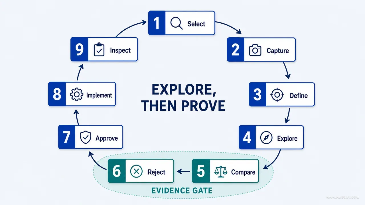
The working loop:
Select one journey
  -> Capture the current implementation
  -> Identify the specific problem
  -> Produce visual alternatives
  -> Compare them against real behaviour
  -> Reject unsupported ideas
  -> Approve hierarchy and direction
  -> Implement a bounded change
  -> Inspect the result
The comparison step is the one that carries the value. Redesigning an entire product at once produces a pile of attractive images and no way to tell whether any of them is better, because there is nothing to compare each against. One journey at a time gives you a before, an after and a running result — and it makes implementation drift visible, because you can see the moment where the built screen stopped matching the approved direction.
Every board was evaluated against ten criteria: product fidelity, hierarchy, task completion, state coverage, content truthfulness, component reuse, accessibility, platform fit, implementation cost and visual distinctiveness. An attractive board could still fail — and several did — by inventing functionality, hiding recovery paths or overstating certainty.
Content truthfulness deserves emphasis because it is the failure that survives longest. A board filled with ideal placeholder data shows the state where every value is present, recent and pleasantly distributed. Ship that layout and the first real user arrives with two data points, one of them entered wrong, and a layout designed around abundance now has to hold scarcity. We ask for boards in three versions — populated, sparse and failed — and the sparse one changes the design far more often than the populated one.
The other rule worth stating out loud: a board is never a functional specification, and nobody outside the room can tell the difference from the image alone. In our portfolio the most expensive board-related mistake is not a bad board — it is a good board that reached an engineer without the note explaining which parts were directional. Part 06 covers running this loop screen by screen, and part 07 covers splitting the board work between a conversational model and a repository-aware agent.
Stage 7 — why build the system before multiplying screens?
Because AI agents generate components faster than any team can govern them, and without a system every new screen introduces another radius, shadow, colour, title style and card variation. The drift is not visible in any single pull request. It is only visible at screen forty.
The order we moved to was semantic rather than visual:
Principles
  -> Colour roles
  -> Typography roles
  -> Spacing rhythm
  -> Surface hierarchy
  -> Radius by component role
  -> Motion tiers
  -> Reusable components
  -> State components
  -> Screen compositions
The semantic rules mattered more than the literal values. Success, warning and danger colours represented state rather than decoration, so nothing could be tinted red because red looked good there. Brand colour was separated from clinical meaning — a genuine hazard in a health product, where a brand accent that happens to be amber will be read as a warning. Motion was divided into micro, interface and rare emotional tiers, which is how you avoid celebrating a routine save. Illustration was restricted on high-trust surfaces. One typography source fed the whole component system. Empty, loading, offline and permission states became reusable components rather than per-screen improvisations, which is the single highest-return decision on this list.
Naming things by role rather than by appearance is what makes any of it survive contact with an agent. Material 3's design-token model is a good reference for the shape of this: a token that means surface-container-high travels correctly into a theme it was not designed for, while a token called light-grey-2 becomes a bug the first time someone builds a dark theme.
Some rules were later enforced by automated checks — a lint rule that fails a build containing a raw hex value, an architecture test that fails when a feature module imports a core internal. That is the step that turns a design system from a suggestion into a contract. A rule an agent can violate without anything going red is a rule it will violate, patiently, for months.
Stage 8 — which role should each AI tool own?
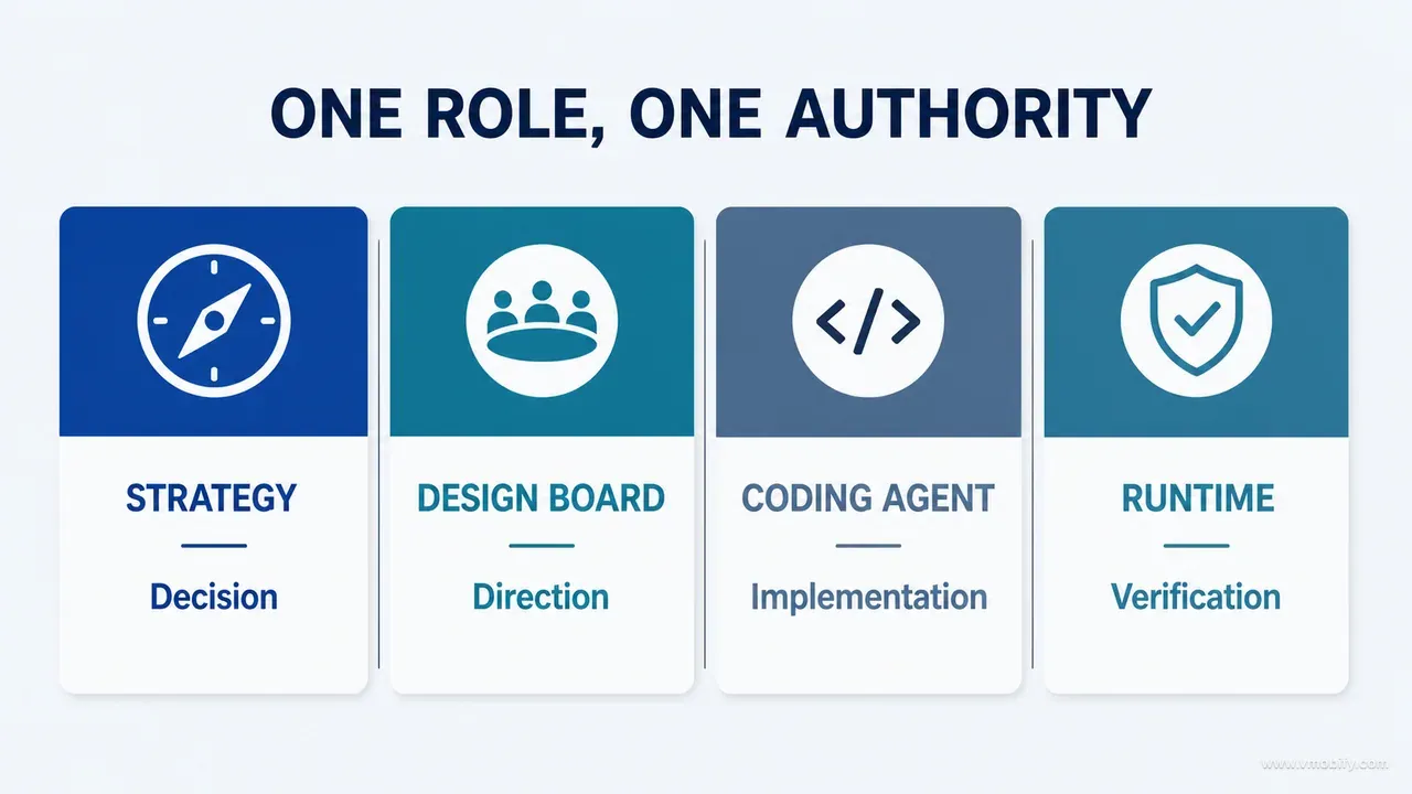
Give every participant one job and one authority, because AI-assisted product work improves when tools collaborate rather than duplicate each other. Asking one model to research, judge visually, implement and verify produces four mediocre outputs with one uniform tone of confidence.
The division that worked:
The human product owner
- Owns priorities, product truth, taste, acceptable risk and final decisions.
- AI can compare alternatives; it must not silently decide what the business promises.
The strategy and critique model
- Synthesises research, defines frameworks, challenges assumptions, structures audits, writes prompts and compares visual directions.
- It works best when it cannot touch the repository, because it then has to argue rather than edit.
The repository-aware coding agent
- Traces source, maps dependencies, implements bounded changes, runs tests, collects evidence and reports discrepancies between documentation and code.
- That last item is underrated: an agent that can read both is the cheapest documentation audit you will ever run.
The design board
- Is a shared visual decision surface.
- It records intended hierarchy and styling; it does not automatically become the functional specification.
The running product
- Remains the final source of visual and interaction truth.
Tests and authoritative references
- Decide whether technical and real-world claims are correct.
The rule underneath all six: AI generates hypotheses and implementations; tests, runtime inspection and authoritative data establish confidence.
There is a second benefit to the split that we did not anticipate. When the critique model and the implementing agent are separate, disagreement becomes visible. The strategist proposes a hierarchy, the coding agent reports that the state owner makes it expensive, and the trade-off surfaces as a conversation you can arbitrate. Run both jobs in one session and that same conflict resolves itself silently, in favour of whatever was easier to write — and you never learn a decision was made. Part 07 goes into how we split the board work specifically; part 09 covers handing an approved direction to an implementing agent without collateral damage.
Stage 9 — what must an agent state before it changes a screen?
Before touching a screen or journey, the agent must state what is there now and what must survive the change — in writing, before the first edit. This one requirement removed more regressions than any review process we added afterwards.
The pre-flight list:
- Current component hierarchy
- State owner
- Existing user actions
- Data read and written
- Shared components involved
- Behaviour that must remain unchanged
- Board elements that were directional rather than specified
- Tests and captures required after implementation
Then one coherent area changes at a time. This is slower than asking an agent to revamp everything in a single command, and much faster than recovering from a broad implementation that altered navigation, behaviour, styling and data flow simultaneously — where the regression you find in week three could have come from any of four hundred edits.
The "shared components involved" line is the one that saves the most. Ask for a rounder card on one screen and you may get a change to the card component every screen uses. The agent is not wrong to make it — it is the correct fix for the request as stated — but nobody asked for the other eleven screens to change, and nobody will look at them before merge.
Bounded implementation also fixes review. If a pull request changes one journey, a reviewer can hold the intended outcome in their head and check against it. If it changes the whole product, visual defects and functional regressions hide inside the volume, and review degrades into approving a diff that is too large to disagree with. We saw exactly this pattern on our own build: the review findings that mattered clustered in persistence, sync and identity, precisely the areas where a large diff makes a missing guarantee invisible.
One practical addition for AI work: require the agent to run the product and describe what it sees after the change, not just report that the build succeeded. A successful compile proves the code is syntactically valid. It proves nothing about whether the screen renders, whether the list scrolls, or whether the empty state still exists. Part 09 covers the full handover; part 10 covers why a code review — human or agent — cannot settle a visual question at all.
Stage 10 — how do you verify claims and stop fixed bugs returning?
Verify every real-world claim against an authoritative source independently, prove each bug-fix guard actually fails when the bug returns, and ask what class of problem your review method made impossible to detect. Three rules, and they are the difference between a product that looks audited and one that is.
Rule 1 — verify real-world claims independently. Any constant, range, threshold, formula, price or lookup table making a claim about health, money or the physical world gets checked outside the application. That means: identify the authoritative source and its version, write a separate verification script, test the complete meaningful input range rather than three convenient values, compare platforms where both implement the same rule, record every mismatch, and preserve golden test values so the comparison can be repeated. For our case study the authority was the WHO Child Growth Standards; for a fintech product it might be a tax table, and for logistics a rate card. The principle does not change: visual inspection cannot prove a formula correct, and neither can an agent's explanation of the formula. Part 12 covers verifying the explanations themselves.
Rule 2 — a bug fix needs a returning-bug detector. For every important corrected defect class, require a test, lint rule, architecture check, assertion or CI guard. Then mutation-test the protection:
Reintroduce the defect deliberately
  -> Confirm the mutated code still compiles
  -> Confirm the protection fails
  -> Restore the corrected implementation
  -> Confirm the suite passes
A passing test is useful. A test proven to fail when the defect returns is much stronger evidence — and the difference is not theoretical. A guard that asserts on the wrong field, or that was quietly disabled by a later refactor, passes exactly as cheerfully as a working one. Deliberately reintroducing one known defect is a narrower, controlled negative test; automated mutation testing systematically introduces many small code changes. Both probe whether the suite is sensitive to meaningful faults, which is the reasoning behind Google's published work on mutation testing at scale. Part 13 works through the targeted version on a single bug end to end.
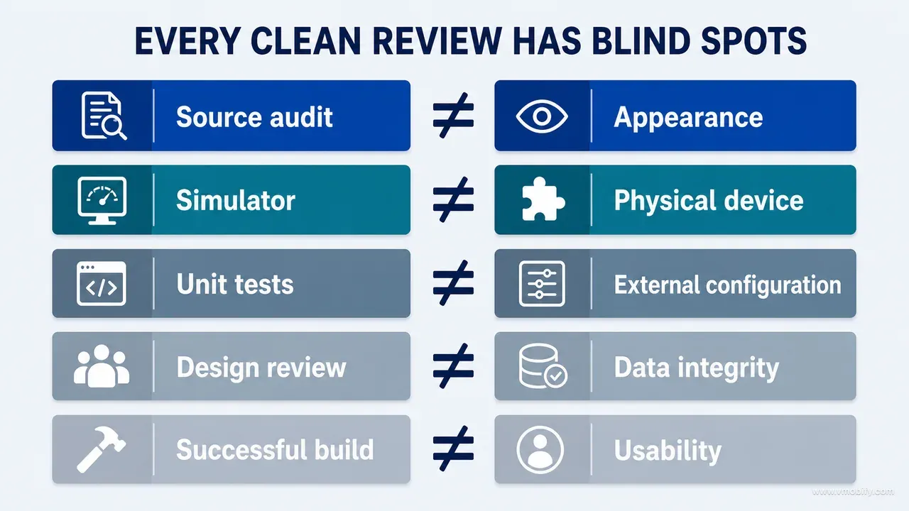
Rule 3 — audit the audit. Whenever a review comes back clean, ask: what class of problem did this review method make impossible to detect? A source-only audit cannot prove visual behaviour. A simulator review cannot prove physical-device performance. Unit tests cannot prove an external configuration. A design review cannot prove data integrity. A successful build cannot prove the product is usable. The goal is not one perfect audit — it is a set of complementary methods with stated boundaries, and a clean result you can interpret.
This question is also the cheapest safeguard against the most common AI-era failure, which is not a wrong answer but an unexamined clean one. The reviews that miss the most are never the negative ones.
How do you choose screenshots that prove a decision?
Every screenshot in a serious review or write-up should prove a decision — if it only shows that a screen exists, it is decoration. This applies to your internal audit deck as much as to a public case study.
For each case, capture six:
- The original running state
- An annotated problem view showing what is actually wrong
- The design board or explored alternative
- The implemented result
- A difficult state — empty, error, or the largest accessible text size
- The verification evidence: the test output, the script result, the comparison table
The discipline rules matter as much as the list. Keep before-and-after images at the same size and crop, or you are comparing two crops rather than two designs. Never present a board as shipped functionality. Use synthetic data and remove personal information — which for a health, finance or messaging product is not a nicety but a condition of being allowed to publish anything at all. Write captions that explain the decision rather than repeating what is visible.
Item five is the one most teams omit, and it is the one that changes minds. A layout that holds at default text size and breaks at the largest accessible size is not finished, and a single screenshot settles that argument faster than any amount of discussion. The same is true of the empty state: showing the populated screen next to the day-one screen is usually the fastest way to get a redesign approved.
There is a commercial version of this discipline too. The screenshots that persuade a user in the store are chosen on the same principle — each one has to prove something specific rather than show that the app exists — which is why our App Store screenshots guide starts with the claim each frame is making rather than with the frame. Part 04 of this series applies the selection rules to audit evidence specifically.
What does the evidence-first master prompt look like?
It is a six-phase prompt that forbids redesign recommendations until reconstruction is complete, and forbids a readiness claim that rests on compilation or confidence. Copy it, adapt the domain nouns, and keep the phase order — the order is doing most of the work.
Act as a senior product strategist, UX designer, design-systems specialist,
software architect, QA lead and evidence-driven reviewer.

Your task is to understand and improve an existing digital product.

Do not begin with redesign recommendations or implementation.

PHASE 1 - RECONSTRUCT THE PRODUCT

Inspect the repository, documentation, routes, data models, design tokens,
components, tests and running product.

Create:
1. Product capability inventory
2. Screen and state inventory
3. User-journey map
4. Critical-data-object map
5. Design-system inventory
6. Integration inventory
7. Documentation-versus-implementation discrepancies
8. Verified, inferred and unverified findings

PHASE 2 - DEFINE THE EVIDENCE BOUNDARY

Use this authority order:
1. Running implementation
2. Current source and executed tests
3. Validated product requirements
4. Design-system documentation
5. Concept boards and aspirational documentation

Never describe a concept-board feature as implemented unless source and
runtime evidence confirm it.

PHASE 3 - AUDIT THE EXPERIENCE

For every important surface, assess purpose, hierarchy, content, actions,
data read and written, loading, empty, error, offline, permission,
authentication, entitlement, accessibility, responsiveness, motion and
recovery.

Classify each surface:
KEEP / POLISH / VISUAL REDESIGN / UX RETHINK / FUNCTIONAL CORRECTION

PHASE 4 - DEFINE THE STRATEGY

Establish the product promise, desired emotional response, design principles,
prohibited patterns, information hierarchy, semantic tokens, component
strategy, illustration rules, motion rules and accessibility baseline.

PHASE 5 - IMPLEMENT IN BOUNDED PASSES

Implement one coherent journey or surface at a time.
Before changing it, list every behaviour that must remain.
After changing it, build, test, render and inspect it.

PHASE 6 - VERIFY

For every claim that something is correct or fixed, provide:
- file paths
- code paths
- commands executed
- test results
- runtime evidence
- remaining unverified conditions

When the audit returns clean, answer:
"What class of problem did this review make impossible to detect?"

Do not claim production readiness based only on compilation,
visual inspection or AI confidence.
Two notes on running it. First, expect phase 1 to take longer than you want and resist the urge to compress it — the whole method is a bet that a slow reconstruction buys a fast, safe redesign. Second, phase 6 works best when you ask for the unverified conditions first. An agent asked what it could not prove gives a straighter answer than one asked to summarise what it proved, because the second framing rewards completeness and the first rewards honesty.
Adapt the vocabulary to your product but keep the prohibitions verbatim. The two lines that do the most work are the concept-board restriction in phase 2 and the final line of phase 6, and both are the kind of sentence a well-meaning edit tends to soften.
Which mistakes cost the most here?
The expensive mistakes are all versions of one mistake: accepting a confident artefact in place of evidence. Seven of them account for nearly everything we have had to undo.
- Starting with visual inspiration. Inspiration is valuable after the team understands product behaviour. Used first, it encourages imitation and invents features nothing supports.
- Treating documentation as fact. Documentation is often outdated, aspirational or simply wrong. Trace important claims to active code paths and runtime behaviour before you rely on them.
- Asking one model to do everything. Research, visual judgement, implementation and verification need different evidence and different incentives. Divide the responsibilities deliberately.
- Reviewing only ideal states. Products lose trust during waiting, failure, correction and recovery — not in the polished default screenshot. Nielsen Norman Group's usability heuristics open with visibility of system status, and give error recovery a heuristic of its own — the two conditions a user only meets while something is loading or has just gone wrong.
- Redesigning every screen simultaneously. Large redesigns make comparison difficult and regressions easy to hide. Work journey by journey.
- Counting tests instead of executing meaningful ones. Quantity does not prove coverage. Confirm which suites ran, which were skipped, and which defect classes remain invisible to all of them.
- Using AI confidence as a release decision. An agent reporting that everything looks good is not evidence. Require commands, output, captures, source paths and explicit uncertainty.
There is an eighth that only shows up later, when the product meets a store review queue: assuming that a working product is a compliant one. Privacy disclosure, account deletion, subscription presentation and permission justification are decided by policy, not by quality, and they are among the most common reasons a finished-looking build gets sent back — as our breakdown of App Store rejection reasons sets out in detail.
Which brings us to the point of all ten stages. The competitive advantage of AI-assisted product development is not that AI can generate more screens, more code or more documentation. It is that a disciplined team can now investigate more broadly, compare more alternatives and verify more systematically than was previously affordable. The discipline is the differentiator, and it is the part that does not come in the box.
So: reconstruct the product before you review it. Separate evidence from inference and label both. Protect the data and journeys that create the value. Use boards to explore rather than to invent. Implement in bounded passes. Inspect the running result rather than the build log. Verify every serious claim against something outside the system. Make corrected problems difficult to reintroduce. That is how a product moves from looking finished to being trustworthy enough to ship — and if you would rather have that audit run by a team that has done it across 300+ apps since 2013, talk to us.
Frequently Asked Questions
Is the evidence-first method only for AI-generated products?+
No. It works for any existing product, whether it was written by a team of twenty over five years or by an agent over a weekend. AI simply increases the need for explicit evidence, because it produces plausible output at a scale that makes superficial review unreliable — the volume defeats the reviewer before the quality does.
Should design or code be the source of truth?+
Neither is universally authoritative. The running product defines the current user experience, code explains why it behaves that way, validated requirements define intended behaviour, and boards guide visual direction. What matters is that you rank them before a conflict appears and resolve disagreements explicitly rather than by whichever artefact is newest or prettiest.
How much of the product needs to be inventoried?+
Every meaningful route, state and data-changing path. Start with the highest-value journeys so the work pays for itself early, but do not declare the inventory complete until conditional, error, permission, entitlement and recovery states are included. An inventory of default states is the specific artefact that makes an audit look thorough while missing most of the product.
Can an AI agent perform the entire audit on its own?+
It can accelerate large parts of it — tracing source, mapping dependencies, listing surfaces, spotting documentation drift. It cannot supply device evidence it does not have, production configuration it cannot see, clinical or regulatory ownership, business decisions or user judgement. The correct behaviour is to mark those boundaries in the report rather than to fill them with reasonable-sounding inference.
When is a redesign ready to implement?+
When the team understands the current product, has resolved the critical integrity issues, has approved the target hierarchy, and can state exactly which behaviours must remain unchanged. If that last list does not exist in writing, the redesign is not ready — it is a rewrite with optimistic scope.
What is the most important question to ask after an audit?+
Ask what the chosen audit method could not detect. A source-only audit cannot prove visual behaviour, a simulator pass cannot prove device performance, and a green build proves nothing about usability. That question almost always identifies the next form of evidence you need, and it is most valuable precisely when the audit came back clean.
How long does this method take on a real product?+
The reconstruction and inventory are the heavy part, and on a product of roughly sixty surfaces expect it to occupy the first days rather than the first hours. Everything after it moves faster than an unstructured redesign, because each bounded pass ships with a known blast radius. The saving is not in the first week; it is in the weeks you do not spend undoing a broad change nobody can review.
Sources
- W3C — Web Content Accessibility Guidelines (WCAG) 2.2 — Pass/fail success criteria for contrast, target size, focus order and error identification.
- Nielsen Norman Group — 10 Usability Heuristics for User Interface Design — Visibility of system status and error recovery — the heuristics that state coverage protects.
- Apple — Human Interface Guidelines: Loading — Platform guidance on communicating progress and avoiding blank waits.
- Android Developers — Fundamentals of testing Android apps — What each test layer can and cannot demonstrate.
- Google Research — State of Mutation Testing at Google — Why proving a test can fail matters more than proving it passes.
- World Health Organization — Child Growth Standards — The authoritative reference used to verify the case-study product calculations.
About the author
Amol Pomane — Founder, Vmobify
Amol leads Vmobify, a mobile app growth agency that has driven 30M+ downloads and ranked 54K+ keywords across 300+ apps since 2013. He writes about ASO, paid user acquisition, retention, and the operational reality of scaling mobile apps in India and global markets.