Networking App Case Study: Activation 22%→44%, k-factor 0.3→0.7
A professional networking app had installs but almost no activated users — most people never completed a profile or formed enough connections to reach the value moment, so retention and word-of-mouth were both weak. Over six months we redefined the activation metric, rebuilt onboarding around it, and engineered a double-sided invite loop. Profile completion went 41% to 67%, install-to-5-connections 22% to 44%, D7 retention 14% to 27%, and the k-factor 0.3 to 0.7. Here is the full activation-and-viral-loop playbook.

What was the brief and the starting position?
A professional networking app came to us with a problem that does not show up in an install chart: it had users, but almost none of them ever became members in any meaningful sense — they installed, glanced at an empty feed, and left before the product could ever be useful to them. The acquisition numbers looked healthy. The retention and word-of-mouth numbers underneath them did not. The brief was blunt: stop the leak, then make the product spread on its own.
The starting position, measured cold across a representative cohort, was a textbook activation crisis. Only 41% of installs completed a profile. Only 22% ever reached what turned out to be the real value threshold — forming five connections. Day-7 retention sat at 14%, which for a network product is close to fatal, because a network with no returning users has no network. And the app was almost entirely dependent on paid acquisition: the viral coefficient (k-factor) was just 0.3, and invite-driven installs were only 12% of the total. Every new user had to be bought.
Those five numbers are not independent. They are one failure expressed five ways. A user who never completes a profile is invisible to the matching engine, so they never get good connection suggestions, so they never hit five connections, so they never see the value, so they churn before D7, so they never invite anyone. The whole thing is a single broken chain, and pouring more paid installs into the top of a broken chain just burns budget faster.
So we did not start with acquisition. We told the client, plainly, that buying more installs against a 22% activation rate would lose money, and that the entire first phase of work would be about the middle of the funnel — activation and the viral loop — not the top. Across our 300+ apps managed since 2013, the network and community products that eventually scaled all had the same shape of fix: define the value moment precisely, engineer the fastest possible path to it, and then make reaching it generate the next user. This case study documents exactly how we did that here, over roughly six months, and the before-and-after on all five metrics.
Why do networking apps live or die on the connection “aha moment”?
A networking app has no standalone value — its entire worth is the connections inside it, so until a user forms enough of them to feel the network working, the product is an empty room, and empty rooms do not retain anyone. This is the defining property of network products and it is why the standard “get more installs” playbook fails them so reliably.
For a single-player app — a photo editor, a calculator, a meditation timer — value is delivered on the first screen and retention is mostly a function of habit. For a network product, value is a function of how many other people the user is connected to. One connection is noise. Five relevant connections is a feed worth opening, a notification worth tapping, a reason to come back tomorrow. The famous formulation of this in growth lore is the early-Facebook insight that users who reached a small number of friends in their first days retained, and those who did not, churned. Amplitude’s writing on the aha moment documents the same pattern across dozens of products: there is a measurable threshold of value-delivering actions below which retention collapses and above which it holds.
The cruel part is that this creates a chicken-and-egg trap at the individual level, not just the network level. A new user has zero connections, so their feed is empty, so they have no reason to invest the effort of building connections, so they leave with zero connections. The product is least valuable at the exact moment the user is deciding whether to stay. If onboarding does not actively manufacture the first five connections — fast, before the user’s patience runs out — the trap wins.
This is also why retention and virality were both weak for the same underlying reason. A user who never reaches the aha moment never experiences value, so they do not return (weak retention) and they have nothing worth telling a colleague about (weak virality). Fix activation and you do not fix one metric — you unlock the two metrics that sit downstream of it. That insight is the whole strategy, and it is why we instrumented and attacked the activation moment before touching anything else. We have written about the general principle in our guide to the app activation aha moment; this case study is that principle applied to a live network product.
How did we find and instrument the real activation metric?
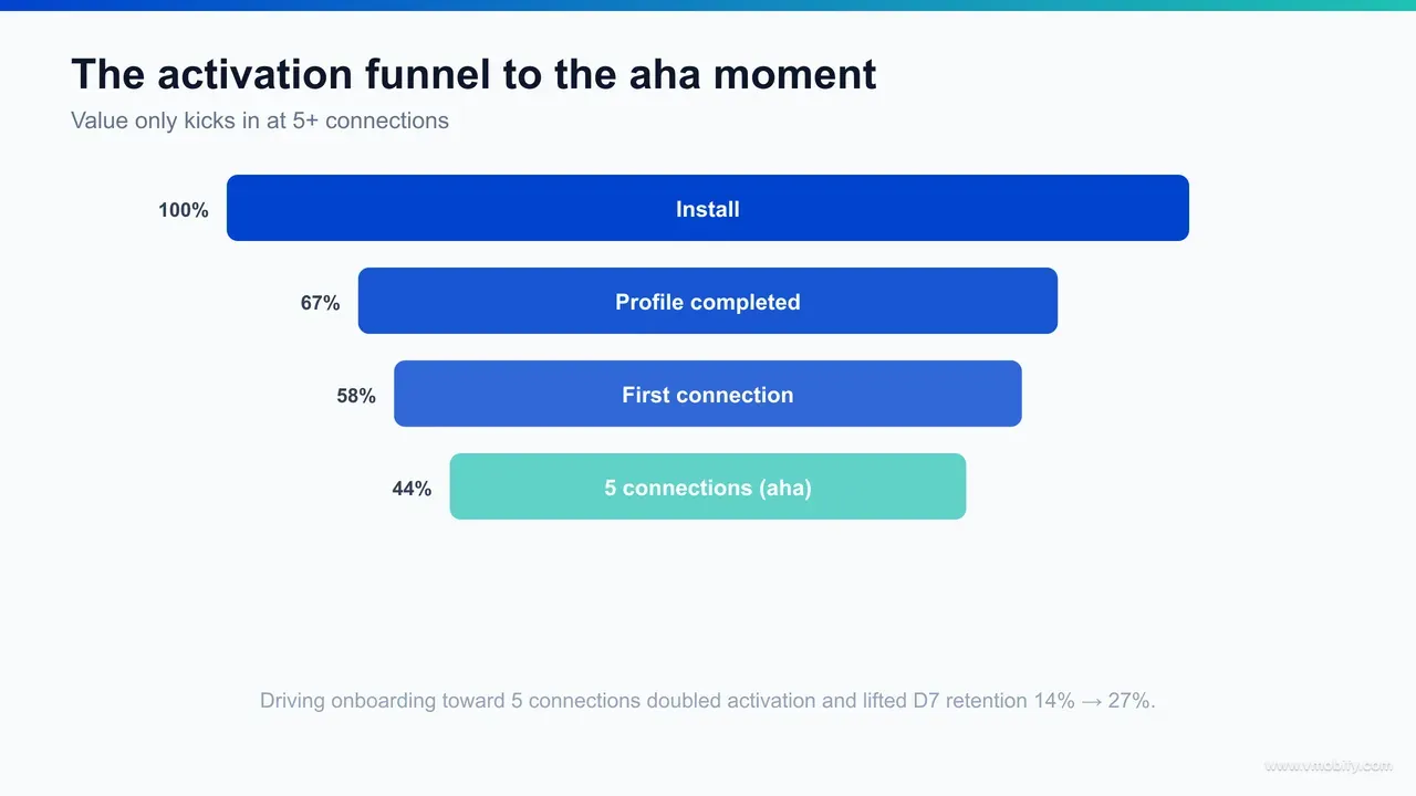
We found the activation metric the only way you reliably can — by instrumenting the full funnel, plotting retention against early in-app actions, and looking for the action count where retention stops improving; for this app it was “connect with 5+ relevant people in the first session.” Before this work, the team had an implicit, never-validated belief that “profile completion” was activation. The data said otherwise.
The first job was measurement, not opinion. We wired a clean event taxonomy through the app — install, profile-field completed, profile completed, connection-request sent, connection accepted, first feed interaction, return visit — so that every step between install and value was a countable event. Our mobile analytics team owns this layer on every engagement, because you cannot optimise a funnel you cannot see, and most activation problems are invisible until the instrumentation exists.
With events flowing, we ran the analysis that defines an activation metric: bucket users by how many accepted connections they formed in their first session, then look at D7 and D30 retention for each bucket. The curve was unambiguous. Retention rose steeply from zero to roughly five accepted connections, then flattened. Users with 5+ first-session connections retained at multiples of those with one or two; pushing past five added little. That inflection point — the action count where extra effort stops buying extra retention — is the activation threshold. The discipline of finding it through the retention curve rather than guessing is laid out well in Lenny’s writing on activation metrics, and it matched what we have seen across our own portfolio of community and marketplace apps.
Two refinements mattered. First, the connections had to be relevant — five random accepts did not predict retention nearly as well as five connections to people in the user’s industry, company graph, or contacts. Relevance was part of the metric, not a nice-to-have. Second, first session mattered: users who reached five connections in session one retained dramatically better than those who took a week, because the value landed while motivation was still high. So the metric we committed the whole roadmap to was specific: connect with five or more relevant people in the first session. Everything downstream — onboarding, suggestions, prompts — was then redesigned to drive that single number.
How did we lift profile completion from 41% to 67%?
We lifted profile completion from 41% to 67% by deleting most of the profile — cutting the upfront form down to the handful of fields that actually power the matching engine, then drip-collecting the rest later — rather than demanding a full CV before the user had any reason to care. The old onboarding treated the profile as a wall to climb before entry. We turned it into a fast on-ramp.
The diagnosis came straight from the funnel instrumentation. We could see exactly which profile field each abandoner quit on, and the drop-offs clustered on high-effort, low-immediate-value fields — long bios, work history, skill lists. Users were being asked to invest before the product had shown them anything. Profile completion was not a motivation problem; it was a sequencing problem.
The fixes, in order of impact:
- Cut to the matching-critical minimum. The matching engine really only needs a few signals to generate good suggestions — name, role/industry, and a location or company anchor. We made those the only required fields. Everything else became optional and was requested later, in context, once the user had a reason to fill it in.
- Pre-fill aggressively. Where the user signed up via a professional identity or imported contacts, we pre-populated role, company, and photo so the profile was half-built before the user typed anything. A pre-filled field that the user merely confirms converts far better than an empty one they must compose.
- Show the payoff during the form. As soon as the matching-critical fields were entered, we surfaced real connection suggestions immediately — “here are 8 people from your company already here.” Completing the profile now had an instant, visible reward instead of dumping the user into an empty feed.
- Progressive profiling after value. The deleted fields were not gone — they were rescheduled. Once a user had connections and was returning, contextual nudges (“add your skills so the right people find you”) collected the richer profile data when motivation was high, which is why richer profiles grew even as the upfront form shrank.
The result was a 26-point lift in profile completion, but the more important effect was what it unlocked downstream. A completed (even if minimal) profile is what makes a user legible to the matching engine, which is the precondition for getting the five relevant suggestions that drive activation. Profile completion was never the goal — it was the gate in front of the goal, and widening it fed everything below.
How did contact-import and “people you may know” drive connections?
Contact-import plus a “people you may know” suggestion engine was the single biggest activation driver — it manufactured the user’s first five relevant connections inside the opening session by surfacing people they already knew, collapsing time-to-aha from days to a couple of minutes. You cannot ask a new user to go find five relevant strangers. You have to hand the connections to them, and the richest source of relevance is the people they already have in their phone.
The mechanics, built directly against the activation metric:
- Permission-gated contact import, framed as value. We requested contact access at the moment it obviously helped the user — right after the minimal profile, framed as “see which of your contacts are already here” — not as a cold permission prompt on launch. Asking at the point of value, with the payoff stated, lifted opt-in materially and immediately produced a list of known, relevant people.
- A relevance-ranked “people you may know” feed. Imported contacts already on the app, plus second-degree connections, plus same-company and same-industry matches, were ranked so the strongest, most recognisable people sat at the top. The first five suggestions a user saw were people they would actually recognise — which is exactly what the activation metric demanded (five relevant connections, not five random ones).
- One-tap connect and batch send. Connecting was reduced to a single tap, and we let users send several requests at once from the suggestion list. Removing the per-connection friction is what made “five in the first session” realistic rather than aspirational.
- Acceptance-side prompts. A request only becomes a connection when accepted, so we made accepting frictionless too — a clear push, a one-tap accept — closing the loop fast and feeding both users’ activation counts at once.
This is where install-to-activation moved from 22% toward 44%. By putting five recognisable, relevant people in front of the user before motivation decayed, we turned activation from something a user had to work for into something the product did for them. The principle generalises: the fastest path to a network’s aha moment is almost always importing an existing graph rather than asking the user to build a new one from scratch.
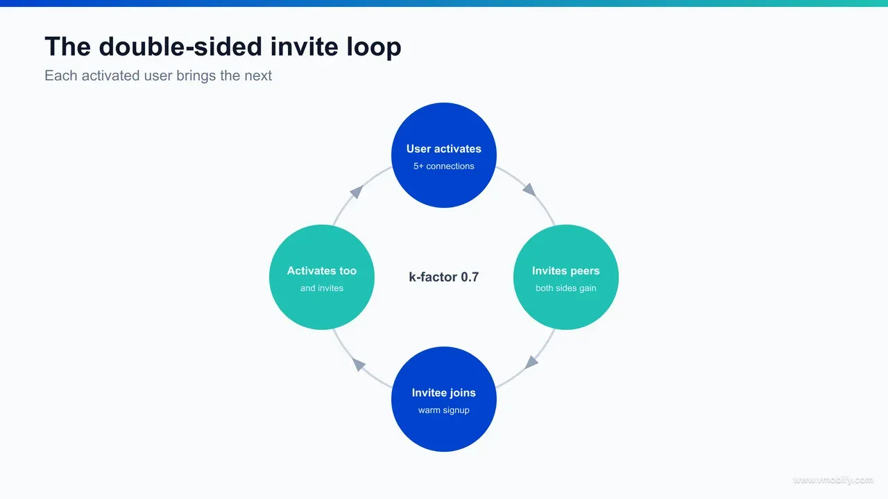
How did the double-sided invite loop raise the k-factor?
We raised the viral coefficient from 0.3 to 0.7 by rebuilding invites as a double-sided loop — where both the inviter and the invitee get something real — and by triggering invites at the natural moments when a user actually wants someone else on the app, rather than burying a generic “invite friends” button in a settings menu. A one-sided invite asks the user to do the app a favour. A double-sided invite gives the user a reason of their own.
The k-factor is simply how many new users each existing user brings in: invites sent per user, times the acceptance-and-install rate of those invites. To move it from 0.3 to 0.7 we had to lift both halves — more invites, and a higher conversion on each — which is exactly what a well-designed double-sided loop does, as Reforge’s work on growth loops lays out.
- Both sides gain. The inviter got value from the invitee actually joining — a real connection added to their network, sometimes an unlock tied to network size — and the invitee arrived to a warm start: a pending connection from someone they know, waiting on first open. Neither side felt like they were doing charity work, which is what lifts send rate and acceptance rate together.
- Contextual triggers at intent moments. Instead of one buried button, invites surfaced exactly when a user wished a specific person were on the app — searching for a colleague who was not a member, viewing a contact who had not joined, or trying to connect with someone outside the network. “This person isn’t on the app yet — invite them” converts far better than a generic prompt because the intent is already there.
- The warm-landing invitee experience. An invitee who installed landed not on an empty feed but on the inviter’s pending connection plus immediate “people you may know” suggestions — so invited users hit activation faster than cold installs, which compounded the whole system.
- Instrumented loop, not a guess. We measured invites-sent-per-user, invite acceptance rate, and the cycle time of the loop, then optimised each lever independently. Treating the loop as a measurable system — in the spirit of Andrew Chen’s writing on viral loops and network effects — is what let us push k from 0.3 to 0.7 deliberately rather than hoping.
The detailed mechanics of designing rewards that do not get gamed are in our mobile app referral program guide, and the broader loop theory in our piece on app growth loops. The headline here: doubling-plus the k-factor was an engineering and incentive-design problem, solved deliberately.
How did activation feed D7 retention?
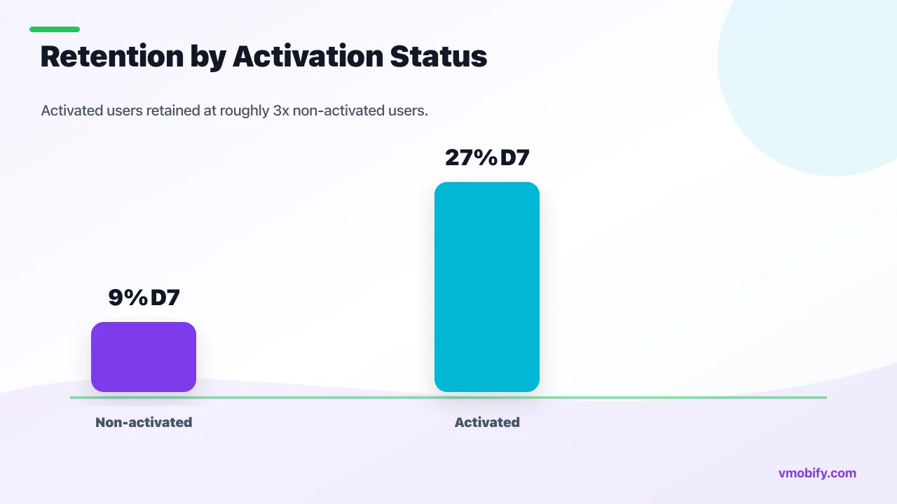
D7 retention rose from 14% to 27% almost entirely as a downstream consequence of activation — activated users (those who hit five relevant connections in the first session) retained at roughly three times the rate of non-activated users, so doubling the activated share mechanically pulled the blended retention curve up with it. We did not run a separate “retention campaign.” We fixed activation and retention followed, because for a network product they are the same problem viewed at two points in time.
The causal chain is concrete. A user with five relevant connections has a non-empty feed, gets notifications that matter (a connection posted, someone viewed their profile, a new relevant suggestion appeared), and has a reason to return tomorrow. A user with zero or one connection has none of that — their app is silent, so they never come back. The instrumentation made the gap visible: when we split D7 retention by activation status, activated users sat far above the line and non-activated users far below it. The blended number was just a weighted average of those two populations, and we changed the weighting.
That said, activation set the ceiling and a few retention-specific moves captured it:
- Connection-driven notifications. We made the return triggers relational — “someone you may know joined,” “your connection posted,” “3 people viewed your profile” — because in a network product the reasons to return are other people, not generic content pings. These only work once a user has connections, which is why activation had to come first.
- Day-1 and day-3 re-engagement for the nearly-activated. Users who reached two or three connections but stalled short of five were the highest-impact re-engagement cohort — close to value, easy to nudge over the line with a fresh batch of suggestions.
- Reinforcing the loop on return. Each return visit surfaced new relevant suggestions, so retention and activation reinforced each other rather than activation being a one-time event.
The benchmark context matters: a jump from 14% to 27% D7 roughly moves the app from well below to around the better end of social-app norms reported in AppsFlyer’s retention benchmarks. For a network product, that is the difference between a leaking bucket and a compounding base.
How did the viral loop compound installs?
Once activation and the double-sided invite loop were both working, installs began compounding — invite-driven installs climbed from 12% to 34% of the total, so a growing share of new users arrived for free, which lowered the effective blended cost of acquisition and let paid spend stretch much further. A k-factor below 1.0 does not produce runaway organic growth on its own, but layered on top of paid acquisition it acts as a multiplier on every bought install.
The arithmetic is worth making explicit, because it is the commercial payoff of the whole project. At a k-factor of 0.7, every 10 installs — however they were acquired — drive a tail of additional installs through invites over the cycles that follow, with invite-driven installs settling at 34% of the total. The practical effect we measured was an effective blended cost-per-install roughly a third lower than paid CPI alone, because the loop was quietly subsidising every paid cohort. This is the mechanism a16z describes in its framework on measuring network effects — virality as an amplifier on acquisition, not a replacement for it.
Three properties made the loop genuinely compounding rather than a one-off bump:
- Invited users activated faster. Because invitees landed on a warm start — a pending connection plus instant suggestions — they crossed the five-connection threshold more reliably than cold installs, which meant they in turn invited at a higher rate. The loop fed better users into itself.
- Cycle time was short. We optimised the time from a user activating to that user sending their first invite, because a fast loop compounds faster than a slow one even at the same k-factor. Shrinking cycle time is one of the most under-rated viral levers.
- Paid and viral reinforced each other. Every paid install was now a potential loop seed, so scaling paid did not just buy installs — it bought loop entrances. Our user acquisition team deliberately fed the loop from the top rather than treating paid and organic as separate ledgers.
The honest framing we gave the client: at k=0.7 the app is not self-sustaining and still needs a paid engine. But it now gets a third of its installs for free and acquires the paid ones more cheaply — a structurally better growth economy than the one we started with, where every single user had to be bought.
What were the final results across activation, retention, and virality?
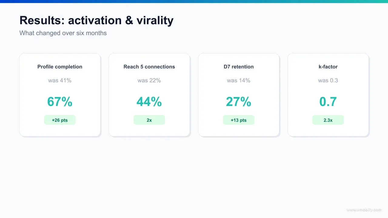
Over roughly six months, every metric in the broken chain moved together: profile completion 41% to 67%, install-to-5-connections activation 22% to 44%, D7 retention 14% to 27%, the viral k-factor 0.3 to 0.7, and invite-driven installs 12% to 34% of the total. Because the metrics are causally linked, they moved as a system — not as five separate wins.
The consolidated before-and-after:
- Profile completion: 41% → 67% — a 26-point lift, driven by cutting the upfront form to matching-critical fields and progressive profiling after value.
- Install-to-activation (5+ relevant connections, first session): 22% → 44% — a clean doubling of the share of installs that reach real value, driven by contact-import and ranked suggestions.
- D7 retention: 14% → 27% — nearly doubled, as a downstream consequence of doubling the activated share.
- Viral k-factor: 0.3 → 0.7 — more than doubled, from rebuilding invites as a double-sided, contextually-triggered loop.
- Invite-driven install share: 12% → 34% — a third of all new installs now arriving for free, lowering effective blended CPI by roughly a third.
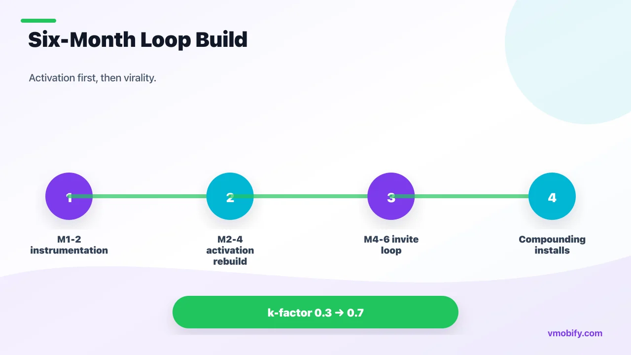
The phased shape of the work:
- Month 1–2 — instrument and diagnose. Event taxonomy wired through the full funnel. Retention-by-action analysis identified the real activation metric (five relevant first-session connections). No growth tactics yet — just measurement and the strategic decision to fix activation before scaling paid.
- Month 2–4 — rebuild activation. Profile compressed and pre-filled; contact-import added at the point of value; “people you may know” ranked for relevance; one-tap batch connect. Profile completion and activation moved first, retention followed.
- Month 4–6 — engineer the loop. Double-sided invites, contextual triggers, warm-landing invitee experience, and full loop instrumentation (sends per user, acceptance rate, cycle time). The k-factor and invite-driven share climbed, and installs began compounding.
Two takeaways future teams should internalise. First, activation is upstream of both retention and virality — fixing it was the highest-impact move because two other metrics sat downstream of it. Second, a k-factor under 1.0 is still hugely valuable — it does not need to hit self-sustaining to materially lower acquisition cost. You can see the same systems thinking across our portfolio of case studies.
What makes this activation-and-loop playbook repeatable?
This playbook is repeatable because it is a sequence, not a set of clever tactics — instrument the funnel, find the activation threshold from the retention curve, engineer the fastest path to it, then make reaching it generate the next user — and that sequence holds for any network, community, or marketplace product regardless of vertical. The specific levers change; the order of operations does not.
The transferable structure:
- Measure before you optimise. Every engagement starts with a clean event taxonomy through the whole funnel. You cannot find an activation metric, or fix it, without seeing every step between install and value. This is non-negotiable and it is why analytics comes first, not last.
- Derive the activation metric, don’t assume it. Plot retention against early actions and find the inflection point. For this app it was five relevant first-session connections; for a marketplace it might be first transaction, for a content app first follow or first save. The method is constant even when the metric is not.
- Manufacture the aha moment. Do not ask users to reach value on their own — import an existing graph, pre-fill, suggest, reduce every step to one tap, and compress time-to-aha to minutes. Onboarding’s job is to deliver the activation event, not to collect data.
- Make value generate the next user. Build the invite as a double-sided loop triggered at natural intent moments, instrument k-factor and cycle time, and feed the loop from paid acquisition rather than running them as separate ledgers.
What makes it durable is that each layer reinforces the others. Better activation produces better retention, which produces more active users to invite, which produces more invited users — who, because of the warm-landing design, activate better than cold installs and invite at a higher rate. In our portfolio, the network products that compound are never the ones with the cheapest installs; they are the ones that turned reaching value into the engine that produces the next user. That is the whole game.
What makes Vmobify the right partner for activation-led growth?
Vmobify has managed app growth for Indian and global publishers since 2013, across 300+ apps in fintech, gaming, OTT, edtech, social, and utility — and the reason this networking-app playbook is repeatable is that we treat activation, retention, and virality as one system measured against in-app value, not as three disconnected dashboards. The variables change between clients; the method does not.
- We optimise toward value, not vanity installs. For a network product the value moment is the activation threshold, and we instrument and engineer toward it before spending a rupee scaling acquisition. Buying installs against a broken activation funnel is how budgets quietly disappear — we fix the funnel first. That discipline runs through our user acquisition and analytics practice.
- Analytics is the foundation, not an add-on. The activation metric here was derived from a retention-by-action analysis that only existed because we wired the funnel properly. Most activation problems are invisible without that instrumentation, which is why we build it on day one.
- We engineer loops deliberately. A k-factor moving from 0.3 to 0.7 is an incentive-design and product-engineering outcome, not luck. We measure sends per user, acceptance rate, and cycle time, and we move each lever on purpose.
- India is our home market. The team works out of India, understands contact-graph and permission behaviour in Indian markets, and brings Tier-2/3 nuance that international agencies spend months relearning.
- The portfolio compounds. Activation and loop learnings from a networking app cross-pollinate with marketplaces, community apps, and fintech — lateral muscle no single-vertical agency builds.
If you are building a networking, community, or marketplace app — and you have installs but cannot turn them into activated, retained, self-propagating users — this playbook adapts to your product. The activation metric, the onboarding levers, and the loop incentives change; the instrument-then-engineer sequence does not. Talk to Vmobify’s growth team to see how it would map to your app.
Frequently Asked Questions
What was the activation metric, and why that one?+
It was “connect with 5+ relevant people in the first session.” We derived it by plotting D7/D30 retention against early in-app actions: retention rose steeply from zero to about five accepted connections, then flattened. That inflection point — where extra actions stop buying extra retention — is the activation threshold. Relevance and first-session timing both mattered, so they were built into the metric, not treated as nice-to-haves.
How did activation go from 22% to 44% so quickly?+
By manufacturing the first five relevant connections for the user instead of asking them to find them. Contact-import (requested at the point of value) plus a relevance-ranked “people you may know” engine put recognisable people in front of the user in the opening session, and one-tap batch connect removed the friction. That collapsed time-to-aha from days to minutes and roughly doubled the share of installs reaching the threshold.
Why did D7 retention rise without a dedicated retention campaign?+
Because for a network product retention is downstream of activation. Activated users — those with five relevant connections — retained at roughly three times the rate of non-activated users, since they had a non-empty feed and relational reasons to return. Doubling the activated share mechanically pulled blended D7 retention from 14% to 27%. A few connection-driven notifications captured the ceiling activation had set.
What is a k-factor, and is 0.7 good?+
The k-factor (viral coefficient) is how many new users each existing user brings in — invites sent per user times the install rate of those invites. Below 1.0, an app is not self-sustaining on virality alone. But 0.7 is very valuable layered on paid acquisition: every 10 installs pull in about 7 more for free, which lowered effective blended CPI by roughly a third. Moving from 0.3 to 0.7 more than doubled the loop’s contribution.
What makes an invite loop “double-sided,” and why does it matter?+
A double-sided loop rewards both the inviter and the invitee — the inviter gains a real connection or unlock, and the invitee arrives to a warm start with a pending connection and instant suggestions. That lifts both halves of the k-factor (more invites sent and a higher acceptance/install rate) because neither side feels like they are doing the app a favour. One-sided “invite friends” buttons rarely move virality.
How long did the whole programme take?+
Roughly six months, in three phases: months 1–2 to instrument the funnel and derive the activation metric, months 2–4 to rebuild activation (profile compression, contact-import, suggestions), and months 4–6 to engineer the double-sided invite loop and let installs start compounding. Activation moved first, retention followed it, and virality came last because it depends on having activated, retained users to invite.
Can this playbook work for a marketplace or community app, not just networking?+
Yes. The sequence is constant — instrument the funnel, derive the activation threshold from the retention curve, engineer the fastest path to it, then make reaching it generate the next user. The metric itself changes: first transaction for a marketplace, first follow or save for a content app, five connections for a networking app. The instrument-then-engineer method transfers across any network, community, or marketplace product.
Sources
- Amplitude — The Aha Moment & Activation — How to identify the value-delivering action threshold that predicts retention
- Reforge — Growth Loops — Framework for designing self-reinforcing acquisition loops instead of one-off funnels
- Lenny’s Newsletter — Activation & Onboarding — Practical method for defining an activation metric from the retention curve
- Andrew Chen — Viral Loops & Network Effects — Essays on the viral coefficient, cycle time, and engineering network effects
- Andreessen Horowitz — 16 Ways to Measure Network Effects — Frameworks for measuring virality and network effects as an acquisition amplifier
- AppsFlyer — App Retention Benchmarks — D1/D7/D30 retention benchmarks by category and geography
- Statista — Social & Professional Network Users, India — Market-size context for the Indian professional networking audience
About the author
Amol Pomane — Founder, Vmobify
Amol leads Vmobify, a mobile app growth agency that has driven 30M+ downloads and ranked 54K+ keywords across 300+ apps since 2013. He writes about ASO, paid user acquisition, retention, and the operational reality of scaling mobile apps in India and global markets.
Free Growth Audit
See exactly how to scale your app with 13+ years of expertise behind you.
Get My Strategy

