Mobile App Funnel & Product Analytics: Activation, Cohorts, North-Star
Acquisition tells you who arrived. Product analytics tells you what they did next — and why most of them left. This is a marketer-first guide to the AARRR funnel, drop-off analysis, cohorts, the North-Star Metric and the event instrumentation that makes all of it trustworthy.

What is product analytics, and why do marketers need it?
Product analytics is the practice of measuring what people actually do inside your app — which screens they reach, which actions they take, where they hesitate and where they leave — so you can connect the users you paid to acquire with the value they did or did not get. It is the difference between knowing an install happened and knowing whether that install will ever become a retained, paying user.
For years, app marketing was judged at the front door. Cost per install, click-through rate, install volume — all of it measured the moment of arrival and stopped there. The problem is that the front door is the cheapest, least informative part of the journey. Two campaigns can deliver installs at an identical cost, and one can produce users who are worth ten times more, simply because of what those users do in the first week. The only way to see that difference is to look past the install into behaviour, and behaviour is what product analytics measures.
This is why the discipline has migrated out of the product team and onto the marketer's desk. When you run user acquisition against a fixed budget, the single most valuable thing you can know is which sources, creatives and audiences produce users who reach the moment that makes them stay. A marketer who can read a funnel and a cohort chart stops optimising for cheap installs and starts optimising for retained users — and those are very different campaigns. Tools like Amplitude and Mixpanel exist specifically to make that behavioural data legible to non-engineers.
Across our 300+ apps managed since 2013, the single clearest dividing line between accounts that scale profitably and accounts that stall is whether the marketing team can read product data. The teams that cannot are stuck judging campaigns by install cost and wondering why "good" CPI does not translate into revenue. The teams that can read it spot a broken onboarding step or a weak source within days, not quarters. This guide is the working knowledge a marketer needs to join that second group — the funnel, the cohort, the North-Star Metric, the instrumentation underneath, and the mistakes that quietly corrupt all of it.
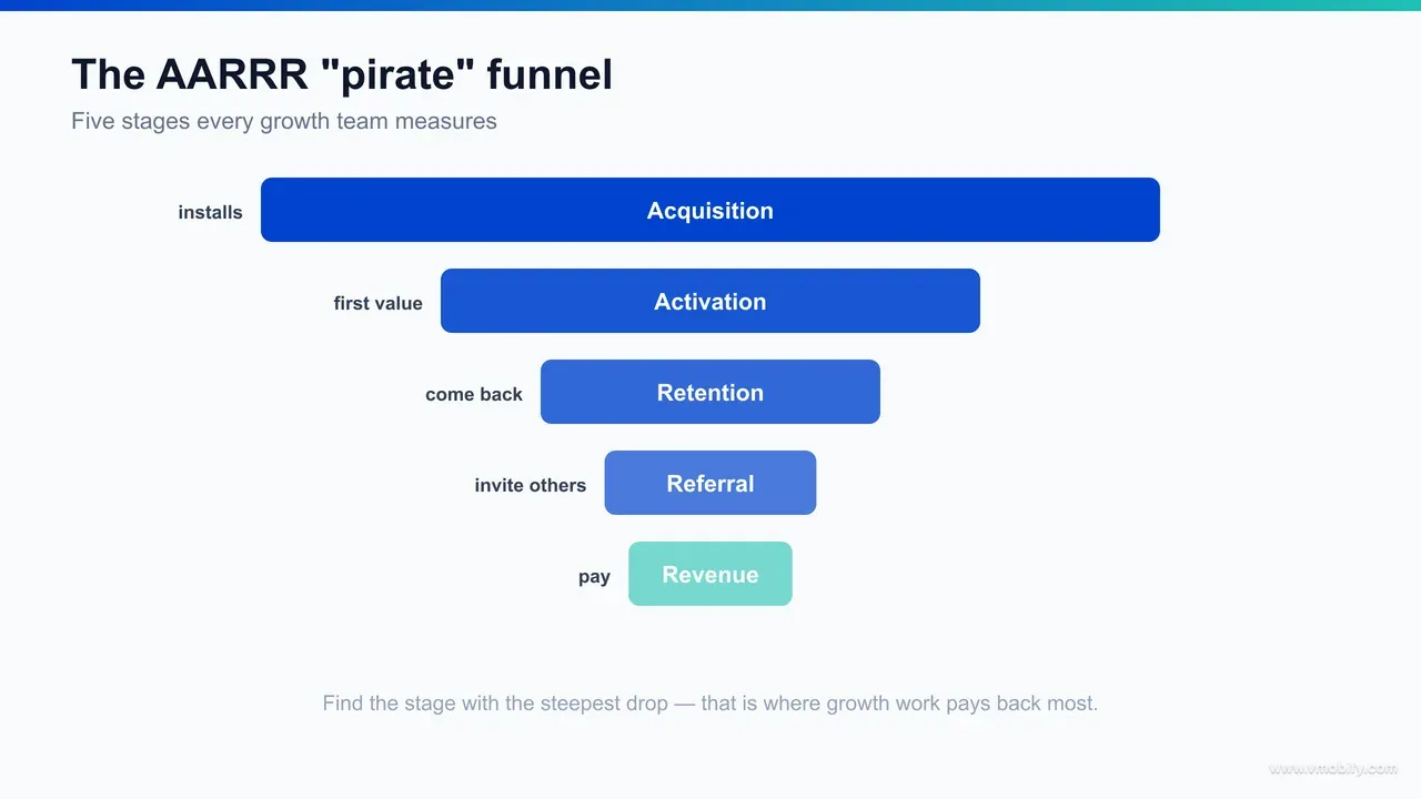
What is the AARRR pirate funnel?
AARRR is a five-stage map of the entire user lifecycle — Acquisition, Activation, Retention, Referral and Revenue — and it works because it forces marketing and product to share one mental model instead of arguing across a wall. The nickname "pirate funnel" comes from the way the acronym reads out loud, but the value is that it puts the whole journey on a single page.
Each stage answers one plain question:
- Acquisition: how do people find and install the app? This is the channel and campaign layer — paid social, search, ASO, referrals — and the one most marketers already measure well.
- Activation: do new users reach their first real moment of value? This is the make-or-break stage, and the one most teams under-measure. Activation is not "opened the app"; it is "did the thing the app exists to do".
- Retention: do they come back? Retention is the truest signal of product-market fit, because a user who returns unprompted is voting with their time.
- Referral: do they bring others in? Word of mouth, invites and shares lower your effective acquisition cost and compound over time.
- Revenue: do they pay, subscribe or generate ad value? This is the stage that has to ultimately justify everything upstream.
The order matters more than it looks. Marketers instinctively pour energy into the top — more installs, lower CPI — but the funnel is multiplicative, so a leak at activation or retention silently caps everything you spend at acquisition. If only a third of installs ever activate, then doubling your install budget mostly doubles the number of people who never come back. Fixing the activation step is usually cheaper and more durable than buying your way around it, which is exactly why finding your app's activation aha-moment is the highest-impact analytics work most teams can do.
We use AARRR as the opening frame in almost every analytics engagement because it instantly locates the argument. When a client says "growth has stalled", AARRR turns a vague worry into a specific question: is the leak at acquisition, activation, retention, referral or revenue? You cannot fix what you cannot locate, and this is the map that locates it.
How do you run a funnel and drop-off analysis?
A funnel analysis lays out an ordered sequence of steps a user is meant to complete, then measures how many people make it from each step to the next — so the largest single drop between two steps tells you precisely where to focus first. It is the most actionable chart in product analytics because it does not just describe a problem; it points at the exact screen causing it.
Start by defining the sequence that represents success for your app. For a finance app it might be: open app, start sign-up, complete KYC, link account, make first transaction. For a content app: open, browse, play first item, finish first item, return next day. Once the steps are defined as tracked events, the analytics tool draws the funnel and shows conversion between each pair of steps. The discipline is to read it as a series of transitions, not a single number — a 4% end-to-end conversion is useless on its own, but "82% finish sign-up yet only 31% complete KYC" tells you exactly where the floor falls away.
Three habits make funnel analysis genuinely useful rather than decorative:
- Segment every funnel. The same funnel split by acquisition source, device tier, country or campaign almost always reveals that your "average" hides two very different stories — a step that converts fine for one source and collapses for another. The average is a lie you tell yourself; the segments are the truth.
- Watch the time-to-convert, not just the rate. A step where users who do convert take a long time to do it is a step with hidden friction, even if the eventual conversion looks acceptable. Firebase and the dedicated tools both let you set the conversion window, and that window changes the picture.
- Compare drop-off against intent. Some drop-off is healthy — not every browser should buy. The signal you want is unexpected drop-off at a step users clearly intended to complete, like abandoning a payment screen after entering card details.
It also helps to distinguish two kinds of funnel. A conversion funnel is rigid and ordered — sign-up, then verify, then pay — and is the right tool for a linear flow you control. An open or unordered funnel asks "of users who eventually did X, what paths led there?" and is better for exploratory products where users wander before committing. Forcing an exploratory product into a strict step-by-step funnel manufactures drop-off that is not real, because users simply took a different valid route. Match the funnel type to how your product actually behaves before you read a single number off it.
In our portfolio, the most common finding from a first funnel build is not a marketing problem at all — it is a single broken or confusing onboarding step quietly destroying a third of the value of every campaign feeding it. That is the kind of fix that pays for the entire analytics effort in a fortnight, and it is invisible to anyone watching install cost alone.
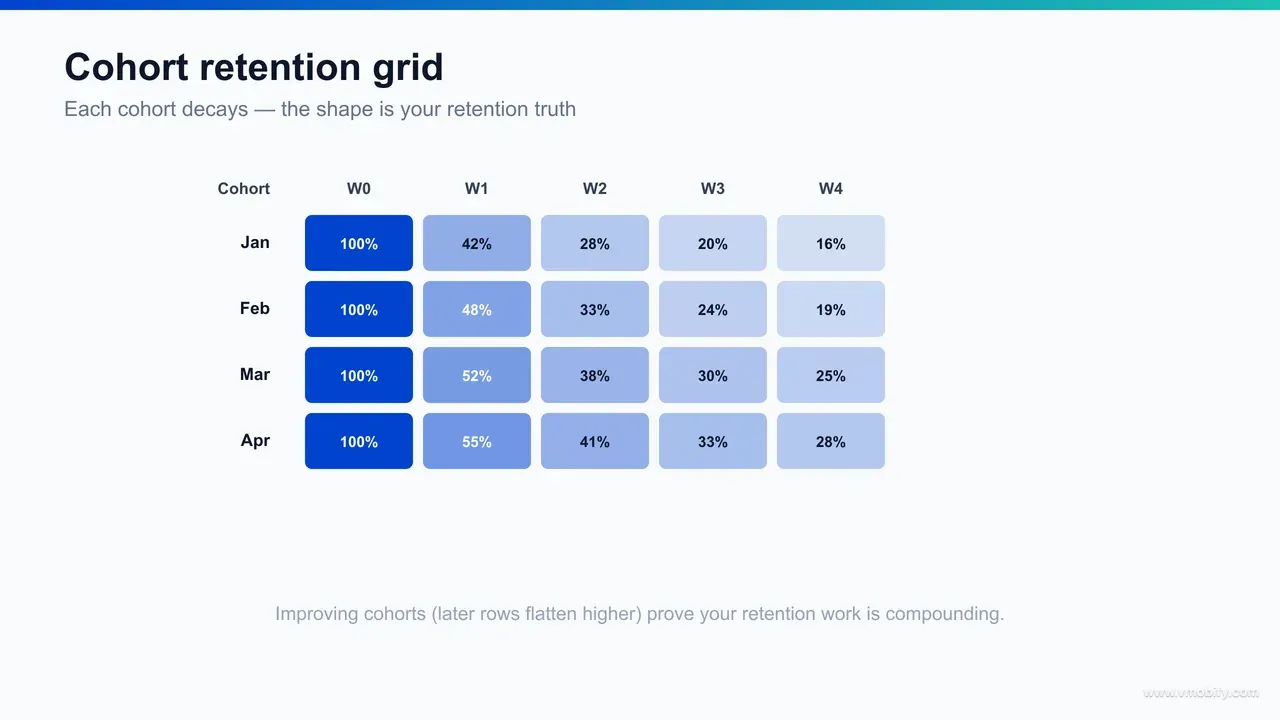
What does cohort analysis reveal that a funnel cannot?
Cohort analysis groups users by something they share — most often the week they installed — and then tracks each group's behaviour forward over time, which reveals whether your product is getting better or worse at keeping people in a way a single-snapshot funnel never can. A funnel is a photograph; a cohort is a film.
The classic view is a retention cohort grid. Each row is a group of users who arrived in the same period; each column is how many of them were still active one day, one week, one month later. Reading down the columns answers the question that actually matters for growth: is the version of your app shipping today retaining new users better than the version from three months ago? If the curve for recent cohorts sits above older ones, your changes are working. If it sits below, you are acquiring on top of a leaking bucket, and more spend will not fix it.
Cohorts expose several things funnels hide:
- Whether a fix actually held. You ship an onboarding change, the funnel conversion ticks up, and you declare victory. The cohort tells you whether those better-activated users were still around in week four — because activation that does not survive into retention is theatre.
- The shape of the retention curve. Healthy apps show a curve that drops then flattens into a stable plateau — the flat part is your committed core. A curve that keeps sliding toward zero has no core, which is the clearest possible signal of weak product-market fit. Mixpanel and Amplitude both make this curve a first-class chart.
- Behavioural cohorts, not just time cohorts. Grouping users by an action — "performed the activation event in week one" versus "did not" — and comparing their long-run retention is how you prove what your true activation moment is, rather than guessing.
There is also a useful distinction between classic retention and unbounded retention. Classic retention counts whether a user was active on a specific later day — strict, and right for daily-use apps. Unbounded, or rolling, retention counts whether they were active on or after that day, which suits apps with naturally weekly or monthly rhythms, like a grocery or travel app where a fortnightly visit is perfectly healthy. Choosing the wrong definition makes a perfectly retained user look churned, so pick the one that matches your product's natural cadence before you judge the curve.
This is also where realistic targets matter. Raw retention numbers vary enormously by category, so comparing yourself against the right baseline — set out in our breakdown of app retention benchmarks — stops you celebrating a curve that is actually below par or panicking over one that is normal for your vertical. The cohort tells you the shape; the benchmark tells you whether the shape is good.
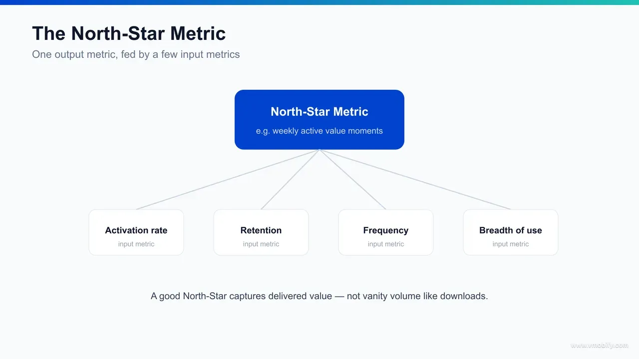
How do you choose a North-Star Metric?
A North-Star Metric is the single number that best captures the core value your product delivers to users — and the discipline of choosing one is forcing your whole organisation to agree on what "winning" actually means, then surrounding it with three to five input metrics you can directly influence. Done well, it aligns marketing, product and leadership behind one outcome. Done badly, it becomes a vanity number that quietly rewards the wrong behaviour.
The defining test of a good North-Star is that it tracks value received, not activity performed. "Total registered users" goes up forever and can never go down, so it tells you nothing about health — it is a vanity metric in a North-Star costume. Contrast it with metrics like nights booked, messages sent to a reply, songs played to completion, or weekly active users who performed the core action. Those can fall when the product gets worse, which is exactly what makes them honest. The North Star framework popularised by Amplitude frames it as the one metric that is a leading indicator of sustainable revenue — value first, money follows.
The North-Star only becomes operational once you decompose it into inputs. A North-Star you cannot move directly is just a wall poster; the inputs are the levers a team can pull this sprint. If your North-Star is "weekly active users who complete a core action", the inputs might be: new-user activation rate, returning-user frequency, breadth of the action across user segments, and resurrection of dormant users. Each input maps cleanly onto an AARRR stage, which is how the North-Star ties the whole funnel together rather than floating above it.
Two rules keep the choice honest. First, one North-Star per product — the moment you have three "primary" metrics, you have none, because teams will optimise the one that flatters them. Second, pick a metric you would still respect if it fell; if a number can only ever rise, it cannot guide decisions. When we set this up inside an analytics engagement, the hardest and most valuable hour is the one spent arguing the organisation down to a single number — because that argument surfaces every unspoken disagreement about what the product is for.
What does good event instrumentation look like?
Every funnel, cohort and North-Star you will ever build sits on top of events — the tracked records of what users do — so a clean, consistent, well-documented event taxonomy is the foundation that decides whether your analytics is trustworthy or quietly fictional. No tool, however expensive, can produce a correct chart from corrupted events. Instrumentation is where analytics quality is actually won or lost.
An event taxonomy is the agreed scheme for what you track and how you name it. The principles that survive contact with a real codebase are consistency and restraint:
- Name events for user actions, in a single convention. Pick one casing and tense — for example object-action like checkout_completed or video_played — and apply it everywhere. A project with SignUp, sign_up and user_signed_up all firing is a project where no funnel can be trusted.
- Push detail into properties, not into event names. Track one purchase_completed event with properties for amount, currency, item and payment method — not twenty differently named purchase events. Properties are what let you segment later; over-named events fragment your data into uselessness.
- Track the few events that matter, not everything that moves. Instrumenting every tap produces noise that buries the signal and inflates your bill. Map your AARRR funnel and North-Star first, then instrument the events those require — deliberately, with a documented plan.
- Maintain a living tracking plan. A shared document listing every event, its properties, and what it means is the difference between analytics that survives staff turnover and analytics that rots. Google's Firebase events documentation and the GA4 events reference are useful starting structures, including the recommended-event conventions worth adopting rather than inventing.
Identity is the other half of instrumentation. If you cannot stitch a user's actions together across anonymous-to-signed-in and across devices, your retention and cohort numbers will understate the truth. Set a stable user identifier at the moment of sign-in and reconcile it with the pre-login anonymous ID. In our portfolio, broken identity resolution is the single most common reason a client's "retention problem" turns out to be a measurement problem — the users came back, but the analytics counted them as strangers.
Amplitude vs Mixpanel vs Firebase: when does each fit?
Amplitude, Mixpanel and Firebase/GA4 all deliver funnels, cohorts and event analysis — so the real choice is not about features but about your team's size, budget, engineering appetite and how tightly you need analytics wired into Google's advertising and data stack. Picking on a feature checklist alone leads teams to buy more than they will ever use.
The practical way to frame each one:
- Firebase / Google Analytics 4 is the default starting point for most apps, especially Android-first and budget-conscious teams. It is free at typical volumes, ships with the Firebase SDK many apps already embed, exports raw events to BigQuery, and feeds conversions straight into Google Ads — which matters enormously if UAC is your main acquisition channel. The trade-off is that its event-based model and reporting are less fluid for fast, exploratory behavioural questions than the dedicated tools, and historic data sampling can frustrate deep analysis. Read the Firebase Analytics docs before assuming it cannot do what you need — it does more than its reputation suggests.
- Amplitude is built for product-led teams who live in behavioural data. Its strengths are deep cohorting, behavioural segmentation, pathfinding and the North-Star tooling baked into the workflow. It suits organisations with a dedicated growth or product-analytics function who will actually use that depth — and it has a free tier generous enough to start small before committing.
- Mixpanel sits close to Amplitude in capability, often with a gentler learning curve and reporting that non-analysts pick up quickly. It is a strong fit for marketing and growth teams who want self-serve funnels and cohorts without waiting on a data team, and its pricing model rewards disciplined event volume.
A pattern we see often, and frequently recommend: run Firebase/GA4 as the always-on backbone for the Google Ads and BigQuery integration, and layer Amplitude or Mixpanel on top for the deep behavioural work the marketing team does day to day. It is not strictly either/or, and pretending it is leads teams to force one tool to do a job it is bad at. The right answer depends on your stack, your budget and who will actually open the dashboards — which is precisely the assessment we run at the start of an analytics engagement rather than defaulting to whatever is most fashionable.
How do you turn product-analytics insight into action?
Product analytics only earns its cost when an insight changes what you do next — so the discipline that matters most is the loop from observation to hypothesis to experiment to decision, run on a regular cadence rather than admired on a dashboard. A beautiful chart that nobody acts on is the most expensive wallpaper in the building.
For a marketer, the highest-value actions fall into a few repeatable moves:
- Reallocate spend by downstream value, not install cost. When a cohort shows that users from one source activate and retain far better than another at the same CPI, you move budget toward the source that produces retained users. This is the core reason to connect product data to acquisition — it turns "cheap installs" into "valuable installs" as the optimisation target, and it is the spine of how we run user acquisition.
- Fix the biggest funnel leak before buying more traffic. If activation is the limiting step, an onboarding experiment usually returns more than the same effort spent lowering CPI — because every install you already pay for becomes worth more. Sequence the work: repair the funnel, then scale the spend into it.
- Build behavioural audiences for re-engagement. Users who reached step three but not step four are a precise, high-intent retargeting and lifecycle-messaging audience. Product analytics defines that audience; your CRM and ad platforms act on it.
- Feed activation signals into the broader retention programme. Knowing which early action predicts long-run retention tells you exactly what onboarding, notifications and lifecycle campaigns should push users toward — the connective tissue described in our app retention strategy guide.
The cadence is what makes it stick. A weekly or fortnightly review where the team looks at the North-Star, its inputs, and the funnel — then commits to one experiment off the back of it — beats an elaborate dashboard reviewed once a quarter every time. Crucially, each experiment should carry a written hypothesis and a single success metric agreed before launch, so the result is a clear yes or no rather than a debate about interpretation after the fact. Across our portfolio, the accounts that compound are the ones where analytics drives a standing decision meeting, not a slide deck. The tool is cheap; the habit is the asset, and the habit is what no competitor can copy.
Which analytics mistakes mislead teams most?
The analytics mistakes that do the most damage are not exotic — they are vanity metrics, broken tracking, unsegmented averages and confusing correlation with causation, and each one produces confident decisions built on data that quietly lies. Knowing the failure modes is half of avoiding them.
- Worshipping vanity metrics. Cumulative downloads, total registered users, raw session counts — numbers that only ever rise feel good and tell you nothing about health. Replace every "total" with a rate or an active-usage measure that can fall when the product gets worse. If a metric cannot go down, it cannot inform a decision.
- Trusting broken tracking. Double-firing events inflate conversions; missing events on a screen make a healthy step look like a leak; a renamed event silently breaks a funnel from the day of release. The fix is unglamorous: validate events in a debug view before launch, monitor event volumes for sudden jumps or drops, and treat the tracking plan as production code that gets reviewed.
- Reading the average instead of the segments. A blended funnel hides that one source converts fine and another collapses. Almost every important insight lives in a segment, not the headline number — segment by source, device tier, geography and behaviour before you conclude anything.
- Confusing correlation with causation. "Users who add three friends retain better" does not prove that pushing friend-adds will lift retention — the friend-adders may simply have been more committed already. Behavioural correlations are hypotheses to test with an experiment, not conclusions to ship on.
- Survivorship and selection blindness. Analysing only the users who completed an action ignores everyone the action filtered out. Always ask who is missing from the chart, because the people who dropped out earlier are usually where the real problem lives.
The cohort grid below shows the most dangerous version of the vanity trap in one picture: a "total users" line can climb steeply while the underlying retention cohorts decay — growth on the surface, churn underneath. We have walked into more than one account celebrating record installs while every recent cohort retained worse than the last. The headline number was rising; the business was hollowing out. Only the cohort view made it visible.
What changes for India and low-connectivity users?
For India and other markets with intermittent connectivity, low-RAM devices and data-sensitive users, your analytics needs to survive offline sessions, batch and compress its uploads, and stay lean enough not to slow the very app you are measuring — otherwise the measurement itself biases your data toward your richest users. The method is the same; the engineering constraints are not.
Three considerations dominate:
- Offline and intermittent sessions. A large share of usage happens on flaky networks or fully offline, then syncs later. An SDK that drops events when there is no connection will systematically undercount your most data-constrained users, skewing every funnel and cohort toward people on good connections. Confirm your analytics queues events locally and uploads them in batches when connectivity returns — most mature SDKs do, but verify it rather than assume it.
- Device tier and app weight. On entry-level Android devices, a heavy analytics SDK competes for the same scarce memory and battery as your app, and a sluggish app retains worse — meaning careless instrumentation can degrade the metric you are trying to improve. Keep the SDK footprint lean and the event volume disciplined. This is another argument for the restraint principle: track what your funnel and North-Star require, nothing more.
- Data cost and consent. Frequent, uncompressed event uploads cost users real money on metered connections, and that cost shapes behaviour. Batched, compressed uploads respect the user and improve completeness at once. Layer in genuine consent handling — particularly as India's data-protection regime matures — so your instrumentation is both lawful and trusted.
Segment your funnels and cohorts by device tier and connection quality from day one. A blended retention curve across a flagship-and-budget-device user base hides two completely different products' worth of behaviour, and the budget-device segment is usually both the larger audience and the one with the most fixable friction. In our work across India-first apps, the act of simply splitting the funnel by device tier is often the insight — the activation step that looks fine on aggregate is collapsing on the ₹8,000 phone that most of the market actually owns.
If you want this built properly — clean instrumentation, a defensible North-Star, funnels and cohorts your marketing team can read, and the connection back into acquisition that turns it into spend decisions — that is exactly the work our analytics team does, and you can talk to us about your specific stack.
Frequently Asked Questions
What is the difference between product analytics and marketing analytics?+
Marketing analytics measures how users arrive — channels, campaigns, cost per install and click-through. Product analytics measures what they do after arriving — activation, retention, the actions that create value. Modern app growth needs both connected, so you can judge acquisition by the retained users it produces rather than the cheap installs it buys.
What does AARRR stand for?+
Acquisition, Activation, Retention, Referral and Revenue. It is a five-stage map of the user lifecycle, nicknamed the pirate funnel, used to locate exactly where users are dropping out so marketing and product teams can agree on what to fix first.
What is the difference between a funnel and a cohort?+
A funnel is a snapshot that shows where users drop out of an ordered sequence of steps. A cohort groups users by a shared trait — usually install week — and tracks their behaviour forward over time. The funnel tells you where the leak is; the cohort tells you whether your fix actually changed behaviour and held.
How do I choose a North-Star Metric?+
Pick the single metric that best captures the value users get from your product, and make sure it can fall when the product gets worse — so a usage measure like weekly active users performing the core action, never a vanity total like cumulative downloads. Then surround it with three to five input metrics you can directly move.
Should I use Amplitude, Mixpanel or Firebase?+
Firebase/GA4 is the free, default backbone, strongest when you need Google Ads and BigQuery integration. Amplitude suits product-led teams who want deep behavioural and cohort analysis. Mixpanel offers similar depth with a gentler learning curve for marketing teams. Many apps run Firebase plus one dedicated tool rather than choosing only one.
Why is event instrumentation so important?+
Every funnel, cohort and North-Star is built from tracked events, so inconsistent naming, missing properties, double-firing or untracked screens corrupt every chart downstream. A clean, documented event taxonomy and reliable identity resolution are the foundation that decides whether your analytics is trustworthy or quietly fictional.
What is the biggest analytics mistake marketers make?+
Optimising for vanity metrics — cumulative installs or total users that only ever rise — instead of rates and active-usage measures that can fall when the product weakens. The close second is trusting broken tracking, because a renamed or double-firing event makes a healthy funnel look broken or a broken one look healthy.
Sources
- Amplitude — Product analytics blog — Funnel, cohort and behavioural analytics method for product-led teams
- Amplitude — The North Star framework — Defining a single value metric and its movable input metrics
- Mixpanel — Product analytics blog — Funnels, retention cohorts and self-serve behavioural analysis
- Firebase — Google Analytics for Firebase — Event-based app analytics, BigQuery export and Google Ads integration
- Firebase — Events reference — Recommended event and property naming conventions for instrumentation
- Google — GA4 events documentation — GA4 event model and recommended-event structure
- Mixpanel — Cohorts documentation — Building behavioural and time-based cohorts for retention analysis
About the author
Amol Pomane — Founder, Vmobify
Amol leads Vmobify, a mobile app growth agency that has driven 30M+ downloads and ranked 54K+ keywords across 300+ apps since 2013. He writes about ASO, paid user acquisition, retention, and the operational reality of scaling mobile apps in India and global markets.
Free Growth Audit
See exactly how to scale your app with 13+ years of expertise behind you.
Get My Strategy

