DAU/MAU & App Stickiness Benchmarks by Category (2026)
A reference table of DAU/MAU "stickiness" benchmarks by category for 2026 — messaging, social, gaming, fintech, B2B SaaS and e-commerce — plus what the ratio actually measures, where it lies to you, and the engagement metrics that have to sit beside it. The data, not the playbook.

What do DAU/MAU and "app stickiness" actually mean?
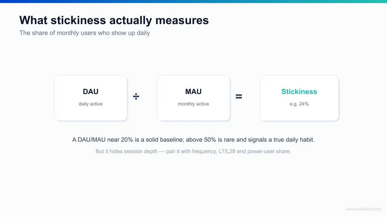
App stickiness is the ratio of daily active users to monthly active users — DAU divided by MAU — and it measures how often your existing users come back, not how many of them there are. A stickiness of 0.2 (20%) means that on an average day, one in five of your monthly users opens the app; put the other way, the typical monthly user shows up on roughly 6 days out of 30. It is the single cleanest one-number proxy for habit.
The metric earns its name honestly. A "sticky" app is one users return to without being prompted — it has lodged itself into a daily or near-daily routine. A messaging app is sticky because the people you talk to are on it; an annual tax-filing app is not sticky, and never will be, because nobody files taxes on a Tuesday for fun. Stickiness captures that behavioural difference in a way raw user counts never can. Two apps can each report a million MAU while one is opened forty times a month per user and the other twice — and DAU/MAU is the number that separates them.
This post is a reference asset, not a how-to. It exists to answer one question precisely — "what stickiness is normal for an app like mine in 2026?" — so you can place your own ratio on a credible scale before deciding what to do about it. It is the engagement sibling to our app retention benchmarks reference: retention curves tell you whether users come back at all over time, while stickiness tells you how frequently the ones who stayed actually engage. The two answer different questions, and a complete picture needs both. If you already know where you stand and want the interventions, our app retention strategy playbook covers the levers; this page is the map, that one is the route.
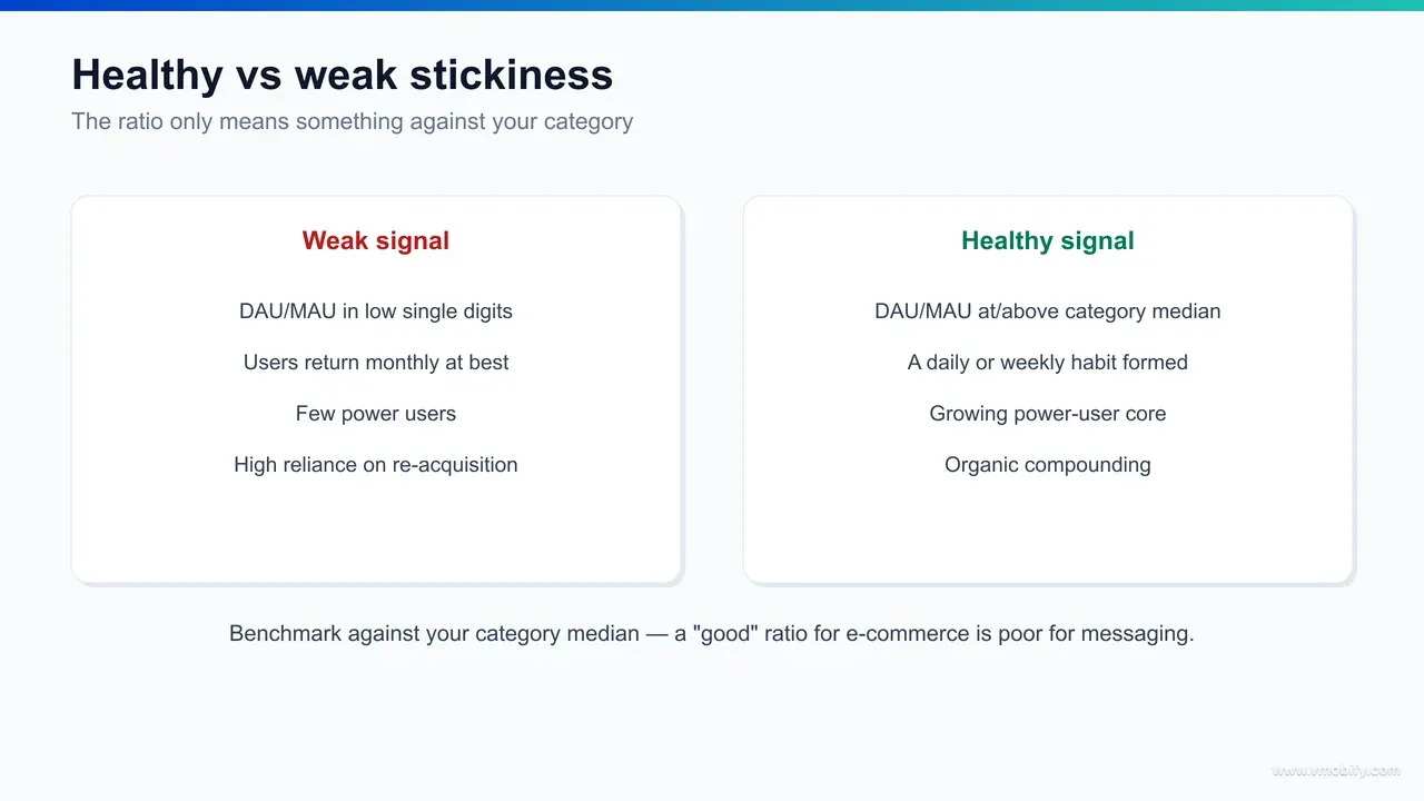
One framing to fix before the numbers. Stickiness is a ratio, so it is deliberately blind to scale. You can grow MAU aggressively through paid acquisition and watch DAU/MAU fall, because you are pouring low-frequency installs into the denominator faster than they convert into daily habit — that is not necessarily a problem, but it is the kind of movement that confuses teams who read the ratio without context. Across our 300+ apps managed since 2013, the most common stickiness mistake we see is a team treating a single DAU/MAU figure as a grade, when it is really the opening line of a diagnosis that only segmentation completes.
What are DAU/MAU stickiness benchmarks by category in 2026?
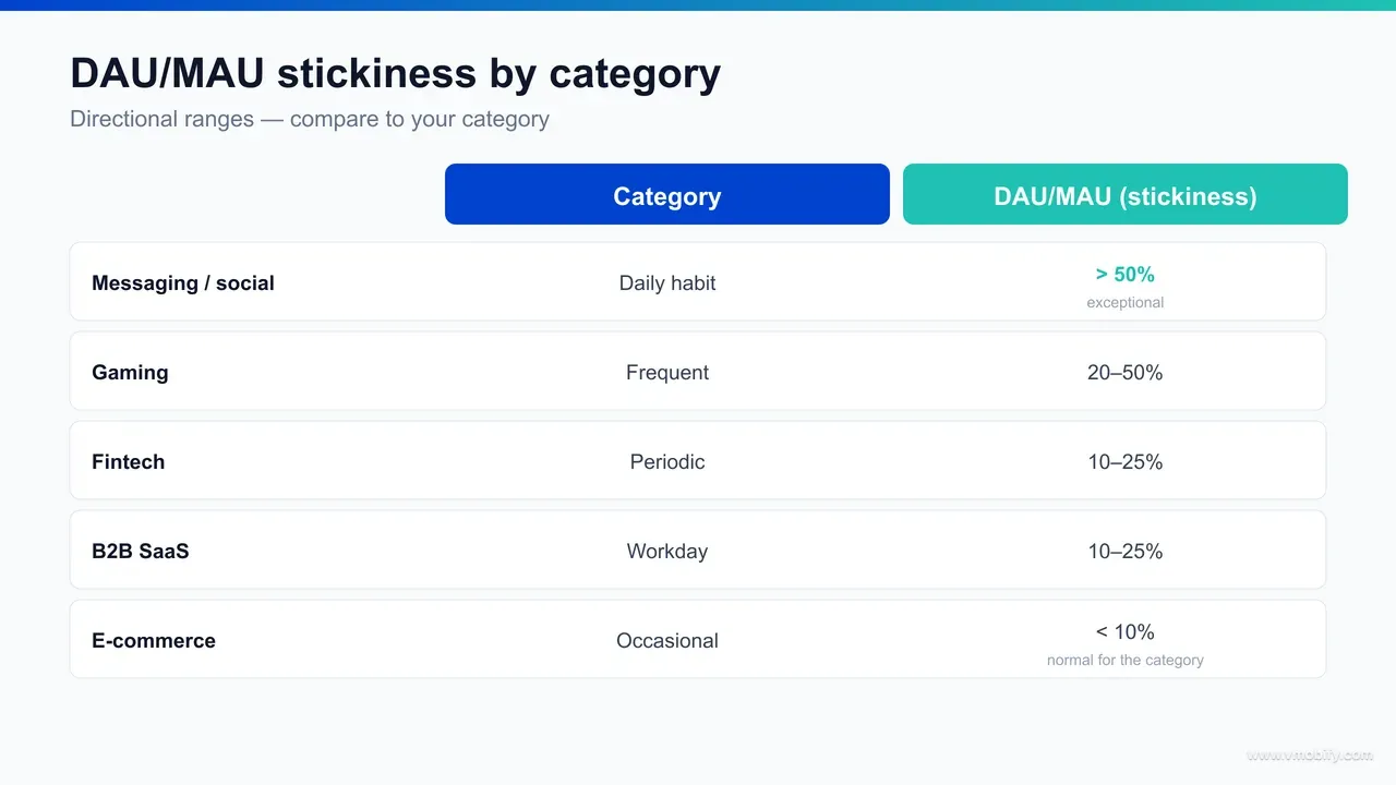
Directional DAU/MAU stickiness benchmarks for 2026 are roughly: messaging and social apps above 50%, gaming spanning a wide ~20-50% band, fintech and banking around ~10-25%, B2B SaaS around ~10-25%, and e-commerce or retail lower still — often in single digits to the low teens. The spread is enormous, which is the whole point: a ratio that is exceptional for retail would be a crisis for a messenger.
Here is the reference table, expressed as bands. Read each one as "normal for the category," not as a target you should beat:
- Messaging & communication: DAU/MAU often well above 50%. The stickiest category that exists, because the network does the retaining — you open WhatsApp or a chat app because the people you need are there, every day. Category leaders run far higher still.
- Social & content feeds: ~40-60%+. Algorithmic feeds are engineered for daily return; a healthy social app behaves much like messaging on this axis. The variable-reward loop is, by design, a stickiness machine.
- Gaming: a broad ~20-50% band. Mid-core, social and live-service titles with daily quests and energy mechanics reach the top; hyper-casual and single-player narrative games sit lower because the design never depended on daily habit.
- Fintech & banking: ~10-25%. Necessity-anchored and account-bound, but with naturally longer gaps between sessions — you check your balance or pay a bill on some days, not most. Trading and payments apps push toward the top of this band.
- B2B SaaS & productivity: ~10-25%, and a very wide internal spread. A daily-workflow tool retains like social; a monthly-reporting tool retains like a utility. Usage follows the work week, which on a daily ratio looks weaker than it is.
- E-commerce & retail: lower, frequently single digits to the low teens. Intent-driven and intermittent by nature — users open the app when they want to buy, and the curve is spiky and low by category norm, not by failure.
Two things to hold onto. First, these are directional ranges aggregated from published engagement studies — chiefly CleverTap's DAU vs MAU analysis, Amplitude's product-analytics research and Appcues' engagement benchmarks — and they shift with each study's definition of an "active" user. Treat every figure as a band, not a line. Second, the gap between categories (a 5x-plus spread from messaging to retail) is far larger than any gap you will realistically close through optimisation inside your own category. That is exactly why the comparison must be like-for-like: the category sets the realistic ceiling, and your job is to reach the top of your own band, not someone else's.
What counts as a "good" DAU/MAU ratio?
As a rough universal baseline, a DAU/MAU of about 20% is widely treated as "good" for a consumer app, a ratio near 50% is exceptional, and anything sustained above 50% is the territory of daily-habit categories like messaging — but the only target that produces a decision is your own category's median, not a universal line. The 20% figure is a useful sanity check precisely because it is so often misapplied.
The "20% is good" rule of thumb comes from consumer-app averages, and it maps to a specific behaviour: a 20% stickiness means the average monthly user opens the app on about 6 of 30 days, or roughly every fifth day. For a great many consumer products, that cadence is a genuinely healthy signal of habit. The often-cited benchmark, popularised in early growth writing and echoed across the engagement-analytics literature, is that strong consumer apps cluster around 20% and the very best approach or exceed 50%.
But "good" is category-relative, and the universal baseline misleads in both directions:
- For a messaging or social app, 20% is poor. The category median sits far higher, so a messenger at 20% is leaking daily habit badly — the right comparison flags a problem the universal baseline would have called healthy.
- For an e-commerce app, 20% is outstanding. Retail rarely sustains double-digit stickiness, so a shopping app at 20% is over-performing its peers — and a team holding it to a 50% "exceptional" bar would be chasing a number the category cannot structurally support.
- For a B2B SaaS tool, the daily ratio understates you. If your product is used on work days for a weekly task, DAU/MAU will read low by construction. The honest read for many SaaS products is WAU/MAU, where the same usage looks far healthier (covered below).
So the practical answer to "what is a good DAU/MAU?" is two-layered. The universal baseline — ~20% good, ~50% exceptional — is a reasonable first orientation when you have nothing else. But the moment you know your category, that median replaces the universal number entirely. Anchor on your peer band, and judge "good" as "at or above the top of my category's range," not "above 20% in absolute terms."
Why does DAU/MAU alone mislead you?
DAU/MAU is a blunt instrument because it is an average of an average: it compresses every nuance of how users behave into one ratio, so it hides session depth, treats a 3-second app open exactly like a 30-minute session, and can be propped up by a small power-user core while the majority of users quietly churn. The ratio tells you cadence — how often — and nothing at all about value per visit. Read alone, it is one of the most over-trusted numbers in mobile analytics.
Four specific ways a single DAU/MAU figure deceives:
- It is blind to session depth. A user who opens the app, glances at a notification and closes it counts identically to a user who spends half an hour engaged. Two apps with the same 25% stickiness can deliver wildly different value if one has 20-second sessions and the other has 8-minute ones. The ratio cannot see the difference — session length is a separate metric, and you have to look at it.
- It is dominated by a power-user minority. Because DAU counts anyone active on a given day, a tight core of daily power users can hold the ratio up while the broad base of monthly users barely returns. A "healthy" 30% can mask a bimodal reality: a thin engaged core plus a large churning tail. The aggregate looks fine; the distribution is broken.
- It moves with acquisition, not just engagement. Scale paid installs fast and MAU swells with low-intent users before they form habit, so DAU/MAU drops even as the product is unchanged and improving for engaged cohorts. Conversely, pausing acquisition can lift the ratio while masking that growth has stalled. The denominator has a life of its own.
- It punishes naturally low-frequency apps. A weekly-cadence SaaS tool or a fortnightly-shopping app is structurally incapable of a high daily ratio, no matter how loved it is. Judging it on DAU/MAU is like judging a cardiologist on sprint times — the metric is measuring the wrong cadence.
The throughline is that DAU/MAU answers exactly one question — "how frequently do active users return?" — and silently stays mute on every other question that matters: how long they stay, what they do, how value is distributed across the base, and whether the cadence even fits the app's purpose. In our portfolio, the apps that misread their own health most badly are almost always the ones that put a single stickiness number on a dashboard and stopped asking the follow-up questions. The fix is not to abandon DAU/MAU — it is to surround it.
Which engagement metrics should sit alongside DAU/MAU?
DAU/MAU only becomes trustworthy when read beside four complementary metrics: session frequency and session length (which expose depth the ratio hides), WAU/MAU (the honest cadence read for weekly-pattern apps), L7/L28 days-active curves (which reveal the distribution of engagement), and a power-user share (which exposes how concentrated that engagement is). Each one answers a question DAU/MAU cannot, and together they convert a single number into an actual engagement profile.
The complementary metrics, and what each adds:
- Session frequency & session length. Frequency (sessions per active user per day or week) and length (average minutes per session) are what give DAU/MAU its missing dimension of depth. A rising stickiness with falling session length can mean users are checking in more but engaging less — a warning the ratio alone would have read as good news. Track both, and watch them against each other.
- WAU/MAU (weekly stickiness). For any app whose natural cadence is weekly rather than daily — most B2B SaaS, much of fintech, periodic-shopping apps — WAU/MAU is the honest stickiness read. A SaaS tool at a weak-looking 12% DAU/MAU might post a robust 60% WAU/MAU, which is the number that actually reflects how engaged its users are. Match the window to the cadence.
- L7 / L28 (days-active-in-window). Popularised by Facebook's growth team, "Ln" metrics count how many of the last n days a user was active — L7 out of 7, L28 out of 28. Plotting the distribution of L28 (how many users were active 1 day, 5 days, 20 days, 28 days) reveals exactly what DAU/MAU averages away: whether you have a healthy spread or a barbell of power users and ghosts. Amplitude's engagement research treats this distribution as the real shape behind the ratio.
- Power-user share & the engagement curve. Segment users by activity intensity — casual, regular, power — and track what share of total engagement (and revenue) each tier drives. If 5% of users generate 50% of sessions, your "good" DAU/MAU is resting on a fragile base, and the strategic priority is widening the engaged middle, not celebrating the ratio.
The discipline here is the same one that governs honest mobile app funnel analytics: never let a single top-line ratio stand in for the distribution beneath it. Appcues' engagement metrics work makes the same case — stickiness is the headline, but feature adoption, session depth and the active-days distribution are the body of the story. Put DAU/MAU at the top of the dashboard, then put these four directly beneath it, and the ratio stops lying to you.
How do you actually calculate DAU/MAU, WAU/MAU and stickiness?
Stickiness is DAU divided by MAU for the same period, expressed as a percentage — but the number is only meaningful once you have pinned down three things that quietly swing it: how you define an "active" user, how you deduplicate users across the window, and which time window (daily vs weekly) matches your app's cadence. The formula is trivial; the definitions are where comparisons are won or lost.
The core calculations, stated plainly:
- DAU — the count of unique users who performed a qualifying active action on a given day. For a fair ratio you typically use the average DAU across the month, not a single day's figure, to smooth out weekday/weekend swings.
- MAU — the count of unique users active at least once across the rolling 30-day (or calendar-month) window. Crucially, each user is counted once no matter how many days they were active — MAU is a deduplicated unique count, not a sum of daily counts.
- Stickiness (DAU/MAU) — average DAU ÷ MAU, as a percentage. A 30,000 average DAU against a 150,000 MAU is a 20% stickiness.
- WAU/MAU (weekly stickiness) — average WAU ÷ MAU, using a 7-day active window. This is the read to use when daily return is the wrong expectation for your app.
Three definitional choices decide whether your number is comparable to a benchmark:
- What is "active"? An app open is the loosest definition and the most common; a meaningful in-app action (sent a message, completed a search, viewed content) is stricter and more honest. A stickiness built on "opened the app" will read higher than one built on "did something that mattered" — so before comparing to any published band, confirm both sides define active the same way.
- How are users deduplicated? MAU must count each user once across the whole window. Summing daily uniques double-counts anyone active on multiple days and inflates the denominator, deflating the ratio. Identity stitching across devices and sessions is the unglamorous work that makes the number real.
- Which window fits the cadence? Daily ratio for daily-habit apps; weekly ratio for weekly-cadence apps. Quoting a daily ratio for an intrinsically weekly product and then comparing it to a daily benchmark is the most common way teams convince themselves they are underperforming when they are not.
The practical rule mirrors the one in our retention work: choose the definition and window that match your app's real usage, document them, and only ever compare against a benchmark computed the same way. Most published stickiness tables use "app open" as the active event and a daily window — so if your tracked event is stricter or your cadence is weekly, expect your raw number to read lower, and benchmark like-for-like rather than concluding you are below par.
How does app stickiness tie into lifetime value?
Stickiness is a leading indicator of lifetime value because frequency compounds: the more often a retained user returns, the more opportunities the app has to monetise, deepen habit and resist churn — so a higher DAU/MAU generally predicts higher retention and higher LTV for the same user base, even though the ratio itself earns no revenue. It is upstream of the money, which is exactly why it is worth watching as an early signal rather than a lagging result.
The mechanism runs through three linked channels:
- More monetisation opportunities. Every session is a chance to show an ad, surface a purchase, prompt an upgrade or reinforce a subscription's value. An ad-monetised app's revenue is close to a direct function of session volume, so stickiness and revenue move almost in lockstep. For a transactional app, more visits mean more baskets and more completed purchases.
- Stronger habit, lower churn. Frequency is how habits form. A user who returns daily has woven the app into a routine and is far harder to lose than one who appears twice a month; sticky cohorts retain better at D30 and beyond, which is the link back to our retention benchmarks. Stickiness today is a forward read on the retention curve tomorrow.
- Better payback on acquisition. Because LTV tracks the area under the retention curve times value per active period, lifting frequency lifts both how often value is captured and how long users stay — which is why sticky apps clear their CAC inside a payback window that low-frequency apps cannot. The relationship between engagement and unit economics is documented across AppsFlyer's State of App Marketing data, where the most engaged apps consistently post the strongest economics on the same media spend.
The important caveat — and the reason stickiness is a leading indicator and not the destination — is that the monetisation model decides how much a given ratio is worth. A messaging app can run a 60% stickiness and monetise almost none of it; a B2B SaaS tool can run a 15% stickiness where every one of those sessions is worth real money. So do not read DAU/MAU as a revenue proxy in isolation. Read it as the frequency engine that, multiplied by your value-per-session, produces LTV. The healthiest growth stories in our portfolio are the ones where rising stickiness preceded rising revenue by a quarter or two — the engagement moved first, and the money followed.
How do India and emerging-market usage patterns change stickiness?
In India and similar emerging markets, blended stickiness often reads differently from Western benchmarks for structural reasons — entry-level Android devices, data-cost sensitivity, multi-app behaviour and OEM notification throttling all depress the daily ratio — so an India-first app should benchmark against its own device tiers and category, not against a US-derived band. The number can look weaker without the product being weaker.
Several India-specific dynamics pull on the ratio:
- Device-tier split. Premium Android and iOS cohorts in India frequently post stickiness much like Western benchmarks, while sub-₹10,000 handsets — with constrained RAM, aggressive battery-saver behaviour and frequent app eviction — return far less often. The blended figure averages two very different populations, hiding both the healthy tier and the constrained one. Always segment by device tier before judging the aggregate.
- Notification reliability. Aggressive OEM battery management on low-end Android silently suppresses the push and re-engagement nudges that carry users back day to day. The same re-engagement campaign that lifts stickiness on a flagship simply reaches fewer users on a budget device, so the daily-return mechanism is weaker for reasons outside the product.
- Data-cost and connectivity rhythm. Usage clusters around Wi-Fi availability and recharge cycles for the most price-sensitive users, which spreads sessions unevenly and can lower the daily ratio even where weekly engagement is strong. WAU/MAU is frequently the fairer read for a value-tier India audience.
- Vernacular and category mix. Categories that anchor daily Indian digital life — UPI payments, messaging, short-form video, vernacular content — post very high stickiness, often matching or exceeding global category leaders, because they sit on genuine daily need. The India stickiness story is bimodal: daily-need categories are extremely sticky, while discretionary ones run below Western equivalents.
The operational takeaway is the same one that governs our India growth work: never compare a blended India number against a Western benchmark, and never compare a value-tier device cohort against a premium one. Segment first, then compare like with like. The data observation belongs here; the playbook for actually lifting India stickiness — lite-mode builds, regional-language onboarding, UPI-native flows, festival-cadence re-engagement and notification-delivery hardening — lives in the companion retention strategy playbook and our user acquisition work, not in this reference. What matters for benchmarking is simply that the right peer set for an India-first app is other India-first apps in its category and device mix.
How do you actually improve app stickiness?
You improve stickiness by giving users a genuine reason to return more often — building a recurring value loop, an effective re-engagement system and the right habit triggers — rather than by chasing the ratio directly; and the difference between a sticky app and a leaky one is almost always the presence of a clear, repeatable reason to come back. This reference stops at "here is your number and what it means," but the shape of the work is worth naming so the benchmark points somewhere.
The levers that move stickiness, in rough priority order:
- A recurring core value loop. The strongest sticky apps deliver a reason to return that renews itself: new messages, a refreshed feed, a daily streak, a balance to check, fresh content. If the core value is one-and-done, no amount of nudging creates durable daily habit. Stickiness is a property of the product first and the marketing second.
- Habit triggers and re-engagement. Well-sequenced push notifications, in-app messages and lifecycle campaigns carry users across the gaps between natural returns — especially through the fragile first week. The contrast between a sticky and a leaky app, illustrated below, is usually visible in whether re-engagement is systematic or absent.
- Onboarding to first value, fast. Stickiness is decided early. Users who reach a genuine value moment in their first session form habit; those who bounce before it never enter the daily loop. Compressing time-to-value is the highest-impact early intervention.
- Personalisation and relevance. A feed, recommendation set or home screen tuned to the individual gives a sharper reason to return than a generic one. Relevance is what turns an occasional opener into a daily one.
- Widening the engaged middle. Because a thin power-user core can flatter the ratio, the durable way to lift stickiness is to move casual users up into regular ones — the L28 distribution shifting right — rather than squeezing more from users who are already daily.
In our portfolio, we have seen the same pattern repeatedly: the apps that lift stickiness sustainably are the ones that fixed the product's reason-to-return first and layered re-engagement on top, never the reverse. A notification blast can spike DAU for a day; only a real value loop holds the ratio up for a quarter. For the full set of levers — onboarding compression, push sequencing, churn prediction and lifecycle design — the retention strategy playbook is the companion to this page. This post names the benchmark; that one names the work.
How do you instrument DAU/MAU and engagement properly?
You instrument stickiness honestly by defining a meaningful "active" event, tracking unique deduplicated users across daily/weekly/monthly windows, and reporting DAU/MAU segmented — by acquisition source, device tier, platform and behaviour cohort — rather than as a single blended number, because the blend hides every leak that actually matters. A stickiness metric is only as trustworthy as the event definition and segmentation behind it.
The instrumentation checklist that makes the number real:
- Define the active event deliberately. Decide whether "active" means an app open or a meaningful action, document it, and apply it consistently. A meaningful-action definition is harder to fake and more predictive of value — but whichever you choose, hold to it so your trend is comparable to itself over time.
- Deduplicate users with real identity stitching. Count each user once per window across devices and sessions. Without solid identity resolution, MAU inflates and your ratio understates — the unglamorous foundation that makes everything downstream honest.
- Compute daily and weekly stickiness both. Report DAU/MAU and WAU/MAU side by side. For most apps one will be the headline and the other the sanity check; for weekly-cadence apps the weekly read is the true one.
- Segment, always. Break stickiness out by acquisition source (organic vs paid vs incentivised), device tier, platform and behavioural cohort. "Our stickiness is 18%" is not actionable; "our stickiness is 35% on organic-iOS and 9% on paid-budget-Android" points straight at the problem.
- Pair it with the engagement panel. Put session frequency, session length, the L28 active-days distribution and power-user share on the same dashboard so the ratio is never read alone.
This cohorting is the core of how our mobile analytics engagements are set up — the stickiness number is the first cut, and the segments are where the decisions live. The same instrumentation discipline underpins honest funnel analytics: define the event, deduplicate the user, segment the result. Treat published benchmarks as a starting reference — "is my ratio in a plausible neighbourhood for an app like mine?" — and then trust your own segmented cohorts over any published figure for every decision that follows. If you want a stickiness and engagement diagnosis scoped to your specific category, device mix and acquisition channels rather than a generic average, that is exactly the work our team does day to day — talk to us and we will benchmark your cohorts against the right peer set, not a blended one.
Frequently Asked Questions
What is a good DAU/MAU stickiness ratio?+
A DAU/MAU of about 20% is the common "good" baseline for a consumer app, and around 50% is exceptional — but the right target is category-relative. For messaging and social, 20% is poor and the median sits above 50%; for e-commerce, 20% is outstanding. Always compare to your own category band, not the universal number.
What does DAU/MAU actually measure?+
It measures stickiness — how often your existing users return. A 0.2 (20%) ratio means the average monthly user opens the app on roughly 6 days a month. It captures usage frequency, not the number of users you have, and it says nothing about how long sessions last or what users do in them.
What are DAU/MAU benchmarks by category in 2026?+
Directional bands: messaging and social apps above 50%, gaming a wide 20-50%, fintech and B2B SaaS around 10-25%, and e-commerce lower still, often single digits to the low teens. Treat them as ranges that shift with each study's definition of an active user, and benchmark against your own measured cohorts.
Why can DAU/MAU be misleading on its own?+
It is an average that hides everything underneath. It ignores session depth (a 3-second open counts like a 30-minute session), can be propped up by a small power-user core while most users churn, and moves with acquisition as much as engagement. Read it alongside session length, WAU/MAU and the L28 active-days distribution.
Should I use DAU/MAU or WAU/MAU for my app?+
Match the window to your app's natural cadence. Use DAU/MAU for daily-habit apps like messaging, social and many games; use WAU/MAU for weekly-cadence apps like most B2B SaaS, fintech and periodic-shopping apps, where a daily ratio understates real engagement.
How does Vmobify use stickiness benchmarks?+
We use them as the first cut in an engagement diagnosis, then segment by acquisition source, device tier, platform and behaviour to find the real leak. The benchmark says whether there is a problem; the segments say where it is. See our /services/analytics work for how we instrument and read engagement cohorts.
Where can I get current DAU/MAU benchmark data?+
Published engagement studies from CleverTap, Amplitude and Appcues are credible public sources for stickiness ranges, and AppsFlyer data covers the engagement-to-LTV link. Treat all of them as directional bands and validate against your own measured, segmented cohorts before making decisions.
Sources
- CleverTap — DAU vs MAU & app stickiness metrics — Stickiness definition, the ~20% baseline and category benchmark ranges
- Amplitude — Product analytics blog — Engagement curves, L7/L28 active-days distribution and stickiness analysis
- Appcues — Engagement metrics and benchmarks — Session depth, feature adoption and engagement alongside stickiness
- AppsFlyer — State of App Marketing — The engagement-to-LTV and unit-economics relationship
- AppsFlyer — App Marketing Performance Index — Category and geography engagement benchmarks for context
- Adjust — Mobile benchmarks and resources — Cross-category engagement and active-user definitions
- UXCam — Mobile app engagement benchmarks — Why category-level benchmarking beats a global average
About the author
Amol Pomane — Founder, Vmobify
Amol leads Vmobify, a mobile app growth agency that has driven 30M+ downloads and ranked 54K+ keywords across 300+ apps since 2013. He writes about ASO, paid user acquisition, retention, and the operational reality of scaling mobile apps in India and global markets.
Free Growth Audit
See exactly how to scale your app with 13+ years of expertise behind you.
Get My Strategy

